|
| Group |
Round |
C/R |
Comment |
Date |
Image |
| 52 |
Jan 18 |
Reply |
There are several ways to skin a cat in PS, and LR adds another. When I have any significant editing to do, I do it in PS. If it's just a couple of spots, I use LR's spot tool. If you hit "A" in LR, it changes a black and white that helps see where the spots are. Hit "A" again to toggle back. In PS, for small things I use the spot healing brush. For larger areas I use the clone stamp. Sometimes I use quick mask to create a selection then use content aware fill. Quick masks (shortcut letter "Q") are naturally feathered for a nice seamless (usually) transition.
For dodging and burning I have an action that makes a blank layer, fills it with 50% grey and changes the blend mode to either overlay on the dodge layer and softlight on the burn layer. If you paint with black on the burn layer it darkens and white on the dodge layer it lightens. Use a low opacity brush. The great thing with this method is that it is totally non-destructive. If this sounds too technical, PS has a burn and dodge brush. Use it on a duplicate layer in case you mess up. |
Jan 10th |
| 52 |
Jan 18 |
Comment |
I love it. I am anything but a purist and join Lisa in her suggestion to clean up the water. Especially the bright little spots. I might also do a bit of dodging and burning around the eye reflection. It almost looks a bit unreal so I would probably lighten it or otherwise attempt to make it look more natural (although I assume it is - it just doesn't look it to me) I like the composition and the angle of the frog, eye contact and the combination of green and orange. Nice job. |
Jan 8th |
| 52 |
Jan 18 |
Comment |
I'm very much in agreement with what Judith and Lisa said and I really like your choice on cropping. Great job in bringing out the beauty of these often disparaged birds. The image does look like it has a slight magenta cast, which I might try to play with. The cast may work for this image but I would want to look at it different ways and compare. I also think the image has some intrinsic humor and tells a story. I like it a lot. |
Jan 8th |
| 52 |
Jan 18 |
Comment |
There is definitely a hobbit hiding in there somewhere. It does look like a secret little place and I like the idea of the sunlit corner of the woods. To my eye, the contrast is a bit too strong and I would lower the highlights just a bit. If you have more of the image before a crop, I'd increase the top area so that the top off the broken off tree is visible. If not, it's not a big point and if the tree is too tall, I wouldn't bother. |
Jan 8th |
| 52 |
Jan 18 |
Comment |
I think you did a great job on the post processing. The head of the bird looks sharp on my screen but you can tell better on the full resolution copy on your computer. I like the reflection on the underside of the wing, which I assume is water. Great Blues are magnificent. I don't have any suggestions to offer. |
Jan 8th |
| 52 |
Jan 18 |
Reply |
Looking at your version and mine, I might just like the longer foreground better. If I were to keep it, I'd darken the area where the grass is lit up in the front and remove the plant on the lower front edge. |
Jan 8th |
| 52 |
Jan 18 |
Comment |
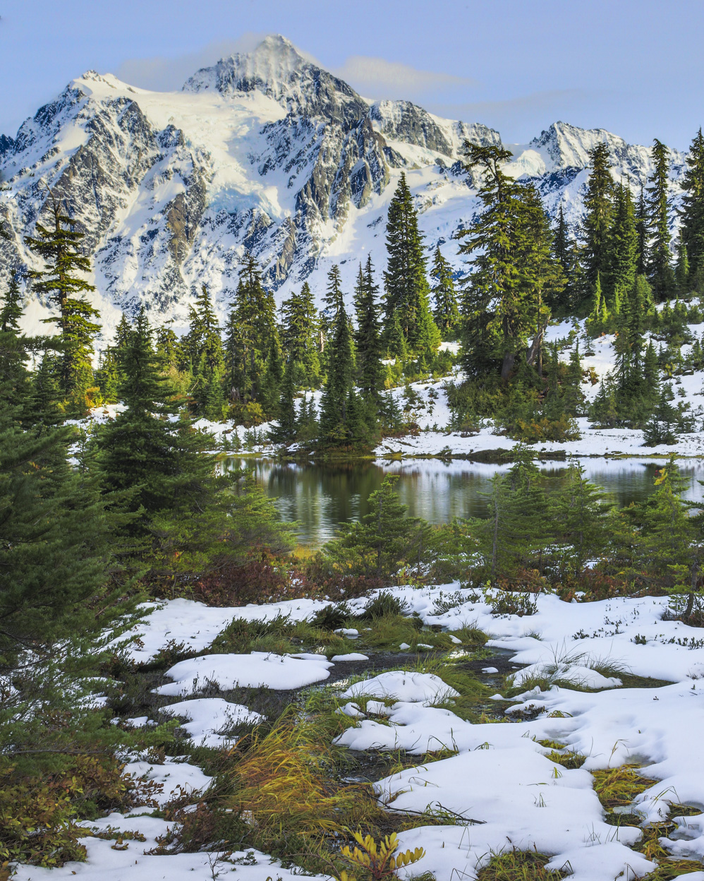
Very lovely scene and I love the colors and overall beauty of the place. I wanted to take a bit of a crack at processing. I could see where the sun was hitting, between the mountain and the lake but felt like the attention should have been on the lake instead. So I dodged a burned a bit to darken where the sunlight was reflecting. I also added a bit of contrast, which darkened the sky a wee bit. Last, I added clarity and sharpness to the water to attempt to draw the eye immediately to that area of the image. Last, I agreed with Lisa and cropped a bit off the bottom. |
Jan 8th |
 |
| 52 |
Jan 18 |
Comment |
Terrific work Sharon. I like everything about this image. The visible breathe (which I've tried unsuccessfully to capture well), pose, colors, background and composition. I appareciate Lisa's comment on the foreground but I like the brightness and lack of color there. It helps separate the elk. The only suggestion I can offer, having to search for something constructive to say, would be to slightly sharpen the eye a bit more and maybe bring a bit more detail back in the underbelly by lightening that area a bit, as long as it doesn't create an unsolvable noise problem. That said, this one's good to go as is. |
Jan 8th |
| 52 |
Jan 18 |
Comment |
Thanks guys. I don't think I blurred the background but I think the right side is just closer to the plane of focus. Good suggestions. |
Jan 8th |
7 comments - 2 replies for Group 52
|
7 comments - 2 replies Total
|