|
| Group |
Round |
C/R |
Comment |
Date |
Image |
| 52 |
Nov 17 |
Reply |
I like the sky better in your last version but there seems to be too much pink in the rocks and water. I prefer the water to look whiter. This is, of course, all a matter of taste and the image is outstanding. Good luck with it. |
Nov 11th |
| 52 |
Nov 17 |
Comment |
I agree with everything Carol said on this one. My first reaction was how artistic the color contrast. You might not have gotten the nice bokeh with a smaller aperture, at least just using one frame, so that I see as a compromise. I like the placement of the leave against the dark parts of the background. I would clean up the leaf a bit. The dark area in the crotch (?) of the leaf bothers me a bit. The image evokes some thoughts of aging and going out with a splash of color. |
Nov 10th |
| 52 |
Nov 17 |
Comment |
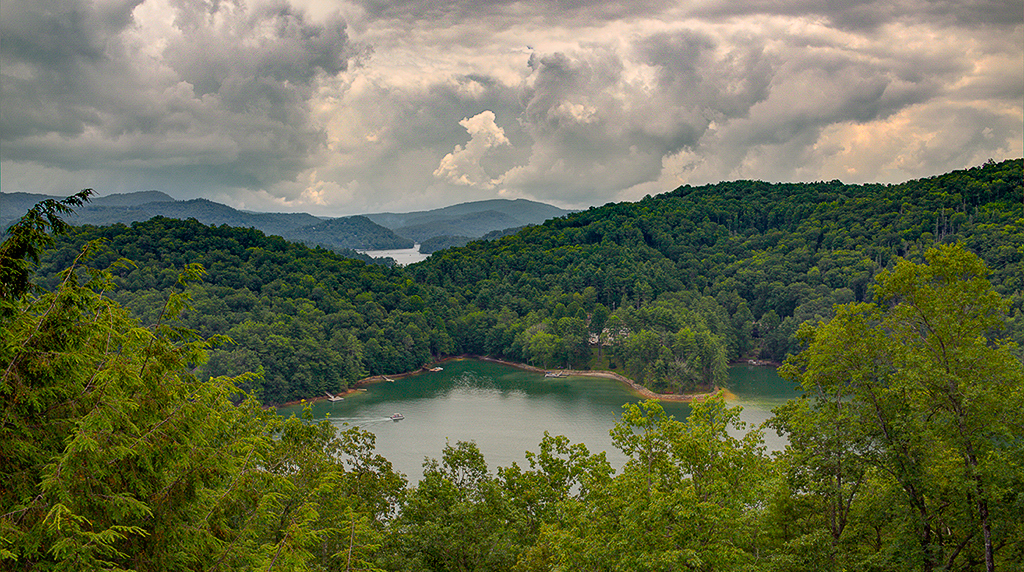
I like this image too Tom. But I'm going the other way with it. I thought a centered horizon and a big sky took some interest away from the image. I cropped a bit and warmed the image up a bit, adding some clarity to the sky to enhance the drama there. |
Nov 10th |
 |
| 52 |
Nov 17 |
Comment |
I agree with the feel and while beautiful, the colors look over the top to me. The blue of the sky does not look authentic and pulls my attention away from the trees, which I think are the main subject. In the trees, the shadows seem to dark, probably as a result of a strong sun. I'd like to see this scene during a still dawn, with nice reflections on the water.
I like the composition: the framing on the left and the way the heights of the trees forms a diagonal going down toward the right. |
Nov 10th |
| 52 |
Nov 17 |
Comment |
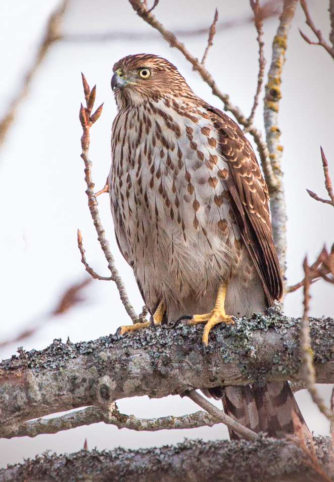
I looked it up and am still not certain but I think it's a juvenile Cooper's Hawk, as you said. Frankly, I couldn't decide if I would remove the branches or not so I played with it and removed the sharp ones on the left, then cropped in from the upper left corner. I looks better to my eye. |
Nov 10th |
 |
| 52 |
Nov 17 |
Comment |
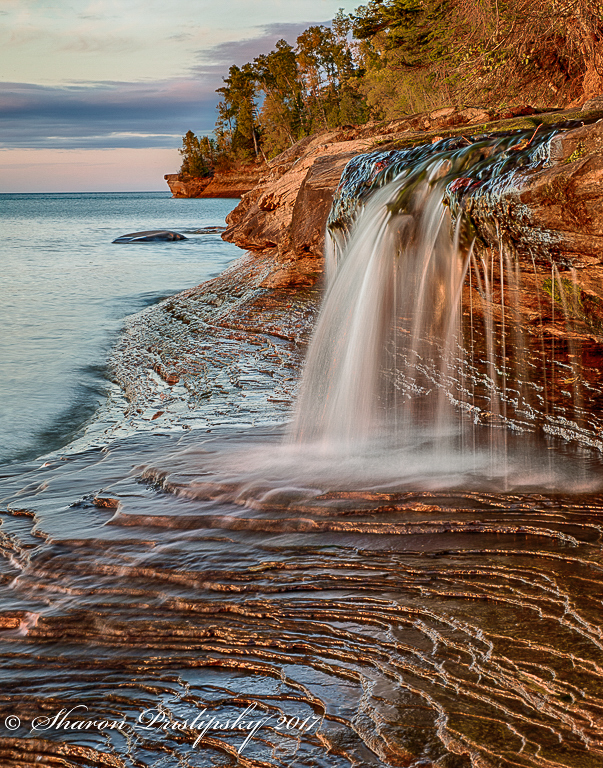
Great idea to remove the bare branch. I love the impact of the image but it did hint of HDR before I read your description. The colors just seem too vivid, often a by-product of many HDR programs. While that is certainly a matter of taste, I would like to compare this result with either your middle exposure processed, or a manual blending using luminosity masks (which I'm still trying to learn) or other techniques. I might find that I like your HDR better but I think the comparison might be worthwhile. If you go for it, maybe layer in this one with the originals and preserve the foreground, which to me is the star of the show, with the non-HDR mid-ground, then choose which sky looks better, the HDR or the origin.
I tried paying with your image which, surprisingly, opened with a slightly different and more pleasing color gamut than looking at it online. I added a touch of green to the rocks and trees and added some negative clarity to the trees in the back, which looked too sharp for my taste. I was trying to not steal the show from the waterfall and wonderful foreground.
I would definitely submit this image. It's a winner in my book. |
Nov 10th |
 |
| 52 |
Nov 17 |
Comment |
Thanks for the input. I particularly like critical comments as I often find myself too enamored with my shots to see there flaws. While I may not always agree, I value critical comments highly, so thanks. I like the idea of cropping off a bit of the bottom and I may have gotten sloppy with my processing. |
Nov 10th |
6 comments - 1 reply for Group 52
|
6 comments - 1 reply Total
|


