|
| Group |
Round |
C/R |
Comment |
Date |
Image |
| 52 |
Apr 17 |
Reply |
Thanks Judith. No, I was hand holding. I'm almost always wide open to increase my shutter speed and blur the background, unless I have a group or large subject. With birds, if the settings are already set, forget it; it all happens in a second or less. In this case, a smaller aperture may have brought a bit more of the foliage into focus but it might have ruined the background, not that I was thinking of it at the time. |
Apr 23rd |
| 52 |
Apr 17 |
Reply |
Although I have one that I've never used, many flower photographers use a diffuser screen. It's placed between the sun and the subject and subdues and diffuses the light. Good thoughts John. |
Apr 12th |
| 52 |
Apr 17 |
Comment |
Very pretty. I agree with Lisa's comments. The colors are striking and it is an interesting composition. I like dark backgrounds like this. |
Apr 9th |
| 52 |
Apr 17 |
Comment |
Their colors are amazing. It's a very interesting close crop which I think really brings out the jewels of color at this time of year for Great Egrets. The lighting and exposure are perfect. I love the streaks of blue in the background as well. I might slightly desaturate just to make thinks look a bit less bold. I know that my Canon tends to oversaturate green which may have happened here. Just a touch. Another thought: you know by now that I'm not against tinkering. I might tilt the bird a bit so that the beak is pointing up a slight bit or maybe down a bit more. It might make a more dramatic composition. |
Apr 9th |
| 52 |
Apr 17 |
Comment |
A purely subjective approach, but I thought their was too much empty space which didn't add to the scene, at least to my eye. The horizon also looked a bit tilted. I cropped and straightened and it looks better to me. |
Apr 9th |
 |
| 52 |
Apr 17 |
Comment |
Here it is. I also added some white to make it look a bit foggier. |
Apr 9th |
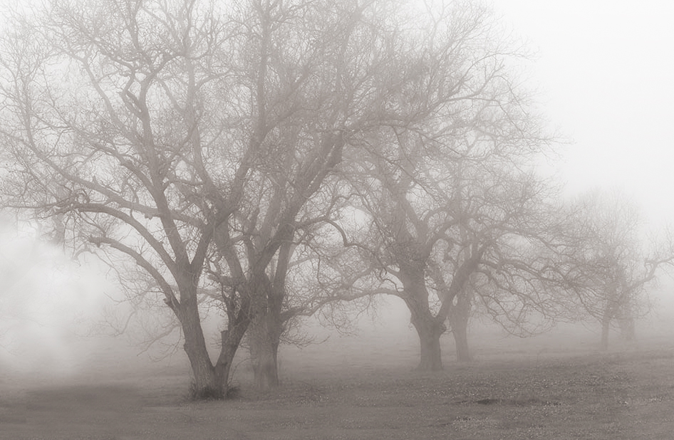 |
| 52 |
Apr 17 |
Comment |
Nice soft scene. I love fog. I have a few thoughts on the image. The diagonal line the row of trees makes just doesn't look pleasant to me. Maybe because the front tree comes too close to the front of the image? I thought I'd play a bit with it. I cropped out the tree on the right and painted over the tree on the left to make it less competitive with the "main" tree. I also added some foreground which to my eye balances the picture a bit better. Last, I added a bit of tone. |
Apr 9th |
| 52 |
Apr 17 |
Comment |
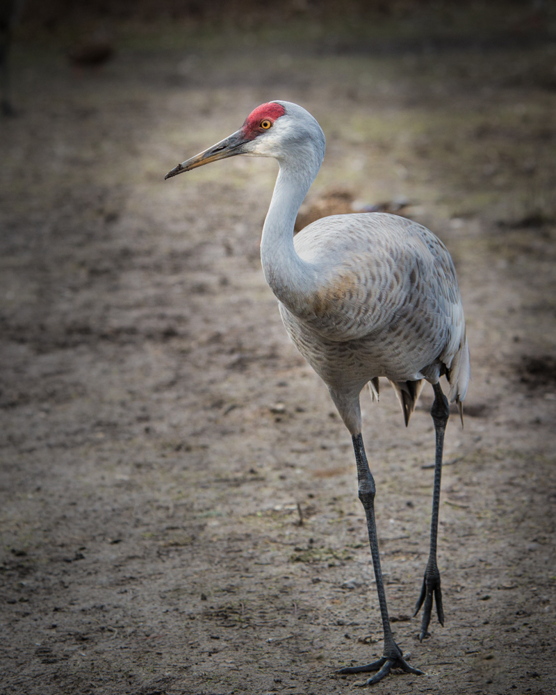
Thanks Lisa. The leaves are definitely out of the plane of focus. I think the bird is acceptably sharp but also agree that it was adversely affected by the ISO, and probably by my hand holding, even at 1/4000. What makes bird photography so much fun is how hard it is. Thanks for the good feedback, Mike |
Apr 9th |
| 52 |
Apr 17 |
Comment |
To my eye my edit is a bit overdone, as the highlight area behind the bird is a bit too distracting. I tried to edit my comment but wasn't able to do it. I would just feather the effect in more if it's something you like. |
Apr 8th |
| 52 |
Apr 17 |
Comment |
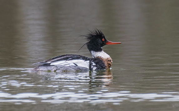
These are such beautiful birds. I liked where you placed the bird in the frame and the almost eye level point of view. I think the bird's tonality is close to the background which makes me also want to vignette the edges. I made a couple radial adjustments in LR, highlighting the bird and darkening everything else and reducing clarity at the same time to the area outside the bird. It makes it a bit more dramatic to my eye. |
Apr 8th |
 |
| 52 |
Apr 17 |
Comment |
OK, I love it. Big wow factor, beautiful, the composition seems perfect to me and the colors really do pop as you said. The background really complements the flower and I like how it fades to black. Congratulations on a wonderful image. |
Apr 8th |
9 comments - 2 replies for Group 52
|
9 comments - 2 replies Total
|


