|
| Group |
Round |
C/R |
Comment |
Date |
Image |
| 54 |
Nov 25 |
Reply |
Thanks, Kirsti! I am really happy with the way the colors of the heron turned out.
I tried this image without the moon and didn't like it as well, but I do think I need to tone it down a bit. Thanks for pointing that out. |
Nov 24th |
| 54 |
Nov 25 |
Reply |
Thanks, Brad. I personally like the moon there, but I think I will burn it down a bit because I can see that it can be distracting. Thanks for pointing that out. |
Nov 24th |
| 54 |
Nov 25 |
Reply |
Thanks for the kind words, Matt!
I did debate about moving the heron further to the left, but I felt that it gave more of the "escape" feeling with this placement. I'm glad to hear that you think it works. |
Nov 24th |
| 54 |
Nov 25 |
Reply |
Thanks, Alan. My intention was to create an image of strong feeling; it's gratifying to hear that I succeeded in that. |
Nov 24th |
| 54 |
Nov 25 |
Comment |
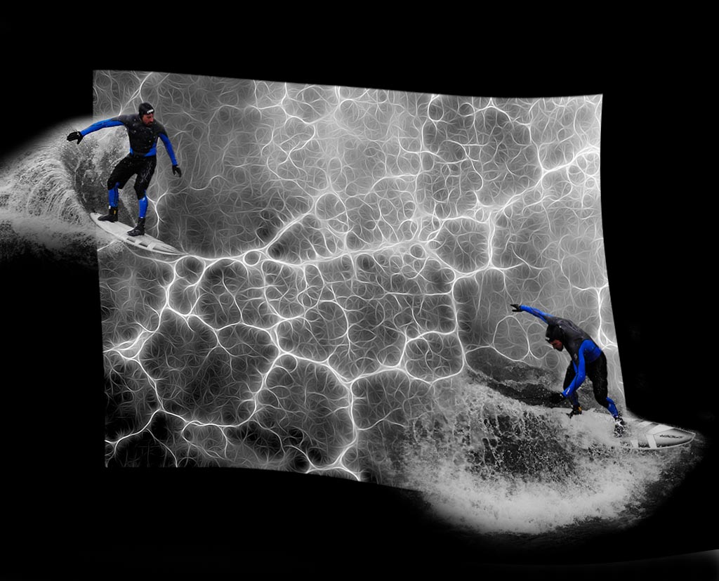
What a cool image, Brad! I love the energy of the sparking background, and how everything is b&w except the blue parts of the surfers' wetsuits. The waves look very natural to me, and their placement gives me a dynamic feeling of balance in action. I especially like how the surfer on the left seems to be surfing onto an energy line.
You might want to consider distorting the frame to emphasize the water motion.
Twirl gives an interesting effect too. Such a cool image!
|
Nov 24th |
 |
| 54 |
Nov 25 |
Comment |
This is a fabulous image, Alan! It is so beautifully conceived and executed. I love all the detail of the arches and the texture of the floor against the careful creases in the robes of the Druids. The colors work together so well, with the Druids' robes differentiating but so similar to the stonework. The 2 lit lanterns are very effective accents to my eye, emphasizing the importance of the Druids. I love how this image is very symmetrical but not exactly. Not only does the line of Druids curve in a balanced but not quite symmetric way, but the light on the foreground columns is slightly different, in a subtly realistic way.
In short, I love this image, Alan! |
Nov 24th |
| 54 |
Nov 25 |
Comment |
This is very fun, Matt, and such a success! I love your color scheme. The red on the building echoes the red of the T-ball trams, and the yellow really accentuates the speeding trams. The blue in the building carries the colorful theme without interfering with the rest of the image. I love the color highlights on the blue buildings.
The timing of the falling tram gives me a feeling of the trams being perfectly timed and super speedy. I think changing the color of the motion blur at the far end is a brilliant touch.
I love the soft, retro look. It reminds me of a movie poster.
One tiny suggestion: the window light just to the left of the P in Paramount has been dimmed but is still just a tad distracting to my eye. I didn't notice it at first, but I'd consider burning it down a bit. |
Nov 24th |
3 comments - 4 replies for Group 54
|
3 comments - 4 replies Total
|