|
| Group |
Round |
C/R |
Comment |
Date |
Image |
| 54 |
Sep 25 |
Reply |
Thanks, Alan!
It's interesting that you should say that about an image not needing a story because I have another version of most of these originals for next month that I was a little concerned about because it does not have a story. But in the end I agree with you that not every image needs a story (even though I love stories). I think this other version also works; we'll see what everyone thinks in October... |
Sep 13th |
| 54 |
Sep 25 |
Comment |
I really like this, Brad! I love the color of the forest floor going up through the trunk to that beautiful flower. I think the b&w of the background works really well- it's a strong contrast to the natural colors, but the organic patterns within the b&w connect the two for me. I think this is a very effective and unique combination of color and b&w that I don't remember seeing anyone use before.
The Coke bottle shape reminds me of the monolith in 2001. The symmetry in this image is pleasing to me because there is a strong symmetry with enough variation to keep it interesting.
In short, a very cool image!
I have 2 small observations. The first is that the black item extends all the way to the top of the image, which leads my eye out of the frame. I'd consider having it stop short of the top.
The second is that this very strongly symmetric image is slightly off-center, not enough to feel intentional but enough to be a bit uncomfortable for me. If that's your intent, it works well. If not, I'd crop a tad off the right side. |
Sep 13th |
| 54 |
Sep 25 |
Comment |
This is beautifully executed, Alan! You have such interesting elements and a wonderful texture. I love how the details of the horse and carriages stand out. I am really enjoying your use of color with the brown as a base and then color added selectively. I personally might consider a touch more color for the cart at the left.
I think the composition works nicely overall. The only suggestion I have is that I might consider moving the left side of the image a bit towards center. It's a wide image with the blank side of the house in the center, so my eye keeps dividing the image in two. For me, a tighter composition feels more cohesive.
|
Sep 12th |
 |
| 54 |
Sep 25 |
Comment |
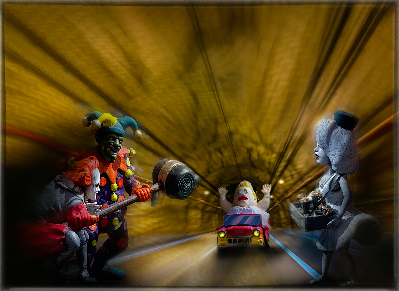
This image is both terrifying (evil clowns!!) and funny for me. I think it works really well. The villainous clown and jester on the left are balanced by the impassive lady on the right, and the helpless car's occupant is bearing down inexorably towards them all. Every one of them has an expression and body language that tells a story. Your composition really gives me the feeling that they are in a long tunnel. The motion blur and the tunnel's lines reinforces the feeling of speed I get from seeing the expression on the face of the car's occupant. I like how the colors of the car match the clothes of the evil doers, and how the lady on the right is as colorless as her expression.
There are 2 things that distract my eye at the top center of the image - an arc running through the lines that direct me to the car, and a sort of hill shape that sits on it. I copied part of the ceiling from the other side as a substitute; see what you think. |
Sep 12th |
 |
| 54 |
Sep 25 |
Comment |
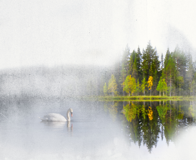
This is a remarkable image, Kirsti! I really get the feeling of mist and reflection. I think you've placed the texture perfectly relative to both the island and the swans. The swans in the mist are so evocative of peace and those magic moments in nature when you don't want to make a sound because everything is so exquisite.
The center and the left side of the image feel very natural to me. I like the symmetry of having the swans bracket the island, but the dark line circling the swan on the right feels less natural than the left side of the image. Personally, I would consider cropping it, or adjusting the texture.
There's a dark line going up the top center of the texture which is a little confusing to my eye. |
Sep 11th |
 |
| 54 |
Sep 25 |
Comment |
This is such a lovely image, Matt! I love the subtle palette and the beautiful countryside. The open window feels very inviting to me as well as acting as a picture frame. I really like how the bride and groom are just slightly off-center; it gives me a feeling of their movement within an idyllic scene. I think this would make a wonderful gift to the bride and groom.
The out of focus leaves at the base of the window do distract me a bit, since everything else is in focus. I do think having leaves there is effective in creating the feeling of separation between the couple and the viewer, and so making the couple's moment more intimate.
To me, the image feels as if it's tilted just a bit to the right.
|
Sep 11th |
| 54 |
Sep 25 |
Reply |
Thanks, Matt!
Yes, reducing the bird and the squirrel sizes made them less of a focal point, and also lost some of the detail. I decided to sacrifice the realism in preference for the detail. |
Sep 11th |
| 54 |
Sep 25 |
Reply |
Thanks, Kirsti! Those are great suggestions. It does look a little dark to me now, and I hadn't considered reducing saturation, but it is an improvement. I'll play with adjusting both. |
Sep 11th |
5 comments - 3 replies for Group 54
|
5 comments - 3 replies Total
|


