|
| Group |
Round |
C/R |
Comment |
Date |
Image |
| 54 |
Jun 25 |
Reply |
Yes, it's the disequilibrium that really intrigues me about this image. For me, it's a great strength here. |
Jun 20th |
| 54 |
Jun 25 |
Reply |
Sorry about that. Here you go. |
Jun 19th |
 |
| 54 |
Jun 25 |
Reply |
Thanks, Maria! Your version feels much better balanced to me. Thank you! |
Jun 19th |
| 54 |
Jun 25 |
Comment |
I'd love to see where you take this, Brad.
I really like how the steps are going up to the left rather than the other way around- for me, it reinforces the idea that something unusual is going on here. I love the colors and textures of the steps. The little workers are nicely sized - I believe they could climb up those stairs to continue their cleaning.
I like the idea of something else to show that they are indeed small. A curious cat coming up the stairs (or perhaps just its paw)? A quizzical mouse? A stream of ants carrying some of the debris? Or a Monty Python-ish foot coming down? A falling Starbucks cup? I think I'd better stop. |
Jun 19th |
| 54 |
Jun 25 |
Comment |
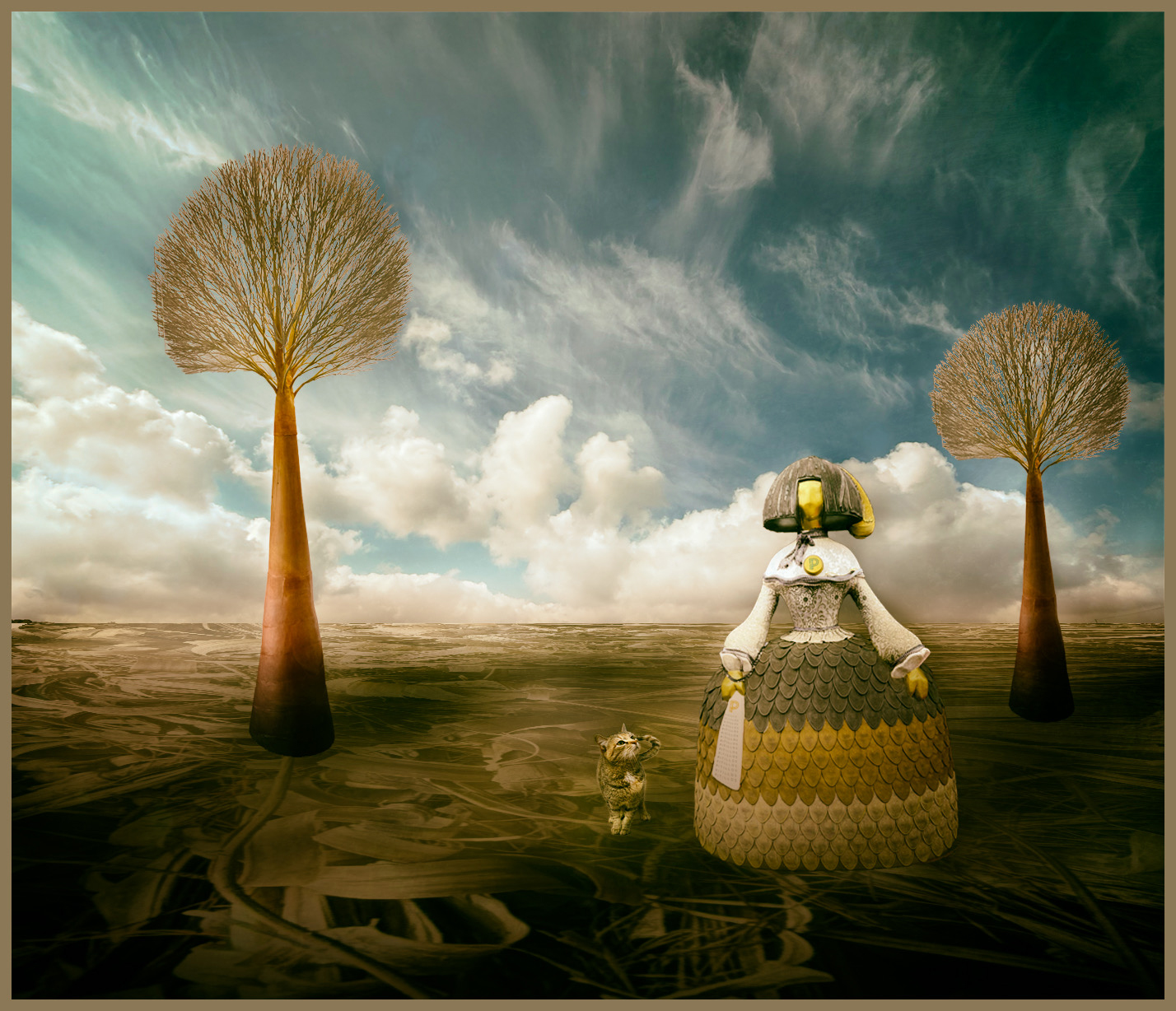
I love all the intricate detail in this image, Maria! The sky is amazing, both in the cloud structure as well as the lovely color, and the ground is both fascinating as well as an instant orientation into this being a fantasy land. The lady and the trees feel wonderfully ordered and proper compared to the twisting strands of the landscape. The cat is adorable , adding a sweet, relatable element to this strange world.
Personally, I like the second tree. I think it adds to the image by creating a triangle for my eye to follow (a favorite pattern for me), and balances the composition by making it clear that the trees are background. For me, if only the tree on the left was there, I would feel it was competing with the lady and the cat.
My only suggestion is to consider brightening the cat a bit. I didn't see it at first due to all the detail in the landscape. |
Jun 19th |
 |
| 54 |
Jun 25 |
Comment |
This is a really interesting image, Alan. It works for me so much better than it would if it was more conventional- if, for example, the man was closer in proportion to the house. There is something uncomfortable about the different proportions and his body facing as if he is walking straight forward while his head is turned to the house (the only destination in sight) - uncomfortable in a way that keeps me coming back to the image and to think about it more. The clarity and detail of the man and the house works well against the backdrop of the foreboding sky, and the red glow of the sun creates a visual triangle that keeps my eye in the frame. Your skill in assembling the components is masterly. This image is very intriguing to me. |
Jun 19th |
| 54 |
Jun 25 |
Comment |
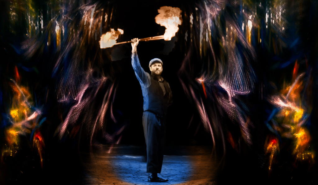
Kirsti, I love this concept and story! The man has such a strong presence, and the fire really rivets my attention. I think the composition works really well - the colors at the sides and lines of the nets emphasize the power and magnetism of the man in the center.
This is such a colorful image that I do wish the man had some color. I used Spherize in the attached to make him larger (having duplicated a layer and then masking only the center in), and added color to that layer. What do you think? |
Jun 15th |
| 54 |
Jun 25 |
Reply |
Thanks, Kirsti! I like your suggestion- she feels more spirit-like in your version. I like the Smudge effect better than blur, which I had tried. |
Jun 15th |
| 54 |
Jun 25 |
Reply |
Thanks, Brad! You've given me something to think about |
Jun 15th |
| 54 |
Jun 25 |
Reply |
Thanks, Alan!
I think you're right, it would work better with a smaller flower. I'll give it a try. |
Jun 15th |
4 comments - 6 replies for Group 54
|
4 comments - 6 replies Total
|