|
| Group |
Round |
C/R |
Comment |
Date |
Image |
| 54 |
Mar 25 |
Comment |
Test comment |
Mar 26th |
| 54 |
Mar 25 |
Comment |
Such a cool image, Alan! It is disturbing yet believable, because all the components have been added so skillfully. The confined space is as mysterious as the strange chess player. I love the hand coming into the frame, watched so intently by the chess player with the strangely textured head. The people on the chess board are a great touch. It's all so deliciously freaky.
The original background might be worth revisiting in another image; there is something very satisfying about its contrast and symmetry. The black square drew my eye into the image in a way that the medium grey surrounded by white does not. A darker room lets my eye focus on the game more. |
Mar 19th |
 |
| 54 |
Mar 25 |
Comment |
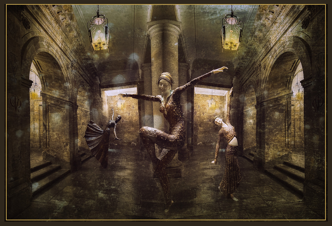
I love this image, Maria! I feel so much joy and movement from these dancers. The texture layer adds a feeling of magic and even more movement. The golden colors feel as if they are shimmering, and I can practically hear the music. The composition is beautifully balanced, with the ceiling lamps and the side dancers showcasing the central dancer. What a wonderful image!
The brown border is effective when the image is on a light background, but I didn't even notice it against the black background on this page. You might consider adding a stroke outside it, or perhaps inside it.
|
Mar 19th |
 |
| 54 |
Mar 25 |
Comment |
This is a very intriguing image, Brad.
It feels to me as if David is being swallowed by the tree and sinking into the dirt.
If the idea is that he's emerging, perhaps some color or texture behind him to suggest that. If he's being swallowed, perhaps a loss of brightness encroaching from the edges. On the other hand, maybe you want to leave it up to the viewer to decide.
In any case, I think it's a great composition, and that David is an interesting contrast to the wonderful nature surrounding him. The combination works in a surprising and intriguing way. |
Mar 17th |
 |
| 54 |
Mar 25 |
Comment |
Very cool image, Kirsti! The blue color works really well, and I think the tangle of branches makes an interesting frame around the man. The umbrella is an interesting touch. I really like the faint branches showing through the man.
I like your second version the best.
I don't have anything to add to the great suggestions the group gave you already. |
Mar 17th |
| 54 |
Mar 25 |
Comment |
This is a brilliant image, Matt! I think you have really captured the feeling of Times Square- the color, so much going on at once, seeing what is there but not being able to focus on details because there is so much to look at. I really love this! The distortion of the buildings add to the feeling of motion, and I really like how the words on the buildings are legible but look fluid and changing as well.
The colors work really well together.
I like how you balance the bright upper left with the brake lights in the lower right corner.
The black car in the lower left does stop my eye a bit; you might consider lightening it up a tad.
Such a wonderful image! |
Mar 15th |
 |
| 54 |
Mar 25 |
Reply |
Thanks, Matt!
|
Mar 15th |
| 54 |
Mar 25 |
Reply |
Thanks, Maria!
I'm glad to hear I got the shadow right; I always have trouble with that. |
Mar 15th |
| 54 |
Mar 25 |
Reply |
Thanks, Kirsti! |
Mar 15th |
| 54 |
Mar 25 |
Reply |
I know what you mean, Brad. I tried a lot of variations of the colors. A sort of sepia colored one looks more authentic, as does one in b&w and another with a "hand colored" filter. I just couldn't resist the colors on this one. ;0) |
Mar 15th |
| 54 |
Mar 25 |
Reply |
Thanks very much, Alan! |
Mar 15th |
6 comments - 5 replies for Group 54
|
6 comments - 5 replies Total
|