|
| Group |
Round |
C/R |
Comment |
Date |
Image |
| 54 |
Feb 25 |
Reply |
Thanks for the compliment, Bob!
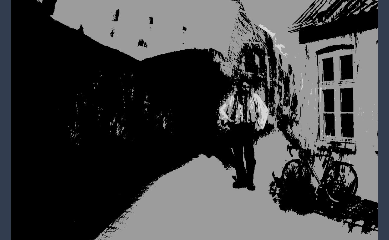
The tonal evaluation is interesting. It's a very useful tool; I haven't used it lately, so I appreciate your reminding me of it.
Personally, I prefer using the Notanizer app set at 3 levels , which gives the results shown below. It's what I'm comfortable with.
(By the way, I don't think I've ever been to a PSA conference). |
Feb 25th |
 |
| 54 |
Feb 25 |
Reply |
Thanks very much, Maria! |
Feb 21st |
| 54 |
Feb 25 |
Comment |
I love the story of this image, Maria, especially because I can think of a variety of stories of what is going on here. Placing the children in the lower corner gives me the feeling of the vastness of the forest and the lake. The egret's wings spread wide give me the feeling that it is there to help.
I am really impressed with how lifelike you make the children look, given the originals.
Personally, I might consider simplifying the background, perhaps with an oil painting filter. Stylizing the scene makes the slight unreality of the children feel more compatible to me. |
Feb 14th |
 |
| 54 |
Feb 25 |
Comment |
This is a great image, Kirsti! I love the way your imagination put this all together. Your little aliens feel very endearing, perhaps because of the way the little one is leaning towards the bigger one. The colors of the vertical bands of light really work well with the purple sky.
I think Bruce's version with the beam defined more clearly really tells the story.
I don't have any useful suggestions, but I do really enjoy this image. |
Feb 14th |
| 54 |
Feb 25 |
Comment |
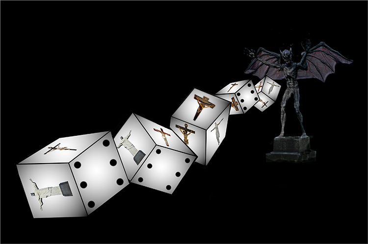
This feels like a very powerful image, Alan. The dice tumble with a very realistic, 3D feeling. I love the shading on their edges. The composition is elegantly simple, inviting my eye to examine all the details on the dice, working back to that gleeful devil.
I do find the imagery rather disturbing; I also feel that it falls well within the realm of artistic expression.
Personally, I like it that you gave the devil something to stand on. It feels like steps to me.
Thanks for your detailed explanation of how you created the dice.
I agree with Matt's comment about making the devil a bit brighter. If you wanted to emphasize just the outlines, you might make a copy and apply filter=>Distort=>emboss and put it in Hard Light mode at lowered opacity. Just a thought.
|
Feb 14th |
 |
| 54 |
Feb 25 |
Comment |
This is a fabulous image, Bruce! I love the way you've shown the vastness of the desert with an almost panoramic crop. The dark soil at the lower left invites me into the image with a generous wide pathway and leads me into the center of the image. The sizes of the camel train and the balloon emphasize the immensity of the desert. I think your color choices really make this image; it feels like golden sands and a silver sky.
I'm particularly interested in your choice of where to place the balloon. I would have tried a little to the left (classic rule of thirds), but I see that instead you have created a connection between the camel train and the balloon. There's more of a story this way for me.
My only suggestion is that a touch of vignette in the lower right corner might be useful to keep the eye in the image, since that is the biggest bright area in the image.
Thanks for your detailed description of how you created this wonderful image, Bruce!
|
Feb 13th |
| 54 |
Feb 25 |
Comment |
This is a beautiful place you've created, Brad. I love the color of the sky and how it's reflected in the water. The layers of the landscape are mysterious and intriguing to me. I love the mist in the far mountains and the glimmer of the water.
The trees in the center of the image are very dark on my monitor; I wish I could see just a little detail there so it wouldn't feel like one big dark area.
I played with your black frame version a bit. For me, having the whole bottom of the frame pouring out looks like there was a mistake in applying the frame (and a black frame doesn't show well against a black background). I tried to make the frame more obviously intentional here. I personally like it with a frame. |
Feb 11th |
 |
| 54 |
Feb 25 |
Comment |
What a great moment you've created here, Matt! I especially like the name of the cafe, because you are definitely telling a story here. The colorful lights fit right in with the "Story" above them, as well as mimicking the dancing words on the colorful menu chalkboard. It feels as if you changed the perspective a bit on the man, as if you were a step to the right; it looks great. I love where the light is falling and where you've introduced shadows. Well done! |
Feb 11th |
| 54 |
Feb 25 |
Reply |
Thanks for your thoughtful and detailed comments, Bruce! I really appreciate how carefully you've looked at my image and your helpful feedback. Thanks! |
Feb 11th |
| 54 |
Feb 25 |
Reply |
Thanks, Brad!
That's an interesting suggestion, I'll keep it in mind. |
Feb 11th |
| 54 |
Feb 25 |
Reply |
Thank you very much, Kirsti!
That's a great suggestion about adding texture to the foreground path, I'll definitely do that. |
Feb 11th |
| 54 |
Feb 25 |
Reply |
Thanks, Matt!
Yes, it's difficult to decide which parts to leave soft and which to define a bit more, especially when combining elements that are originally sharp. I've gone back and forth on that quite a bit for this image. |
Feb 11th |
| 54 |
Feb 25 |
Reply |
Thanks very much, Alan! |
Feb 11th |
6 comments - 7 replies for Group 54
|
| 60 |
Feb 25 |
Comment |
(I'm visiting from Group 54).
I love the colors and textures, Erin. The composition is great, especially with the placement of the screw. The words are very faint and don't distract me; I personally think they add interest to the careful observer.
I like the suggestion to rotate the image. I have a preference, but that doesn't really matter, what matters is what you prefer.
Well done! |
Feb 21st |
1 comment - 0 replies for Group 60
|
7 comments - 7 replies Total
|


