|
| Group |
Round |
C/R |
Comment |
Date |
Image |
| 54 |
Jan 25 |
Comment |
Just to add my opinion about the shadows of the rails - I noticed that they weren't realistic (only after looking at a lot of other aspects of the image first), but for me, it added to the surrealistic effect of the image. I know there are judges who would deduct points for that, but for me, the added strength of the leading lines and unworldliness more than overcome that insistence on reality. |
Jan 20th |
| 54 |
Jan 25 |
Reply |
Thanks for your kind words , Maria!
I've tried the flower larger, and don't like it as much. But I agree that I've created a confusion here about what the center of interest is (snow or flower?). So now I'm playing with making the flower smaller. |
Jan 20th |
 |
| 54 |
Jan 25 |
Reply |
I think I will make a card of it; there's plenty of space for "Happy Birthday" at the top ;0) |
Jan 17th |
| 54 |
Jan 25 |
Reply |
Thanks, Brad! |
Jan 17th |
| 54 |
Jan 25 |
Reply |
Thanks, Bruce! |
Jan 13th |
| 54 |
Jan 25 |
Comment |
What a great image, Bruce! The crop makes me look up and up that tall tower. Your Juliet is so intense - I love the look on her face and how she is reaching out. (Personally, I could read this as how passionately she desires Romeo, or that she is really ticked off at him, but I think it works either way).
The balcony frames her so nicely, and the sky provides an interesting frame for. the tower.
I really love her Rapunzel hair. It feels to me to be very similar in shade to parts of the tower. I shifted that a bit here by adding a B&w layer in luminosity mode, with the red and yellow sliders moved to the right, masking in her hair. Just a matter of taste. |
Jan 12th |
 |
| 54 |
Jan 25 |
Comment |
This picture is certainly worth a thousand words, Alan! It's so easy to imagine stories about what's going on here, and what the relationship is between these two men. They look very natural in your setting.
I love the arches and the stairs, and all the texture in the setting.
My one suggestion is to warm up the white balance a bit; to me, the men's robes and the desaturated mid-ground look bluer than the light on the nearest arch. |
Jan 12th |
 |
| 54 |
Jan 25 |
Comment |
Wow, what a powerful image, Maria! The symmetry of the setting really makes the fallen angel stand out. All the textures - the cracks, the sky, the stone walls - are as turbulent as the texture of the fallen angel itself.
I really like how you kept the triangle of shadow at the top of the stairs, and how it leads into the shadowy triangular entrance.
All of your elements are beautifully integrated.
My one suggestion would be that you might consider doing a levels correction. |
Jan 12th |
 |
| 54 |
Jan 25 |
Comment |
I'm really enjoying this image, Brad. It reminds me of looking at an M C Escher drawing, thinking I'm following along until I realize it's morphed into something else entirely. Your crop makes this even better, because I want to zoom in to see the details of one part and so have to scroll to get to the part that makes my mind boggle.
I love how the clouds and the geyser have the same texture, and how the clouds on the right seem to be feeding into the geyser.
I think all of the water here has beautiful texture.
I'm glad you left the color on the tiny people, because they could be easy to overlook otherwise.
Well done, Brad! |
Jan 12th |
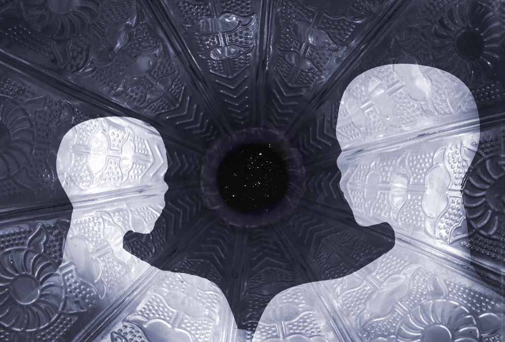
| 54 |
Jan 25 |
Comment |
I think this is a very striking image, Kirsti! I love the pattern on the background. I think the figures look very futuristic, and I really like how you have one further away than the other.
It is interesting to see the color version; my preference is your moonlight version.
I really like the stars. It might be interesting to accentuate that opening. I did it here by copying one of the circular patterns from your gramophone (linear dodge/add mode at 16%, then removing the center). |
Jan 12th |
 |
| 54 |
Jan 25 |
Comment |
This is so cool, Matt! I love the colors and how there is enough detail to know what each scene is but not so much as to be distracting. I like the shell texture; it brings home for me the feeling of the beach (and finding sand and little shell bits in everything when I got home).
I think your composition works really well.
My eye moves all around the image except for the upper right hand corner; I wish I could see what was going on there. |
Jan 12th |
| 54 |
Jan 25 |
Reply |
Thanks, Matt!
I understand what you mean about placing the flower higher. I think that would make the flower more prominent and more obviously the subject. The flower is competing with the background here.
For me, the image is actually more about the background, so maybe I should crop a bit from the bottom. |
Jan 12th |
 |
| 54 |
Jan 25 |
Reply |
Thanks, Kirsti!
That's an interesting suggestion. Here's a first cut at what I think you meant (I'd want to add some snow accumulating on the flower if I continued). I like that it looks more realistic, but I feel I've lost a little of the connection with the flower. |
Jan 12th |
 |
| 54 |
Jan 25 |
Reply |
Thanks, Alan!
And I guess we've gotten the real snow now, too. |
Jan 12th |
7 comments - 7 replies for Group 54
|
7 comments - 7 replies Total
|


