|
| Group |
Round |
C/R |
Comment |
Date |
Image |
| 54 |
Dec 24 |
Reply |
Thanks, Maria, for your thoughtful response! I tried the square crop and agree it works better. I think the drop shadow helps as well, though it makes the image rather dark. I'll keep that in mind next time I choose a background color. |
Dec 29th |
| 54 |
Dec 24 |
Comment |
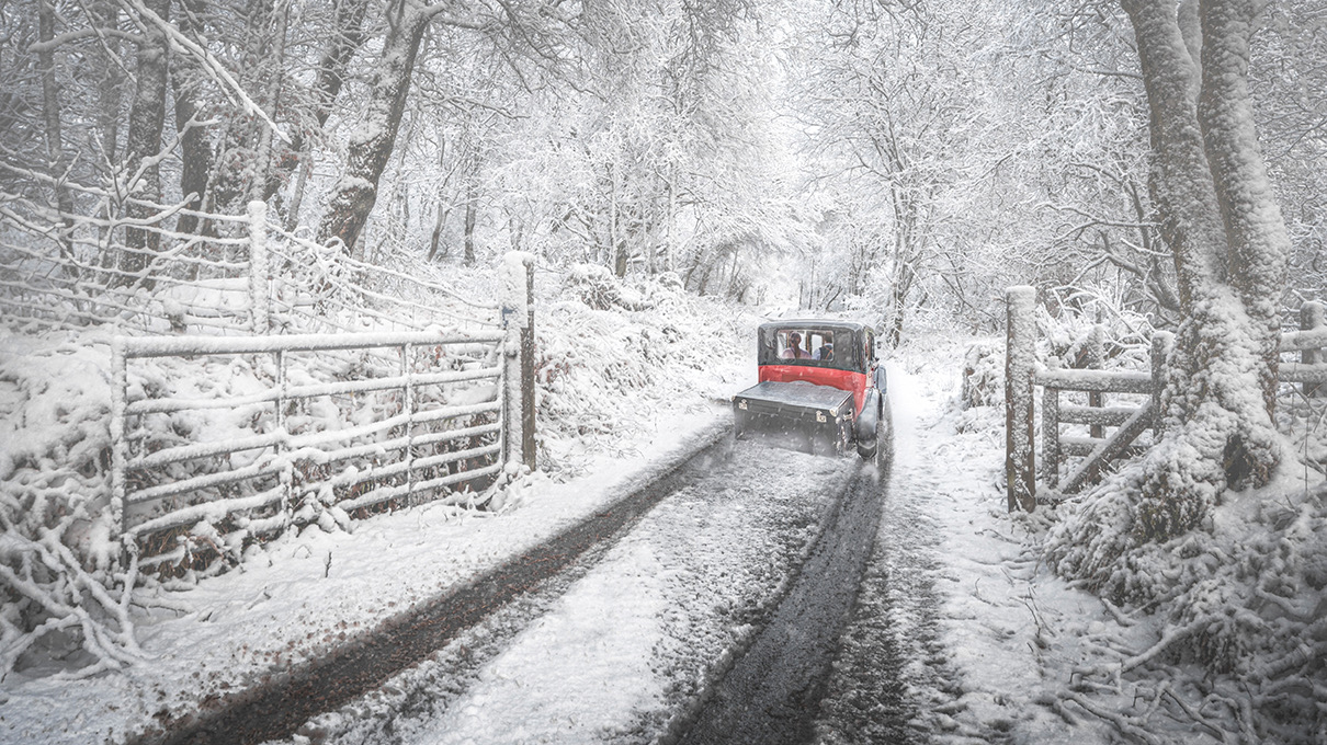
This is such an evocative winter scene, Bruce. I love the way you integrated all the components; I think they all feel very natural together. I really admire the way the people in the car have been added - just enough detail without distracting from the scene.
Your explanations of what you placed where and why are very helpful. I'm really enjoying the results, and I know I am learning a lot from your insights.
My only suggestion has to do with that marvelous antique Austin. The angle really foreshortens the vehicle, and the box at the back is placed asymmetrically. The combination of these two factors make it a little confusing to my eye as to just what the vehicle is. I know it would detract from the authenticity of the Austin to widen the box, but it might encourage the judges' eyes to focus more on the surrounding beauty. Just a thought. |
Dec 17th |
 |
| 54 |
Dec 24 |
Comment |
You've created a very interesting creature, Maria! I could see it living contentedly in a sci-fi movie. I really like the third ear and the way the heads are off-center to the body. |
Dec 17th |
| 54 |
Dec 24 |
Reply |
I'm keeping a copy of these tips, Bruce. Thanks! |
Dec 17th |
| 54 |
Dec 24 |
Comment |
This is brilliant, Kirsti! I love the peeling wallpaper and the enchanted forest it reveals. I think the mirror image of the trees works really well, giving me a sense of magic as well as having its symmetry play nicely against the peeling wallpaper. Your little forest creature is just adorable, and I think adds to the story (is it the reason the wallpaper is torn?).
I don't have any suggestions to add, just a comment that I think Bruce has given some great ideas above. |
Dec 17th |
| 54 |
Dec 24 |
Comment |
This image makes me smile, Matt. I think you have definitely enhanced an interesting subject. I'm not surprised that the municipality licensed this image; it captures the spirit of Christmas in a warm climate (which is nostalgic for me, as I used to live in So. California).
I particularly like the gradient lighting and selective color adjustments you made in addition to the background additions.
|
Dec 17th |
| 54 |
Dec 24 |
Comment |
Thank you, Matt!
I know what you mean about how it feels as if it's floating. I'm going to give Alan's radial gradient idea a try to see if that helps. |
Dec 17th |
| 54 |
Dec 24 |
Reply |
Thanks very much, Bruce! |
Dec 17th |
| 54 |
Dec 24 |
Reply |
Thanks, Alan!
I haven't used a radial gradient before and now I'm wondering why. Your example shows how much it can enhance an image. It's definitely something I'm going to add to my toolbox.
|
Dec 17th |
| 54 |
Dec 24 |
Reply |
Thanks very much, Brad! |
Dec 17th |
| 54 |
Dec 24 |
Reply |
Thanks, Kirsti!
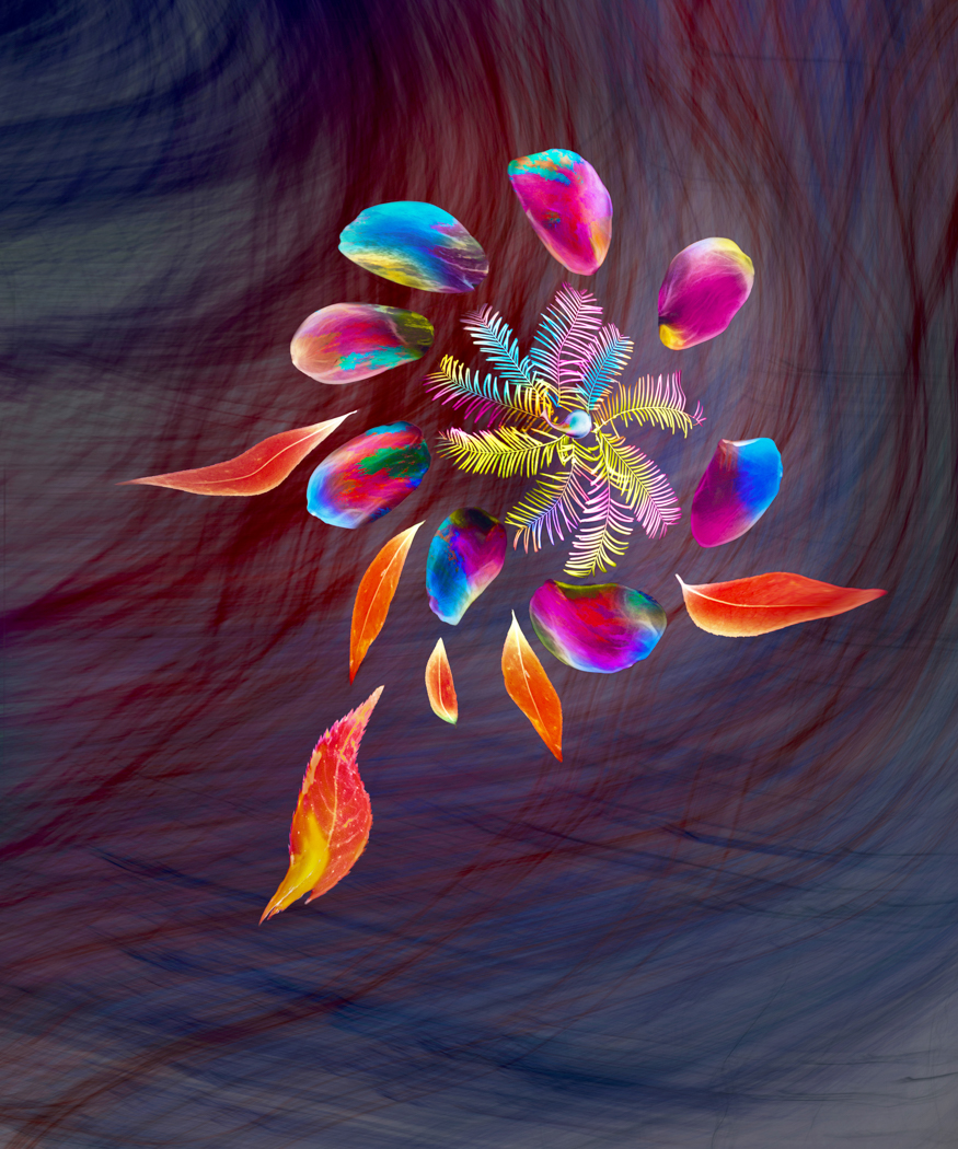
I see what you mean, adding another texture on top does help unify the flower and the background. I think in this particular case I'd need to add shading and shadows to add dimension. You did make me think about what I could easily change, and I realized that less contrast in the background might help. |
Dec 17th |
 |
| 54 |
Dec 24 |
Comment |
Here's what it looked like before adding the texture to the background. I think the flower shows up better in this version, but it seemed a bit tame. |
Dec 5th |
 |
6 comments - 6 replies for Group 54
|
6 comments - 6 replies Total
|