|
| Group |
Round |
C/R |
Comment |
Date |
Image |
| 54 |
Jun 24 |
Reply |
Thanks, Bruce! That sounds like a great technique. I often use a filter to try to align the colors, but this sounds like a more targeted approach (with the added benefit of better masking). I'm going to keep this in mind. |
Jun 30th |
| 54 |
Jun 24 |
Comment |
Thanks, Maria!
I'll keep an eye on the pink and blue hues as I take another pass at this image. I did notice that a filter I used added them, and I liked them at the time, but they do add an artificial feel to the colors.
Sorry for the slow response. I've been traveling this month visiting family and haven't had time for anything except that. |
Jun 30th |
| 54 |
Jun 24 |
Reply |
Interesting suggestion, Alan! I've given it a quick try, and I like where it's going. Thanks very much!! I hadn't thought of that (probably because I started with the window rather than starting with the swans). I'm definitely going to follow that up.
Sorry for the slow response. I've been traveling this month visiting family and haven't had time for anything except that. |
Jun 30th |
| 54 |
Jun 24 |
Reply |
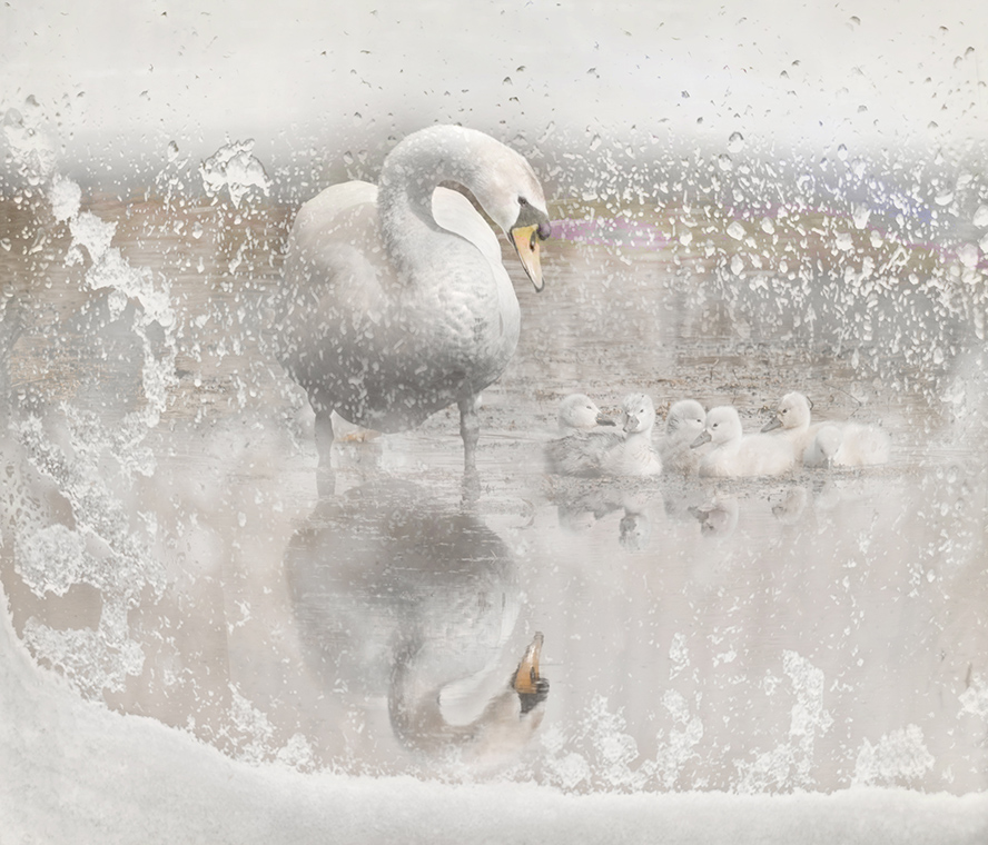
Thanks, Bruce!
I see what you mean about needing to include the window - I thought it might be distracting when I cropped it out, but I can see that it provides a useful context.
This may make you laugh, but I added a warming cast in the first place because I felt bad putting the little swans in such a cold setting. But I'm going to go back and revisit that now that I've got a little distance from that.
Thanks for your helpful advice.
Sorry for the slow response. I've been traveling this month visiting family and haven't had time for anything except that. |
Jun 30th |
| 54 |
Jun 24 |
Reply |
Thanks, Kirsti! I felt a little bad about putting them all in the cold; I love the way you interpret the scene.
I made a version making the birds more clearly seen, attached to my reply to Brad above. |
Jun 8th |
| 54 |
Jun 24 |
Reply |
Thanks, Brad! I know what you mean. I don't think the swan original really needed anything added, but I did need something to put behind the window and ran out of time.
Here's a version with less obstruction. |
Jun 8th |
 |
| 54 |
Jun 24 |
Comment |
What a spectacular waterfall! And the woman in red is a striking component as well.
This image suggests to me all kinds of stories - why the woman is there, what is she thinking? - and the darkness of the mood adds to the feeling that there is a story. I really like the way the clouds seem to tumble down into the waterfall.
I am really impressed how you took such a dramatic landscape image and modified it to integrate the woman. I initially thought that the stronger contrast of the landscape original would work better, but once I tried that I see how it would be overwhelming. Then I saw that you used an offset exposure layer to create a misty atmosphere. I have never used the offset slider on the exposure layer, but gave it a try and saw how effective it is to create that misty look. And I think that is an important factor in the cohesiveness of this image.
I do agree with Brad about the vignette being so dark that it loses some of the detail. The histogram is almost entirely left of center. I might consider trying an exposure layer with the gamma slider moved to the left a bit, but that's just a matter of personal taste.
And thanks for pointing out a useful function of the exposure adjustment layer!
|
Jun 8th |
 |
| 54 |
Jun 24 |
Reply |
Kirsti, I saw your comment after I wrote mine. What a fun idea! I think you really tied in the red light; I think your version makes the colors feel cohesive. |
Jun 6th |
| 54 |
Jun 24 |
Comment |
I really like your experimentation, and especially that you are sharing it with us.
This is a challenging set of components, I think - the Northern lights are horizontal here, and the sunbeams are vertical and spreading, and the man doesn't feel to me to be connected to the trees. I think the image is about the lights, but the red light at the man's feet feels distracting to me.
I do love both the golden and the green northern lights, and I think the way the trees lean into the light is an interesting aspect.
You might consider simplifying the image to the upper left quadrant and move a tree there. I put the tree in luminosity mode at a lowered opacity. |
Jun 6th |
 |
| 54 |
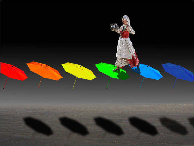
Jun 24 |
Comment |
Such a fun image, Alan! I love the rainbow spectrum and the whole concept. The woman's body language is perfect for this - she looks as if she's stepping very carefully, balancing, yet confident. The placement of the umbrellas so high over the shadows adds to the feeling of height.
The brightness of the yellow umbrella feels a little distracting to me. I might consider a hue shift on that one umbrella. |
Jun 5th |
 |
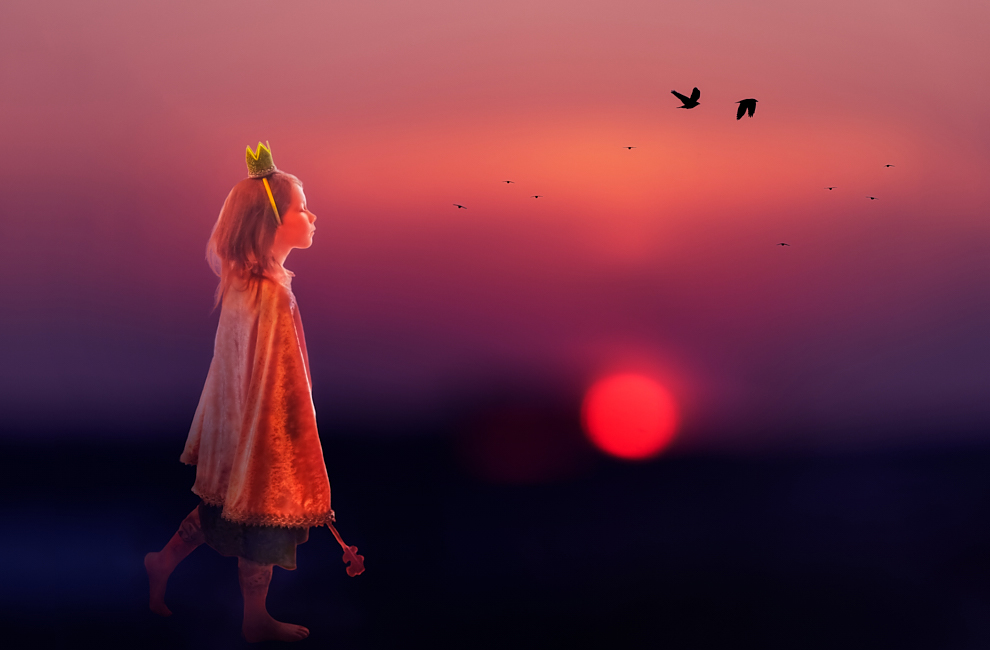
| 54 |
Jun 24 |
Comment |
This is such a lovely image, Kirsti! I love the colors and saturation - for me they really give an otherworldly feeling to this. I think the way the light outlines her face and hair works really well, and the shading into shadow at her feet looks very natural to me.
That blurry sun is magic.
I might consider adding a bit of a glow and actually intensifying the colors by adding a layer with gaussian blur in Overlay mode and perhaps a slight crop. |
Jun 5th |
 |
5 comments - 6 replies for Group 54
|
5 comments - 6 replies Total
|


