|
| Group |
Round |
C/R |
Comment |
Date |
Image |
| 54 |
Aug 23 |
Comment |
Here's another thought, though whether it is useful depends on the story you want to tell.
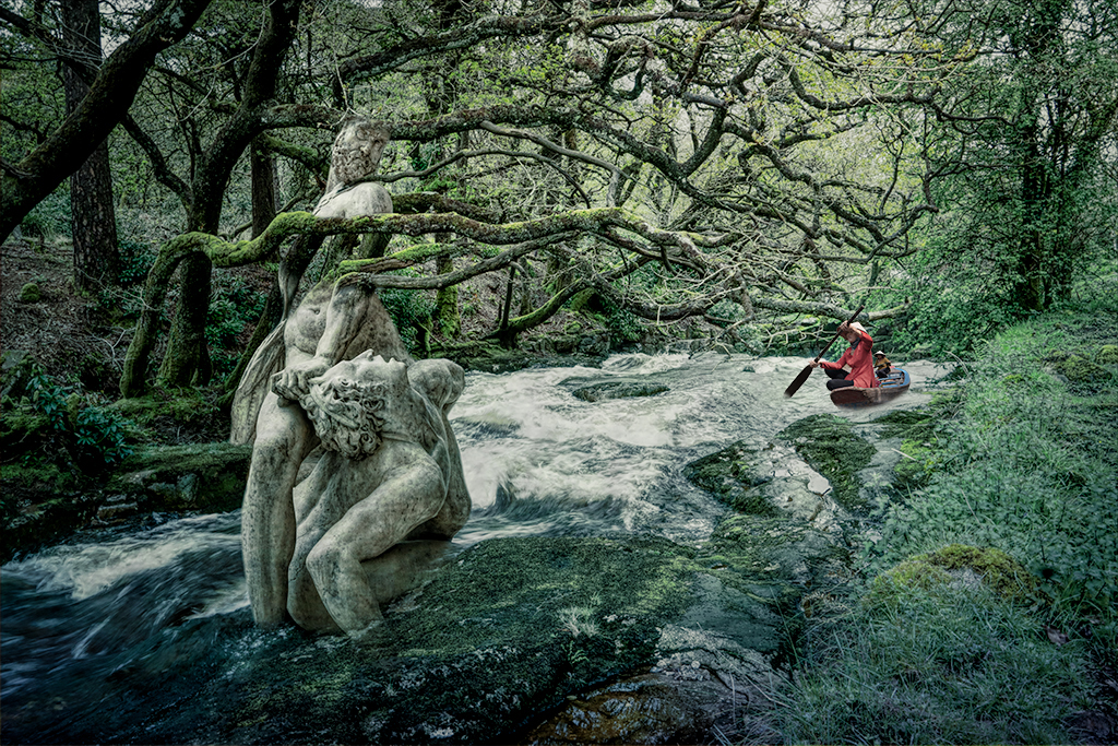
I made a levels correction on a duplicate layer and masked in most of the stone men and a path to the person in the boat. For me, it helps the story that the person in the boat is coming because of the two men.
If the story is that the stone men have been there in the shadows for aeons and are going to be a surprise for the boater, then I like it better without this change.
But of course what really matters is what you like. |
Aug 16th |
 |
| 54 |
Aug 23 |
Comment |
Such a dramatic image! I love the way Samson is incomplete and integrated with the branches, and the Philistine is completely visible. The story that comes to my mind is that the gods turned them both into stone to save the Philistine, and now nature is consuming Samson until the Philistine is free and can be brought back to life. I think you've chosen an excellent spot in the river to place them. The intricacy of the forest makes a great background, with no details standing out to distract my eye. I like the way the green surrounds the river and the 2 stone men.
The traveler in the boat adds an intriguing element. Is it someone who is going to come to discover what has happened, or is coming to help, or is going to soon have a big surprise? The traveler and boat look well integrated to me for the most part.
Personally, I'd consider lightening the shadow and decreasing the saturation of the red for the person in the boat. The red is such a different color from the rest of the image that for me it feels just a tad artificial . |
Aug 16th |
 |
| 54 |
Aug 23 |
Comment |
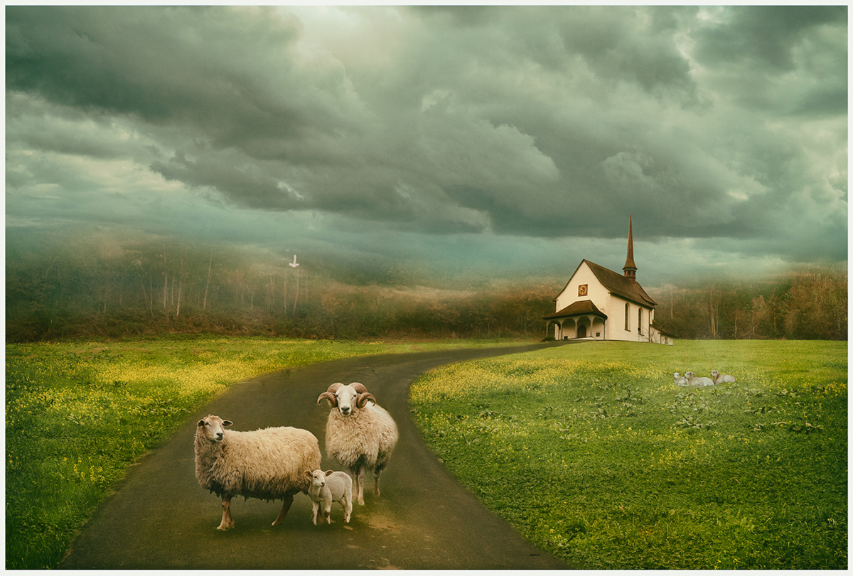
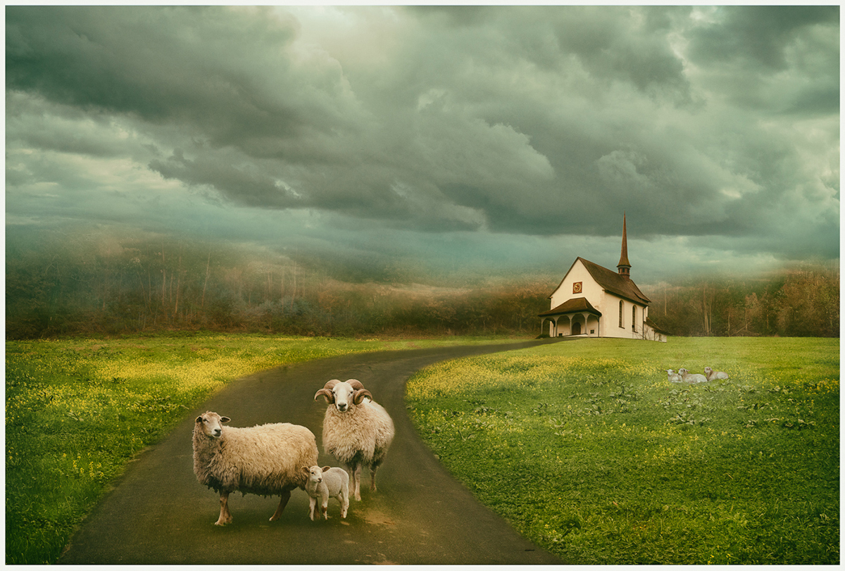
Such a beautiful image, Maria! I love the colors and the softness, and the balance of the composition. I love the way the light plays across the grass and the cheerful yellow flowers. The sheep in the road make me smile - are they waiting for me, or are they a family going to church on Sunday? The curve in the road going to the church is a very strong leading line, and I think having the sheep at the front of it works very well.
I really like the foggy far horizon blending into the clouds. Personally, I might consider adding something a little more distinct on the left side of the start of the forest, to balance what's on the right side of the church. |
Aug 16th |
 |
| 54 |
Aug 23 |
Comment |
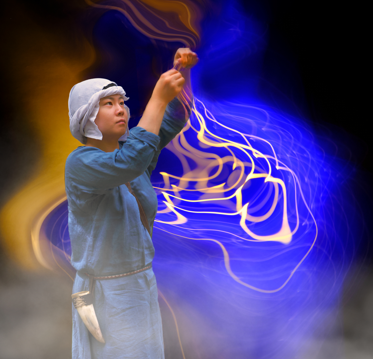
Both versions of this image are really great, Kirsti!
The closeup one feels like a great portrait, with her intense concentration and the perfect focus on her face. I really like the way you have made her left hand indistinct. I can't quite tell if it's her hand moving fast, or perhaps in another dimension, or someone else's hand. That uncertainty makes me wonder and start developing a story.
If I had to choose a favorite, I would choose the second version. The colors and shapes of the background really blow me away. I love the way she is so distinct and the golden threads and background are soft and amorphous. The way the threads seem to blend with her left hand is truly magical.
Then again, I don't think there's a need to choose, because there is every reason to keep both versions. |
Aug 16th |
| 54 |
Aug 23 |
Comment |
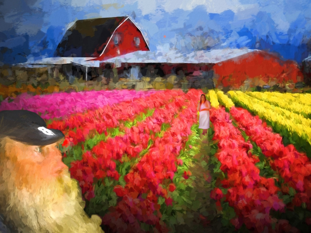
I love the colors in this image! The leading lines of the rows of colorful tulips bring me right to that lovely red barn. I think your man in the corner is well placed; he adds balance to the composition.
I agree with the comments above about considering reducing the opacity of the filter on the face of the man.
I didn't see the woman the first time I looked at your image. I think it was because she consists entirely of neutral colors and is less bright than everything around her. For me, she fits in better when she is brighter and the color of her sweater is more saturated. If you changed her sweater color to blue, she would stand out even more. |
Aug 16th |
 |
| 54 |
Aug 23 |
Reply |
Thanks, Aavo! I'll do that. |
Aug 13th |
| 54 |
Aug 23 |
Reply |
Thanks, Maria! I love what you've done. I think it really makes the image more cohesive.
I've got that filter, I'll give it a try. |
Aug 13th |
| 54 |
Aug 23 |
Reply |
Thanks, Brad! That's easy enough to fix. |
Aug 13th |
| 54 |
Aug 23 |
Reply |
Thanks, Kirsti!
It's funny, the original of the bird has the type of shadow you suggest, so it won't be hard to try it out. I'll see what it looks like. Thanks! |
Aug 13th |
| 54 |
Aug 23 |
Comment |
Here's the alternate version, Kirsti. I could only upload 4 files when I posted your images. |
Aug 1st |
 |
7 comments - 4 replies for Group 54
|
7 comments - 4 replies Total
|