|
| Group |
Round |
C/R |
Comment |
Date |
Image |
| 54 |
Jun 23 |
Reply |
Thanks for your suggestions, Maria! And my apologies for the slow reply; I've been out of town without my laptop.
I really like your idea of the panorama crop, and going more blue than green. I've tried out a few variations already.
I think going darker with the boat in a storm would work well, and I'm going to explore that as well. So thank you for your great ideas! |
Jun 30th |
| 54 |
Jun 23 |
Reply |
Thanks, Aavo!
I can understand your thinking the sail was a waterfall. I didn't notice it when I placed it, but I certainly see it now.
I think you are right, a bit of a crop on the right would work well.
Thanks for the suggestions. |
Jun 18th |
| 54 |
Jun 23 |
Reply |
Thank you very much, Alan! |
Jun 18th |
| 54 |
Jun 23 |
Reply |
Thanks, Kirsti!
I appreciate your suggestions and agree that something closer to the original palette would be calmer and more realistic.
As it happens, what I like most about this version is the feeling of chaos and distortion. It's how I feel when I go on a boat (even a ferry in a harbor) LOL! |
Jun 18th |
| 54 |
Jun 23 |
Comment |
A beautiful image, Maria, seamlessly put together. I love your soft colors and the peacefulness of the scene. The rolling horizon is very pleasing to my eye and the bare branches of the tree agree with the golden landscape and the weathered building. The tractor looks as if it's stood in that exact spot for decades.
I agree with Brad, that you could crop out the tractor, because you still have the birds in the sky to give a triangle of objects to look at. I also agree with him that it works very well as it is. |
Jun 13th |
| 54 |
Jun 23 |
Comment |
This is a beautiful image, Alan. I love it in b&w, with the range between light tones to the darkest shadows. I really like that the man is solitary, and just a touch indistinct due to distance. I love the way the light bounces around as the spaces open up. The stair-stepped column towards the right of the image and the v-shaped ceiling above it really make this setting unique.
I would not change a thing. |
Jun 13th |
| 54 |
Jun 23 |
Comment |
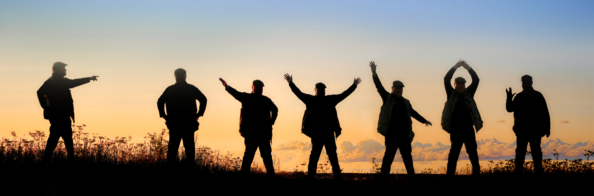
Beautifully done, Kirsti! I love the dark silhouettes against the golden sky. The delicate grasses and distant clouds add interest without being distracting. Excellent choice of poses!
This image really brought a smile to my face.
The top of the image is so bright it tends to draw my eye away from those entrancing dancing men. I might consider using the blue top of the image from your second original. What do you think? |
Jun 13th |
 |
| 54 |
Jun 23 |
Comment |
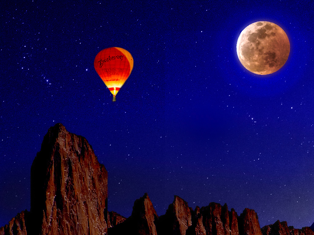
I love that balloon floating up in the night sky over the cliffs to the moon. The balloon's colors are a nice complement to the color of the night sky. The message on the balloon is perfect for this image.
I might consider adding some stars to that clear dark sky. |
Jun 13th |
 |
| 54 |
Jun 23 |
Comment |
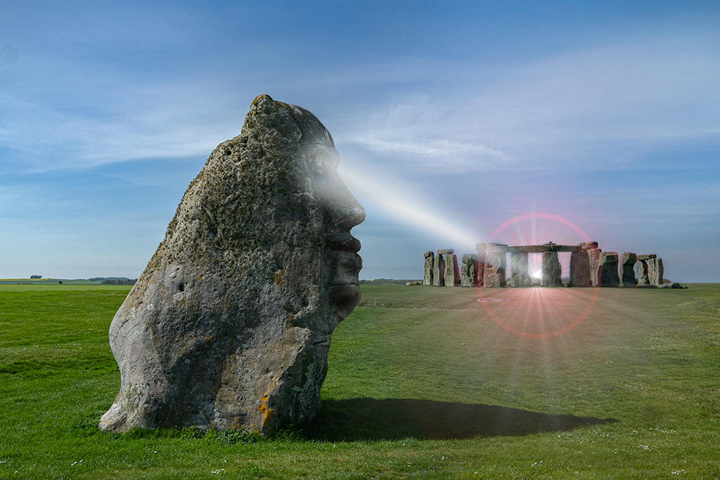
A very effective image, Brad! How cool!
I think the simplicity of the elements really works here. I feel as if there is heat radiating from that power beam. The color glow of the beam as it hits Stonehenge gives me a feeling of transformation - something is certainly happening there!
The wispy clouds in the sky give me the idea that they are the source of the power beam, being drawn to this mystic being and focused so effectively.
Personally, I'd think about making the beam brighter near the mystic being's eye (to make it clear that that's the origin), and either make the beam spread out or focus in as it travels into the distance. It's confusing to me that it remains the same while going so far away.
I like Kirsti's version too.
|
Jun 11th |
 |
| 54 |
Jun 23 |
Reply |
Thanks, Brad.
I made this image about a month ago and on viewing it now, am not happy with the color of the buildings being the same as the water.
I understand what you mean about the green area; what I really like about it is that it creates a strong background for the sailboat. So maybe I'll keep that in mind for a new composition.
I just got back from a workshop in Maine and so have some lighthouse pictures that might be useful. I'll give your suggestion a try. |
Jun 11th |
6 comments - 5 replies for Group 54
|
6 comments - 5 replies Total
|


