|
| Group |
Round |
C/R |
Comment |
Date |
Image |
| 54 |
Apr 23 |
Reply |
Cool! |
Apr 27th |
| 54 |
Apr 23 |
Reply |
Thanks, Brad. I appreciate your honesty. |
Apr 27th |
| 54 |
Apr 23 |
Reply |
I just got back from a workshop led by Colleen Miniuk, who showed us a very simple way to dodge and burn. She makes a duplicate layer of the original, makes a levels adjustment (CMD + L on a Mac) by moving the middle slider to the right to make a burn layer, adds a mask to the burn layer and paints in wherever she wants it darker. Same thing to make a dodge layer except move the middle slider to the left.
It doesn't have the advantage of the burn/dodge tool highlights etc categories, but it does a better job of keeping the colors true. The other methods can make the colors look strange if you do more than a small adjustment.
|
Apr 22nd |
| 54 |
Apr 23 |
Comment |
Thanks for including your use of Filter/other/Minimum. I've never used that one; good to know! |
Apr 21st |
| 54 |
Apr 23 |
Comment |
You've created a very exciting image with great textures. I love the rich colors against the black of space and the sparkle of stars. The way the asteroid and spaceship are hanging right over the man's head feels forbidding, and I'm fascinated to learn just why he is beckoning the spaceship. And maybe even controlling the asteroid? Definitely a story here!
I agree that it would be stronger with either the spaceship or the asteroid. Personally, I would choose the asteroid. It has such great texture and a 3D sort of depth, and the concept is more original than the spaceship (as much as I love spaceships).
I had to turn the brightness way up on my monitor to see the details. If you check your histogram, you'll see that everything is in the left quarter. It makes sense to have space be pure black, but the man and the asteroid and the spaceship could easily be closer to midtones and be effective. If you plan to print this, it's going to be hard to see the details.
|
Apr 21st |
| 54 |
Apr 23 |
Reply |
Wow, you have a lot of ideas! That's great.
If you add more asteroids here, I kind of expect more spaceships too. For me, it sort of lessens the impact a bit compared to your original image. |
Apr 21st |
| 54 |
Apr 23 |
Reply |
There's a scary thought!
I think this is very effective, and that it really works to show only parts of the other asteroids. I'm not sure you need the planet surface here. |
Apr 21st |
| 54 |
Apr 23 |
Reply |
Usually when people want to dodge / burn by painting with white/black, they create a new layer and put it overlay mode, fill it with 50% grey, and paint the white/black on that. (here's why: https://fstoppers.com/education/why-do-we-fill-50-percent-grey-when-dodging-and-burning-photoshop-are-we-doing-483760).
To me, the advantage of using the dodge/burn tools is because you can limit their impact to just the highlights or midtones or shadows. It's really useful in high contrast areas where you only want to affect one of those categories. |
Apr 21st |
| 54 |
Apr 23 |
Comment |
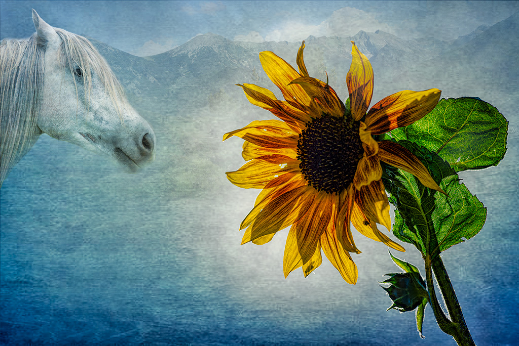
Lovely image, Brad! I love the colors and textures of the background. The sunflower is really glorious, including the little bug bitten holes. There's so much color and detail in the petals and leaves.
It's a very interesting composition. At first I thought I might like the horse to come into the frame a bit more, but then I realized that the sunflower is really the star here and we didn't need to see more of the horse. The way the sunflower is leaning invitingly towards the horse makes a connection between the two.
Personally, I would brighten the horse a tad; it's the same colors as the background so it tends to blend into the background to my eye. |
Apr 21st |
 |
| 54 |
Apr 23 |
Comment |
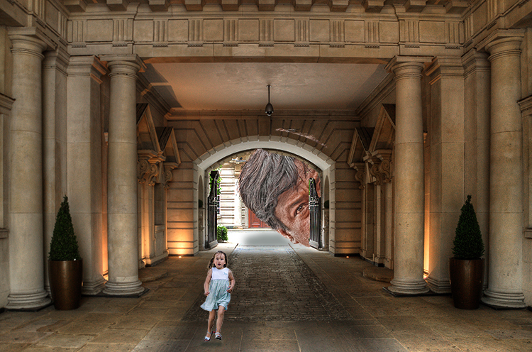
Great image, Alan! I would run as fast as possible too.
You did a beautiful job on the HDR of the hotel. It's beautifully lit with a quiet elegance, which makes it a great contrast for the girl's terror and the looming giant.
My eye was drawn to the white in the background, and then I realized that it was part of a giant's head next to it. That little delay gave me an extra shock, so I personally would not darken the white too much. I think it makes the giant even more frightening.
I really like how the little girl is so small in the frame, and how she is bright enough to stand out from the background but not the brightest thing in the frame. For me, it adds to the feeling that she is so small and not being given the attention and assistance she needs.
Everything in the image is very sharp and detailed except the girl. Perhaps you did this intentionally to give her a feeling of motion. Personally, I would consider giving her more detail. I tried to do that here with some texture, clarity, and sharpening. Just a matter of personal preference. |
Apr 21st |
 |
| 54 |
Apr 23 |
Comment |
This is such a happy and charming image, Maria! I love the carefree feeling of the girl and dog running, and the child balancing on the fence. Your composition works beautifully, bringing my eye from the barn to the girl all the way through to the last fence post and the distant hill. Even the sky has a subtle yellow tint that complements the golden hill.
I originally thought that there was a bit too much sky, but I tried different ways of reducing it and I like your version better. All that sky adds a sense of openness and freedom to me.
This is a really beautiful image. |
Apr 21st |
| 54 |
Apr 23 |
Comment |
Hope this helps! |
Apr 21st |
 |
| 54 |
Apr 23 |
Reply |
I started with your layer from your response to Christian.
I added a Brightness layer set at -31 with the mask all black, and brushed with white to deepen the in shadows in the forest. I also brushed around the opening in the trunk to give a feeling of seeing the edges of the bark.
Then I added a layer with your final image (with fog) and brushed in your granddaughter.
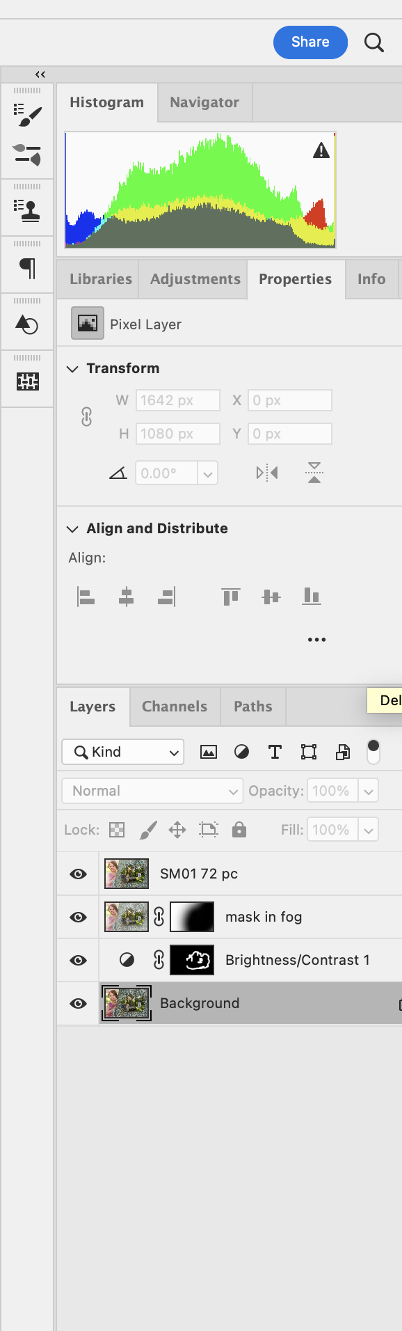
I made a stamp copy (which combines all the layers below) and applied the SM01 filter at 72 %. You can do the same thing by taking the settings in my next response and setting the opacity at 72%. |
Apr 21st |
 |
| 54 |
Apr 23 |
Comment |
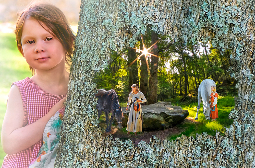
This is a lovely image, Kirsti! Your granddaughter is beautiful. I love the way her hair is stirring in the breeze and how she is touching the tree, as if summoning up the magic that lets us see the past. I really enjoy how the image of the past is of a woman and a young girl, both intent on what they are doing.
I like the fog effect on your granddaughter. The tree looks flat to me, so I might consider taking the fog effect off that. I like the sharper line between the trunk and the magical image that you have before the fog.
I darkened the shadows in the forest a bit here to give more of a feeling of depth and applied a SM01 filter (Camera Raw) to tie the colors of all the components together a bit more. |
Apr 20th |
 |
| 54 |
Apr 23 |
Comment |
I really like this, Aavo. It's interesting how you show only part of the cat, have the shoe (normally low in the frame) levitating, and the two sets of almost-smiling lipsticked lips. I like the frame around the lips. Your composition has my eye traveling in a triangle around the image, letting me revisit each item.
I'm curious, was your selection of the lips a bit smudged on the left and a bit rough on the right intentional? It's not a strong enough effect to feel intentional to me. I would consider exaggerating that if it was intentional. |
Apr 20th |
| 54 |
Apr 23 |
Reply |
Thanks for sharing your thoughts, Alan. |
Apr 20th |
| 54 |
Apr 23 |
Reply |
Thanks, Aavo.
The white streaks are a feature of the Topaz Glow filter. That particular filter adds an outline to the subjects and emphasizes existing lines. |
Apr 20th |
| 54 |
Apr 23 |
Reply |
Thanks, Maria!
I agree, I love Kirsti's version. |
Apr 20th |
| 54 |
Apr 23 |
Reply |
Oh, I love this, Kirsti!
I'm definitely going to be taking your suggestion! Thank you!!
(Sorry for the delayed response; I've been traveling in an area with very poor wi-fi). |
Apr 20th |
| 54 |
Apr 23 |
Reply |
Thanks, Christian. You bring up an interesting point about taking pictures of other people's work.
My camera club has a policy that all components of an image have to have been pictures taken by the maker. In the case of works of art, the competition committee decides if the art has been altered enough in the final image in order to not be considered stealing someone else's art. The prominence of the work of art is also a factor.
I haven't seen anything like that in the PSA guidelines, so as far as I know you can include a picture you took of someone else's art as a component of your composite.
Personally, I'd include a picture of a statue as a component, because I think it's usually obvious how much is someone else's original art and how much is due to my manipulation.
If the statue is in public view with photography permitted, is using its picture any different from using a picture of a building or a garden landscape, both of which are designed and created by other people?
As I said, you've raised an interesting question.
|
Apr 7th |
| 54 |
Apr 23 |
Comment |
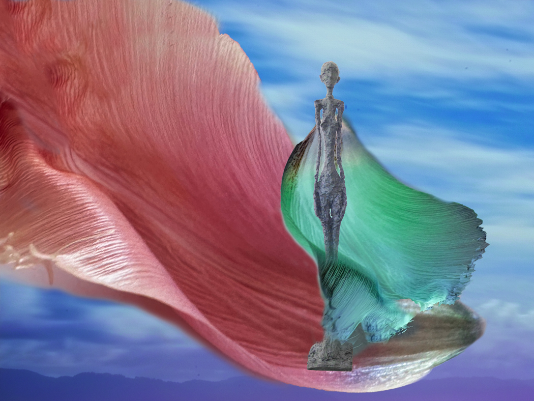
It sounds like you know a lot about Giacometti!
That's an interesting suggestion, to use varying colors instead of Topaz Glow. Here's my image before I applied Topaz Glow. Various attempts with the color didn't give me the feeling I was going for.
For me, the attraction of using Topaz Glow in this image is the simplification of the forms. Like motion blur and high key images, it eliminates the details. I realize that that's the antithesis of most photography, but I enjoy it.
I appreciate the honesty of your opinion, Alan. This kind of exchange of ideas has really helped me develop my images.
I also really love your calling my subject a nymph. It's the perfect description. |
Apr 4th |
 |
9 comments - 12 replies for Group 54
|
9 comments - 12 replies Total
|


