|
| Group |
Round |
C/R |
Comment |
Date |
Image |
| 54 |
Mar 23 |
Reply |
Thanks for your thoughts, Christian. I see what you mean.
I'm at a point where I need to walk away from it for a couple of weeks and then revisit it. Then I'll be able to see it more clearly.
|
Mar 28th |
| 54 |
Mar 23 |
Reply |
Thank you, Maria! |
Mar 27th |
| 54 |
Mar 23 |
Comment |
Sorry about that, too many versions. Here's the one I should have posted.
Thanks very much for your thoughtful comments and interesting suggestions!
|
Mar 27th |
 |
| 54 |
Mar 23 |
Reply |
Thanks, Alan!
I agree, the feedback I get on my images here go a long way in helping me see them differently and work my way to better images. Everyone's input is greatly appreciated. |
Mar 25th |
| 54 |
Mar 23 |
Reply |
Thanks, Christian!
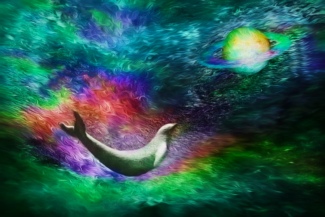
I'm in total agreement with you about highlights - I think they are overly discouraged in photography. Sometimes the highlights are what make the image.
After thinking some more about what you said, I've added some more glow to my most recent version. I'd be interested in what you think. |
Mar 25th |
 |
| 54 |
Mar 23 |
Reply |
Thanks, Alan!
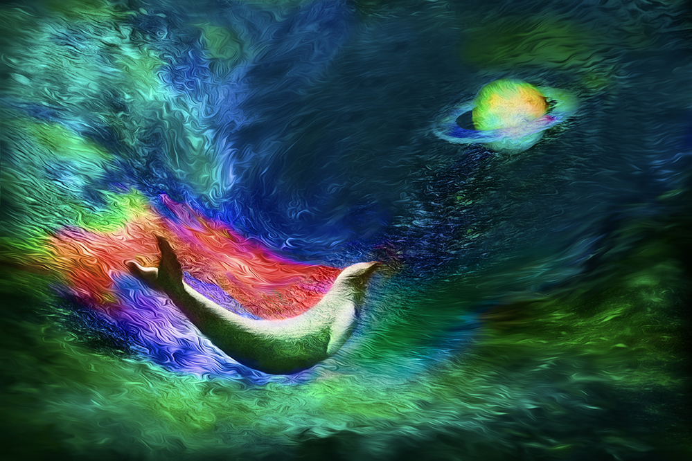
I hadn't thought of the planet being in the ocean, but that's intriguing... a lot to think about there.
I've moved and reduced the planet and incorporated some other suggestions, as you can see in my reply to Brad. I'd be interested in what you think of that version. |
Mar 25th |
| 54 |
Mar 23 |
Reply |
Thanks, Maria!
I've taken your suggestion and Brad's and come up with a new version in my reply to Brad. I'd be interested in what you think of it. |
Mar 25th |
| 54 |
Mar 23 |
Reply |
Thanks very much, Aavo! |
Mar 25th |
| 54 |
Mar 23 |
Reply |
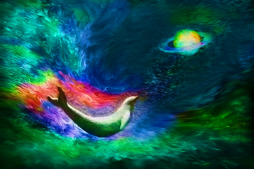
Thanks, Brad! That's a great suggestion.
It took me a number of tries to get there, but I'm glad I kept trying. Here's what I've got now. |
Mar 25th |
 |
| 54 |
Mar 23 |
Reply |
Yes, I like it better this way. Thanks, Kirsti! |
Mar 12th |
 |
| 54 |
Mar 23 |
Comment |
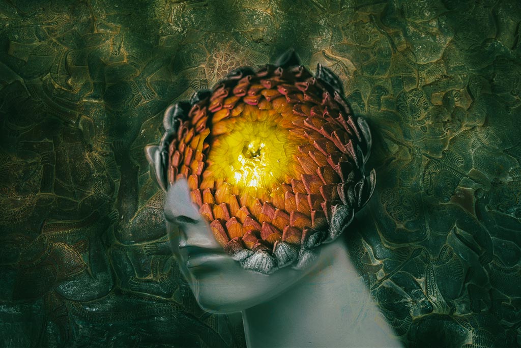
Oh, I'm going to be seeing this when I try to go to sleep tonight. This could be a poster for a sci-fi movie. I definitely see the center of the flower as an eye. I like how you made the outer petals the same color as the face - that ties them together for me.
Your use of the bas relief as background is brilliant! The way you've blended it and given it shadows made it into a fascinating, complex background that does not detract from the subject. Well done!
Personally, I find the image just a little flat. I'd consider adding a filter like this (Camera Raw Cinematic filter CN09). Just my personal opinion. |
Mar 12th |
 |
| 54 |
Mar 23 |
Comment |
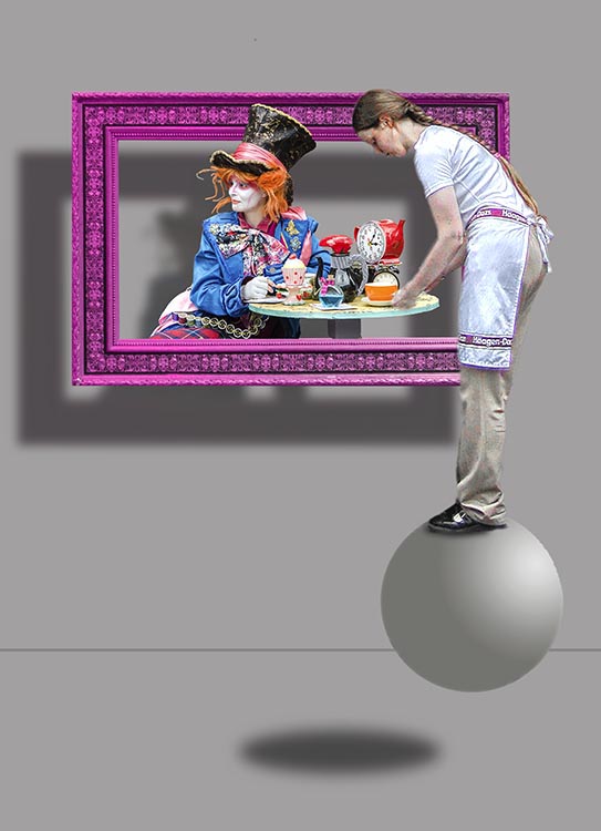
A delightful image, Alan!
I love the colors - the purple frame is a perfect counterpart for the colorful Mad Hatter. The grey of the background and sphere, and the neutral colors worn by the waitress really make the Mad Hatter and the frame pop.
I really like your use of the shadows, and that the waitress doesn't have one. It adds to the surreal feeling for me.
I like how the waitress's hand gets blurry as it enters the frame, as if it doesn't quite belong there.
The back of the waitress's neck feels very bright to me. I'd consider cloning in a little skin tone. |
Mar 12th |
 |
| 54 |
Mar 23 |
Comment |
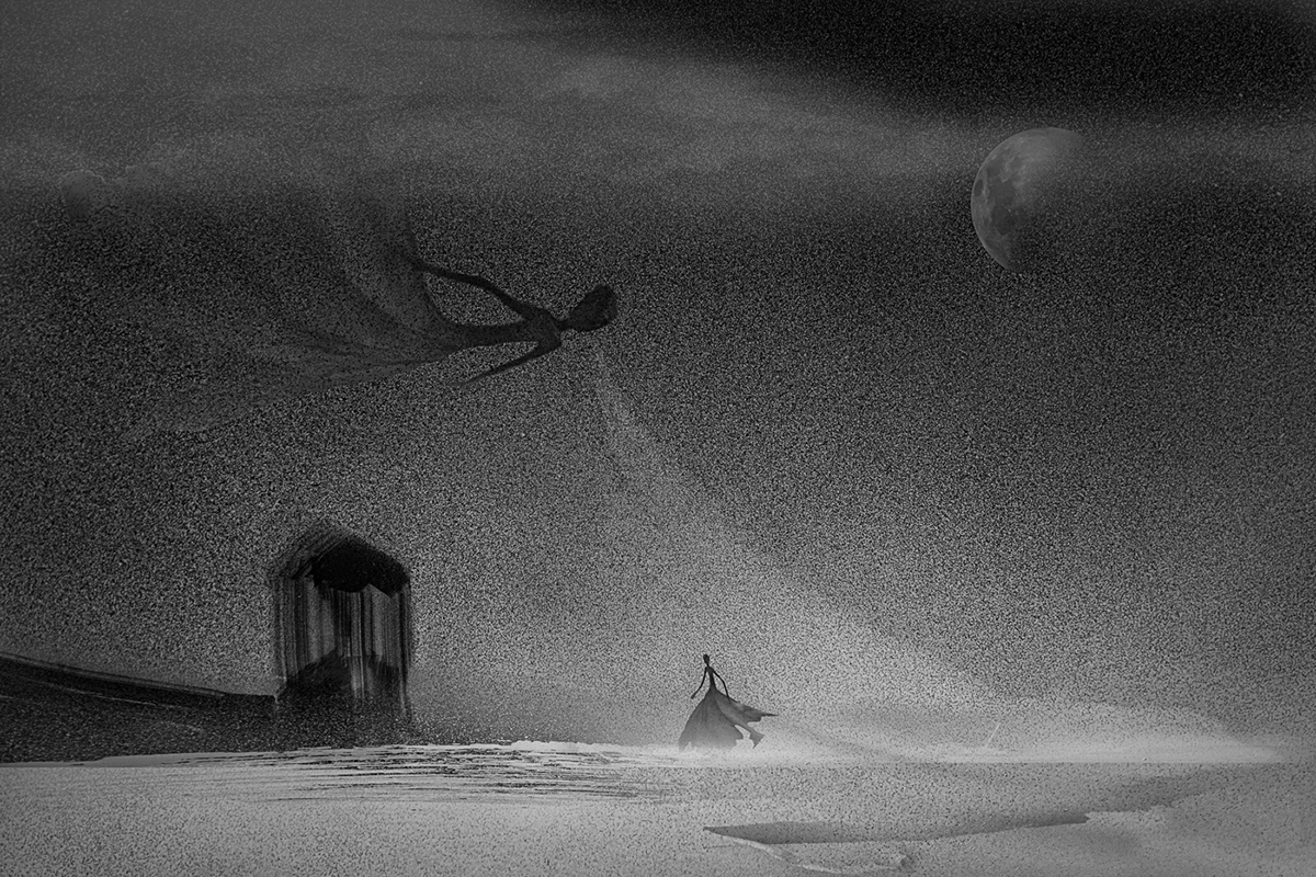
I love this image, Maria!
It's so very elegant. The figures remind me of Tim Burton's expressive animation. I feel a chill looking at this image, as if I feel the wind and snow myself.
I like that the building she is hurrying towards is blurry, as she might see it herself through the wind, and as if it might not be real.
I really like the balance of the composition, with the building balanced by that beautiful moon, and the floating winter balanced by the tiny hurrying figure.
The one thing that I might suggest is adding some clouds. The snow appears to be falling from a clear sky (or else we couldn't see the moon). Just a thought.
|
Mar 12th |
 |
| 54 |
Mar 23 |
Comment |
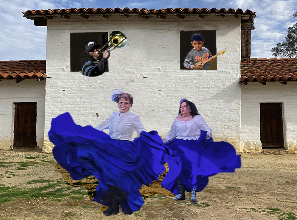
There's a whole story in this image!
I love the contrast in expressions between the dancers, and how the musicians are really into their playing. I really like how the square of the building frames both the musicians and the dancers. The two door flanking that square add a nice symmetry that helps move my eye in a circle around the image.
I hadn't noticed at first that you replaced a sleeve that was blown out; you placed it at a very natural angle.
The blue that's in direct light is blown out; I can't see any detail there. I sampled blue from another part of the skirt and painted that in, then desaturated blue throughout, and cloned in a fold of the skirt. It helps me look at the dancer's faces instead of the very bright blue of the skirts. What do you think?
|
Mar 12th |
 |
| 54 |
Mar 23 |
Comment |
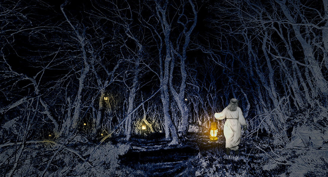
There's a story I'd like to read!
I think you've chosen an excellent image of your heroine - she does look like she is striding purposefully, and her costume fits into the story quite nicely. All the tangles of the branches of the trees feel ominous and threatening to me, as does the increasing darkness of the forest. I like your distribution of lanterns.
I tried a Camera Raw filter (Winter 02), which looks like it increases contrast, darkening shadows and increasing brights, and adds a blue color. I also added a little yellow color around the lanterns. What do you think?
|
Mar 12th |
 |
| 54 |
Mar 23 |
Reply |
Thanks, Kirsti! What a great idea, to tilt the planet. I'll give it a try |
Mar 7th |
| 54 |
Mar 23 |
Comment |
Here it is before the Star Effect glow. Sometimes I think this version works better. |
Mar 1st |
 |
7 comments - 10 replies for Group 54
|
7 comments - 10 replies Total
|


