|
| Group |
Round |
C/R |
Comment |
Date |
Image |
| 54 |
Feb 23 |
Comment |
Oooooh, that's amazing. It must have been even more so to see it in person. |
Feb 23rd |
| 54 |
Feb 23 |
Reply |
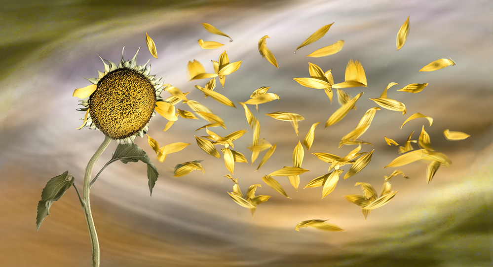
Great suggestion, Brad!
I gave it a shot here, using Smudge on some of the petals. I think it looks better this way.
I'm still trying to figure out how to add the wind, per Alan's suggestion. I need to find the right brush and break out my Wacom tablet. But I think that a touch of wind, together with this selected blur, will be just what I need here.
I hope you got to see some Northern lights on your trip! |
Feb 23rd |
 |
| 54 |
Feb 23 |
Comment |
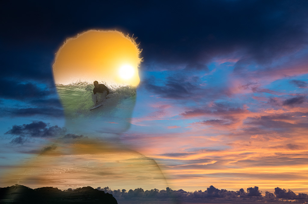
Very cool, Brad!
I really like how the sunshine in the surf scene echoes the yellow of the clouds. Great choice of the surfer shot - the way he is just getting up works really well with the idea of envisioning it, as does the fact that his face is obscured.
The whole sunset is really glorious.
The head is so well defined that it might be nice to give a little more definition below the neck. Here was my attempt at that. Just a touch of color sampled from the sunshine above.
|
Feb 23rd |
 |
| 54 |
Feb 23 |
Comment |
I really enjoy this image, Alan. I think your use of black and white for the structure works really well; it contrasts with the colorful people. There is that gentleman in the center, who is dressed all in b&w - will he become more colorful as he gets closer to the front? This image suggests that all things are possible.
I love the balance of the composition. The 9 squares in b&w could feel very static if handled differently, but the deep perspective of your shadows and the artful distribution of your subjects make this an endlessly fascinating image. |
Feb 23rd |
| 54 |
Feb 23 |
Comment |
This is a beautiful image, Maria. I really like how the woman and the church are centered but the walkway wanders a bit. That invites my eye to wander around the hill and tree but also brings me back to the church and to the woman again. You've done a wonderful job of matching tones on all the elements - it really feels as if they all belong together. I love the rich colors, and the way the yellow parts of the grass look like sunshine breaking through the fog.
There's something dark at the end of the walkway, just under the middle arch of the church. It feels to me as if it's blocking her path to the church. If that's not your intention, you might want to clone it out. |
Feb 23rd |
| 54 |
Feb 23 |
Comment |
Such a fun image! I love the colors and those large staring eyes - they look so surprised to me! The city below gives me the feeling that your fiery friend is hovering above the city. I like how you coordinated the colors of the city with your firebird.
I tried adding some rays from the firebird to shine down on the city, but they were just distracting. So I'd say enjoy this image just as you have it. It's great! |
Feb 23rd |
| 54 |
Feb 23 |
Comment |
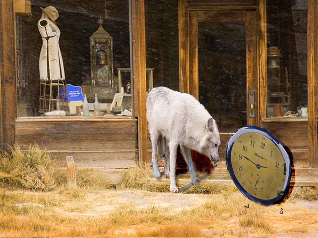
This is very clever, Aavo. I love the idea of time running out together with the Bodie store, which has itself effectively stopped in time. The removal of the numbers works really well; I especially like the #5 in the wolf's mouth. Having a light background behind the #5 is effective.
I think that it would take a very large wolf to stop time.
I think your wolf original has a different white balance than the other elements; they feel much warmer. I would consider adding a warm filter on the wolf.
I wish I'd come up with this idea. |
Feb 7th |
 |
| 54 |
Feb 23 |
Reply |
Thanks, Alan!
I think using that texture to show the wind is an ingenious idea. I'll have to play with it; it's a little tricky. Thanks for the idea! |
Feb 7th |
6 comments - 2 replies for Group 54
|
6 comments - 2 replies Total
|