|
| Group |
Round |
C/R |
Comment |
Date |
Image |
| 54 |
Dec 22 |
Reply |
Hi Maria,
I agree, the cabin does add depth. And most importantly, you like it and it is your image. That's what matters.
Merry Christmas! |
Dec 23rd |
| 54 |
Dec 22 |
Comment |
Thanks, Maria!
Merry Christmas! |
Dec 23rd |
| 54 |
Dec 22 |
Comment |
So glad you have joined our group, Christian!
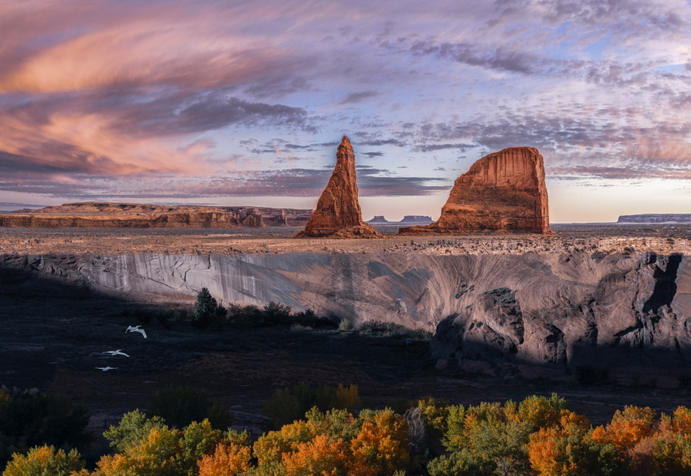
I really like your image. It has so much depth, with lots of interest in each plane. The glorious landscape and sunset at the top is really like icing on a delicious cake. I've always struggled with landscapes but this image makes me want to give them another go.
Personally, I like the diagonal shadow, and I really like the birds. For me, they provide a bridge between the growing trees and all the rocky plain, and are an important part of the image because of that. I also like both large rocks. So as you can see, everyone has their own viewpoint; ultimately it is you as the artist to choose yours.
The one suggestion I have is that the green of the trees seems to me to be existing in a different light than the landscape behind it. You might consider either adding a Photo Filter adjustment layer with magenta selected (masking out everything above the trees) or using a Hue/Saturation layer with the Hue set around -12 (masking out everything above the trees).
|
Dec 13th |
 |
| 54 |
Dec 22 |
Reply |
Thanks, Aavo! |
Dec 12th |
| 54 |
Dec 22 |
Reply |
Thanks, Alan! |
Dec 12th |
| 54 |
Dec 22 |
Reply |
|
Dec 12th |
 |
| 54 |
Dec 22 |
Reply |
Questions are encouraged!
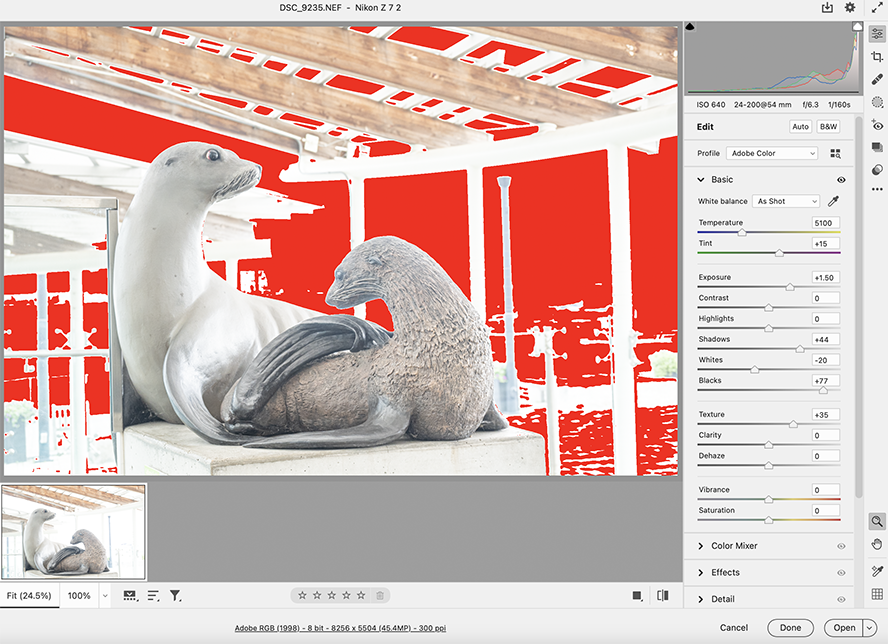
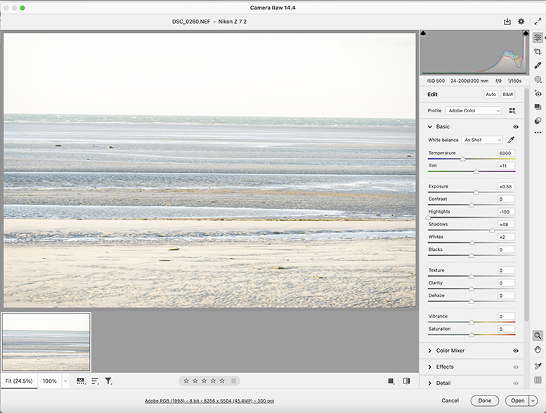
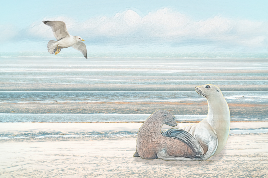
The color picker would certainly work to change the colors. Photoshop often has many paths to the same result. As it happened, I took a this route: I wanted to create a light image in happy colors, so I first took the background into Camera Raw and adjusted per the first screen shot, below. I also adjust the seals file in Camera Raw, per the second screen shot. A lot of the background was then blown out, but it didn't matter because I always intended to only select the seals. I brought the background back into Camera Raw and used the HSL panel to shift the yellows more towards the green and the blue more towards aqua (Hue), and increased luminance of the orange. I then went into the Basic panel and increased whites (+26), decreased black (-15) and highlights (-43). That got the colors pretty closely aligned .
After adding the sky (adjusted with a Hue/saturation adjustment layer), I added a Color Lookup adjustment layer ("2 strip" at 40% ). I generally use a Color Lookup adjustment layer or a Topaz filter at lowered opacity to harmonize the colors throughout an image.
The seagull just happened to fit in without adjustment. |
Dec 12th |
 |
| 54 |
Dec 22 |
Reply |
Thank you for always being so open to everyone's comments. I really appreciate your consideration of others' comments while being secure in your own artistic vision. |
Dec 9th |
| 54 |
Dec 22 |
Reply |
Actually, now that the seagull is higher, per Kirsti's suggestion, I prefer it without a shadow. :0) |
Dec 8th |
| 54 |
Dec 22 |
Comment |
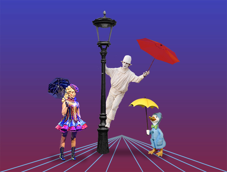
This is a such a fun tribute to a great movie! I love the colors and your characters. The duck with the umbrella is priceless.
I don't think a dim bulb would draw my eye too much, but given your signature bare stage setting, its lack doesn't bother me.
I like the idea of your converging lines. They are so bright that I'm disappointed that there is nothing at the apex. Perhaps you might want to consider a little desaturation or less brightness there. Or, perhaps not. |
Dec 8th |
 |
| 54 |
Dec 22 |
Comment |
I love all the textures in this image. You have such great detail in the sheep's coat, and then the wild grass growing all the way back to the stormy clouds. The patch of blue sky is a nice balance to the sheep. All of your colors work so well together, and the light plays beautifully across the image.
This is such a strong image, with the sheep standing so sturdily despite the stormy sky.
Personally, the cabin doesn't add to this image for me. I might consider taking it out. |
Dec 8th |
| 54 |
Dec 22 |
Reply |
That's a great idea, Kirsti! Yes, it looks more natural that way. Thanks! |
Dec 8th |
 |
| 54 |
Dec 22 |
Comment |
What a great image, Kirsti! I love the version you posted in response to Brad's comments. My eye goes from the girl to the woman at the cave's mouth to that terrifying wolf. Will the woman be able to save the girl? Her glow gives me hope.
The b&w works really well here. I thought the ice near the wolf was too bright in your original version, but I don't feel that way in your updated version - the girl, the woman, and the wolf are such strong figures that the ice mound doesn't distract me. In fact, I love the way it shimmers.
You have a tremendous feeling of depth and distance in this image. I think it's great. |
Dec 8th |
| 54 |
Dec 22 |
Comment |
I too enjoy this image, Aavo. Great composition, and I really like how you corrected the perspective on the building. It almost looks like a stage set, in a good way, because it's easy to see the story here. The colors all work well together.
It would have been nice to have the father looking at the couple, but it works anyway. It just makes me think he's already seen them and is being grumpy about it.
I find the signs a little distracting, especially because the letters are indistinct. You might consider cloning them out - or changing the signs to "No loitering". |
Dec 6th |
| 54 |
Dec 22 |
Comment |
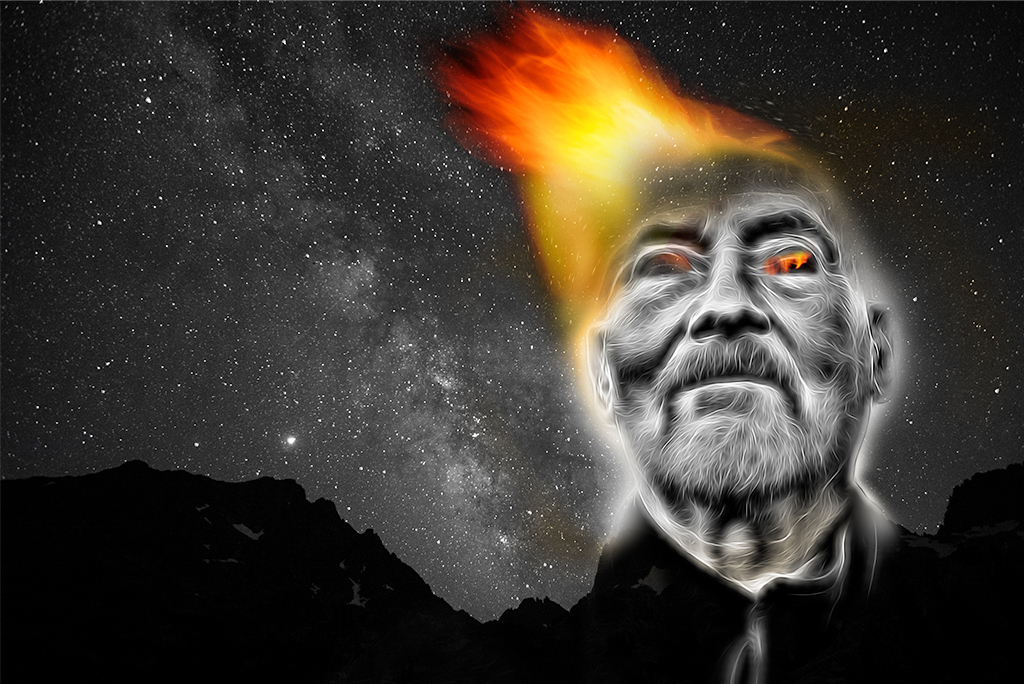
This is a very intense image. I really like how the electrified filter integrates with John's facial hair, and how his black shirt becomes part of the mountain range. The flame and his glowing eyes really stand out in the b&w. Seeing the stars through his forehead gives me the feeling that this is a powerful being that inspires awe. I love the way the Milky Way works with the flame to frame his face.
You might consider spreading the flame out a bit to give more of a feeling that it is all emanating from him.
|
Dec 6th |
 |
| 54 |
Dec 22 |
Reply |
Thanks, Brad!
I see what you mean.
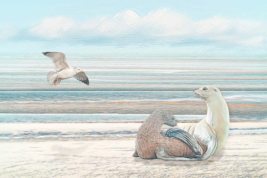
I added a filter literally at the last minute before posting this month's image, which I thought was an enhancement; now I prefer my earlier version (attached). This one has a lighter shadow.
I've tried it without a shadow and it didn't work for me. |
Dec 6th |
 |
7 comments - 9 replies for Group 54
|
7 comments - 9 replies Total
|