|
| Group |
Round |
C/R |
Comment |
Date |
Image |
| 54 |
Nov 22 |
Reply |
Oh, interesting suggestions, Brad! Thanks!
I'm going to be working on this some more, and will definitely try some of your ideas. |
Nov 20th |
| 54 |
Nov 22 |
Reply |
Thanks, Maria! That's a good idea, to either bring the antelope down or extend the shadow up so it's not floating so much. |
Nov 20th |
| 54 |
Nov 22 |
Reply |
Thanks, Aavo!
I was hoping the vague roundness at the bottom of the antelope would fit in with the general swirl, but I can see from your version that it would look more realistic if I masked to suggest legs. It's a good idea, and I will give it a try. Thanks for the suggestion! |
Nov 20th |
| 54 |
Nov 22 |
Reply |
Thanks for your input, Alan!
And apologies for the slow response, it's been a busy time with family here.
Yes, I completely agree, it is great that different viewpoints can be freely shared in this forum. I learn so much from considering everyone's personal viewpoints.
Your version is indeed very close to the colors and saturation level of the actual landscape I shot. I think the antelope looks more connected to the background in your version than in mine, just as Kirsti's version looks more integrated when she took a different approach. I hadn't thought about the disconnect of color/saturation when I was putting this image together, and it's very helpful to see options to address that.
I need to work on this image some more, but I'm encouraged by your kind words about the antelope sitting in the midst of the swirling leaves. Thanks! |
Nov 20th |
| 54 |
Nov 22 |
Comment |
This image is so much fun, Brad!
I love the colors and the vibrance of the flower, the fly, and the bee. There is so much energy in this image.
I thought about whether it would be better to remove the black lines above the fly, and realized I like them. I think they add a bit of depth and lessen the isolation of a solid color background. I feel they also provide a link between the fly and the bee.
The competition-trained part of my brain feels that the bee is too close to the edge. The independent artist part of me loves how the components become more realistic as they get closer to the viewer (totally abstract lines in the background to a very realistic, detailed bee). I do get that feeling of a bee buzzing off quickly when it's done. I'm also reminded how many paintings I've seen in museums that have partial views of people/creatures at the edges. I don't think anything is added by seeing the entire bee; we know what it is. So personally, I like the choice you made.
Good for you for creating such a joyful image after having to deal with a car and computer theft. |
Nov 20th |
| 54 |
Nov 22 |
Comment |
A wonderful image, Alan!
I love the way my eye travels deep into the reflections on the left and then comes back to the artist, and then over to the reflection on the right. Your colors are masterly, with everything in grey except the lush golden frames (with even the sketch surrounded in a golden hue). I personally would have probably used transform=>perspective for the mirror on the right, but I think you have nailed it with distort. It really gives me that feeling of how a reflection that's not straight on is always different from what I expect.
I love this image as is. I have no suggestions for you. |
Nov 20th |
| 54 |
Nov 22 |
Reply |
Oh, I like that a lot, Kirsti!
There's a sponge tool in Photoshop, which I've never used. I'll give it a try.
Thanks! |
Nov 7th |
| 54 |
Nov 22 |
Comment |
I gave it a try here. |
Nov 6th |
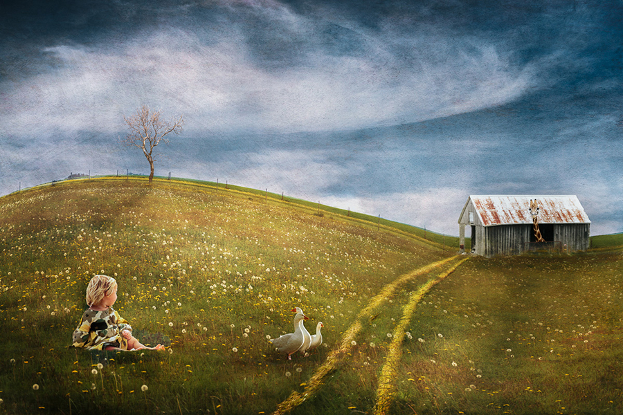 |
| 54 |
Nov 22 |
Comment |
No need to apologize for the number of images, Maria! You can alway use as many as you like.
I love this image! It feels like it could be in a storybook. The giraffe is so whimsical! The curve of the hill is perfect, and the tree looks great against that sky, All of your colors go together so well. The cabin might be a little small compared to everything else, but for me that adds to the storybook feeling. I think the path was a good addition.
I love the light on the ducks.
To me, the little girl doesn't quite seem to fit. I think the white balance on your original of her is very golden, while the setting of the final image is rather more blue. You might want to see if changing the white balance on her helps. |
Nov 6th |
| 54 |
Nov 22 |
Comment |
This is really charming, Kirsti! I think the b&w works well. Great composition - I can see how the children climbed up the crevice, and I love their enthusiasm in going in the cave on their hunt. They look so adorable in their bunny costumes!
I think the background works really well with the story you are telling.
Great gesture on the observer bunny.
The observer bunny seems to be in softer focus in the final image compared to the original. Since everything else in the final image is sharp, I might consider putting in a sharper image of the observer bunny.
|
Nov 6th |
| 54 |
Nov 22 |
Comment |
I'm sure he's just asking directions.
I love what you've done here, Aavo! Great composition. The starry sky looks very real to me. I love the street and the arch at the top. How did you darken the highlights on the buildings? Was it a filter on the whole image or...? I like the way it helps me see the details in the brick.
The woman looks very believable to me. I like the way you've made the walls appear thick at the doorway, consistent with the rough texture of the outside walls.
The man doesn't have quite as much detail as the rest of the image, and his face is rather pink. I think desaturating his face a bit might help.
|
Nov 6th |
6 comments - 5 replies for Group 54
|
6 comments - 5 replies Total
|


