|
| Group |
Round |
C/R |
Comment |
Date |
Image |
| 54 |
Sep 22 |
Reply |
Thanks, Aavo! |
Sep 11th |
| 54 |
Sep 22 |
Reply |
Thanks, Alan!
I didn't think I'd like it with the pink bill, but I now that I see it I think I prefer it. Great suggestion!
I'm going to leave it for a few days and then come back to decide. |
Sep 11th |
| 54 |
Sep 22 |
Reply |
Thanks, Brad!
I'll try playing with the contrast, hadn't thought of that. |
Sep 9th |
| 54 |
Sep 22 |
Comment |
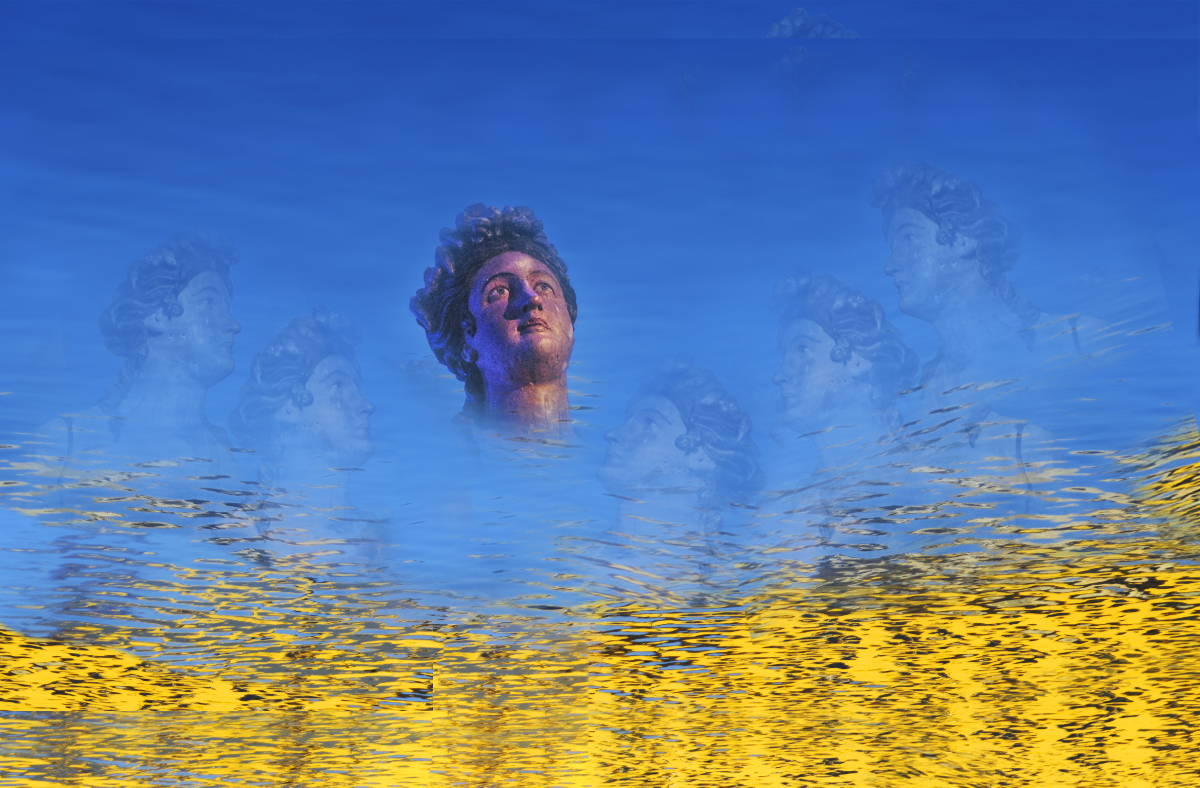
I really like the addition of the two more sisters. I really feel their hovering now, and their distance from the Little Mermaid.
I also like it that they look so much like the Little Mermaid, because it gives me two interpretations. They could be her sisters, or it could be her own conflicting thoughts, that she has doubts somewhere in the back of her mind that she is ignoring.
I think you've done a great job with the desaturation and opacity change on the sisters as well; they have much more of an underwater look to me.
You could enhance that by fading their opacity a bit more as the depth increases (the top of their heads being more visible than their chins).
With your new configuration, some of the sisters' eyes aren't looking at the Little Mermaid. You might consider rearranging them a bit. |
Sep 9th |
 |
| 54 |
Sep 22 |
Reply |
Thanks, Maria! |
Sep 7th |
| 54 |
Sep 22 |
Comment |
What a great image, Brad!
I love the flower, especially how the petals completely expose the middle but then up at the edges. The Topaz filter feels almost as if everything is just buzzing with energy.
The colors are all beautiful, including the addition of the painter's blue top and the red.
At first I thought that the artistic filter should be applied to the painter, since her feet are in the flower, but after a bit of thought I realized I like it better the way you did it. It gives her an "otherness" that makes it feel more natural to me that she is changing the reality.
I love your red dot. How did you create it? It seems to have some color variation - a touch of orange? - and some randomness in its diffusion (though that might just be an optical illusion). Anyway, I'd love to know how you created it.
|
Sep 3rd |
| 54 |
Sep 22 |
Comment |
This is a very charming scene to me, Alan! What a pleasant surprise, to walk in to find a little fairy on the table.
I love the texture of the room - it's as if I can reach out and touch it. The cat looks as much at home as the fairy. It also adds a nice question - is the cat sitting at its ease because it's used to seeing a fairy there? Or perhaps it's thinking about pouncing...
I love your composition; my eye keeps wandering around that little circle of chairs and pausing at the cat and the fairy on the way.
I might consider decreasing brightness on the fairy's shoulder a bit.
I can't see the cat's eye or the features of the fairy's face as much as I would like, but I have a feeling that is due to the file size. They are probably more visible in a larger file size.
|
Sep 3rd |
| 54 |
Sep 22 |
Comment |
This is so beautiful to me, Maria!
It does feel like old times to me, especially because there are no cars or farm equipment. The colors are so delicate. It has a romantic feeling to me, like a painting.
I really like how the buildings and windmill fade into the distance.
I like the way the image is very wide, like a panorama. It gives me the feeling of wide open spaces.
One small suggestion: I would consider darkening the left edge of the image a bit. It's so much lighter than the right side that it feels just a little unbalanced to me. |
Sep 3rd |
| 54 |
Sep 22 |
Comment |
This is a delightful image, Aavo!
I love the tree, especially because I see a suggestion of eyes up by the branches. The light over the door and the light in the window makes it very welcoming to me. Which is especially nice because the tree looks a little intimidating. So much character for a tree!
The door and window and lantern add just the right touches for me.
I think the fog adds a nice touch. Perhaps you might consider having bits of the fog roll into the foreground, as if it's coming towards us.
I know I keep my monitor darker than most people do, but I had to turn the brightness almost up to maximum to see any details. Personally, I would consider backing off a bit on darkening the tree, and maybe add a vignette to add to the nighttime effect. |
Sep 3rd |
| 54 |
Sep 22 |
Comment |
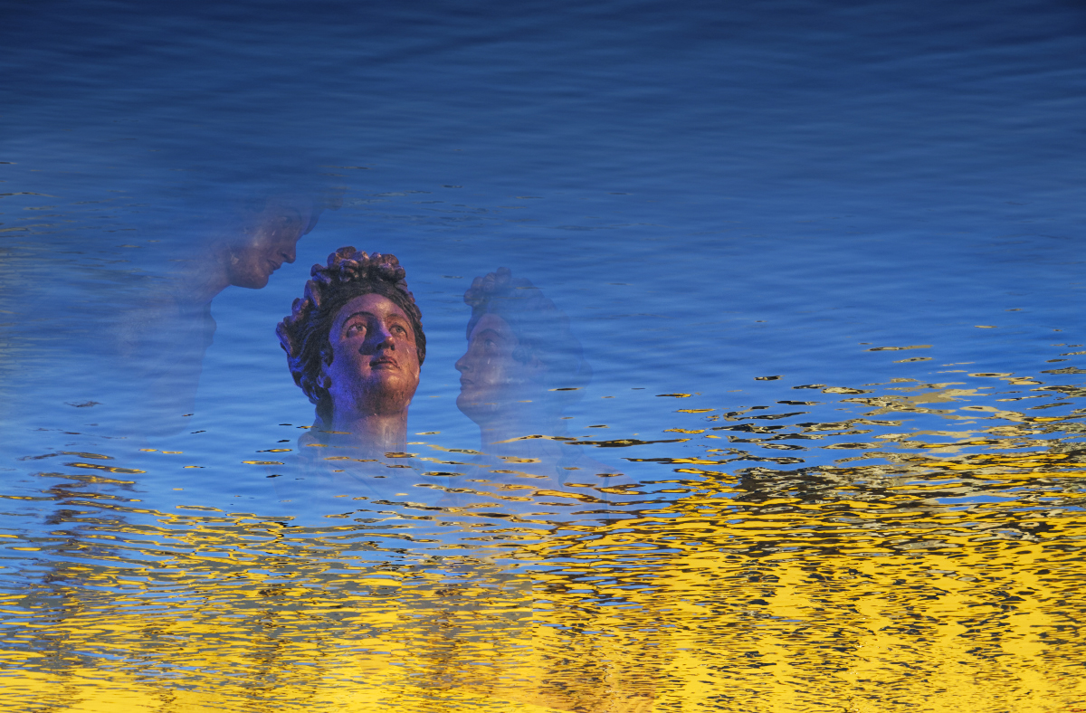
For me, this is a very dramatic image. The gold and blue of the water is really stunning. The poignant look on the Little Mermaid is wonderful - I can see the yearning and determination. I like the light on her face.
I find the water a bit confusing. The ripples are bigger at the top of the image than at the bottom, so it feels to me as if she is looking up at the surface of the water. You might transform your water original into a shorter aspect to make the ripples smaller at the top, and then mask that in over your existing image.
I think having just the sister at her right might work better than having two.
I really like where you are going with this image.
|
Sep 3rd |
 |
| 54 |
Sep 22 |
Reply |
Thank you so much, Kirsti! I have never used the Burn Edges in Silver Efex before - I just added vignettes after I was back in Photoshop. But I like what you've done a lot! I think it does add depth and drama. I hadn't thought to go that wide but I like it better than other things I tried. So thank you! |
Sep 3rd |
| 54 |
Sep 22 |
Comment |
Here's my color version |
Sep 1st |
 |
7 comments - 5 replies for Group 54
|
7 comments - 5 replies Total
|


