|
| Group |
Round |
C/R |
Comment |
Date |
Image |
| 54 |
Sep 20 |
Reply |
Thanks, Kathy!
That was my feeling about the pink, too; I think I was a little reluctant to embrace it because I usually choose neutral backgrounds. I'm glad you like it too! |
Sep 21st |
| 54 |
Sep 20 |
Reply |
Thanks, Marilyn!
That's an interesting suggestion about the shadow. I had not considered one. I've played around a bit with it now; a shadow adds some depth and definition to the background, but alters the balance a bit.
Hmmm, decisions, decisions...
|
Sep 21st |
| 54 |
Sep 20 |
Reply |
Thanks very much, Alan! |
Sep 21st |
| 54 |
Sep 20 |
Reply |
Thanks, Brad! I appreciate getting the validation on the pink; I'm more comfortable with neutral tones for backgrounds. It's helpful to know someone else likes it too. |
Sep 21st |
| 54 |
Sep 20 |
Comment |
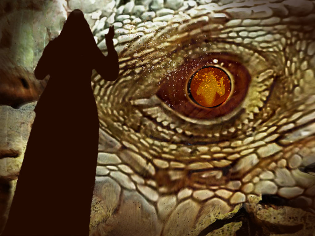
Welcome to the group, Marilyn!
This is a very compelling image. The giant reptile eye is fantastic. The silhouette on the left balances it very nicely. I really like the way you took the color from the eye to apply to the silhouette. I feel the play of light and shadow here is very satisfying, especially the carefully crafted shadows in the corners.
The splatter trail between the hand and the eye is a nice touch.
I really love the sharpness in the original of the eye and would have liked to see more of that in the final image. The clarity of the ridges of the skin texture would add to the ominous feeling of the reptile for me (though it is plenty intimidating as is!).
At first I thought the reflection in the eye was part of the wood texture you used. A brighter eye might make that easier to see. Just a thought.
I hope you don't mind my showing my suggestion via a modification of your image; it's just hard to explain what I mean in words sometimes and easier to illustrate it. If you prefer that I don't do that, just let me know.
I'm very glad you have joined our group!
|
Sep 9th |
 |
| 54 |
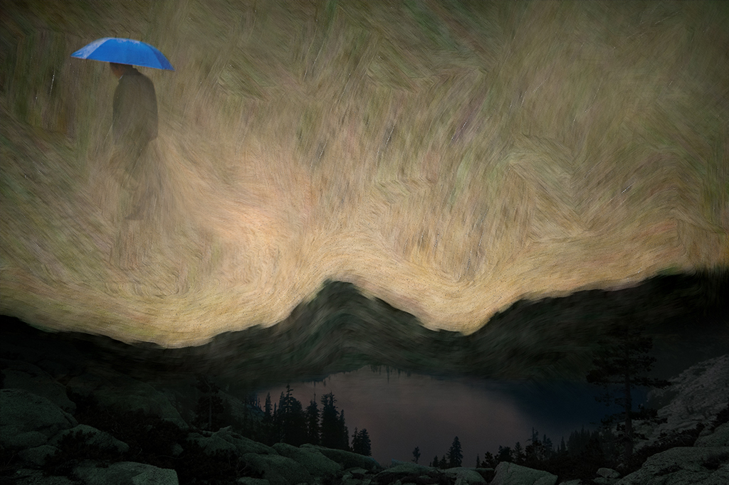
Sep 20 |
Comment |
This is a very cool image, Brad!
I really like how the stars have been turned into a brushstroke sort of texture. It really works for me against the dark landscape below, which is very interesting in itself.
I love where you've put your man with that wonderful blue umbrella, and how he is walking out of the picture rather than in. It just feels right to me.
I agree with Kathy that the man could be less distinct. Her idea of more diffused is a good one; I was thinking less opaque. I'd also consider having that bright streak in the sky lead to the man rather than up to the edge.
Thanks for sharing a work in progress! Always a welcome thing to do. |
Sep 9th |
 |
| 54 |
Sep 20 |
Reply |
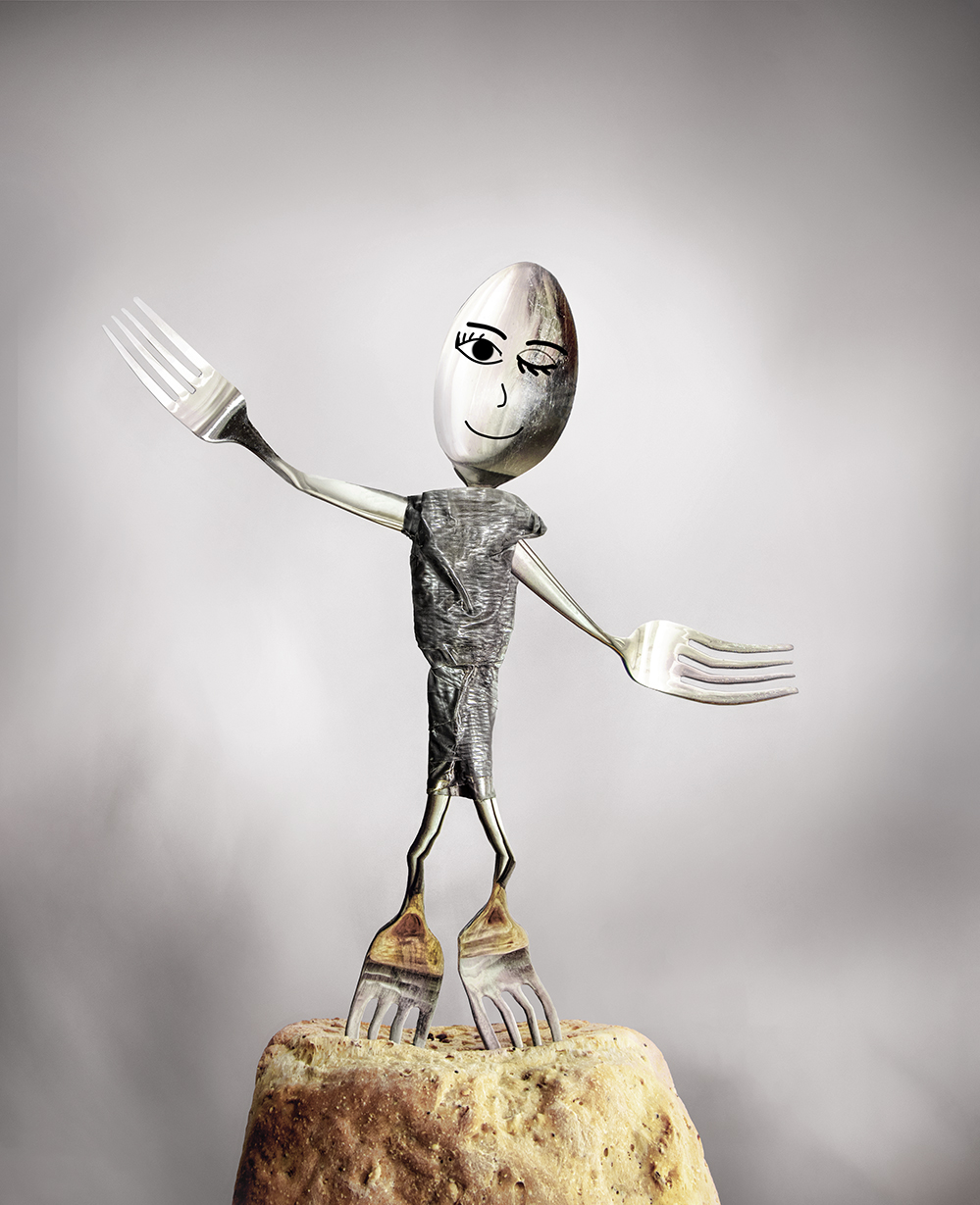
Thanks, Aavo!
The bright silverware got sort of lost against a bright white background, which is why I went for the change of background. I was hoping the color added to the lighthearted feeling. |
Sep 9th |
 |
| 54 |
Sep 20 |
Reply |
A fun idea, Betty!
I was looking for an easy way to do that, and came across this Youtube tutorial https://www.youtube.com/watch?v=BFxeIJZGUSg. Now I just have to find some dancing silverware... |
Sep 9th |
| 54 |
Sep 20 |
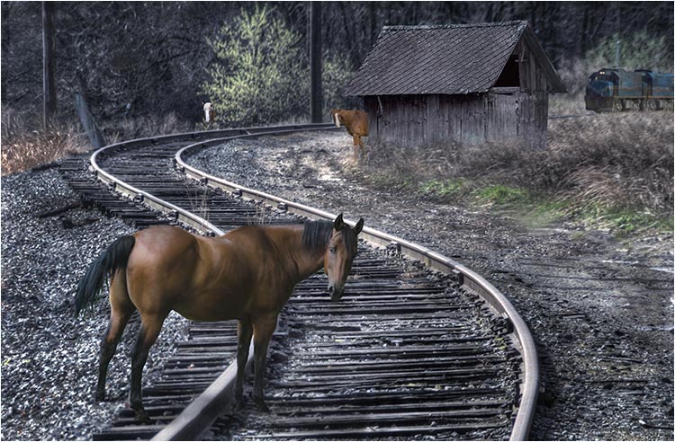
Comment |
Great image with a great title!
As I so often find with your images, Alan, the more I look at this, the better it gets. The horse on the tracks has a great inquisitive look, and I like how you've placed him just enough on the tracks to have gone too far into danger.
Such a fabulous curve of track. leading right to the second curious horse. I didn't see that horse at first because I kept looking at that bright spot of the nearby tree, but I think that works, adding an element of surprise . The building is a nice touch, looking very natural and adding balance to the composition.
I really like Betty's idea of a light on the engine, or lightening its surroundings, because I find it very hard to see. I understand the idea of having it be seen last, the visual punchline, but I suspect some of your viewers will stop at the building and never get to see the train. I'd also think about lightening the horse's face a bit, the better to see that great inquiring expression. |
Sep 9th |
 |
| 54 |
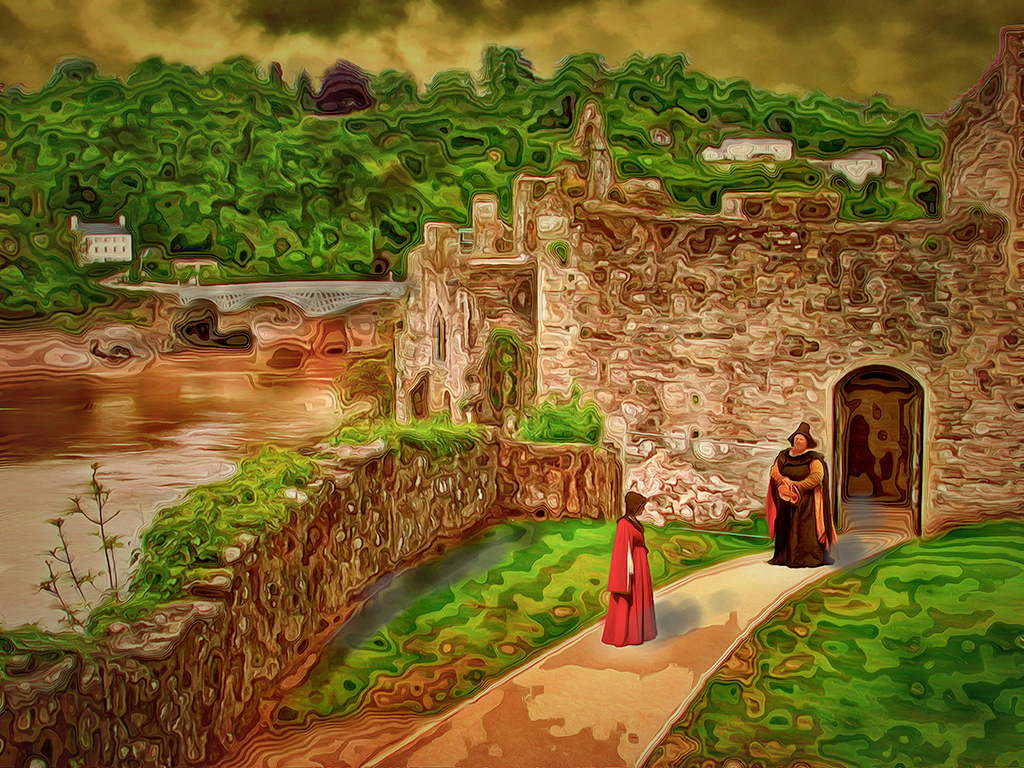
Sep 20 |
Comment |
This feels like a picture in a book of fairy tales, for a story I'd love to read.
I love the rich colors and all the soft, swirly lines.
The river and the road keep bringing my eye around the image and back to the two women.
The yellow mist in the distance suggests a mysterious presence approaching.
A wonderful image, Betty!
My only suggestion is that you might consider a levels correction applied to the center of the image. |
Sep 9th |
 |
| 54 |
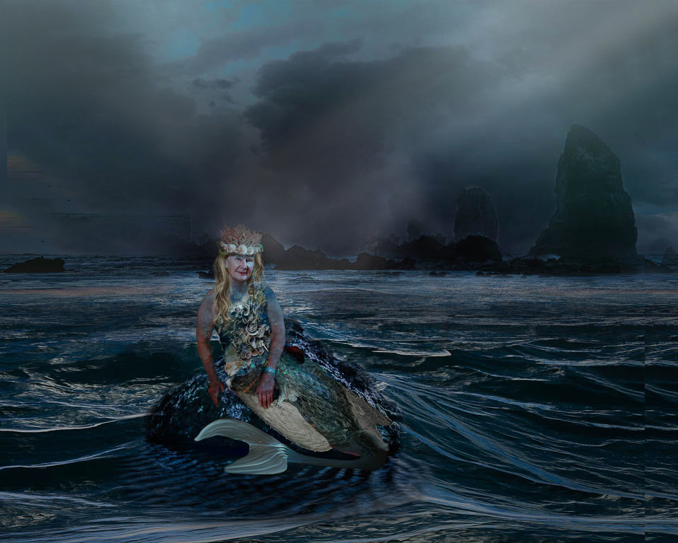
Sep 20 |
Comment |
Very cool image!
You've done a fantastic job transforming your friend into a majestic queen of the mermaids - I love her crown and hair and crustacean bodice.
You've put her in a beautiful setting. I think you really nailed the shutter speed for the waves - smooth and reflective water with loads of movement. The mist and shaft of light are excellent additions.
I found this image to be pretty dark on my monitor, and the histogram shows it all left of center, so that's something to consider before printing. I personally feel it's visually heavier on the left, and might have chosen to flip the rocks in the background. |
Sep 9th |
 |
| 54 |
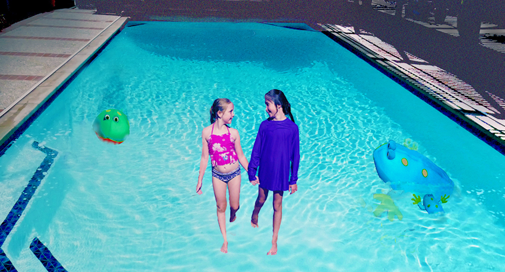
Sep 20 |
Comment |
Very fun!
That's such a great shot of your two granddaughters - the way they're mirroring each other and holding hands with obvious affection. I'm sure the whole family enjoys their transformation into walking on water.
Great colors. The angle of the pool receding into the distance is a very nice frame.
I like the addition of the pool toys.
Personally, I would consider making the girls a little larger, and lightening up the mid-tones on that level to match the lighting of the pool, but those are just technical quibbles. You've already got a fun, lighthearted image here.
|
Sep 9th |
 |
6 comments - 6 replies for Group 54
|
6 comments - 6 replies Total
|


