|
| Group |
Round |
C/R |
Comment |
Date |
Image |
| 54 |
Aug 20 |
Reply |
I see what you mean, Betty. A background with a sense of location would definitely add to the story. Thanks for your insight! |
Aug 18th |
| 54 |
Aug 20 |
Reply |
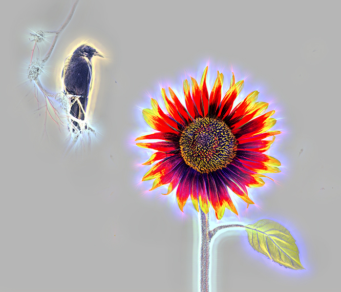
Hmm, thinking about the "op art" part of your comment, maybe I could add a filter. ;0) |
Aug 18th |
 |
| 54 |
Aug 20 |
Reply |
I love an independent thinker, Kathy!
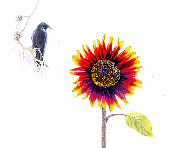
I do really like this image, and so think I am going to end up with more than one "final" version. Thanks for your suggestion. I had been thinking in terms of bird or no bird, but I do like it as well with the flower and the crow. Thanks! |
Aug 18th |
 |
| 54 |
Aug 20 |
Reply |
Thanks, Alan! Definitely not something I would. have thought of myself. I lose the intimacy of the lizard and the sunflower, but it definitely makes a more interesting composition.
I'm going to start over, so I can match the contrast of the flower and lizard with the bird. |
Aug 18th |
| 54 |
Aug 20 |
Reply |
Thanks for the suggestion, Aavo! I had tried a light grey and a light blue background, but they didn't work, so I stayed with the white. A light warm background works much better. |
Aug 18th |
| 54 |
Aug 20 |
Reply |
Thanks, Brad! I think you're right. I felt like the bird didn't quite fit but couldn't put my finger on why. |
Aug 18th |
| 54 |
Aug 20 |
Reply |
I changed the color of the shirt by taking the layer into Camera Raw and using the White Balance eyedropper. I positioned it towards the bottom of what's showing of his tee shirt and clicked the mouse (you get a different result depending on where you position it). Here's a Youtube video on how to do it with earlier Photoshop versions https://www.youtube.com/watch?v=jd4g9-pAloI. The eyedropper has moved to be right next to the White Balance dropdown menu in Camera Raw in Photoshop 2020.
|
Aug 18th |
| 54 |
Aug 20 |
Reply |
Hahaha! I'll bet you are right.
No one's ever satisfied. |
Aug 17th |
| 54 |
Aug 20 |
Comment |
A very imaginative concept!
You have beautiful originals. I think the colors work well together, and the simplicity of the image really works well to tell a story.
For me, the shallow depth of field of the flower makes the butterfly feel too sharp, and the forest confusing, because it surely would be out of focus (unless you add a swirl of color or something to suggest the flame is opening a wormhole rather than simply illuminating the forest.) The tree trunk that is in between the flame and the forest is a straight line, which to my eye looks more like a selection edge than a tree trunk, because the right side is not lit up.
I think you've got a really interesting concept that could be a very provocative image. It would be really interesting to see this developed a bit more, perhaps with Alan and/or Kathy's excellent suggestions. |
Aug 17th |
| 54 |
Aug 20 |
Comment |
Thank you for the detailed description of how you created this image! It's very helpful to learn new techniques.
I love the background. It's very effective in b&w, and is elegantly shaded from distant dark to lightness as it grows to the right. The two bright spots are very effective and give a nice balance to the whole image.
I feel as if maybe a little more could have been done with the lady on the right. Perhaps if she were somewhat transparent, as if growing out of the step...or if she was very small. Or perhaps you don't need her at all. It's such a dynamic background, and the lady on the left works very well. I just feel the lady on the right as is isn't adding anything to the image for me.
|
Aug 17th |
| 54 |
Aug 20 |
Comment |
Such a lovely girl in a very elegant costume!
The plant she is in looks like an organic throne to me, so I imagine that she is a princess on her fairyland throne. Her self-possessed expression seems friendly in a regal sort of way.
Your images always seem to suggest a story, Betty. You really inspire me. |
Aug 17th |
| 54 |
Aug 20 |
Comment |
I think this is really wonderful, Kathy!
I love the overall dark tone, with plenty of shadow detail and rich colors. The brighter areas give a nice balance.
Personally, I love the woman's smile. To me, it feels like confidence and a plan about to be executed. I don't know if she's for me or against me, but something's about to happen. Great title!
My only suggestion is that you might want to explore a more vertical crop, only because a square crop tends to be more restful. Just a thought. It's a marvelous image already, so maybe you don't want to go there. |
Aug 17th |
 |
| 54 |
Aug 20 |
Comment |
You're messing with my mind here, Aavo. ;0)
I really like how the line of pictures in the boy's gallery and the gallery's baseboard really lead me in. A very fun concept to have the boy making his own art on the floor.
The luminosity of the man goes well with his gallery. You probably already know this, but an easy way to adjust his coloring is to click the white balance eyedropper on his tee shirt (near the belt line) .
I agree with Brad and Alan's comments. |
Aug 10th |
 |
5 comments - 8 replies for Group 54
|
5 comments - 8 replies Total
|