|
| Group |
Round |
C/R |
Comment |
Date |
Image |
| 54 |
May 20 |
Reply |
Thank you, Kathy! |
May 11th |
| 54 |
May 20 |
Reply |
Thank you very much, Brad! |
May 11th |
| 54 |
May 20 |
Reply |
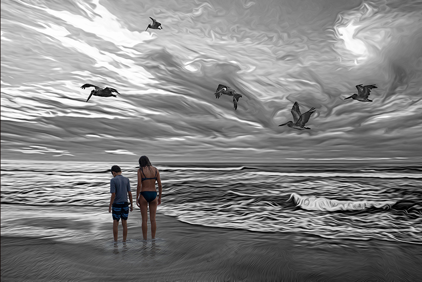
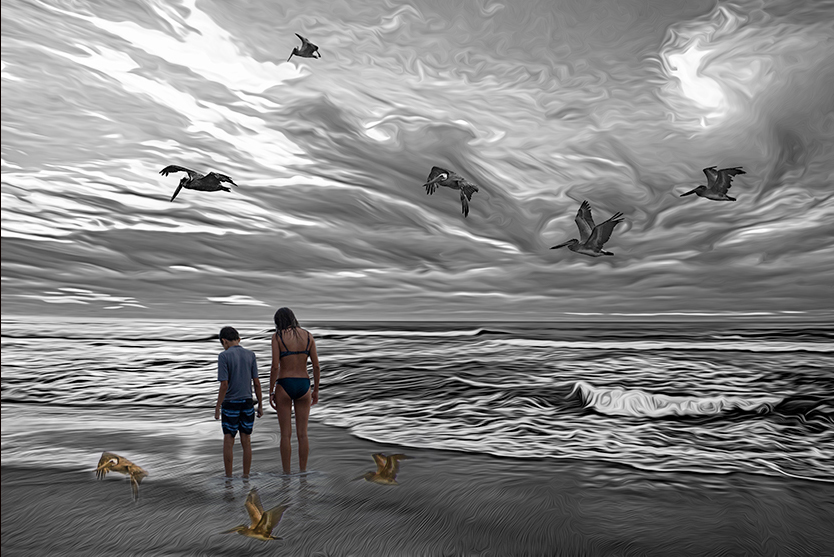
But just to be clear, I used your pelicans as an example only because they were at hand. I was actually thinking of something more subtle, like lines in the sand. |
May 11th |
 |
| 54 |
May 20 |
Reply |
LOL! Well, as the song says, "ya can't please everyone, so ya got to please yourself". I know you are always true to your own artistic vision. It's a great image.
|
May 10th |
| 54 |
May 20 |
Comment |
I think it works very well, Brad.
I think your filters stylized a marvelous sky and wave movement into something very different and interesting. The rhythm of the pelicans flows very nicely with the clouds. Adding your daughter and son without stylizing is a really interesting contrast, adding a bit a mystery which is enhanced by the focus of their gaze.
I might consider making a little more intimate with a bit of a crop and something to tie the kids more closely into the landscape. |
May 8th |
 |
| 54 |
May 20 |
Comment |
A very interesting image, Alan!
There are a lot of things that appeal to me here - the colors, the balance of the dark sky against the bottom half, the simplicity of each element (which invites me to consider each in itself as well as its place in the whole).
I particularly like how everything points to the sphere - the man's gaze, those lovely long shadows of the pillars.
Because of this direction for my eye to keep returning to the sphere, I feel as if it should have at least a bit more visual weight than the man. His white garments really draw my eye, and the sphere doesn't quite balance it for me. I might consider making it a bit bigger, or a bit more impactful somehow. Just a thought. |
May 8th |
| 54 |
May 20 |
Comment |
I love how your images always invite me to create a story.
The way the horses float above the ground is a very nice touch. I really like how the fog does not envelop the foreground, which adds to that ghostly feeling.
For my taste, I might have cropped a tad off the top, but that's just a nit.
|
May 8th |
| 54 |
May 20 |
Reply |
Thanks, Aavo! I'll give the vignetting a try. |
May 8th |
| 54 |
May 20 |
Comment |
I really like the contrast of the soft pastels with the harsh colors of the body of the deadly angel.
Very nice use of blend modes to get the city detail within the angel. Could you share your steps on that? I think it's really effective, and it's always so interesting to learn from such an artistic image.
Great choice of model - her expressing intimidates me. Her connection to the viewer is so strong that it does create a bit of a disconnect for me between her and the city. Perhaps if she was behind the city rather than beside it, or if more of the city showed on her left side I would feel more of that connection.
This is a wonderful introduction to your work, Kathy, and I look forward to seeing many more of your creative images.
|
May 8th |
| 54 |
May 20 |
Comment |
I really like this image. The black and white works well, particularly with the fog. You've really worked with perspective here in a very satisfying way.
The softness of the fog is a nice contrast to the angularity of the robots.
I wouldn't change a thing, Aavo. Well done! |
May 8th |
5 comments - 5 replies for Group 54
|
5 comments - 5 replies Total
|