|
| Group |
Round |
C/R |
Comment |
Date |
Image |
| 54 |
Apr 19 |
Reply |
Brad, I know that when I try to print an image on that glows with light on matte paper, I am always disappointed. The best paper solution I've found is metallic paper. Metal prints are nice too, though more expensive. I have not tried prints on glass but think they might work well, though again more of a commitment than a paper print.
Betty, I'd love to hear any print vendors you are happy with. Maybe the UK does it better. |
Apr 11th |
| 54 |
Apr 19 |
Comment |
Beautiful image, Betty!
I love the colors and the simplicity of the lines.
The lathe does dominate the image, and that totally works for me. It is in such contrast with the lush green forest, and literally shows the hand of man in using that forest. While my first reaction would be that the forest would be so nice to enjoy just as a place of nature, the lovely vase by the tree shows a very positive result of the man's actions. There is so much here, so beautifully presented.
Thanks for telling us about the lathe - how interesting!
I do agree with Brad that a bit more contrast on the vase might be worth trying.
|
Apr 10th |
| 54 |
Apr 19 |
Comment |
Very fun! And a great title!
I like your composition and the bright colors. I think it worked out well to place your granddaughters in front of the window so the light shines on their hair. I think they look charming.
I can appreciate your difficulties in adding the cloud. I might have tried putting the cloud layer in "lighter color" mode to brush in what I could, and then a second cloud layer in normal mode to brush in some more, using a brush with an irregular edge.
I do think the cloud shadow you added does help.
|
Apr 10th |
| 54 |
Apr 19 |
Comment |
Wonderful image, Alan! It all flows seamlessly, and the grungy b&W is an excellent choice.
I really like the triangle in the composition of the glasses, the chair, and the man's face.
The expression on the man's face really makes this image.
I love the crop. I think it adds a lot of tension and is in perfect harmony with the man's expression and the camera angle relatively close to the floor. Nice way to turn a potential problem into an asset!
Well done! |
Apr 8th |
| 54 |
Apr 19 |
Comment |
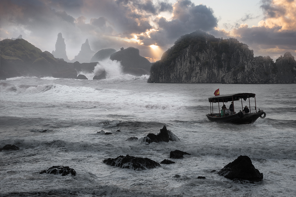
Wow, what a difference! I love this image. The position of the boat between the waves and the rocks, combined with the color of the sunset makes gives a feeling of urgency as the boat flees from peril. The light mountains in the upper left are mysterious and nicely balance the boat.
You might consider adding a touch of mist in front of those light mountains and the rocks in front of them to give them a little more weight and more reason for the lack of detail in the mountains.
|
Apr 8th |
 |
| 54 |
Apr 19 |
Reply |
Thanks, Aavo. I think you're right. I'm going to play with that and see how it looks.
|
Apr 8th |
| 54 |
Apr 19 |
Reply |
Thanks, Alan!
The painted halo was an intentional choice, because I wanted to use the colors of the gorilla for the background, but still needed to separate subject from background. Maybe they are too much the same. I'm going to play with that a bit more.
I think you are right about the hands and foot. They were too soft so I brought back the detail but I think I went a bit too far. |
Apr 8th |
| 54 |
Apr 19 |
Reply |
Thanks, Brad!
I see what you mean about the green. I usually have my laptop screen turned down darker than most people, because it corresponds to the way my prints turn out. So I didn't see green, just shadow. Thanks for the heads-up. Guess I check my images with a brighter screen as well.
|
Apr 8th |
4 comments - 4 replies for Group 54
|
4 comments - 4 replies Total
|