|
| Group |
Round |
C/R |
Comment |
Date |
Image |
| 54 |
May 18 |
Comment |
You never cease to amaze me, Phill. You've transformed a simple image of a hand sketching, with a lot of empty desk space, into a structural abstract of that image. I'm especially intrigued by how well the gradient works, with the lighter yellow on the bottom. Exquisite balance. |
May 24th |
| 54 |
May 18 |
Reply |
Your son has a great imagination! I can just see the little arms waving in dismay.
I like the idea very much, and do want to give it a try. I think I will put it on the back burner until I've got some more time. If it works out, I'll bring it back another month. |
May 24th |
| 54 |
May 18 |
Reply |
Clever idea! |
May 24th |
| 54 |
May 18 |
Comment |
I really love this image.
I can definitely tell that this is something you are feeling, and you evoke emotion in the viewer as well.
Personally, I really like the blur of the bird's wings. I think it works for two reasons. The bird is in that forbidden zone of flying out of the picture, but it is tied to the image by the wing fading into the water. It also gives it a ghostly feeling, which is enhanced by the star trails.
Excellent composition. I like everything exactly where it is.
For me, a subtle light source for that wave reflection would feel right. But that's just a nit. This is a wonderful image!
|
May 24th |
 |
| 54 |
May 18 |
Comment |
Fabulous image, Betty!
I love everything about this image. When I first saw it, I felt that it was summer inside the house and winter outside -- sort of like how you can feel happy and content in your house with family no matter what is going on in the rest of the world.
Excellent composition. The tree is so delicate and the flowers are a gorgeous balance. The make a great contrast to the winter scene.
Well done!
|
May 24th |
| 54 |
May 18 |
Reply |
It would be very interesting to see that version. |
May 24th |
| 54 |
May 18 |
Comment |
I really like where you are going with this. I agree with the others. I tried revealing more of the woman's eyes, with the same composition, and a few other things but I like Alan's version better. It's surprisingly difficult, I think because of the lighting is so different between your subjects. I can't think of how to resolve that, because the little girl looking out to sea is such a great combination, but it really is so different than the brooding woman.
Your subjects are really excellent. You've definitely created an image that is much more than the sum of the originals. |
May 24th |
| 54 |
May 18 |
Reply |
We do still have the 3 originals rule. I'm afraid I cheated in this case. I was thinking that I would update with a third original after reading the comments and further developing the concept, but it looks like that won't happen this month. Mea culpa.
I like your suggestions. |
May 24th |
| 54 |
May 18 |
Reply |
Oh, very nice! I think your addition bridges the gap very nicely!
|
May 24th |
| 54 |
May 18 |
Reply |
I applaud your vision. I think it is a very strong image as is, one to be proud of. |
May 5th |
| 54 |
May 18 |
Comment |
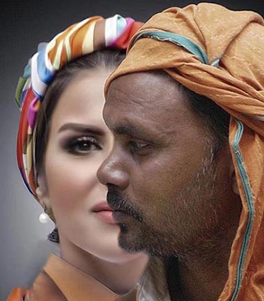
Very cool!
I can see why you kept being drawn back to this image. I really like how you have his profile turning her face into half of a face. Their expressions are excellent.
I love the colors. They suggest the passions of the characters.
For me, this image is all about their faces, and I would consider cropping accordingly. |
May 2nd |
 |
5 comments - 6 replies for Group 54
|
| 61 |
May 18 |
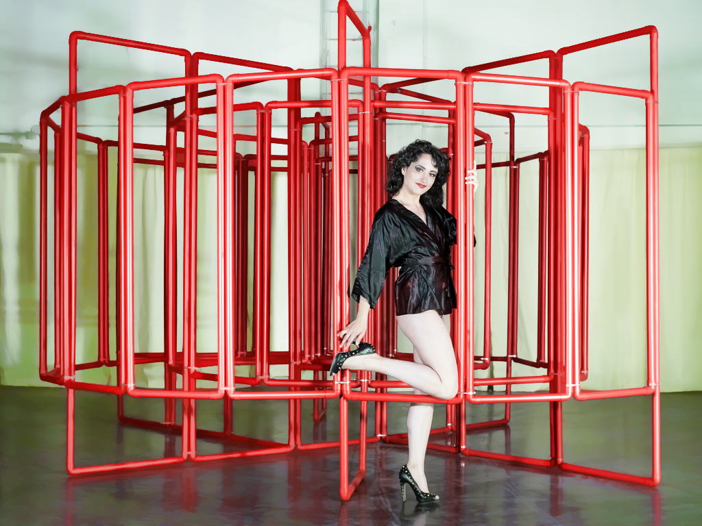
Comment |
What a fabulous model! She has a bit of a vintage look, especially with that great pose.
I know this is a portrait group, and agree with the others' comments about how to make it more of a portrait, but I really do think your composition is an interesting image. I think her playful pose is great in context.
Personally, I would simplify the lighting in post. |
May 24th |
 |
| 61 |
May 18 |
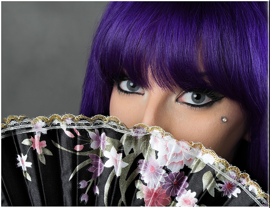
Comment |
Love the hair, and of course the eyes.
Great pose and lighting.
Personally, I would consider just a bit tighter crop. |
May 24th |
 |
| 61 |
May 18 |
Comment |
Brilliant, Leo!
As soon as I saw her, I did think "Mona Lisa". What a fabulous expression.
Very clever and subtle of you to title it simply "Lisa".
Beautiful lighting. Excellent job matching the white balance and colors of the background.
For me, the distinctness of the model vs the background is not a problem in this image, because that is also true of the Mona Lisa. But as a technique for dealing with subjects from difficult backgrounds, I have found that after cloning around the outline that brushing with the blur tool can integrate the subject better.
|
May 24th |
| 61 |
May 18 |
Reply |
I love this one |
May 24th |
| 61 |
May 18 |
Comment |
A very striking image!
Wonderful detail, and such an interesting model. I think her profile and expression really bring out the body art while keeping her human in a personal way.
I really like how close you have cropped. The background works well too.
The only thing that bothers me a bit is the placement of her earring. It was actually the first thing that caught my eye, and just felt a bit off-balance. I might consider just tilting the composition a tad. |
May 24th |
 |
4 comments - 1 reply for Group 61
|
9 comments - 7 replies Total
|


