|
| Group |
Round |
C/R |
Comment |
Date |
Image |
| 54 |
Mar 18 |
Comment |
Fabulous image, Alan!
Quintessential surrealism - who are these strange people and what are they doing in the same image? That certainly does disorient me, but the superb composition keeps me coming back. I really love how the composition is not quite symmetric; it adds to the surrealism, especially because it feels right because of the just off-kilter balance.
The colors are marvelous. I am so impressed with the golden light, which is enhanced so much by the shadows.
I would not change a thing!
I understand what you mean by the camera club judges. You might find some proper appreciation in a PSA competition.
|
Mar 16th |
| 54 |
Mar 18 |
Comment |
First, Betty, I want to apologize for putting one of Phill's originals in place of yours. I was half-asleep when I posted this month's images and did not mean to do that. I'd fix it, but am afraid I would delete everyone's comments, so will just let it be.
Such a wonderful image! I always think that people tend to become the subject of an image, but have to say that marvelous dog does steal the show here. I think you really made this even more interesting by adding the water. While it is true the light direction is different, everything is so bright that I did not even notice that.
Thanks for the detailed info on how you created the frame, which I think works very well. I am going to archive that process for future use. |
Mar 16th |
| 54 |
Mar 18 |
Comment |
Masterly blending, Phill!
I really like how the visual layers bend and are at different depths and then blend. Given the title, the particle/spotting portions remind me of falling leaves.
I like how the fanned out segments of original 3 open up as my eye moves to the right.
I really like how a layer of colors is at an angle counter to the dominant left-to-right diagonal, but also enhances the vertical sides of the fanned out segments. |
Mar 16th |
| 54 |
Mar 18 |
Comment |
This made me smile, Aavo! I think you are quite young at heart.
Great composition. I like the colors, and how you have the two girls there, especially how one seems to be looking a bit inquisitively at the other.
I think I might have tried it with a bit more of the girls showing, with a soft fade-out like you did on his elbow. |
Mar 16th |
4 comments - 0 replies for Group 54
|
| 61 |
Mar 18 |
Comment |
You can create a brightness layer from the pull down menu at the top : Layer=> New Adjustment Layer => Brightness/Contrast. Click OK. Now you have a new layer. Move the slider to the right to increase brightness to about where you want it. Invert the brightness layer (CMD+I [command key and the I key at the same time] on a Mac. If you have a PC, use the Windows key instead of the command key. Now the brightness layer is filled with black. Select the brush tool by pressing the B key. Go up to the menu at the top of the screen to where it says Fill and change the number to about 15%. Make sure you have a soft round brush (use the pulldown just to the right of the brush symbol at the top of the screen to choose the brush and move the slider all the way to the left) Use your left bracket key [ to make the brush smaller or the right one ] to make it larger. Go down to the two colored squares on the tool bar and click on them so you have black in one and white in the other. You want to have white in the foreground. If it's the other way around, click on the X key and they will reverse. Click on your brightness layer to make sure it is selected, and then use your brush on the image in your window to paint on the part of the face you want brighter. Each time you move your cursor across part of the image it is like a paint stroke. Since you will be at 15%, you have to go over the same area 7 or 8 times to get the full effect of the brightness level you have set, but this allows you control to have more in some parts and less in other.
If you go too far, just switch to the black color and paint in black, which will lessen the effect of that mask.
To decrease brightness, do the same thing with an additional brightness layer, except move the brightness slider to the left.
It sounds complicated because I tried to give you a lot of details, but it's really simple. There are youtube videos that might be useful if you want to watch someone doing it.
|
Mar 20th |
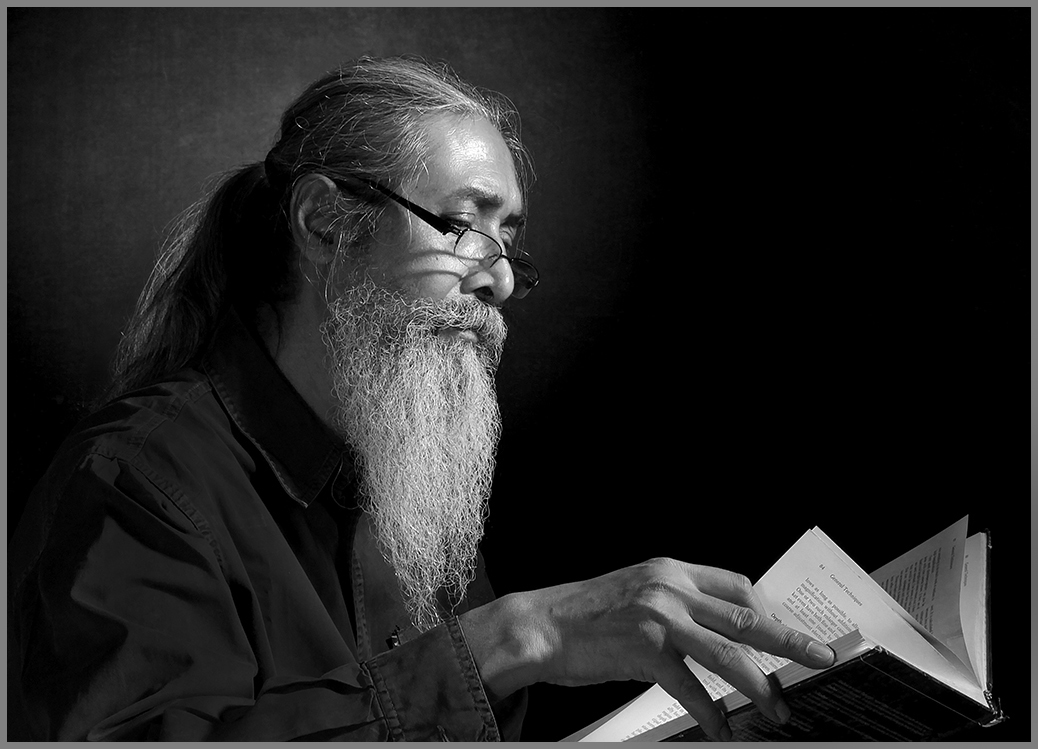
| 61 |
Mar 18 |
Comment |
Oh wow, I love this!
Wonderful subject, great composition, b&w is so beautiful here.
Really a fabulous image.
Just a tiny suggestion: I might try to brighten his face a little, and lessen brightness on the pages, because my eye keeps going to the brightest part of the image. But wow, what a wonderful image it is!
|
Mar 19th |
 |
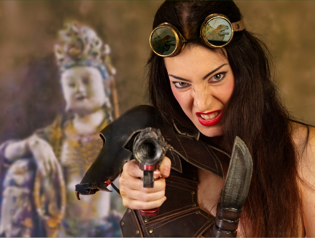
| 61 |
Mar 18 |
Comment |
Well done, Salvador! I love her pose and costume, especially the goggles. Adding the statue in the background was pure genius; it is so calm and offers the perfect contrast to the intensity of the warrior.
I really do love this image.
I like additional warmth on your warrior, but personally would have added a little less warmth. I would also consider removing the head strap and a bit of extra gear in front of the statue. |
Mar 19th |
 |
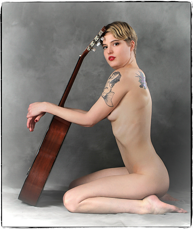
| 61 |
Mar 18 |
Comment |
Very interesting pose - I like all the triangles.
Great model. She is lovely, and the tattoo on her shoulder is really fabulous.
The light on her back washes out the hummingbird tattoo and makes it a distraction for me. Personally, I think that light might have worked better on her hair. |
Mar 19th |
 |
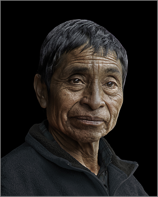
| 61 |
Mar 18 |
Comment |
Wow, this is great!
Fabulous subject, great crop and processing. I love the play of light and shadows on his face. He really stands out well against the black background.
If it were my image, I might indulge my personal preference for eyes towards the camera. I'm not sure it makes a difference here.
|
Mar 19th |
 |
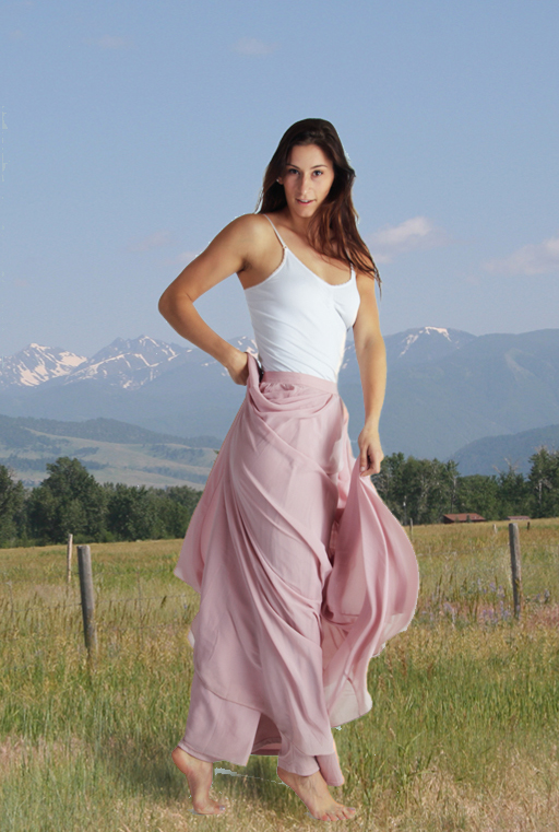
| 61 |
Mar 18 |
Comment |
Beautiful model. Love the pose, especially with the drape of the fabric around her legs. I think your lighting enhances her very nicely.
I agree with Salvador about changing the background being a good idea, but seeing a disconnect between the her and the outdoors.
I suggest that you consider the light balance. Your original looks very warm (and works well on her). The outdoors image is definitely cool. Even if your light source is daylight balanced, the walls, etc can shift the light balance. |
Mar 19th |
 |
| 61 |
Mar 18 |
Comment |
A sweet picture of a very sweet little girl! The umbrella is the perfect accessory; you can see she is intent to do everything properly. I love the placement of her hands on the umbrella's handle.
Lovely lighting.
I like the b&w version a lot, except that I think I would have cropped a bit less tightly, to give her a little more headroom.
|
Mar 17th |
7 comments - 0 replies for Group 61
|
11 comments - 0 replies Total
|


