|
| Group |
Round |
C/R |
Comment |
Date |
Image |
| 54 |
Jan 18 |
Comment |
Great title for a wonderfully fanciful image!
For me, the background works quite well; it is neutral and subtle, and the dark variations just feel like abstract shapes, effectively placed.
I think the subtle curved lines reinforce that and give a feeling of slight restraint around the flowers, which the butterflies burst through. The frame adds its own constraint, but I feel sure the butterflies will fly free.
Very nicely done, Kurt! |
Jan 17th |
| 54 |
Jan 18 |
Comment |
I love the colors and the balance. I think the flowers contrast very nicely with the bare branches and the colorful sky. The bevel/emboss of the flower layers works well, and I particularly like the cheeky fuchsia petal sticking in front. It gives the flower layers a 3D feel.
I have no suggestions, I like this just the way it is!
|
Jan 17th |
| 54 |
Jan 18 |
Comment |
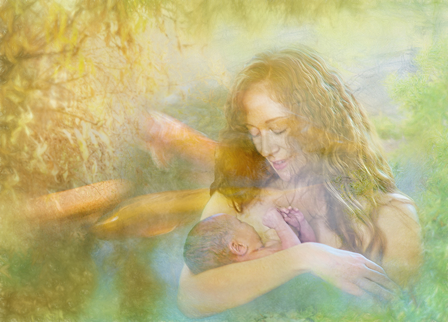
I like this very much! The dark sockets of her eyes are really in tune with that artistically dark background... it makes me think of Cinderella right after the ball, in despair with no hope of ever going to one again. The position of the shoes work for me because they suggest the wonders of a world just out of reach.
What I am particularly taken with in this image is the composition... she is so far to the right with so much negative space. For me, this really feels as if her back is against the wall, with nothing for her to face except the darkness. It is not something I would think of doing, but I find it very effective indeed. It's such a pleasure to get the opportunity to appreciate a different approach. |
Jan 17th |
| 54 |
Jan 18 |
Comment |
This is excellent, Aavo! I agree with what the others have said.
Just so you know, the image can appear to be extremely dark on a monitor which is set to lower brightness. But I expect that will not be a problem if you put it into competition as a projected image. |
Jan 17th |
| 54 |
Jan 18 |
Comment |
An earlier version had more texture. Any opinions -- should I have gone down this road instead? Are the fish too abstract? |
Jan 4th |
 |
5 comments - 0 replies for Group 54
|
| 61 |
Jan 18 |
Comment |
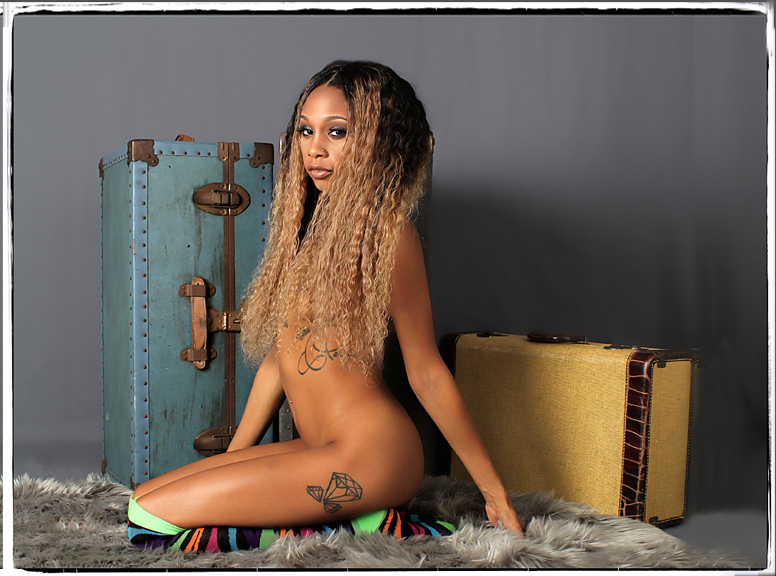
A fun image of an excellent model. Novaa is quite exceptional, with beautiful skin and hair and such interesting body art.
Great props. The lighting is perfect on her and the trunk. Perfect pose.
Personally, I'd consider giving her just a little more room to the right and top. Obviously, a personal preference. |
Jan 17th |
 |
| 61 |
Jan 18 |
Comment |
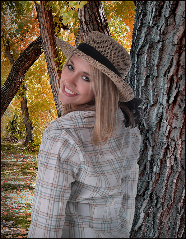
Wow, great portrait!
Wonderful connection. Her expression and hands and head position all work very well together.
The colors are marvelous. It almost feels like a sepia, and then there's that nice touch of color on her lips.
Great composition. I like how her sleeve just shows at the bottom so my eye does not wander off the bottom.
One nit: the bright spots in the background are a bit distracting. Perhaps a touch of vignette might be useful. |
Jan 17th |
| 61 |
Jan 18 |
Comment |
Lovely model, and you've added a very pretty background.
I think you did well to fill in the bright spots in the background so as not to distract from your model. The autumn leaves complement her hair and complexion.
I do a lot of compositing, and spend a lot of time making the lighting of the components match up. In this case, her far sleeve is bright while the trunk immediately behind her is not. If you want a realistic look, you might consider addressing that, and toning down those gorgeous leaves so they do not steal the show.
|
Jan 17th |
 |
| 61 |
Jan 18 |
Comment |
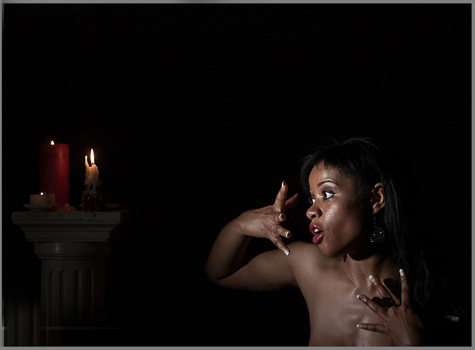
I can see how her hands really add to her expression and the interest of the image.
I love the light. You have a remarkably sharp image; I'd never have guessed a 1/15 sec shutter speed.
It's an interesting and unusual image. Great title, and the candles really add to the image.
Personally, I'd move the candles in a bit. |
Jan 17th |
 |
4 comments - 0 replies for Group 61
|
9 comments - 0 replies Total
|


