|
| Group |
Round |
C/R |
Comment |
Date |
Image |
| 54 |
Dec 17 |
Comment |
Phill, not sure if you'd get the notification of my posting this when I put it as a reply to my original comment, so I'm just repeating it here.
Just to clarify, for me the pink stamen works extremely well. I think it elevates this from a soft, take-a-quick look image into one that keeps me intrigued and fascinated.
|
Dec 29th |
| 54 |
Dec 17 |
Reply |
Just to clarify, for me the pink stamen works extremely well. I think it elevates this from a soft, take-a-quick look image into one that keeps me intrigued and fascinated. |
Dec 29th |
| 54 |
Dec 17 |
Comment |
I love the feeling of this image. The textures are an excellent match for the vintage train, Great composition, particularly with the addition of the schedule. The Topaz Star effect on the light works very well.
I'm not sure how you've done it, but the train has a feeling of rushing down the track. Maybe it is that dark patch suggesting smoke coming out of the stack? Or maybe it is the dynamics of the dark vs. light patches in the background? How ever you did it, it certainly works.
My one nit is that the schedule's lines don't change opacity as they cross the front of the train. Phillipa feels the train is breaking through. I get that feeling where the line crosses the light, but feel the train is constrained where the lines are the same opacity as the background. For me, that "breaking through" feeling would be stronger if the crossing lines were just a touch lighter. |
Dec 8th |
| 54 |
Dec 17 |
Comment |
This is so lovely!
It's wonderful how it goes from dark to light, with increasing detail. The bright spot on the petal and its stamen bring my eye back from the edge of the image. It is impressive how an image with so little detail invites me to wander everywhere, and still clearly have a subject.
Masterly done, Phill! |
Dec 8th |
| 54 |
Dec 17 |
Comment |
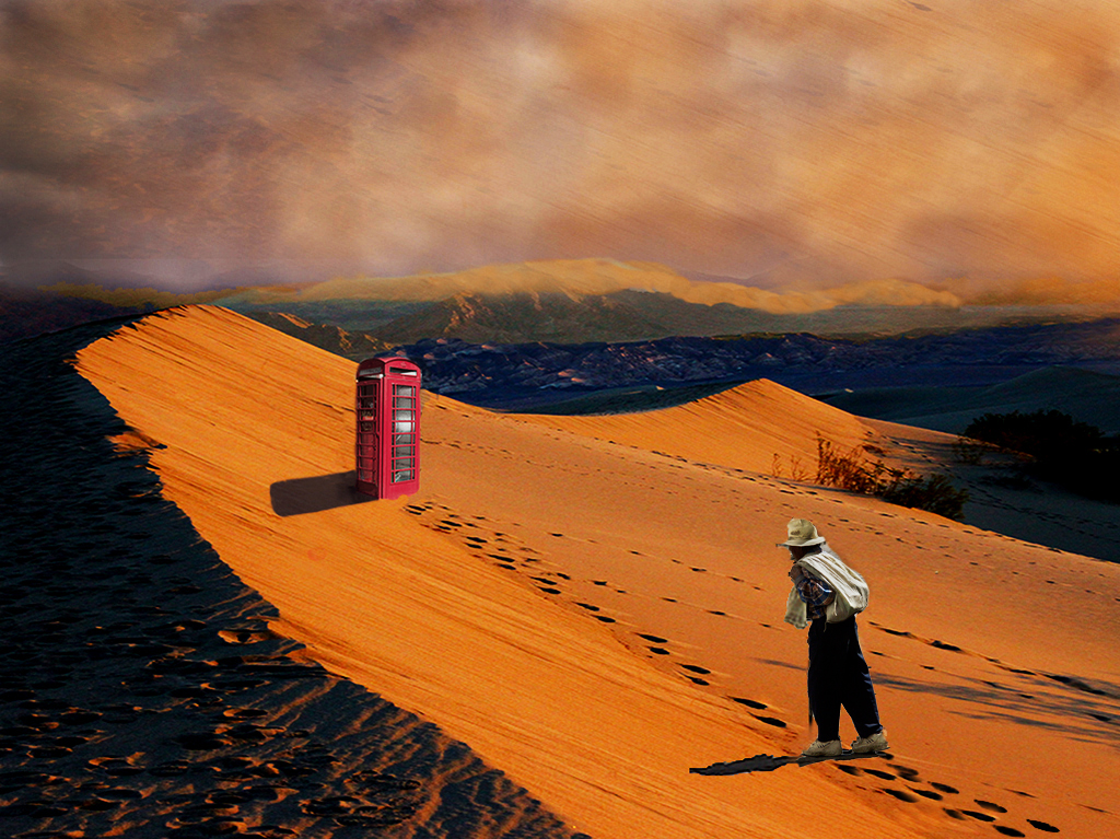
So much to like in this image! The sand dune is wonderful, and of course the phone box gives a bit of a Doctor Who vibe. I love the foot tracks up to the booth, with the sand all smoothed out behind.
The clouds add a nice mysterious feeling to the scene, and feel very natural to me.
The brightness of the phone box and the man don't seem to match the scene. Perhaps that is an artistic choice to emphasize the bizarre nature of the situation. If not, I'd consider decreasing brightness of the phone box and going with more of the original exposure of the man. And perhaps increasing contrast of the whole, though that's just a personal choice. |
Dec 6th |
 |
| 54 |
Dec 17 |
Comment |
Very charming! I love his gesture and the birds surrounding him. Although the bird flapping its wings in the original captured a nice sense of motion, I think you did well to replace him with the serene bird - it emphasizes his mastery over the birds.
He stands out well, even against that cloudy sky. The bright clouds in the gap in the buildings draws me into him.
Everything is in such soft colors except the stalls on the left and the lady seen through the crook of his arm. I like them in the image, but personally might choose to soften the colors a bit.
|
Dec 6th |
5 comments - 1 reply for Group 54
|
| 61 |
Dec 17 |
Reply |
That's a very interesting approach, Salvador. I think it is a great idea to get the model involved. And there is something special about a portrait that has a unique pose.
Thanks for explaining it to me.
Happy new year! |
Dec 31st |
| 61 |
Dec 17 |
Comment |
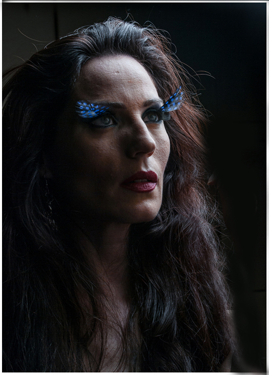
Beautiful model! Excellent angle on her face, accentuating her great cheekbones.
I really like the butterfly eyelashes and the way the light catches them.
I like her expression. I don't understand why she is playing with her hair when she has such an intense expression. I would consider removing her hand. |
Dec 29th |
 |
| 61 |
Dec 17 |
Comment |
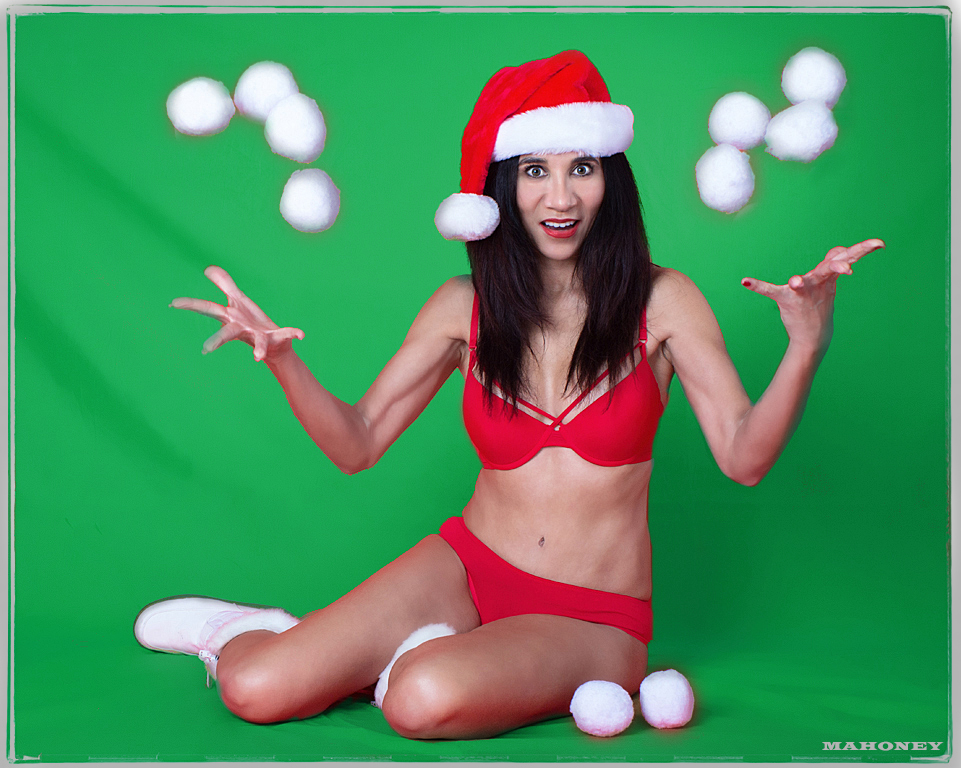
Very fun!
DeDe has great expression and must be in great shape to hold that pose. I love the costume.
I like the balls on the ground and how the ball on her hat matches the ones in the air.
Great job making her stand out from the background even with everything red. It might be interesting going with a contrasting background next time.
|
Dec 29th |
 |
| 61 |
Dec 17 |
Reply |
I actually have several versions of this pose with various crops, and I do like the alternate crops suggested.
I had not thought of the starry vignette. It's an interesting thought.
I am looking forward to seeing your photos of your daughter and grandson! |
Dec 29th |
| 61 |
Dec 17 |
Comment |
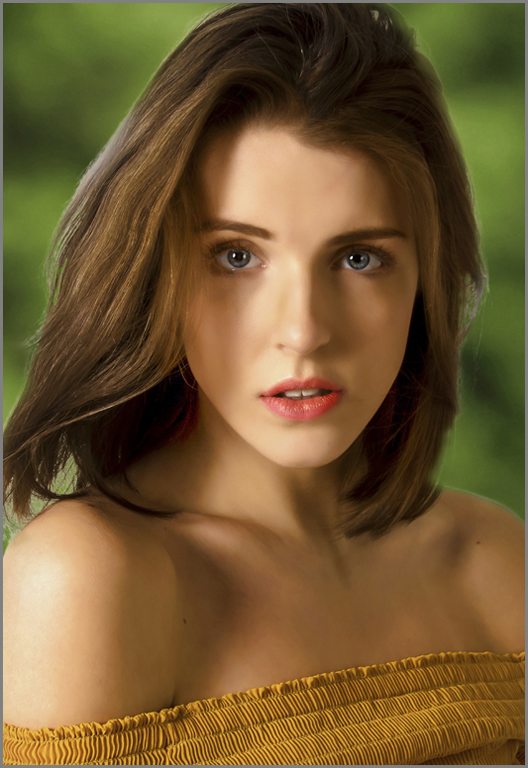
Great pose and expression. I like the angle of her top across the bottom of the frame - it's interesting but not distraction.
Her hair is really great. It would be interesting to see the light per Jim's suggestion.
Between skin smoothing and added contrast, her skin looks rather plastic to me. However, I put that solidly in the individual preference category, because I know that my preferences on this are often different than competition judges'.
I like both the b&w and the color. I'd just consider desaturating and darkening the green background a bit. |
Dec 29th |
 |
| 61 |
Dec 17 |
Comment |
I love this shot, and I'm sure the family does as well.
I agree it's not a portrait, but it is a helpful reminder that during a portrait shoot there are unplanned moments that offer the opportunity to capture a great shot.
Excellent control of the flash. Do you you have any hints to pass on? |
Dec 29th |
4 comments - 2 replies for Group 61
|
9 comments - 3 replies Total
|


