|
| Group |
Round |
C/R |
Comment |
Date |
Image |
| 54 |
Nov 17 |
Comment |
Wonderful composition and colors. You have integrated all the components beautifully.
I love the way the textures work with the background. I might have used a bit less texture on the top of the stack if it was my image, but I see you have a very cohesive image, so I applaud your choices.
Excellent choice of objects for your still life.
Great lighting.
I personally would like to see a little less glare on the title of the bottom book.
|
Nov 19th |
| 54 |
Nov 17 |
Comment |
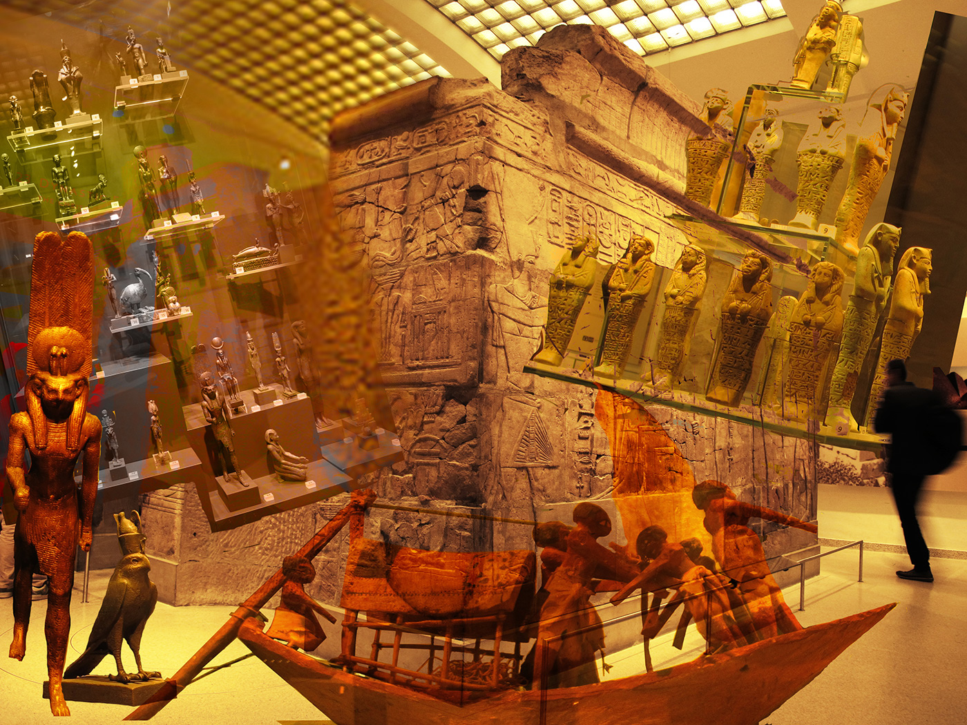
Personally, I really like this image. It is the way I feel when I walk into a new exhibit in a museum -- so many things to look at, all calling to me.
I like the splashes of color and the balance of the statues on either side. I also like the way you balanced the blurred photographer on the right with the statue on the left. The figures in the boat tie them together nicely.
My one suggestion is to soften the hard edge of the statue case on the left. |
Nov 19th |
 |
| 54 |
Nov 17 |
Comment |
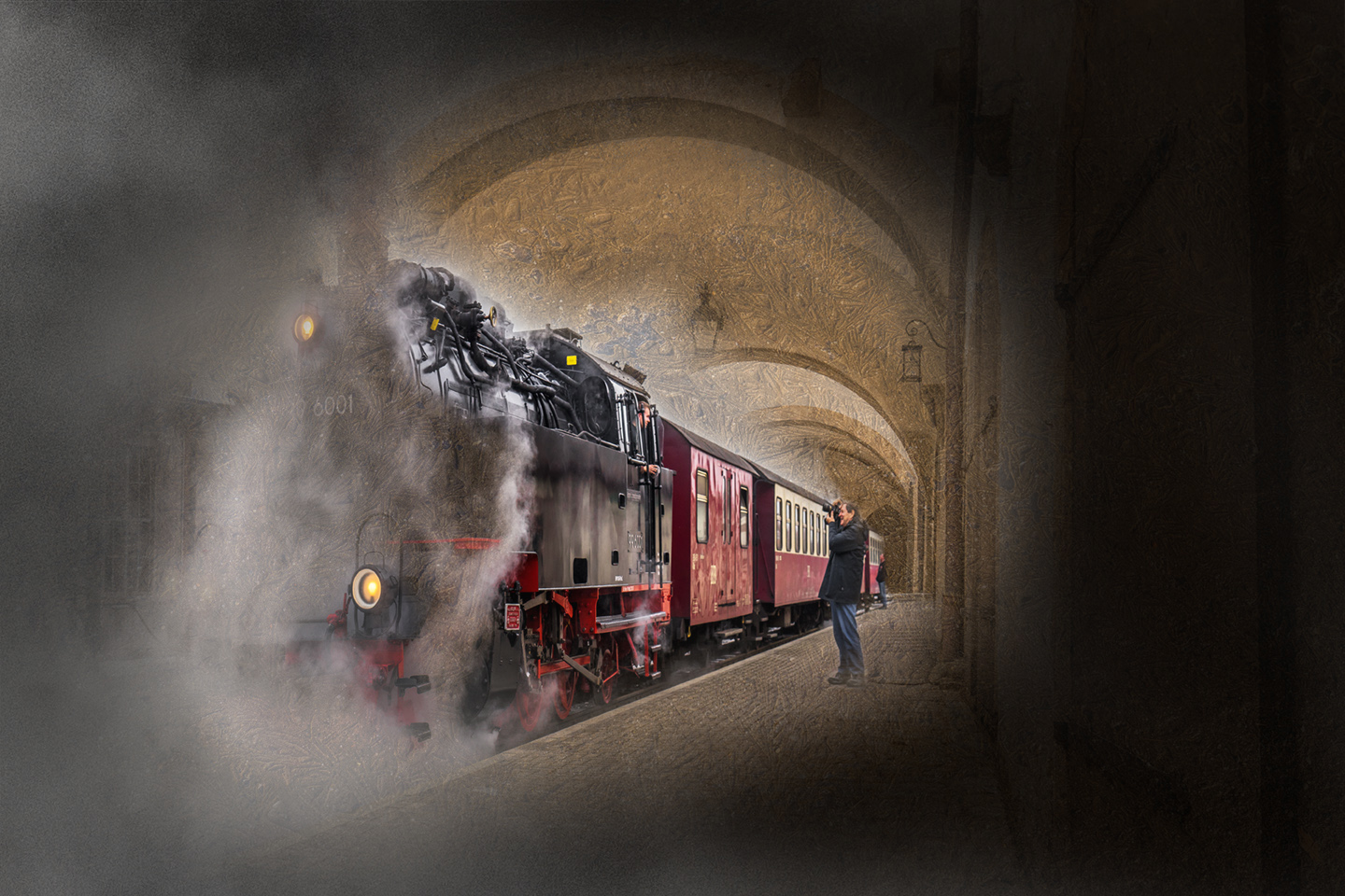
Beautifully done! So much drama, all integrated seamlessly.
I think Robert adds a lot to the composition exactly where you have him - I like the way he puts the train into perspective, and his excitement is infectious.
The one thing from the original train image I miss is more of that wonderful plume of steam in front. I masked in a bit from a picture of a cloud. It does change the tone of the image, maybe not what you had in mind.
|
Nov 19th |
 |
| 54 |
Nov 17 |
Comment |
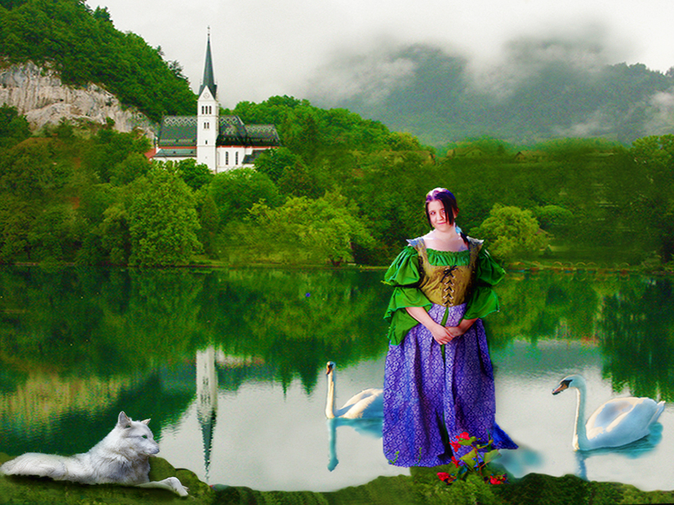
Personally, I like the way she is floating above the water; it suits the mystical title.
I really like your composition. The swans and wolf form a great foreground, especially with the light oblong of water. The greenery and reflection make a very pleasing background, giving a lot of depth to the image.
The mystique of the lady of the lake suggests a fairy tale to me. I might consider a filter to give a bit of a painterly impression
|
Nov 19th |
 |
| 54 |
Nov 17 |
Reply |
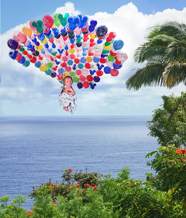
I originally was going to use more of the background but was afraid I would have to make the baby too small to keep him in perspective. But I tried it, and think it actually works better than my original. Thanks, Betty! |
Nov 19th |
 |
| 54 |
Nov 17 |
Reply |
Ha ha ha! And that suggests a title : "When the Stork Goes on Strike" |
Nov 19th |
| 54 |
Nov 17 |
Reply |
Thanks for the great suggestion and clear instructions on how to implement it!
I usually use Topaz Restyle to do something similar but could not find a filter I liked there. I had heard about the color lookup but never used it. Yes, it definitely helps. Thanks, Kurt! |
Nov 19th |
4 comments - 3 replies for Group 54
|
| 61 |
Nov 17 |
Reply |
Thanks so much, Dave! |
Nov 19th |
| 61 |
Nov 17 |
Comment |
Great image! I love the closeup. What a wonderful smile! And lots of connection with the camera. The hat and the pose make the most of her pretty face and great hair. I really like your lighting.
Nice choice on the frame; I think it adds to the image.
I really like your processing. There is that one area in the background lower left corner that seems to have texture added, which I find distracting. I would not change anything else.
|
Nov 19th |
| 61 |
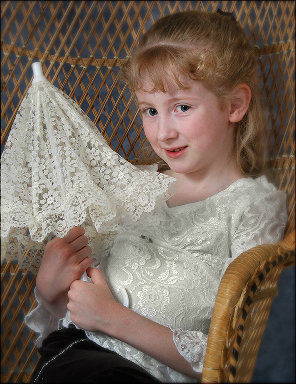
Nov 17 |
Comment |
A very sweet girl! Such a beautiful complexion and engaging expression.
I like the way you have apparently caught her as she starts to open the umbrella; it lends a spontaneous feeling to the image.
The details on the lace of the umbrella is a great echo of the lace on her blouse.
Personally, I'd bring down the edges a bit by duplicating the layer and blurring it, and masking her out. You also might consider softening the white of her blouse to more closely coordinate with the umbrella. |
Nov 19th |
 |
| 61 |
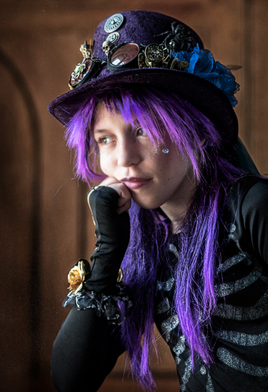
Nov 17 |
Comment |
Such a fun subject! Beautifully executed. Great light, perfect background, great pose. Wonderful colors. Love the purple. So many interesting details in that fabulous outfit.
I originally thought that having her look at the camera would be better, but I see that your original actually has that. Excellent job of changing her eyes! I think it's a much better choice, especially with Dave's crop, which I like very much.
Personally, I would consider adding a vignette, to match her pensive pose, and perhaps even a bit of a grunge filter, mostly masked out over her face. But that's just me. |
Nov 19th |
 |
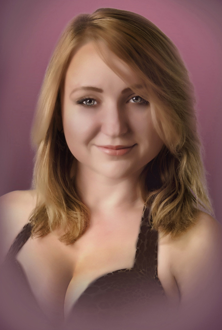
| 61 |
Nov 17 |
Comment |
Great expression. I like the soft focus while keeping her eyes sharp; it goes well with her expression. What a promising smile! Totally appropriate with the bikini top. Nice job turning it a solid color.
I like the background. It's a happy color, and goes very nicely with her hair.
I agree with Jim about a bit of a crop. Personally, I would add a layer in soft light and paint in some shadows and highlights (black and white in low opacity) to make her face a bit less flat.
|
Nov 19th |
 |
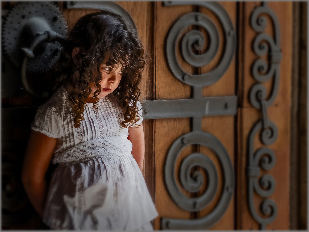
| 61 |
Nov 17 |
Comment |
This is lovely, Salvadore!
I love the light on her face, and her expression. Wonderful composition. Fabulous background. I love the details of her s and the door behind her head and the lace on her dress.
You've lost just a little bit of detail in the brightest part of her dress anyway, so personally I would consider duplicating a layer, blurring it, and masking out her face and behind her head. |
Nov 19th |
 |
5 comments - 1 reply for Group 61
|
9 comments - 4 replies Total
|


