|
| Group |
Round |
C/R |
Comment |
Date |
Image |
| 54 |
Aug 17 |
Reply |
Interesting observation about the saturation, Phillipa! I could not figure out why the colorful balls fit so well into the image, with all the browns and muted whites, but I see it now. Thanks for the insight.
And well done, Betty, for envisioning how well it would all work together! |
Aug 12th |
| 54 |
Aug 17 |
Comment |
I like this image so much, I keep thinking about it.
I feel that it is not just a portrait, but a celebration of the land. Your textures, especially in the sky, really elevate it into art.
Like Kurt's image, yours would work well in more than one incarnation. A bit of a crop could give you a second version with a classic portrait feel, if that appealed to you. Though I admit that if it was my image, it is your full size version I would hang on the wall.
|
Aug 12th |
 |
| 54 |
Aug 17 |
Comment |
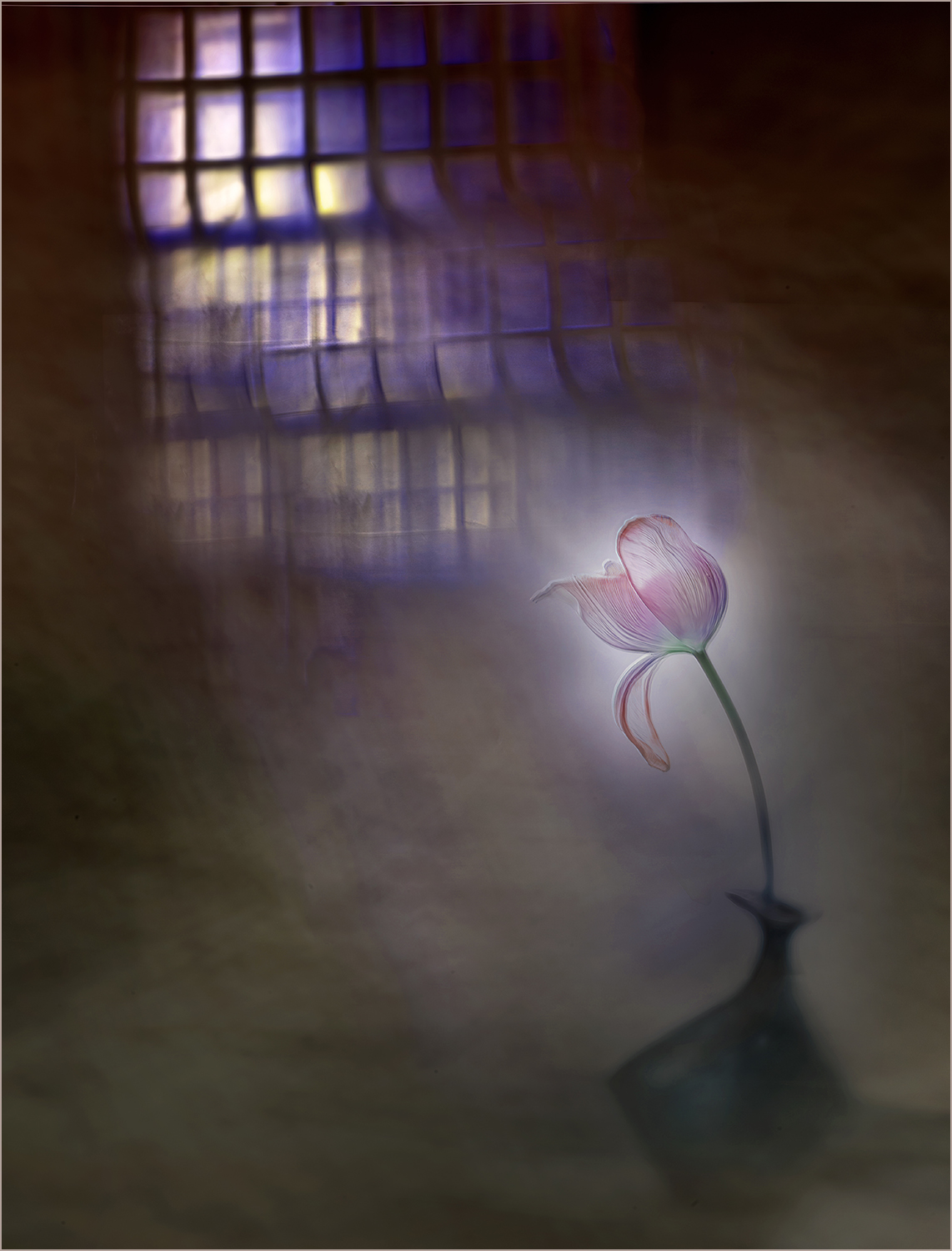
Wonderful subject, and a great choice for the processing you did.
I do really love the detail on your original; this is one of those images that could enjoy several incarnations.
Great colors, which get so soft and muted.
When I first saw the grid in the lower left corner, I thought it was giving the effect of the canvas showing through. Then saw it elsewhere. I've never noticed the use of a grid like that before, and at first was a tad uncomfortable with it, but after a little thought realized it works very well. Very interesting technique!
This feels more impressionistic than surreal to me, but the angle of the flower is slightly sinister and looming, so perhaps that suggests surrealism.
Personally, I would consider a more cheerful tilt, and brighten up the colors a bit. Of course, that would be a different image with a different feel. I think your version works very well indeed.
|
Aug 12th |
 |
| 54 |
Aug 17 |
Comment |
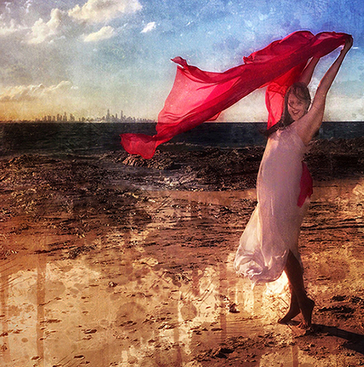
Such a lovely capture of your pregnant granddaughter!
Your wait was definitely worthwhile. I love her pose and the lighting and the setting. That red scarf floating in the breeze is wonderful.
I really like the colors in your final image, and how you lightened up the shadows on your granddaughter.
I like the texture in the sky very much.
I'm not as much a fan of the drips added to the sand; personally, they distract me from the rest of this wonderful image.
|
Aug 1st |
| 54 |
Aug 17 |
Comment |
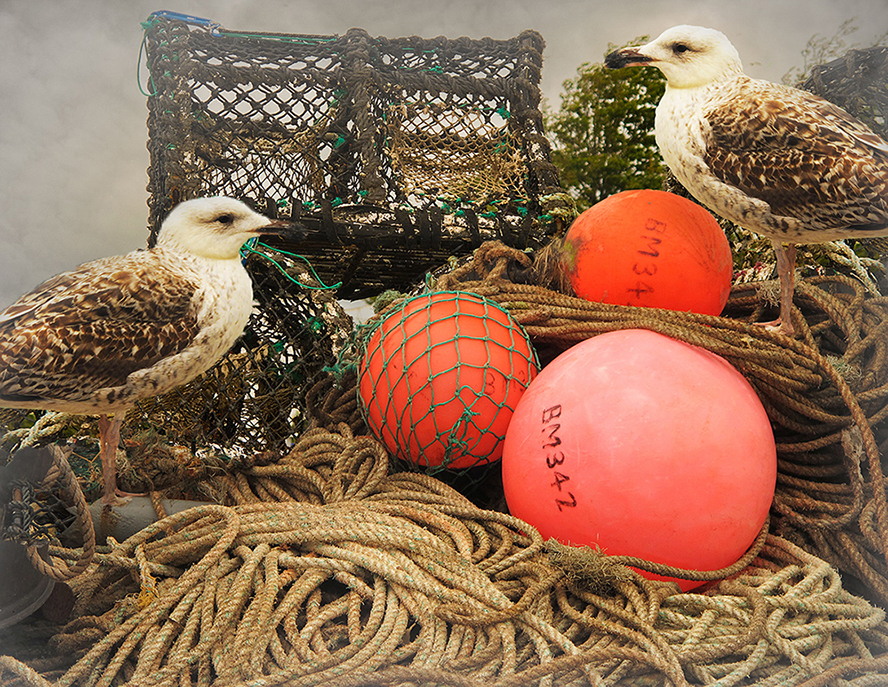
Beautifully executed!
This image looks so well integrated that most people would believe it was a single in-camera shot.
I love the textures of the rope and the traps. The sky is a nice addition,
It looks as if there is mist creeping in over the traps, which does give that cold and misty feeling.
Between the colorful floats and the bright head of the seagull, the image feels just a little heavy on the right to me. It might be interesting to add something on the left to balance it. |
Aug 1st |
 |
| 54 |
Aug 17 |
Comment |
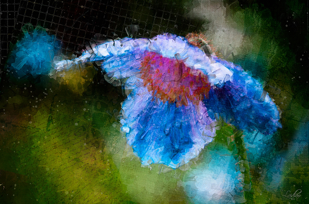
Very whimsical!
This image reminds me of the work of an artist whose paintings I've seen in museums (sorry, I've got a terrible memory for names, so cannot tell you who it is).
I like your composition.
I probably would have cloned out the little flags but I find that they add another layer of mystery, and like them very much. Good call leaving them in!
I think your Hide and Seek Festival is quite amusing.
The light is very orange on some of the ladies. I think your white balance was different between the natural light of the woods and the studio light in the model shoot (except for original 2, which either had daylight balanced lights, or some sort of correction.) I'm trying to say I think the image might work better if all components have a similar white balance. |
Aug 1st |
5 comments - 1 reply for Group 54
|
| 61 |
Aug 17 |
Reply |
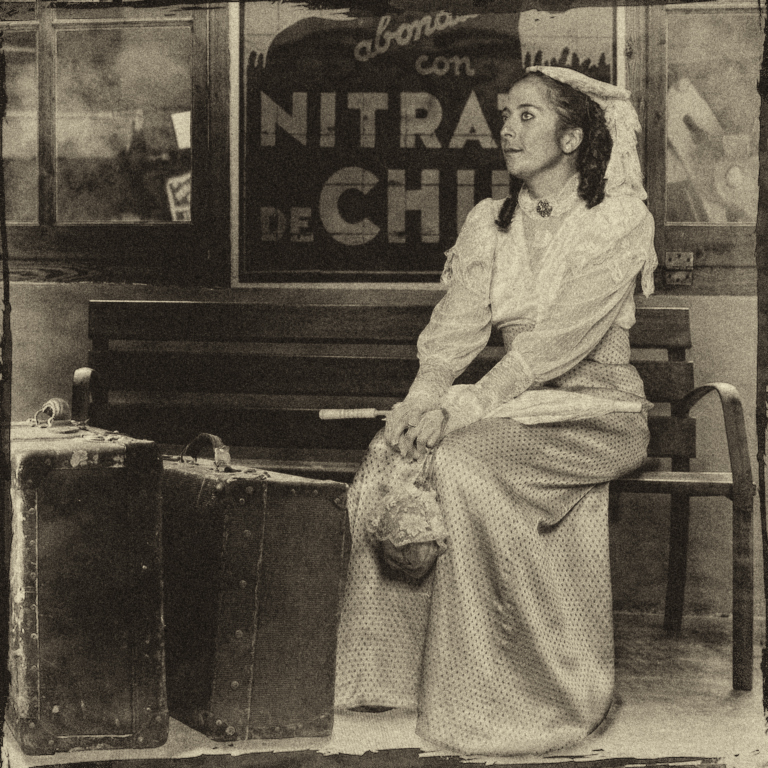
Nice touch, then, with her having no shoes. |
Aug 20th |
| 61 |
Aug 17 |
Comment |
Very well done!
Great light and pose. She really does look as if she is waiting patiently for a train, thinking about what she will do when she arrives.
Flawless incorporation of the suitcases and background. It feels as if it was all the same image from the start. I think they add a lot to the story.
My only suggestion is that a vintage processing look, like sepia in the Nik software, might give that last touch of realism. |
Aug 19th |
 |
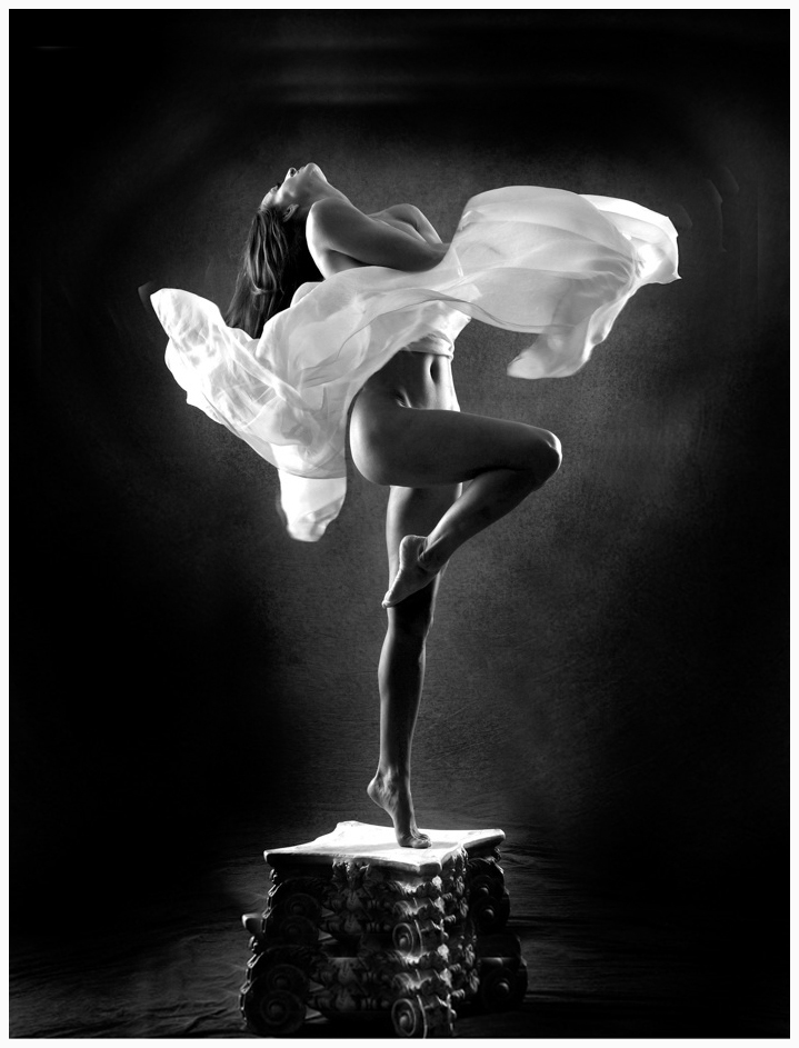
| 61 |
Aug 17 |
Comment |
Wow! Wonderful!
I love the light and the pose. Beautiful job on the blending of the photos; the fabric looks perfect.
B&W looks great.
I think your burning in of the sides is just right.
Fabulous image!
My only suggestion is that the crop feels a bit close at the top. I would consider giving her a little more room. |
Aug 19th |
 |
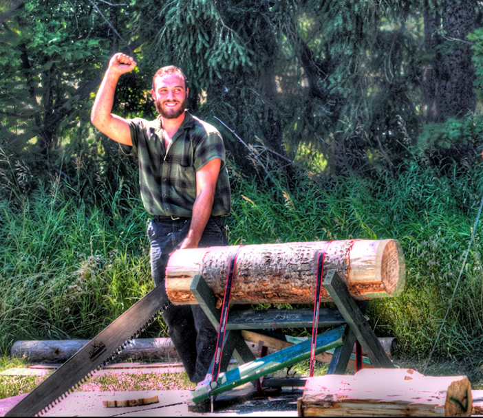
| 61 |
Aug 17 |
Comment |
Perfect timing on the shot! I really like the lumberjack's smile and gesture. Nice leading line with that huge saw.
I like how your processing brought out the color and life to the scene.
I get a real feeling of the lumberjack's triumph here. Very nice!
Because of the distance between the two men, it almost feels like 2 images, so I would personally crop accordingly, and perhaps dampen some of the background bright spots.
|
Aug 19th |
 |
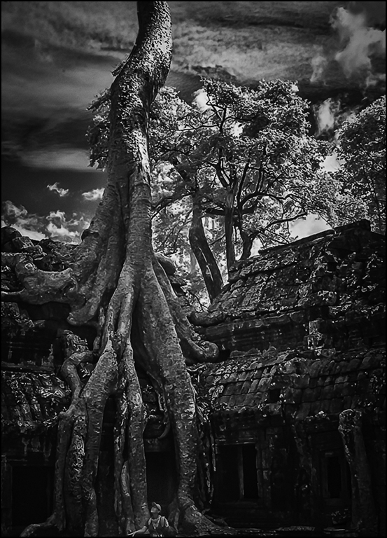
| 61 |
Aug 17 |
Comment |
Very cool! What an amazing place!
The man in the image really adds to the impact of that encroaching tree. It feels as if it goes up forever, like the beanstalk in Jack and the Beanstalk.
B&W works very well here.
This image feels almost like a woodcut, and I think it works well.
I tried lightening up the shadows and burning down the highlights, and got more detail, but I really prefer the unusual starkness of your version. It matches the awe of the subject.
I might consider lightening the man a bit, because I did not notice him at first. |
Aug 19th |
 |
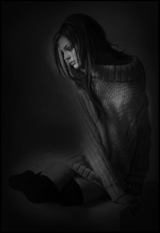
| 61 |
Aug 17 |
Comment |
Wonderful pose in beautiful light. Lovely model. I love her hair and the sweater is fabulous -- all that texture and drape. Perfect!
I like the boots, though she might appear more vulnerable without them.
Placement of her hand across the front is genius.
Given the title and your comment, a shot from further back, with more space around her and more of the block she is on would have given more of a sense of isolation.
Alternatively, I would go very dark. |
Aug 19th |
 |
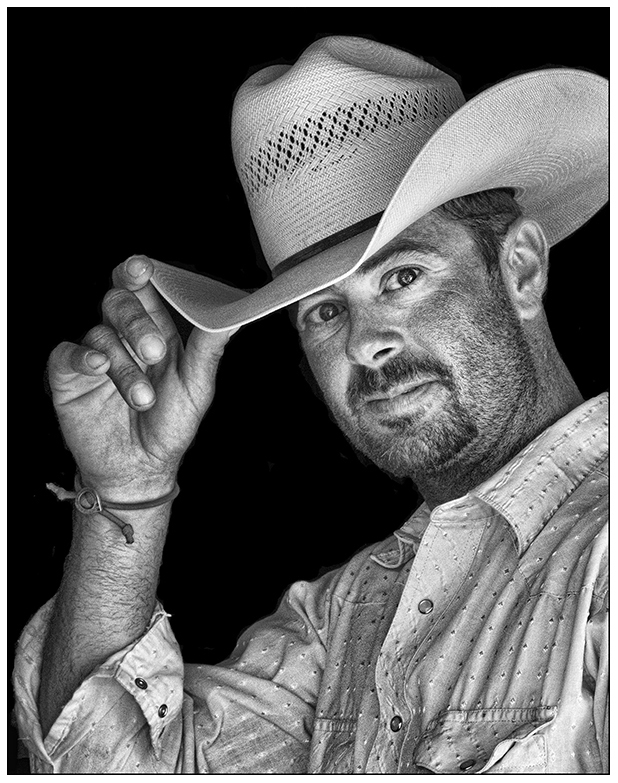
| 61 |
Aug 17 |
Comment |
Love the crop! The positions of his arm and fingers really make the composition.
Great processing. Wonderful detail in his shirt, hat, and face. I like the plain black background.
Really a great portrait.
Personally, I'd bring down brightness a bit of all but his face, and increase exposure on his face just a tad more. |
Aug 19th |
 |
6 comments - 1 reply for Group 61
|
11 comments - 2 replies Total
|