|
| Group |
Round |
C/R |
Comment |
Date |
Image |
| 54 |
Jul 17 |
Reply |
It is acceptable to use stock textures in the images for this group. I think Phillipa meant that her images are constructed only using her own textures.
I am constantly collecting images that I might use someday as a texture or background, and I use those most of the time. But I think it would be unfortunate to compromise my vision for an image just because I don't have the right component in my library and can't make one, but I know one is readily available. So it's in my comfort level to use stock textures on occasion, and even a background when I just can't supply what I need on my own.
I've got to say, Phillipa, it's very clear that your images are never a compromise, so it's certainly possible to create wonderful images using only one's own images. I am just trying to explain why our group can accommodate different thresholds on that particular choice. |
Jul 18th |
| 54 |
Jul 17 |
Reply |
I made the exposure more consistent by using an exposure layer with a higher exposure and clipping it to the selection of my model, and brushing in a more even exposure. As I went on in the processing, I found I had made it too even, and so had to back off some of it down by her feet.
You are quite correct about the haloing. I did notice that, but decided to leave it in because there is a strong backlight in the finished image. Maybe I should have made the halo the color of the background light. Good catch! |
Jul 18th |
| 54 |
Jul 17 |
Comment |
This image is really beautiful. You have transformed a good picture of a bird into art.
Great composition. I love the shadow of the branch and the textures. The soft colors are lovely and keep the attention on the heron.
I don't have any suggestions; I would not change a thing.
Not that it matters to the image, but what do the Chinese characters say?
|
Jul 8th |
| 54 |
Jul 17 |
Comment |
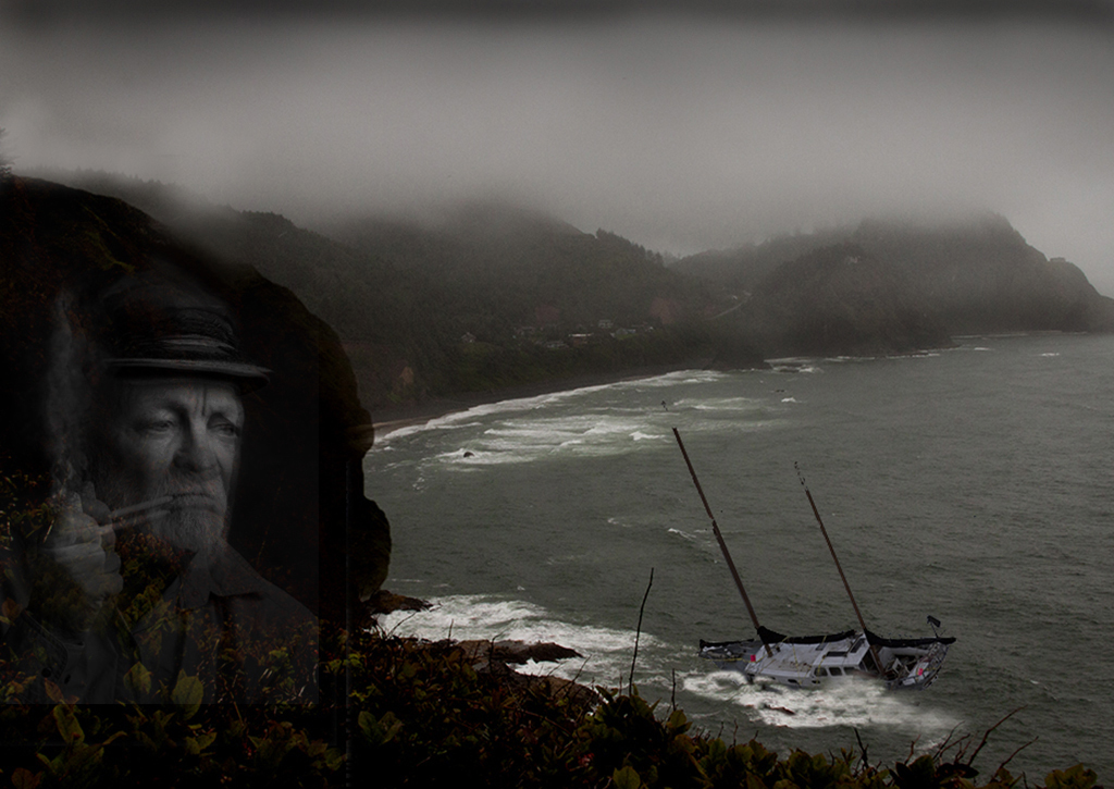
You have captured that eerie, mysterious mood very well.
I really like how the waves by the boat give that washed-up on the shore feeling.
Great composition. And wonderful portrait of the captain.
I like how everything is de-saturated; the hint of color works really well here. There are two spots of red on the boat that are a little distracting.
The captain is too dark for my eye, at least on my monitor. I tried an additional layer of him, lowered opacity in screen mode. See what you think. |
Jul 6th |
 |
| 54 |
Jul 17 |
Comment |
Marvelous pears and blossoms! I love the dappled sunlight. Having the pears and blossoms exceed the frame gives a very nice 3D effect, as does the depth of field. I think the way the blossoms creep out of the frame on top looks especially natural.
Great composition. I like how the pears and blossoms have center stage.
I like Phillipa's suggestion; the clock would keep that same balance as well as be in sync with the depth of field.
|
Jul 6th |
| 54 |
Jul 17 |
Comment |
Very stern and beautiful!
I am particularly fascinated by the layers and transitions on the left side of the image. I love your use of red; it suggests flames, especially given the title. The geometric shapes seem to entrap her. Her expression suggests that she has been enduring this for an eternity.
I'd love to know what your original 1 image was a picture of. And Original 2 - is that a picture of something, or did you create it digitally?
At first I thought that your image would be more interesting if the cone shapes were softened, but I tried it in Photoshop and found that instead the power of the image was diminished. So I endorse your vision!
Personally, I might consider cropping a tad off the left and darkening that back ellipse just a tad, but that is just my taste. I really love your image as it is.
|
Jul 3rd |
4 comments - 2 replies for Group 54
|
| 61 |
Jul 17 |
Reply |
I take it you are not a Star Wars fan.
My model's character is Padme, a major Star Wars character. My intent was to portray her as if capturing a moment during a dual. Her weapon is a light saber, an energy beam wielded like a sword. |
Jul 23rd |
| 61 |
Jul 17 |
Reply |
I love the starship idea! Hmmm, where to find one? I like to use my own backgrounds, so I will have to think of what I can find and then convert to suggest one. Great idea! |
Jul 18th |
| 61 |
Jul 17 |
Comment |
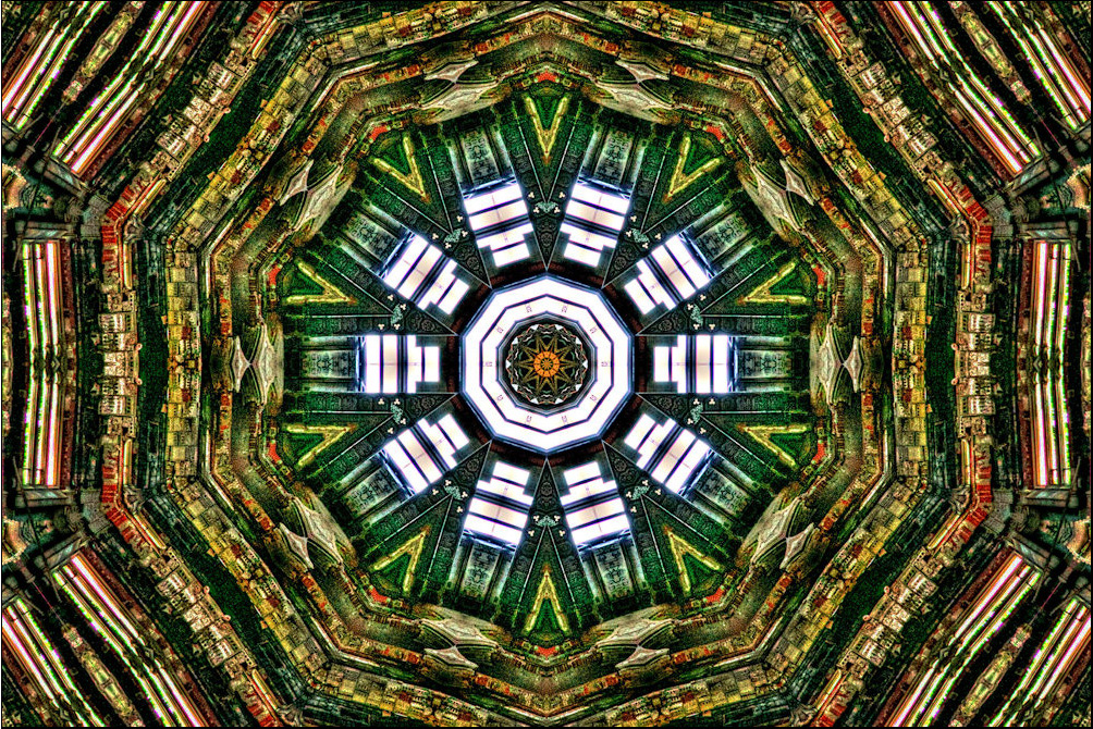
Very interesting! I too thought of a stained glass window.
You have such interesting detail in those fascinating symmetric rings.
The original looks rather HDR to me, with increased saturation and a constrained tonal range, which I think makes this conversion work well. I'll have to keep that in mind if I try your technique in the future.
The brighter ring of lines near the edges is a little distracting to my eye; personally, I'd consider decreasing their brightness. |
Jul 18th |
 |
| 61 |
Jul 17 |
Comment |
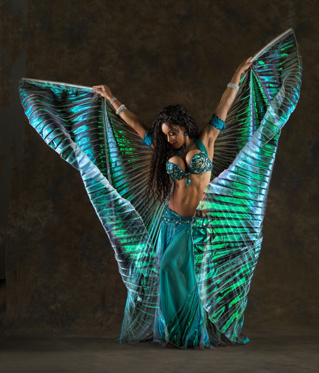
Oh, I love it! She looks like a butterfly.
Great light, wonderful pose. Love the colors.
Very, very nice!
I would consider bringing down the exposure of the strip of light in the foreground, and backing off on the highlights on her forehead and just a bit on the left side of the image.
|
Jul 18th |
 |
| 61 |
Jul 17 |
Comment |
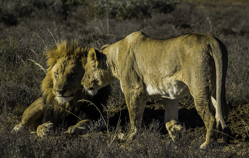
I really like how the lions stand out from the vegetation, with such a nice golden glow. You've captured a rather sweet moment here with such powerful animals.
Great composition; I like having that amount of space around them.
You might consider adding a bit of a vignette. |
Jul 18th |
 |
| 61 |
Jul 17 |
Comment |
I agree, the lighting is beautiful. Such great texture on his face and beard! I like the way his hat fades into the background.
I love the b&w. Great processing.
I am a big fan of a tight crop, but personally would have included a bit more of the left of the image, to get more of his strumming hand and balance the placement of his face a little. |
Jul 18th |
| 61 |
Jul 17 |
Comment |
Great capture!
OK, I'm going against the tide here, but I like #4. It really puts the emphasis on his expression. Did you change his eyes in that version? He seems to be looking ahead in #4, but looking more downwards in the others. In any case, the shadowing and his eyes give me a real sensation of determination and speed in #4.
I personally like the glow; it makes me feel you have added a positive and even heroic attribute to him. That said, I have to warn you that I tend to be more sentimental and fond of extremes than most people, so my view may well not be shared by judges.
In short, I love #4.
Versions #2 and 3 do not have a feeling of speed for me; the close crop gives me a feeling that he is confined and even that his leaning forward is a discouraged slump. My impression that his eyes are down rather than forward adds to that. I would include more of the background if using one of these, and possibly add a little motion blur at his back.
|
Jul 18th |
5 comments - 2 replies for Group 61
|
9 comments - 4 replies Total
|


