|
| Group |
Round |
C/R |
Comment |
Date |
Image |
| 54 |
May 17 |
Comment |
My apologies for the lateness of my comment here; just too much going on at home this month.
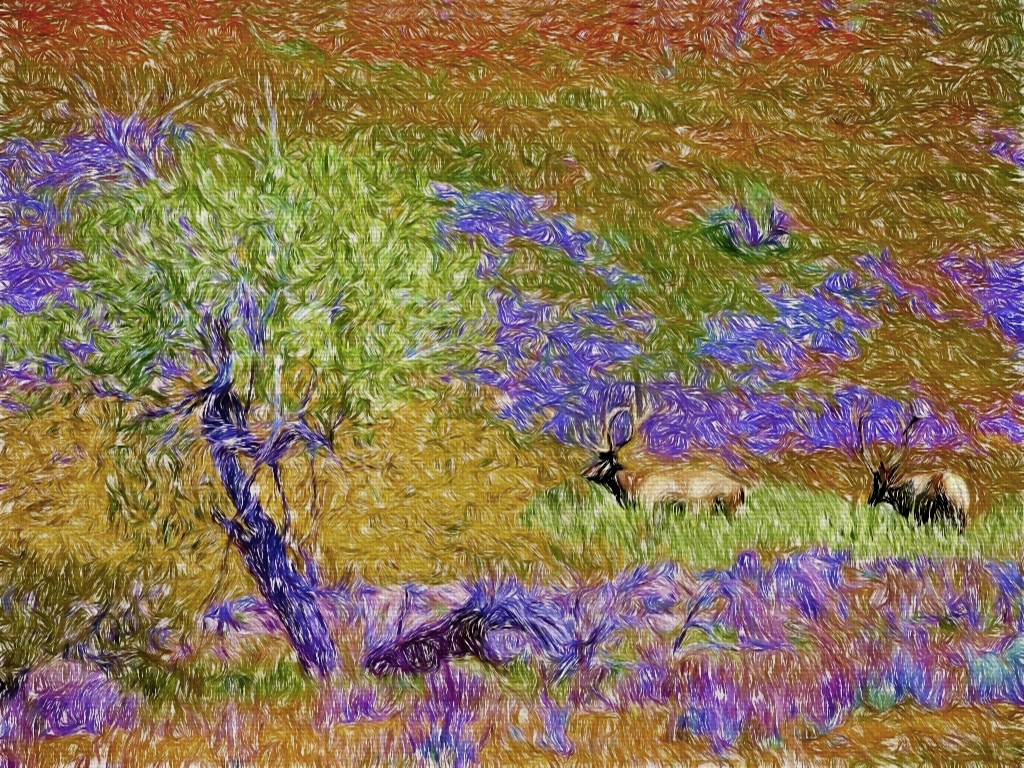
I really love this image. The brush strokes add a lot of excitement and interest and emphasize your textures. The elk are a great addition, both in interest and composition. You have just enough detail on them to make them stand out and make them readily identifiable.
It can sometimes be useful to mask in this kind of filter, or vary the brightness a bit so the eye doesn't get overwhelmed. I tried that here with brightening up the greens and the elk.
|
May 28th |
 |
| 54 |
May 17 |
Comment |
What a great idea! I never thought of that, but I do think it would help tie the image together.
I like it |
May 4th |
 |
| 54 |
May 17 |
Comment |
Very well done!
You know this is creeping me out a little, right? Surreal images always do that to me, even my own. I think that's the point.
You have the perfect base image for this. She is smiling, but has her chin pointed down so that opening up her head seems natural. Her eyes are relaxed and happy as the top of her head tilts back, as if to say, "Yes, we do this all the time".
The gummy bears are so cheery and colorful, it adds to the surrealism.
You did a great job with the selection and masking.
One tiny little nit of a suggestion: there's just a bit of yellow gummy bear sticking up over her cheek. You might want to remove that.
|
May 4th |
| 54 |
May 17 |
Comment |
So very interesting, Betty! And a great improvement over the original with the huge tubing.
I love the colors and the exposure. The bit of bright sunlight in the background makes it feel like it's right there in the jungle. I think you struck just the right balance in improving the background.
Beautiful job of selections and masking!
|
May 4th |
| 54 |
May 17 |
Comment |
This is really a lovely image. It is soft and suggest a contemplative moment. You have created that peaceful feeling at sunset of seeing birds flying.
I like how the colors and the grasses frame the birds.
It is great to see the originals that you started with, because they are so very different from the finished image.
I love this image just as it is and so have no suggestions for changes. I did try flipping it horizontally, and that gives a very different look, but I like this better the way you have it. Well done! |
May 4th |
5 comments - 0 replies for Group 54
|
| 61 |
May 17 |
Comment |
Excellent timing on your shot! I like your DOF and the B&W. I like how it captures the dramatic flair of the horse vs. the calm, controlled man behind him.
I think de-emphasizing the audience is a good idea. Still, I would personally like to see a little more of the audience ; to me, it reinforces the interest of the performance. I'd also consider decreasing the brightness of the stadium stair rails. |
May 28th |
 |
| 61 |
May 17 |
Comment |
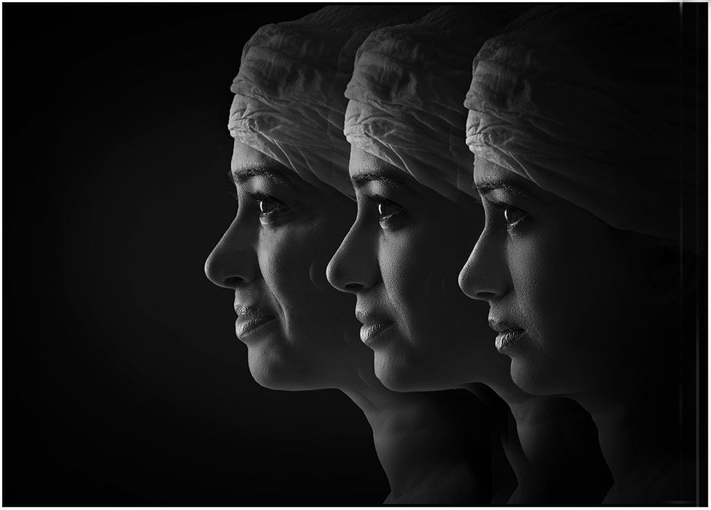
Very interesting! I think it works very well. It is especially effective because you converted to b&w.
I love your lighting.
Personally, I like the orientation you have. My eye moves in from the left, meets their gaze from smiling to neutral, then follows their gaze back out to the left smiling face. So the orientation works well for me just the way it is.
The faces feel just a little crowded, given all the black space. Personally, I'd consider spacing them out a little. |
May 28th |
 |
| 61 |
May 17 |
Comment |
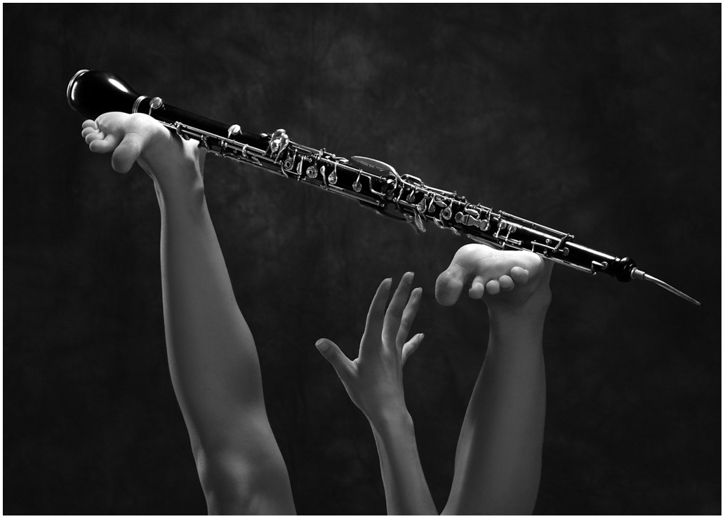
Love it! I love the way the toes are ed, how far away the hand is, how the hand is really stretching out, the angle of the oboe, the title -- simply brilliant! And beautifully executed.
One tiny nit is that the bright tip of the oboe is very close to the edge, so I would consider burning it down a tad. Maybe I just worry too much about the eye wandering out of the frame.
|
May 28th |
 |
| 61 |
May 17 |
Comment |
Very elegant and interesting! Perfect DOF.
Great composition. I thought it might be better with a bit of the left cropped out to remove the little dark areas: I tried it and realized your composition is much better.
I like it very much and would not change anything.
|
May 28th |
| 61 |
May 17 |
Comment |
I like the way you gave her hand a reason to be there.
Nice composition. I think if you had cropped lower the triangle formed by her leg and upper arm would have competed with her face.
Personally, I would have preferred a bit less contrast. |
May 28th |
 |
| 61 |
May 17 |
Comment |
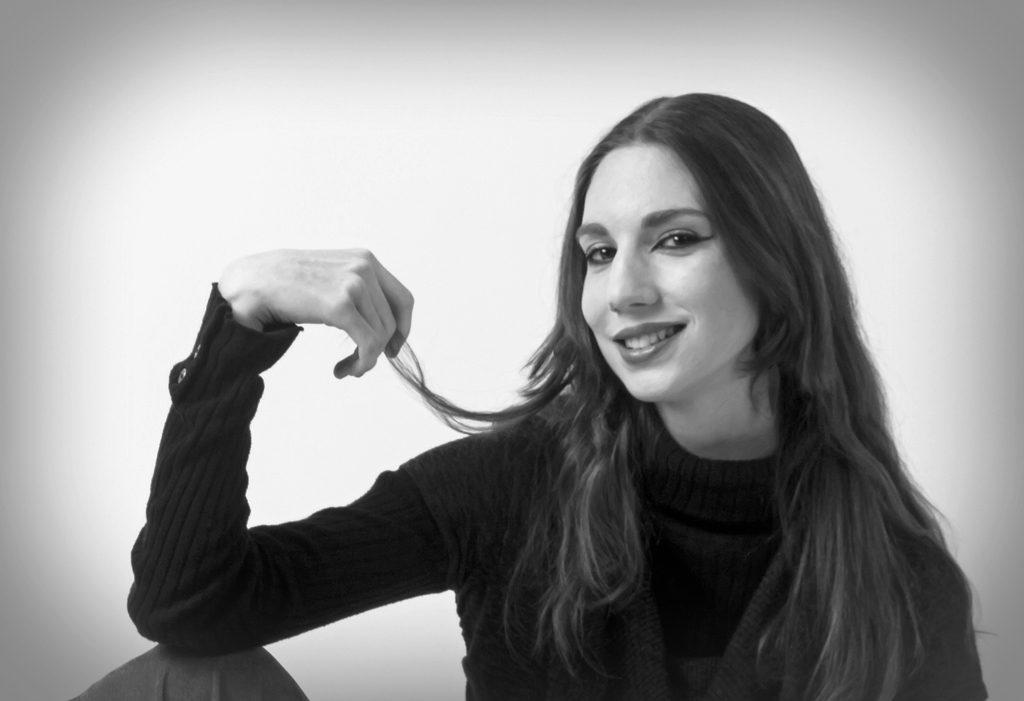
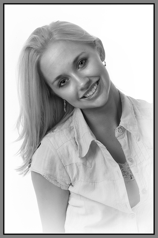
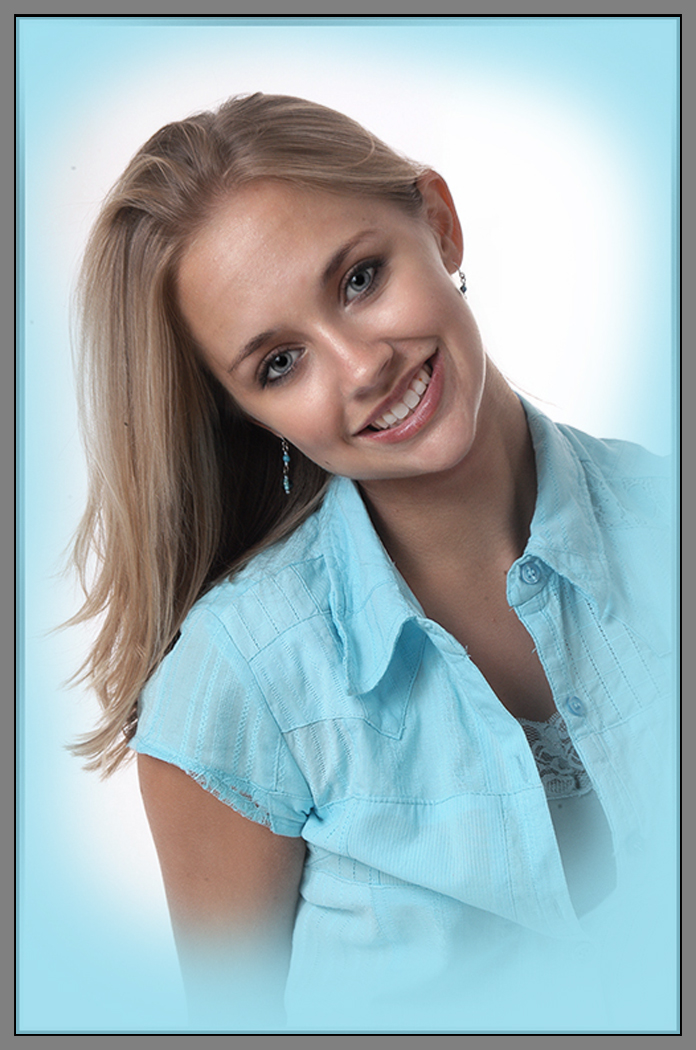
A lovely model with a very fun, relaxed pose. What a great smile! I love your lighting, as always.
Gorgeous color. This image works very well in both color and b&w; very hard to choose between them. I think I'd lean towards the color one, especially with Dave's turquoise vignette idea.
For the b&w, I would personally feather the vignette a bit more, and take a bit more off her face. |
May 28th |
 |
| 61 |
May 17 |
Reply |
I had not noticed the dark triangle, but now that you pointed it out, I really think you are right. |
May 28th |
| 61 |
May 17 |
Reply |
I love the blue vignette! Personally, I'd go a bit lighter.
I never think of colored vignettes. I really like the effect on this portrait. |
May 28th |
 |
| 61 |
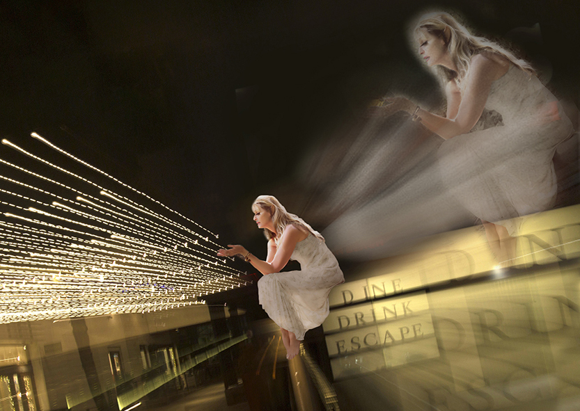
May 17 |
Comment |
That's true. I was thinking of something like a highball glass, but it could be a martini.
The moon is a great idea! The open sky felt a bit unbalanced there. Will have to play with that. Thanks! |
May 28th |
 |
| 61 |
May 17 |
Reply |
Interesting idea! I feel that your version loses a little impact when applied to the whole picture, but I do like it a lot on the part that is the zoomed out woman. I'm thinking something like this.
Love your crop. Brilliant! |
May 28th |
 |
7 comments - 3 replies for Group 61
|
12 comments - 3 replies Total
|


