|
| Group |
Round |
C/R |
Comment |
Date |
Image |
| 54 |
Apr 17 |
Reply |
Thanks! Do you have any suggestions for which blend modes to use? I'm still having trouble with this. |
Apr 27th |
| 54 |
Apr 17 |
Comment |
The sunburst is actually in-camera (for a change!). I think I had a CP filter on the lens, so maybe that's how I got so many rays.
|
Apr 26th |
| 54 |
Apr 17 |
Comment |
This is beautiful. And so very, very cold! Perfect title.
I too love the berries with the spider web. It's great how the web sort of funnels down to the branch. That spider web is amazing, with all the little ice crystals and missing bits.
The frosty jug is a good counterpoint, emphasizing the cold.
Wonderful image, Betty! |
Apr 17th |
| 54 |
Apr 17 |
Comment |
This is quite fascinating. It messes with my mind, in a good way, as I try to sort out the abstract into concrete images. It's the way I think; I just can't sit back and accept abstract. But it makes me look at each part and think about it, and then step back and consider the whole.
I think this is wonderful. It is balanced and simplified enough to feel ordered, but the overlaying pieces make it complex and interesting. I would not have expected having such bright colors at the edges to work well, but the bright "eyes' in the center dominate. Then looking closer and seeing they are not eyes but your face is just brilliant.
The circle is key to holding it all together, and it does the job.
I would not change a thing. |
Apr 17th |
| 54 |
Apr 17 |
Comment |
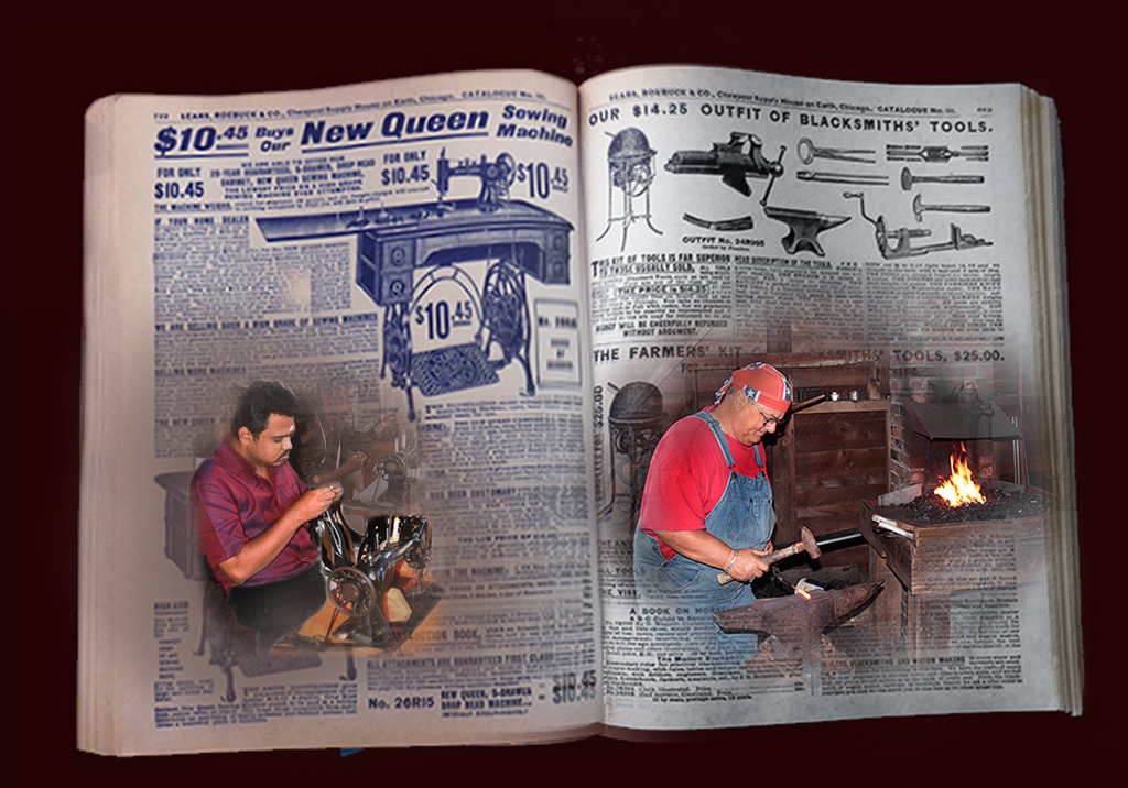
This is very fun. Such a great juxtaposition of a sewing machine beside blacksmith tools.
I really like the blacksmith side. You have the perfect combination of his workplace vs. the page. The fire is particularly great; it almost looks as if the page is on fire.
I wish there was a little more workplace for the sewing machine operator. He feels a bit too integrated into the page.
I was trying to create something to show you what I mean, and it made me appreciate what a great job you did on the transitions. It's a difficult and subtle task Well done! |
Apr 17th |
 |
4 comments - 1 reply for Group 54
|
| 61 |
Apr 17 |
Comment |
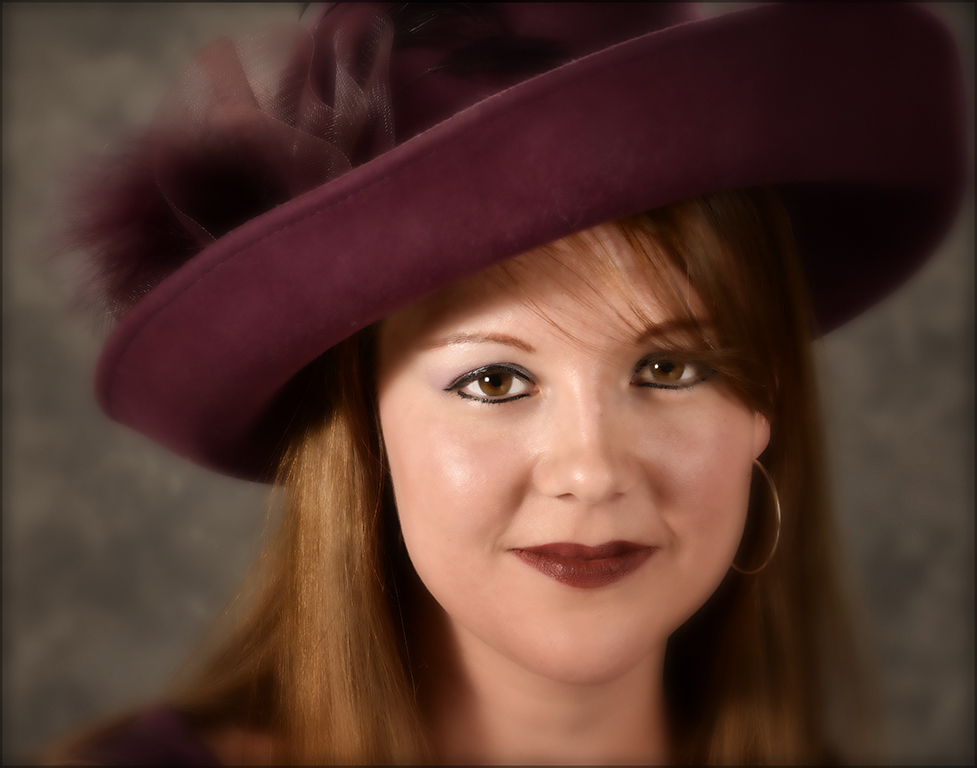
Lovely portrait. I like your crop and composition.
I do like the softening effect in #2. It makes it a more intimate portrait and does add a glow.
Personally, I would blur out her hat brim and the crown of the hat a bit, and desaturate the crown just a touch. That would balance out having her throat out of focus.
I like the b&w version as is. Her face is bright enough that I don't notice the hat brim focus. Her skin may be a bit blown out but it does not bother me.
|
Apr 17th |
 |
| 61 |
Apr 17 |
Comment |
Great portrait!
I love his expression; he's making a real connection. The pose shows off his muscles effectively.
Beautiful post-processing.
The background works really well in b&w; it goes well with his outfit.
I think his outfit works well too, but am wondering why the scarf is in front. I'd rather have seen the rest of his arms.
Still, a very good portrait. |
Apr 17th |
| 61 |
Apr 17 |
Comment |
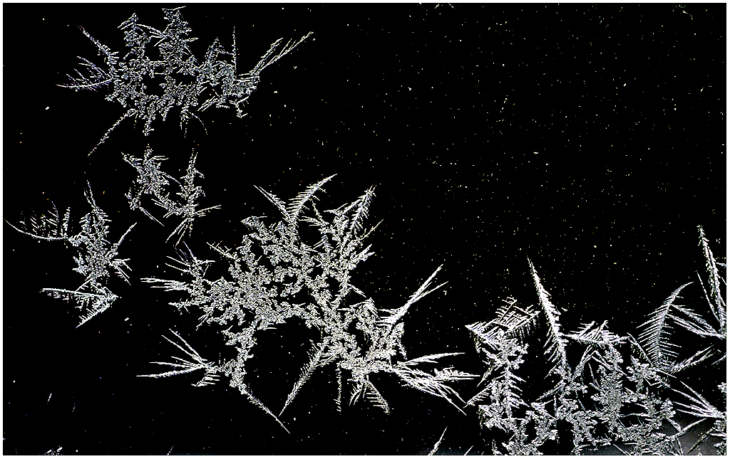
This is very beautiful. I am jealous of your image but glad I don't find crystals on my mirror, especially ones that stay around long enough to set up a tripod.
The little flecks of ice definitely look like stars. I would have thought this was a window view if you had not said otherwise.
This image would make a wonderful start of a composite if you ever wanted to do one.
I think you did well to darken and desaturate. I love the composition.
If you wanted to remove the haze, you could pull up a Levels layer in Photoshop, click the white eyedropper on a crystal, then click the black eyedropper in the hazy part, to get something like the attached.
|
Apr 17th |
 |
| 61 |
Apr 17 |
Comment |
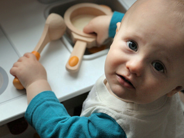
Very sweet!
That is so cute, catching him in a favorite activity. I like how you have a shallow DOF to keep the interest on that adorable face.
I think your composition works well. And I appreciate how hard it is to compose with such an active subject.
I would consider a slight crop and a little more exposure adjustment. |
Apr 17th |
 |
| 61 |
Apr 17 |
Comment |
Great concept! The claw certainly suggests the pain, and its tight grip on the Tylenol reinforces the suggestion while offering the cure. I would definitely send this to the company that makes Tylenol to see if they want to buy it.
Beautifully lit. I love the colors on the claw, and the background is perfect, fading into black and keeping my attention where it belongs.
I love the red stroke.
I would not change a thing. |
Apr 17th |
5 comments - 0 replies for Group 61
|
9 comments - 1 reply Total
|


