|
| Group |
Round |
C/R |
Comment |
Date |
Image |
| 54 |
Mar 17 |
Comment |
I love the strong colors and textures. There is a vigorous life to this image which is very appealing.
The pale line Betty mentioned does not bother me at all; but the vertical lines do.
My eye gets drawn to the lower right because of the brightness. Decreasing brightness or exposure seemed to just suck the life out, and after looking at it more I realized that the bright yellow is balancing the whole of the image. So, well done! |
Mar 8th |
| 54 |
Mar 17 |
Comment |
A very sweet image, and so true! I'll bet your granddaughter loves it.
Excellent job of capturing the on-stage action; that lighting is very tricky. I like how the little girls are the main subject but their dreams are distinct enough to be unambiguous.
I am curious as to why the final image is spread out horizontally. It looks a little distorted to my eye. |
Mar 8th |
| 54 |
Mar 17 |
Comment |
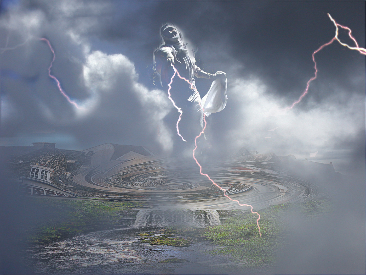
Thor is very angry! A great deal of power and destruction packed into this image. That's a marvelous pose on Thor. I like the way the clouds are ominously low to the ground and provide support for Thor. Everything is so well integrated.
The left side feels a little visually light to me. Maybe consider adding another lightning bolt?
|
Mar 2nd |
 |
| 54 |
Mar 17 |
Comment |
It is a bit of the Wolfman look. It's an artifact of having a lot of hair over her face at one point. It seemed to make sense last night but in today's light I agree with you. Thanks, Betty! |
Mar 2nd |
4 comments - 0 replies for Group 54
|
| 61 |
Mar 17 |
Comment |
Personally, I like the image as is. The three bright spots - face, hands on sword hilt, and sleeve - make a nice triangle that keep my eye interested. For me, it works very well as is. |
Mar 28th |
| 61 |
Mar 17 |
Reply |
I did. I had forgotten to have a light in front to get a catchlight, so Photoshopped one in. I think it was a good move. |
Mar 28th |
| 61 |
Mar 17 |
Reply |
You are quite right about brush and comb being less work. A lesson I'll try to remember next time. |
Mar 25th |
| 61 |
Mar 17 |
Comment |
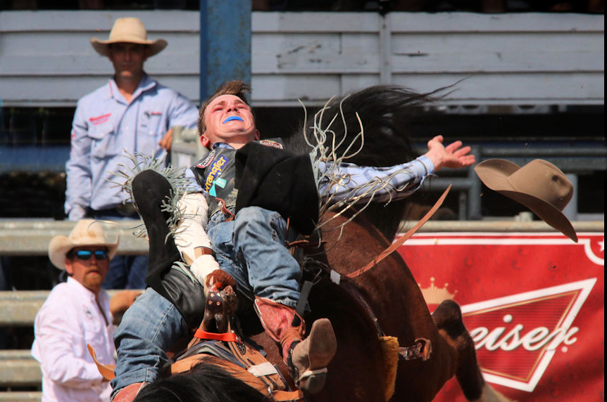
Excellent timing! Great action and great color.
I like your depth of field.
I agree with Albert and Darrell about the crop. |
Mar 25th |
 |
| 61 |
Mar 17 |
Comment |
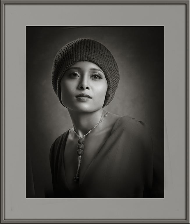
Very elegant!
Beautiful light on a beautiful model. The vignette adds the perfect finish. I really like your b&w conversion.
She has a yearning expression which is very appealing. And such lovely eyes.
The lower catch-light is just a little distracting to me.
Personally, I would rotate the image a bit.
But these are very small matters. You have created a lovely portrait.
|
Mar 25th |
 |
| 61 |
Mar 17 |
Comment |
You might consider titling it something like "A Study in Textures". Just a thought. |
Mar 25th |
| 61 |
Mar 17 |
Comment |
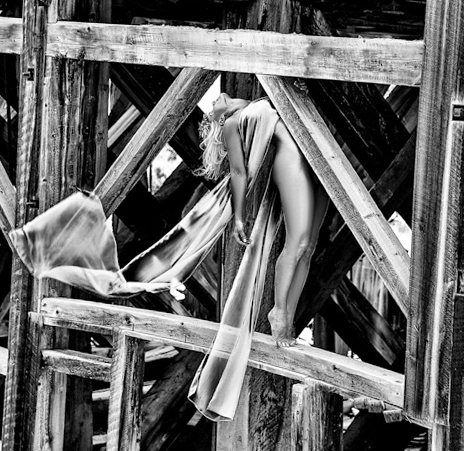
Definitely unique!
At first I thought it was a composite, but then realized you have an extremely cooperative model.
I really like the b&w. I think you've got the contrast and texture effects spot on. I love the transparency of the scarf. The lighting and range from black to white is fantastic. I love the angle you shot this at; it makes the most of the angles of the beams and your model.
I personally dislike images with women in victim mode, which this could be interpreted as (almost as if she is a sacrifice on an alter). However, this image does not feel exploitative to me because she does feel very much like a structural element, an artistic element in a visual puzzle. I like it very, very much. This is an image with a powerful vision beautifully executed.
Personally, I'd consider a tighter crop. |
Mar 25th |
 |
| 61 |
Mar 17 |
Comment |
Must have been a very cool trip!
I really like the relative positions of their faces.
I can see by the shadow that this was taken under a very harsh sun. I think your shallow depth of field was a great choice in making the lions stand out.
I'd consider decreasing saturation on that flat area behind the lioness's tail. It's similar to the lion's mane and distracts me a bit. |
Mar 25th |
| 61 |
Mar 17 |
Comment |
Wonderful! It does have exactly the feel of a warrior after battle sitting for Rembrandt in natural light. The pose, expression, and technical details are just perfect.
For me, his skin texture works fine, perhaps because it does not look surprising on someone from an era of poor nutrition and healthcare.
You did a great job on the b&w conversion, but I too prefer the color version, only because the image reminds me so strongly of classic paintings (all in color).
|
Mar 25th |
| 61 |
Mar 17 |
Comment |
Such a cute expression! I love the beaded head cover.
Great light as always.
I think the b&w version would work better if the canvas was larger. The high contrast of the white vignette to the rays is so close to her eye that it competes. I like the white vignette, just wish it was a little further away.
The sepia version works very well for me. Personally, I like her eye in the center.
|
Mar 25th |
8 comments - 2 replies for Group 61
|
12 comments - 2 replies Total
|


