|
| Group |
Round |
C/R |
Comment |
Date |
Image |
| 54 |
Jan 17 |
Reply |
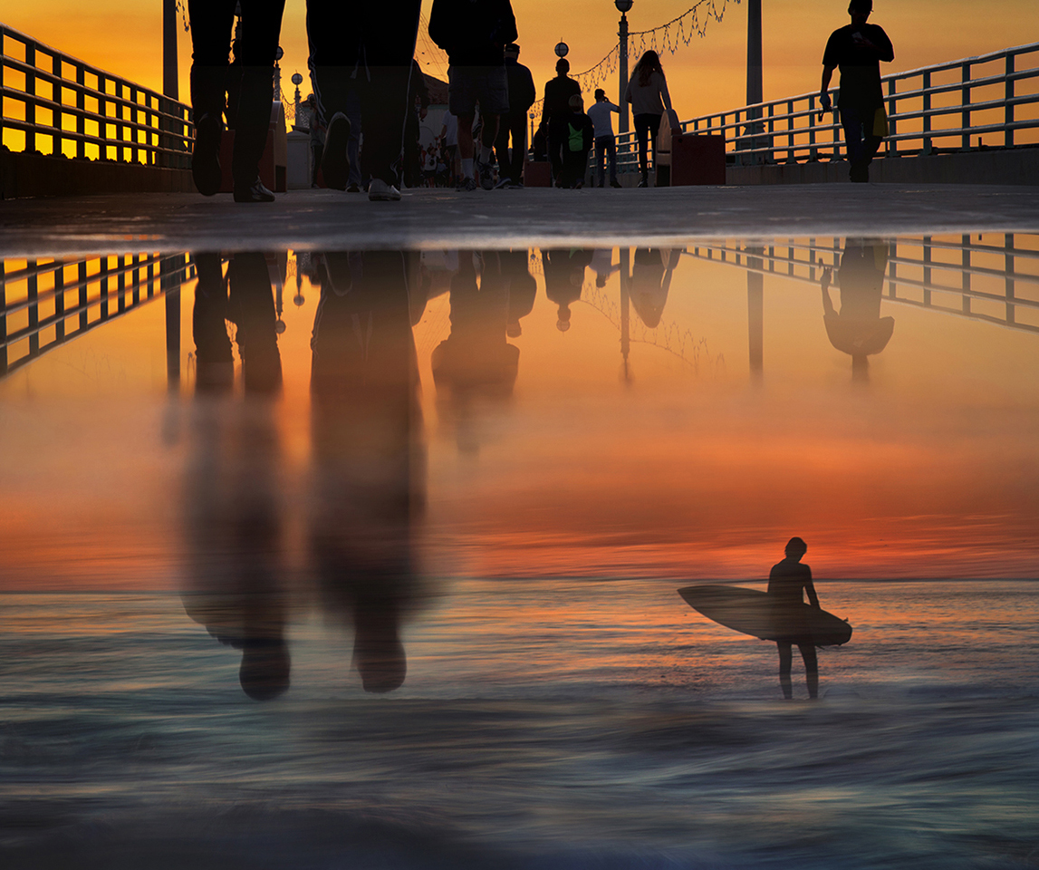
I know what you mean. I did feel as if it is two images in the same frame. I like the idea of a sailboat. Guess I need to head out with my camera. :0) |
Jan 18th |
| 54 |
Jan 17 |
Reply |
Great suggestion!
I do think that works better if I keep the surfer. |
Jan 18th |
 |
| 54 |
Jan 17 |
Comment |
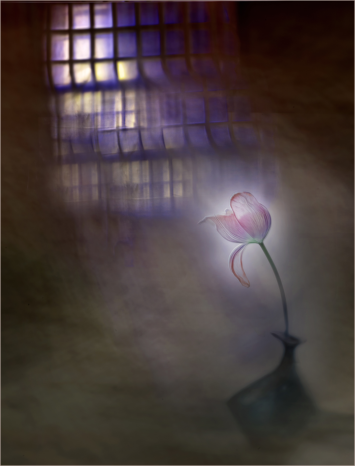
I think it's marvelous how you have combined these two images! I especially like how the grasses become her hair and the contour of her cheek.
I love the texture and the birds flying in the sky.
Personally, I like the strong colors -- partly because I do love color for itself, and partly because it makes it easy for me to see both original images in a very complementary way.
The white lines are distracting for me as well. |
Jan 18th |
| 54 |
Jan 17 |
Comment |
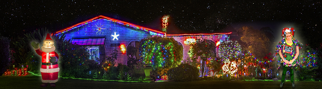
Such a cheerful image! Panorama was a perfect choice here. Beautiful capture of the color of the lights as well as the details of the house and landscaping.
I really like the addition of the stars in the sky.
Christmas Spirit is hilarious; what a great and unique feature to balance out Santa!
I like the glow on around Santa and Christmas Spirit, because Santa is obviously lighting up his proximity. You could adjust the Whites on Christmas Spirit to match Santa.
|
Jan 18th |
 |
| 54 |
Jan 17 |
Comment |
Love the pun in your title; they really are leaving the church. I do like how that messes with my mind a bit.
I like the effect of your processing on the ruffles of the dresses. I can still see the ruffles but they are soft and keep the interest on the faces.
The lighting and coloring of the church and the bride and groom all go very nicely together. The little girl's dress feels very white because she was in direct sun; a touch of yellow or sepia might be nice.
Is that a shadow behind the little girl? The color feels off to me.
|
Jan 18th |
| 54 |
Jan 17 |
Comment |
Very cool! One of those images I seem to be unable to stop looking at.
The overlap of the heads is excellent. It's fascinating how his head seems to be a different perspective in the final image, rather as if we are seeing him from behind. I love her rainbow colors, and the text and fuzzy brown for him. I
I very much like the texture. Personally, I would consider applying it with a little less opacity, or perhaps a touch darker, for the background. Since it is light and has contrast, it competes a little with the couple.
It is a wonderful, intriguing image.
|
Jan 7th |
4 comments - 2 replies for Group 54
|
| 61 |
Jan 17 |
Comment |
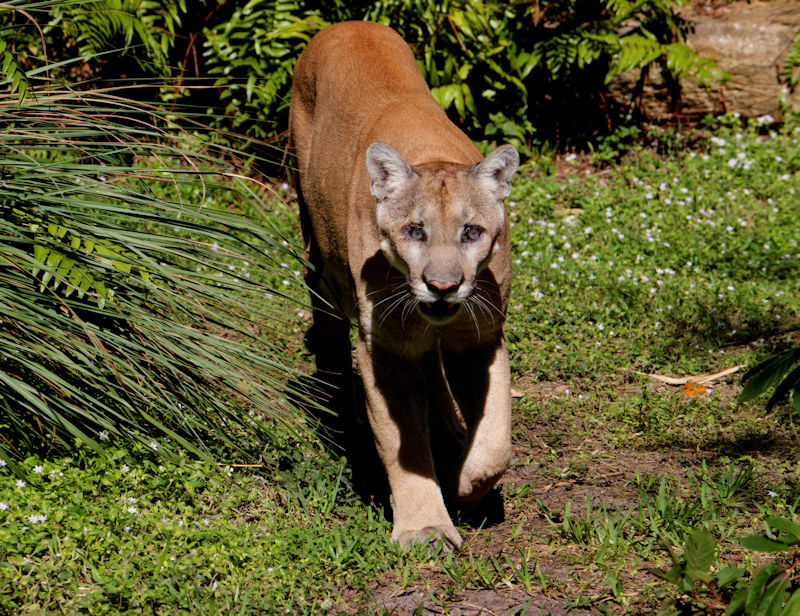
Sounds like a fun day! And you have a nice action closeup to remember it by.
The panther's coat stands out really well against that beautiful green. That lifted paw gives an interesting little hint of menace.
Very skillful job replacing that poor damaged eye!
Personally, I might have replaced both eyes with some taken from a Wikipedia photo. |
Jan 18th |
 |
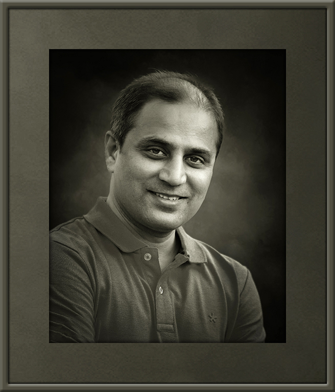
| 61 |
Jan 17 |
Comment |
Wow! Yes, I agree, you've produced a great fine art portrait. Very well done! Great expression. It feels very personal and formal at the same time.
I would consider a levels correction rather than increased contrast.
|
Jan 18th |
 |
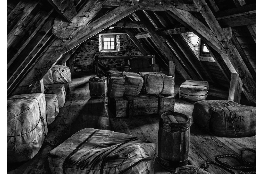
| 61 |
Jan 17 |
Comment |
I like the texture and detail you have brought out, which has turned a clean, simple scene into one full of interest. I think the b&w works well.
The original has a real feel of depth with the play of shadow and light, which gets a little lost in the more even lighting of your processed image. Selected decrease of brightness might be interesting. |
Jan 18th |
 |
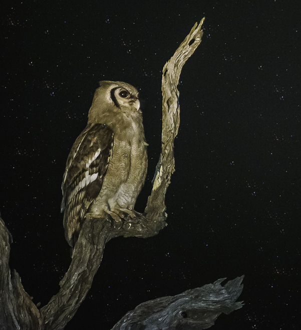
| 61 |
Jan 17 |
Comment |
Wonderful detail. It's very cool how the branch color morphs to match the owl, and it makes a great frame.
I think you made a good choice in removing the color noise in the sky; it looks very dramatic against the pure black, which is probably what you actually experienced.
Unless maybe there were stars? Because that might work too. |
Jan 18th |
 |
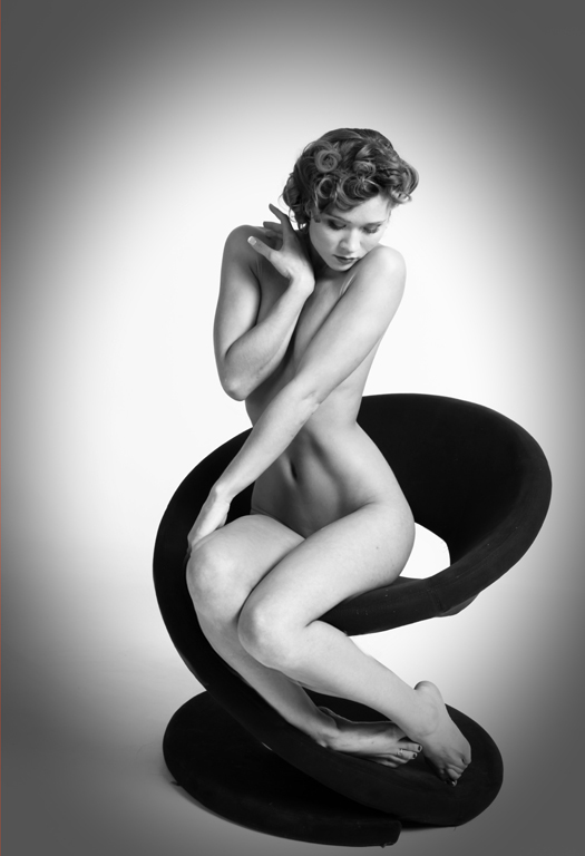
| 61 |
Jan 17 |
Comment |
Very beautiful! B&W is perfect for this.
Wonderful pose, especially the way her one foot s in. Excellent light, particularly on her stomach.
Great title.
Really, such a beautiful, beautiful image!
I hesitate to mention this, because I love this image just as it is, but I recently took a class that made me very aware of how whatever is closest to the camera looks larger. In this image, it's her knees, so if I did not re-shoot from a higher perspective, I'd consider a bit of Photoshop.
I think you've got a winner regardless.
|
Jan 18th |
 |
| 61 |
Jan 17 |
Reply |
I think that works very well!
|
Jan 18th |
| 61 |
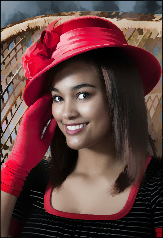
Jan 17 |
Comment |
Beautiful lighting, as always. I like the way you kept the colors simple.
I'd love to know what you say to your models to get such great smiles.
I think the background works well for a straight portrait. It might be fun to play around with an art filter like Topaz Simplify to emphasize her face. |
Jan 18th |
 |
| 61 |
Jan 17 |
Reply |
Thanks! I did not notice the artifacts, but definitely see them now.
I think you are right, a bit less brightness would be good. |
Jan 18th |
6 comments - 2 replies for Group 61
|
10 comments - 4 replies Total
|