|
| Group |
Round |
C/R |
Comment |
Date |
Image |
| 12 |
Apr 21 |
Comment |
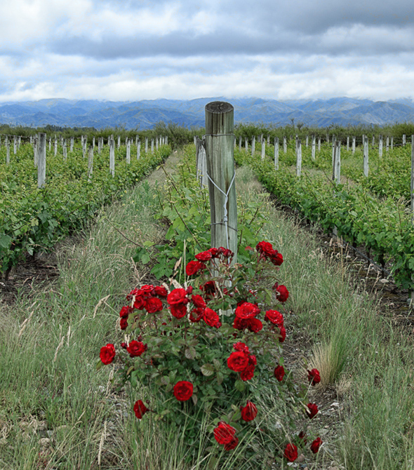
Nice leading lines with those posts and the roses are indeed the eyecatcher her. Like Carole I see the picture a bit tilting - but it is only slightly. Nevertheless I gave the picture a try and I desaturated the green color a bit to enhanced the posts more. Does it work? |
Apr 29th |
 |
| 12 |
Apr 21 |
Comment |
Yes, playing with such graphic design elements can be so much fun. And you did good here. I like the natural colors and the texture overall.
Barbara, do you know the Smartphone App Mirror Lab? You should try it. You can play there a lot with graphic elements. |
Apr 29th |
| 12 |
Apr 21 |
Comment |
Hallways are great for our topic - you shot it well. There are a lot of symmetries, as the others already mentioned. And I like the leading line with those lights above too. |
Apr 29th |
| 12 |
Apr 21 |
Comment |
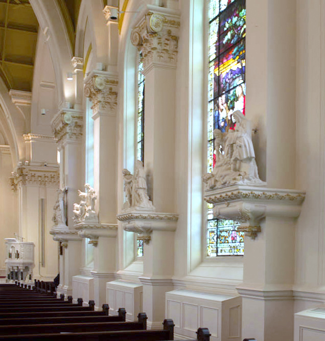
Yes Gavin, that window is a wonderful asset of this church. But I also see the symmetry more in the columns and bench rows. To center the viewer's eye on it I would crop the picture and brighten it up a bit. I am adding my version to show you.
|
Apr 29th |
 |
| 12 |
Apr 21 |
Comment |
That's the very classical way of symmetry I would say, as the greek once taught us. And the stair is the fitting contrast. Well seen, Carole! |
Apr 29th |
5 comments - 0 replies for Group 12
|
5 comments - 0 replies Total
|