|
| Group |
Round |
C/R |
Comment |
Date |
Image |
| 18 |
Dec 18 |
Comment |
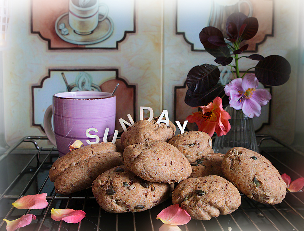
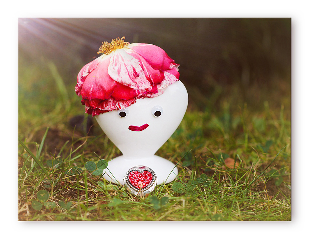
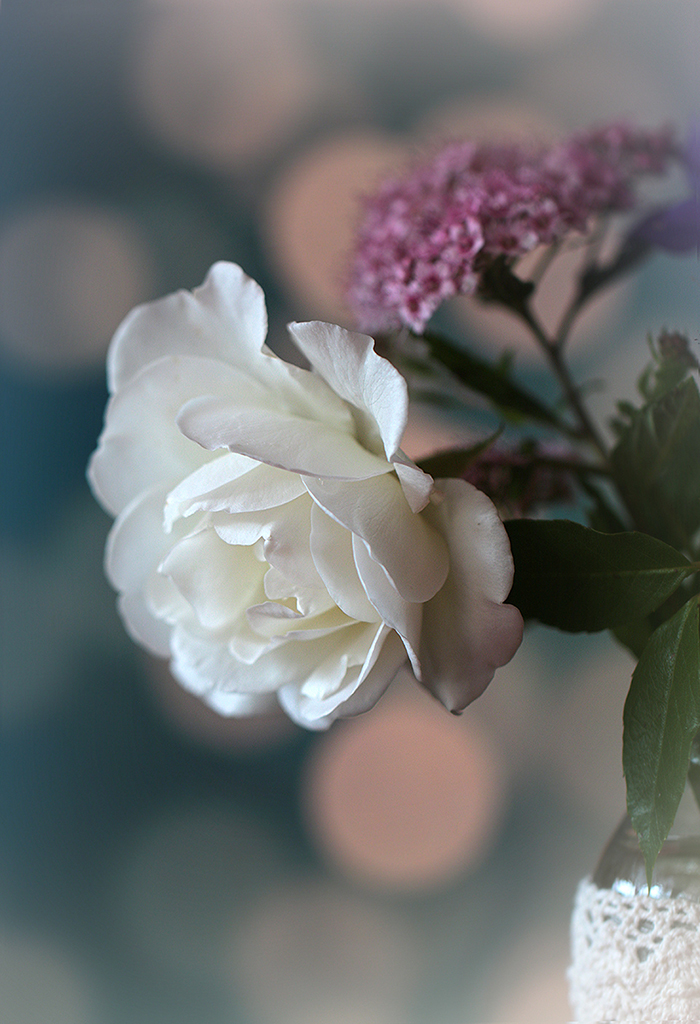
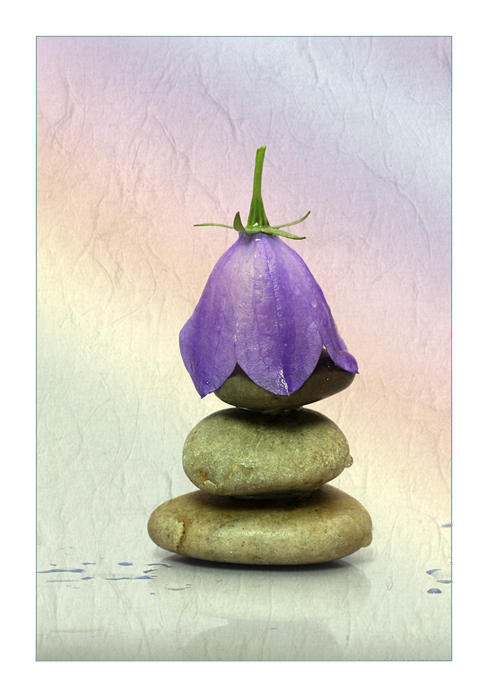
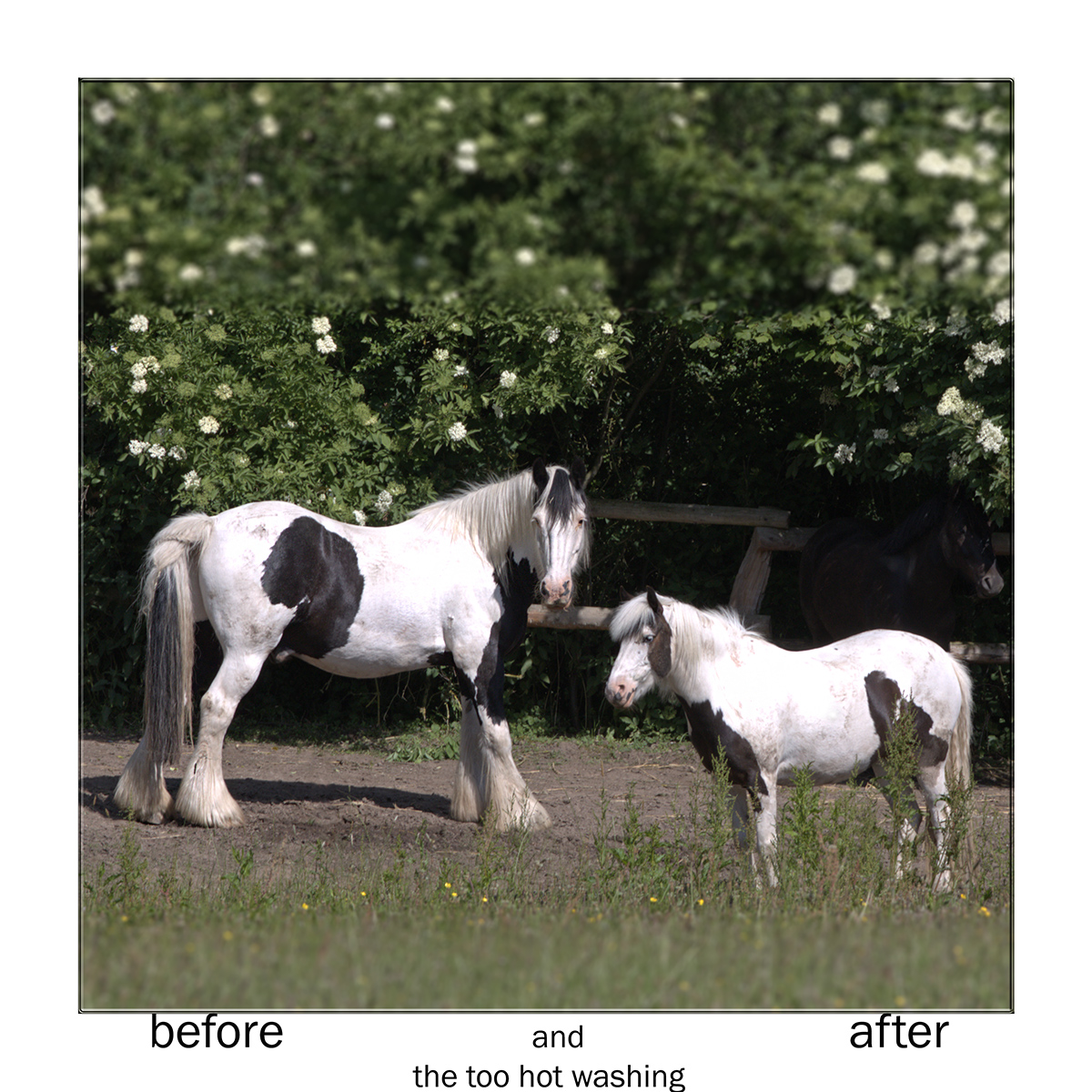
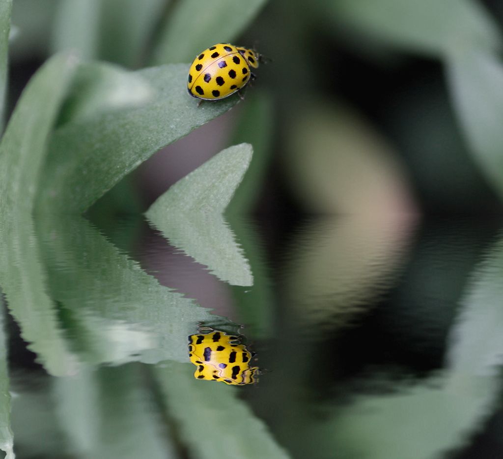
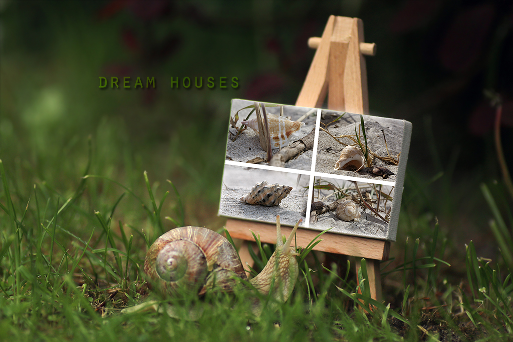
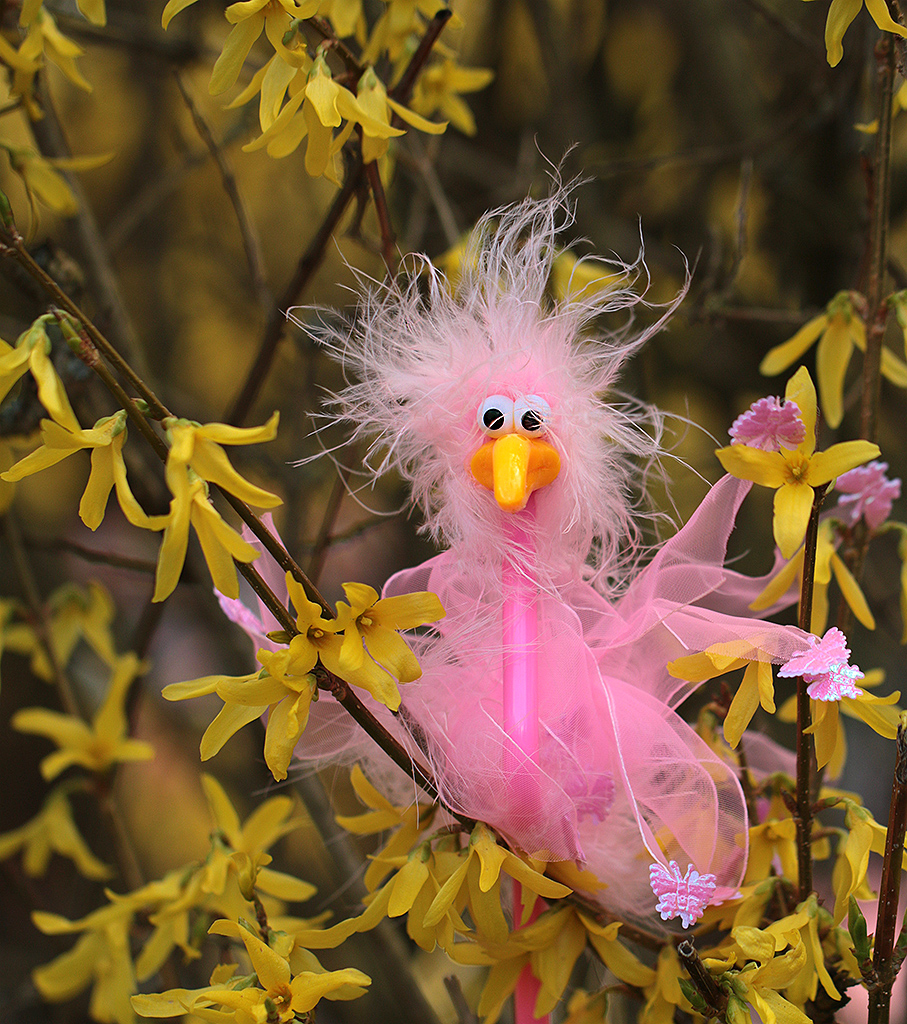
Andrew, I agree that this "green" somehow takes getting used to - but I tried to color it up with the red winter rose.
I wish you all a joyful Christmas time.
|
Dec 25th |
| 18 |
Dec 18 |
Comment |
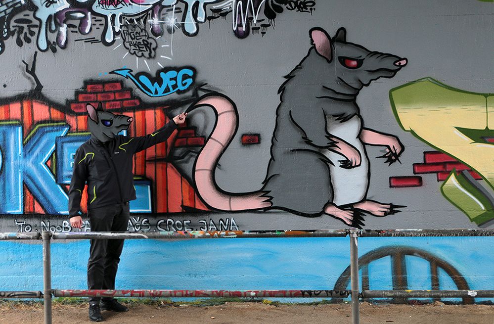
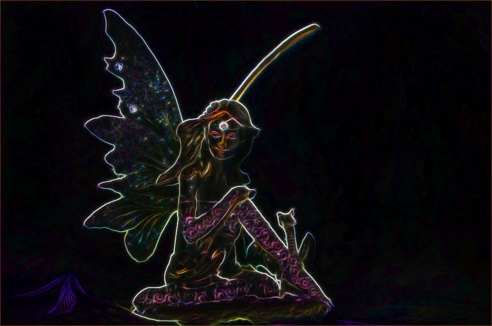
Tom, you played well here with forms and colors. Mike was right with his suggestion about filling the black section. You made here some nice piece of abstract art. |
Dec 25th |
| 18 |
Dec 18 |
Comment |
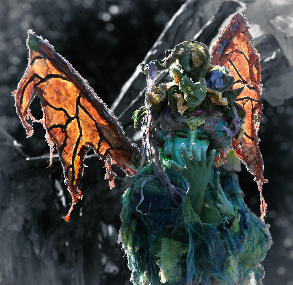
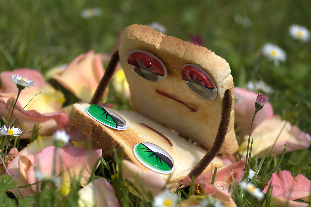
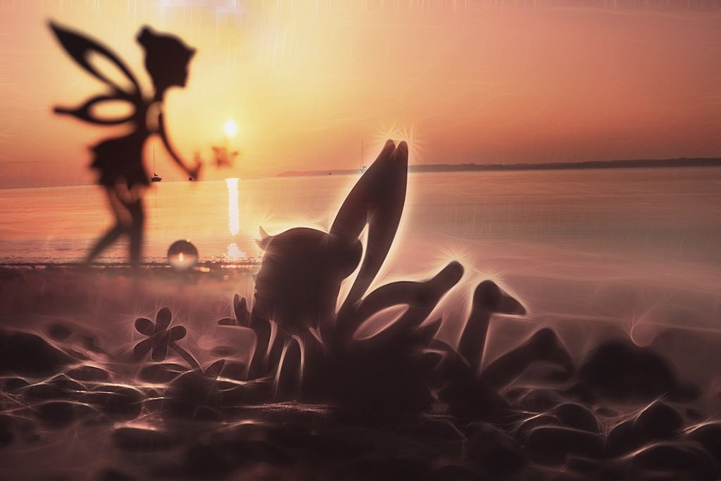
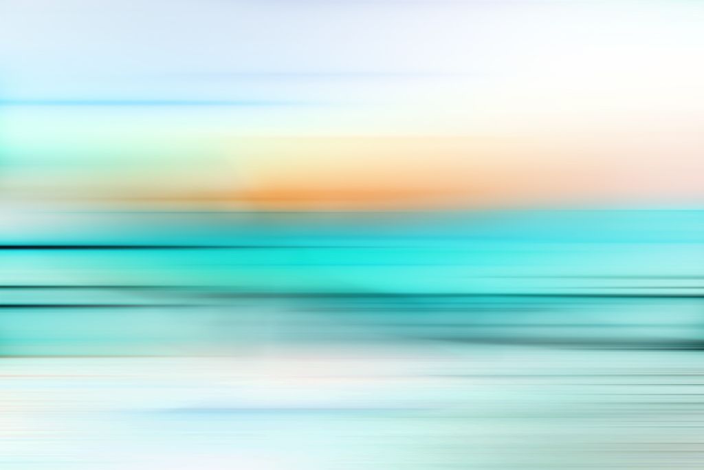
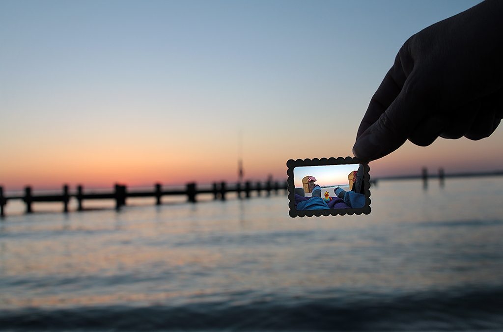
Thank you for your advice about Photocrowd - it looks like an interesting site. I do like to work with the Polor-coordinate-filter by my self (example: https://www.instagram.com/p/BrHu7Q8gBPe/?utm_source=ig_web_copy_link). For me your fantasy planet universe works - but it would be better without the big overwhelming orange one.
|
Dec 25th |
| 18 |
Dec 18 |
Comment |
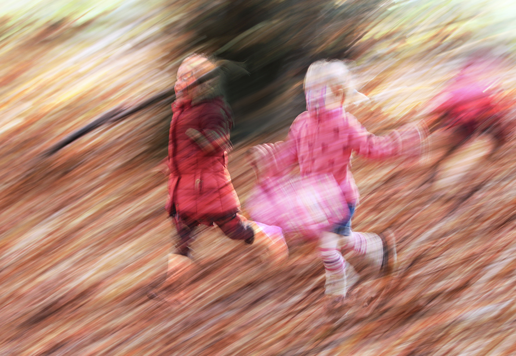
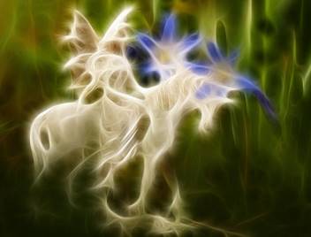
It is all about our imaginations and fantasies. Adding the second eye was a great idea. |
Dec 25th |
| 18 |
Dec 18 |
Comment |
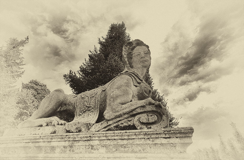
Ian, the soft toned sepia look is the right choice for this picture and your second attempt would be the perfect picture for me. |
Dec 25th |
| 18 |
Dec 18 |
Comment |
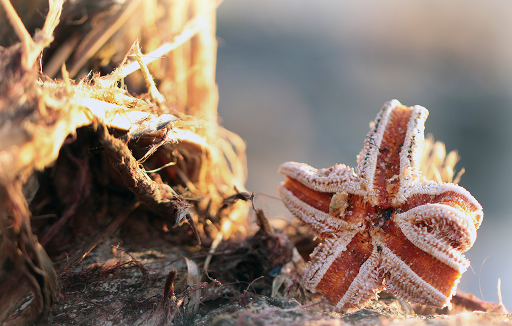
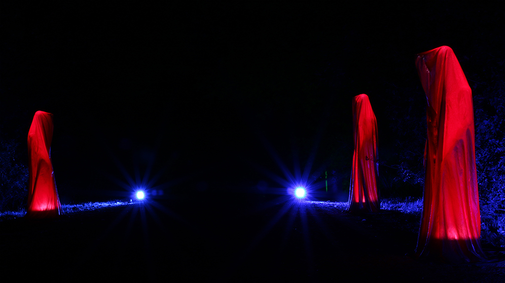
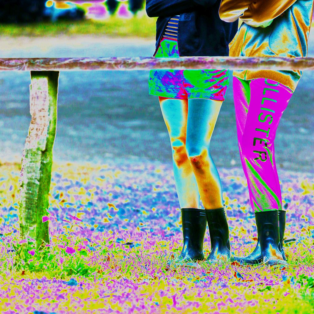
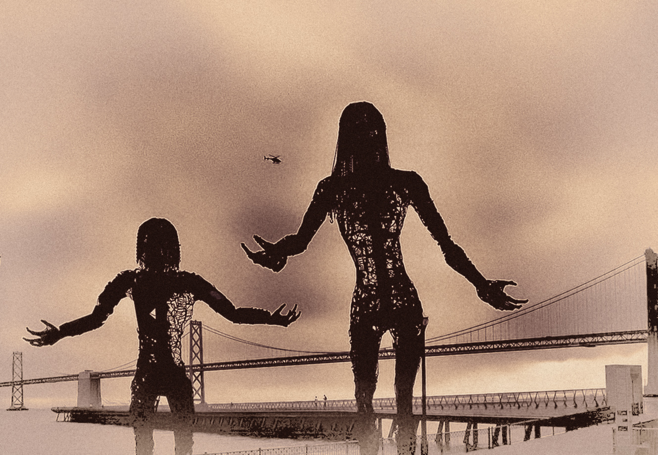
That's a great shot with so much potential to work at. I am all in with Tom's cropping and his imagination about it. The picture gives such an alien apocalyptic feeling and therefor some (the magenta) color works better on my eyes.
And since you can't get the noise out of the picture I would add on it - see my added example. |
Dec 25th |
 |
6 comments - 0 replies for Group 18
|
| 38 |
Dec 18 |
Comment |
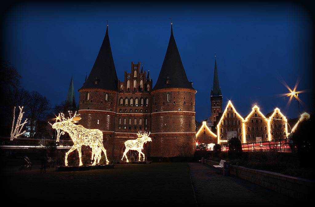
Hello - I am back and wish you all a wonderful Christmas!
Thank you for your suggestions/comments.
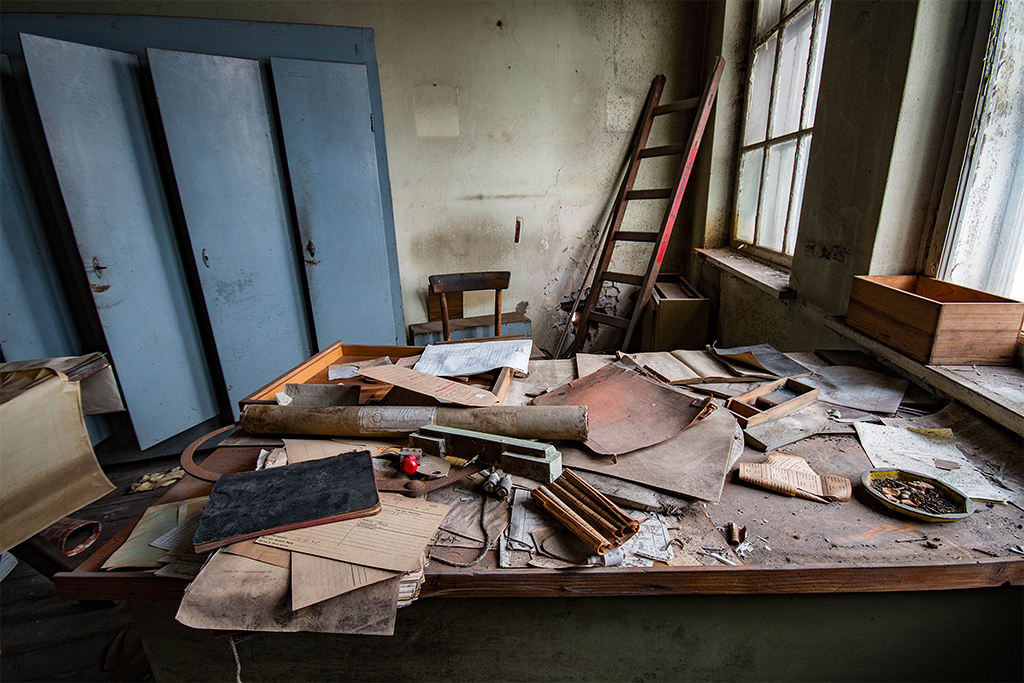
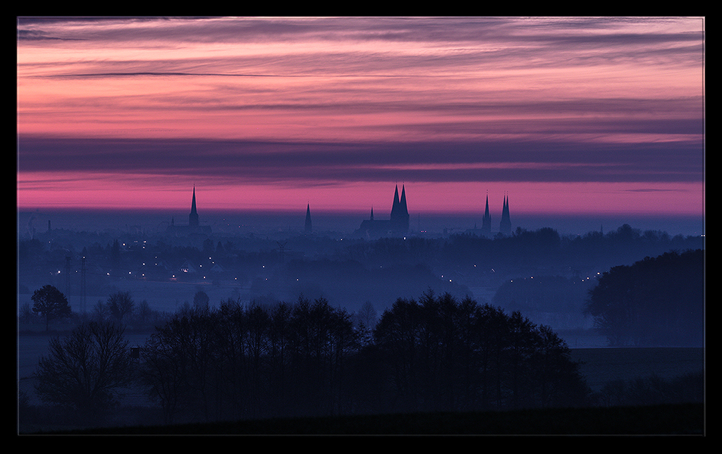
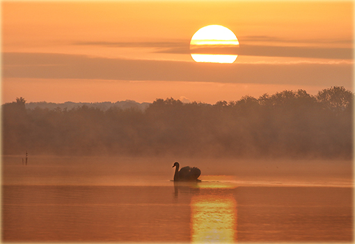
@Art: I avoided here to sharpen the buildings, because I wanted the more foggy/mystical look. With the cropping of the bottom I could agree - but I wouldn't crop any of the nice sky texture.
@Gabriele: I like your lightening up of the picture and the more blueish tone, but not the blown out parts in the sky. And by the way: That tiny little pinnacle on the big chathedral doesn't count! ;-)
@Marge: I did a panorama, but the left and right are too plain. |
Dec 25th |
| 38 |
Dec 18 |
Comment |
Well done nature shot, Marge. Art did the right suggestion by increasing the contrast and giving it more light and details.
Gabrieles way is bringing up even more green color, but it blows out the the white in the waterfall and kills the texture.
|
Dec 25th |
| 38 |
Dec 18 |
Comment |
The little spritz work from Gabriele does give this photo the perfect touch. Althoug this portrait is already a great picture showing your cousin living his music. Great job done here, Art. |
Dec 25th |
| 38 |
Dec 18 |
Comment |
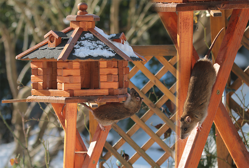
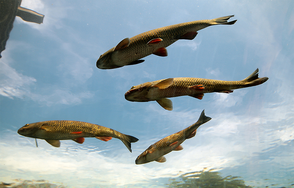
Gerhard, that's another of your great wildlife shots! Wonderful. I only would dare to suggest one minor hint ;-): Sharpen the fish's head/eye a tad bit so it would be in the equal sharp focus like the crocodile head. |
Dec 25th |
| 38 |
Dec 18 |
Comment |
This is definitley a challenge for the eye - without your explanation I wouldn't get the 3-D-view to figure out, what you show us here. |
Dec 25th |
| 38 |
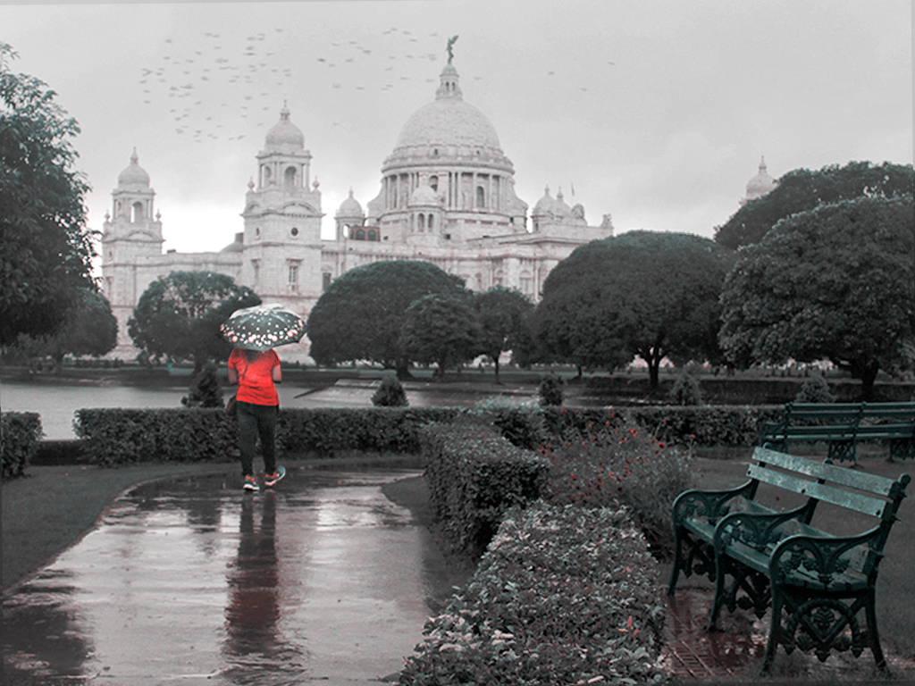
Dec 18 |
Comment |
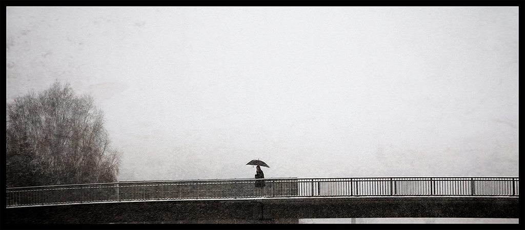
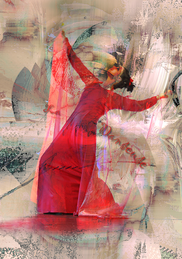
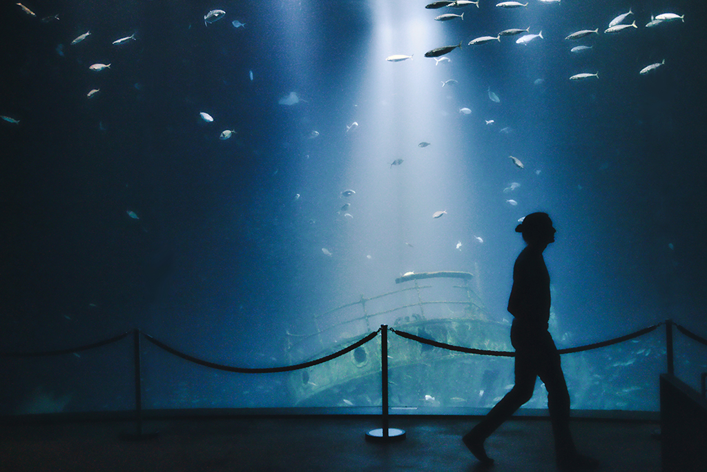
Hello Sunandan, would like to change the main view here from the building to the walking person in the this nice red eye catching coat. I used PS6 and the color-lookup-filter (2strip.look) - somehow all the dark green is distracting my eye. |
Dec 25th |
 |
6 comments - 0 replies for Group 38
|
12 comments - 0 replies Total
|