|
| Group |
Round |
C/R |
Comment |
Date |
Image |
| 12 |
Aug 18 |
Comment |
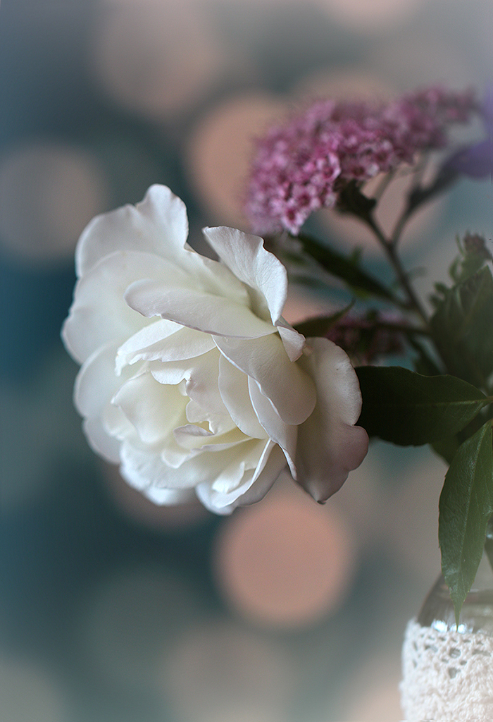
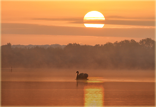
Ally, I like to play with some motion in the flowers too and know, that Barbara's suggestion is a good creative advidce.
All in all you did well with your picture, but I would turn down the lights, because the white color is very bright here. |
Aug 26th |
| 12 |
Aug 18 |
Comment |
I am with you about these festivals, Barbara. I like gooing photoshooting there too! I like you picture with all this well done colors. |
Aug 26th |
| 12 |
Aug 18 |
Comment |
If I remember right, they were playing 3-D-chess on the Enterprise (Mr. Spock?!). Well, alone that makes it whimsical, I guess. |
Aug 26th |
| 12 |
Aug 18 |
Comment |
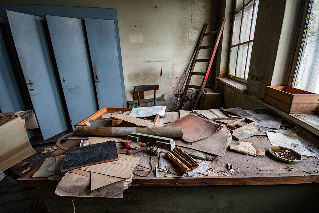
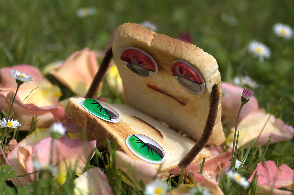
My suggestion: Just give things some eyes and it is becoming alive! Very funny and well done. |
Aug 26th |
| 12 |
Aug 18 |
Comment |
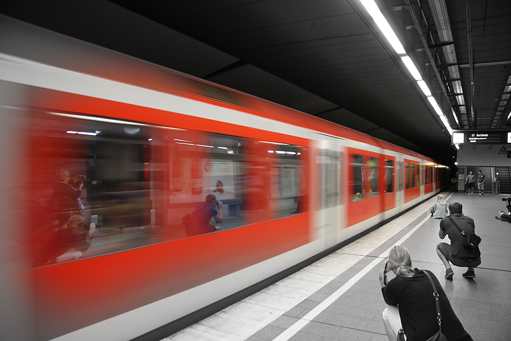
The train is blended in perfect - a very well done composition. |
Aug 26th |
| 12 |
Aug 18 |
Comment |
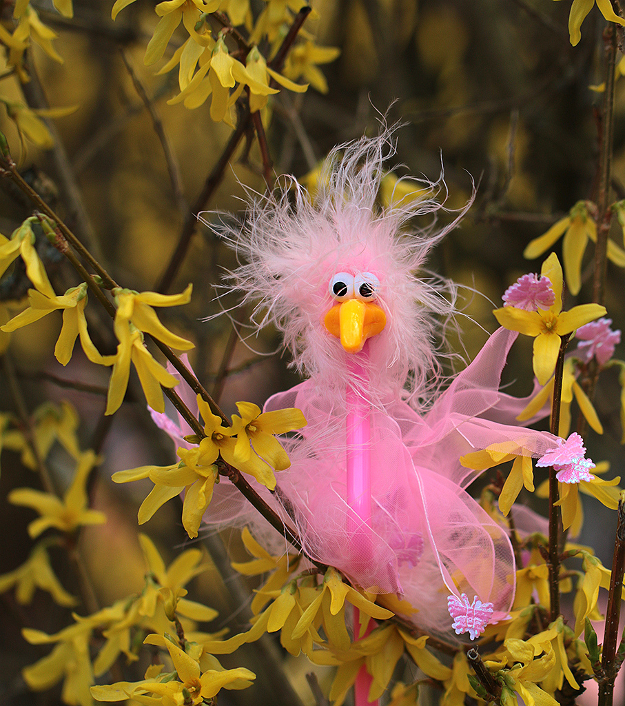
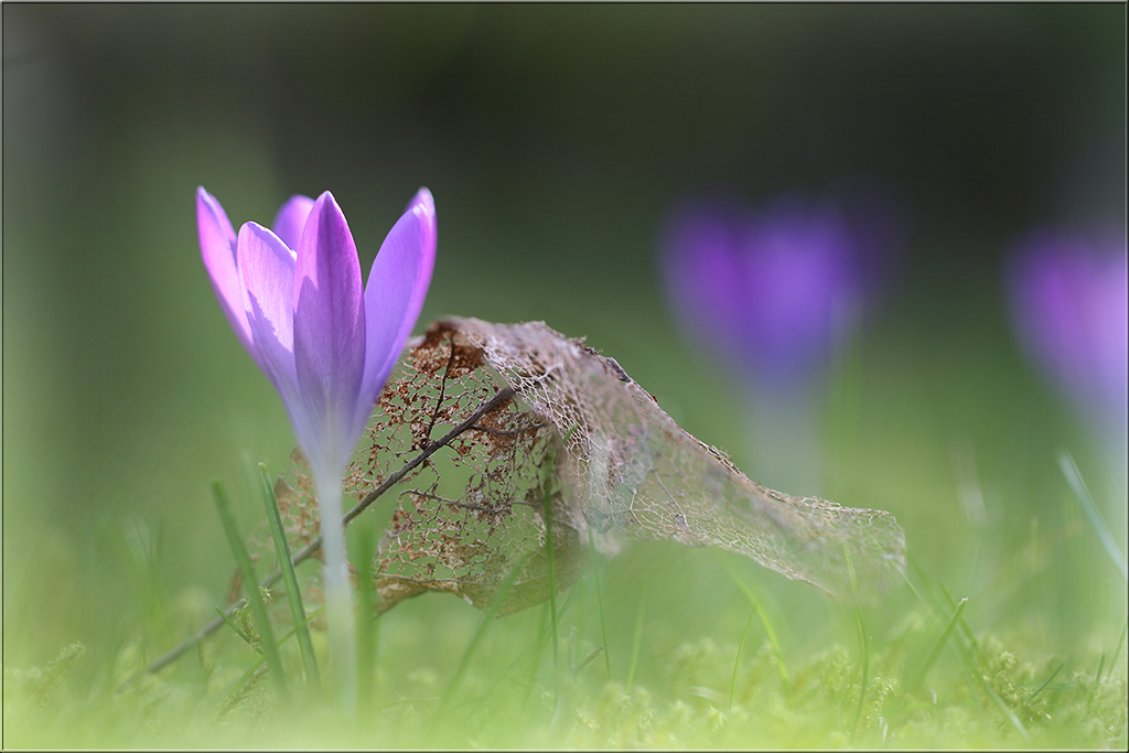
Splendid idea, Carole! So creative - I really love the blurr and pink color here. |
Aug 26th |
6 comments - 0 replies for Group 12
|
| 18 |
Aug 18 |
Comment |
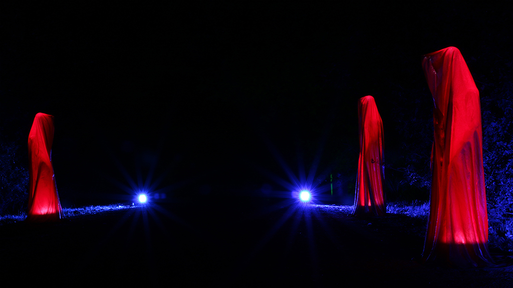
Just WONDERFUL - what a great idea. I love that fire twirl you've created. I have to say, I "robbed" your idea and tried something with my own pictures at home - that was fun! |
Aug 26th |
| 18 |
Aug 18 |
Comment |
Very well done - your photo got a vivid, artificial touch. That is one picture for a calendar! |
Aug 26th |
| 18 |
Aug 18 |
Comment |
I always admire people who can create picture before shooting them with no postprocessing needed. Great idea here. But you maybe you could try to tilt the picture 90 degrees counterclockwise. For looks somehow smoother for my eyes...? |
Aug 26th |
| 18 |
Aug 18 |
Comment |
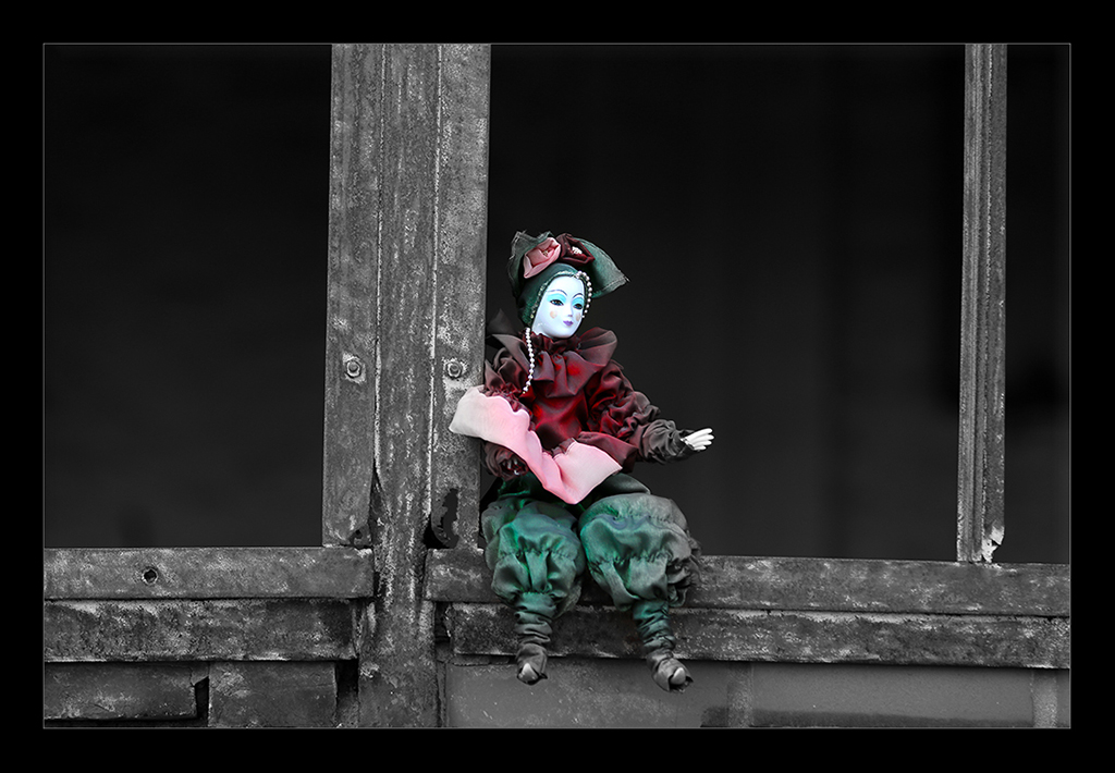
I would say: Mission accomplished - your photo really got the touch of a poster of old times. |
Aug 26th |
| 18 |
Aug 18 |
Comment |
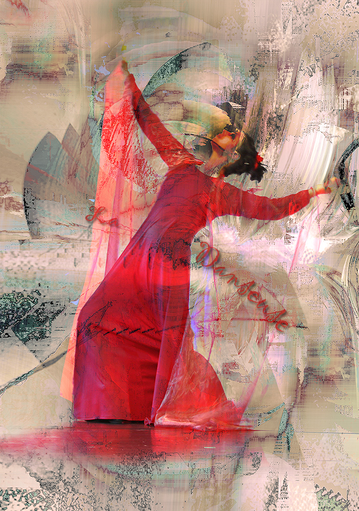
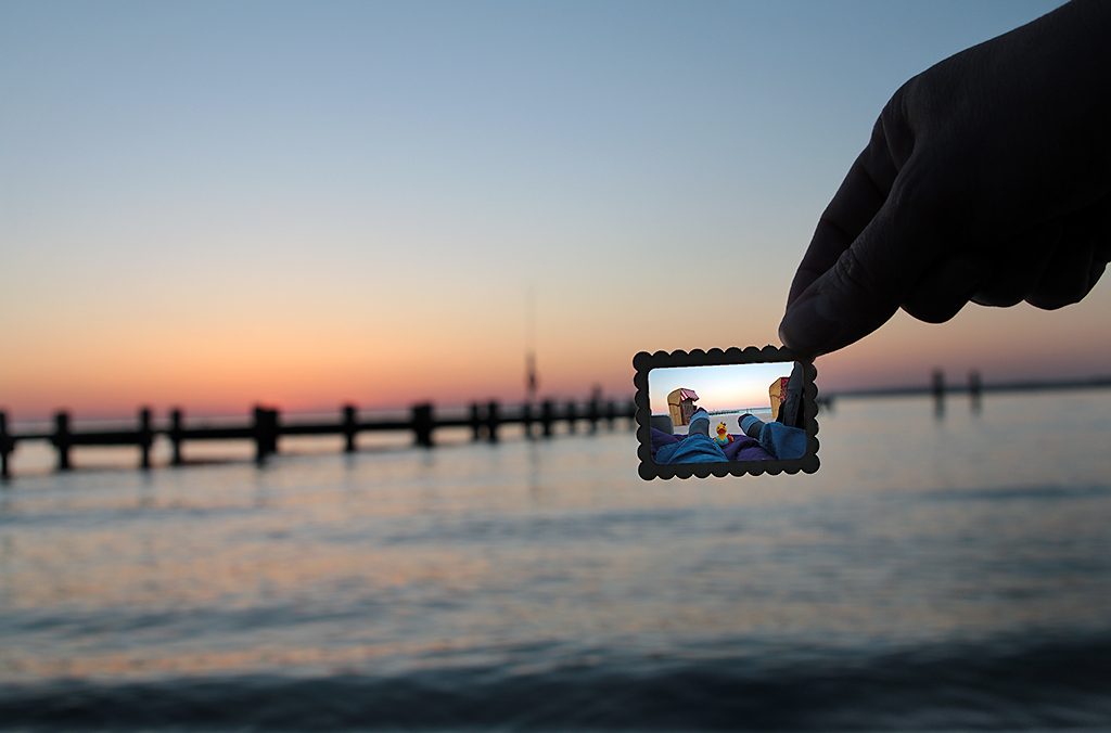
Your are definitely giving the picture some impressionistic touch - maybe a bit overboard (depends on the viewer's taste). But Toms' suggestion about removing the lettering is giving they eye a bit more peace. On the other hand I would not remove the port of harbor wall - it is giving the story, that the boat is just departing. |
Aug 26th |
| 18 |
Aug 18 |
Comment |
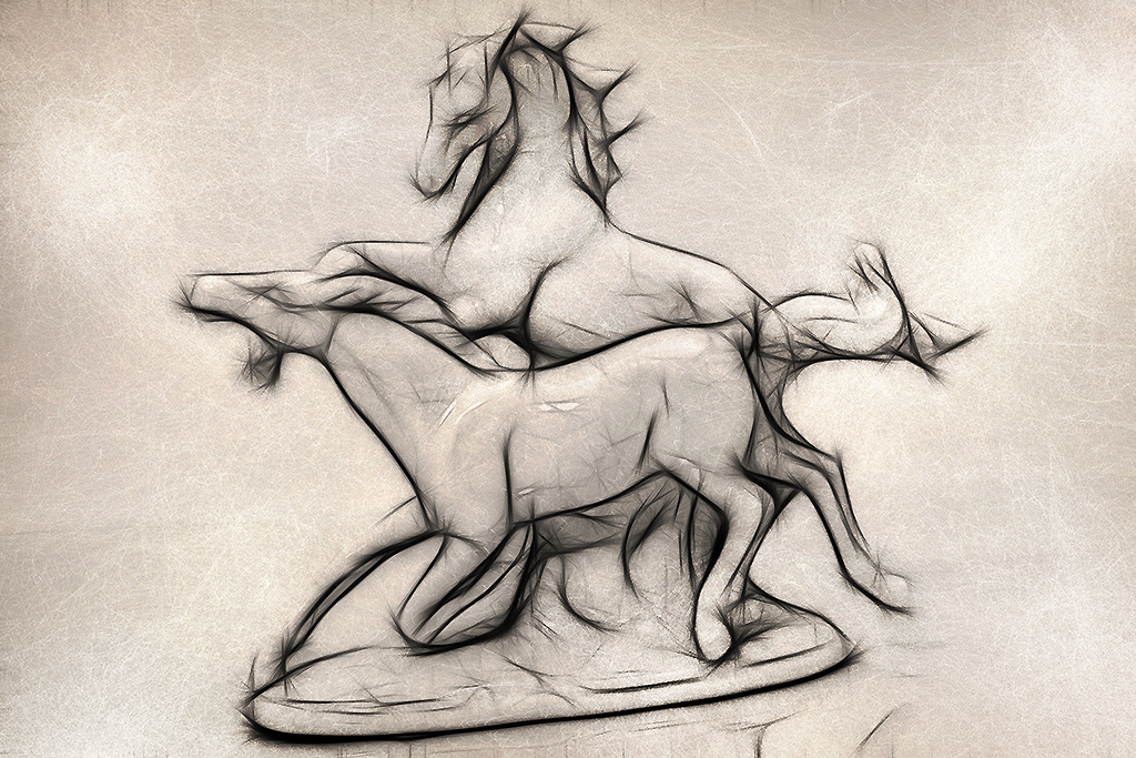
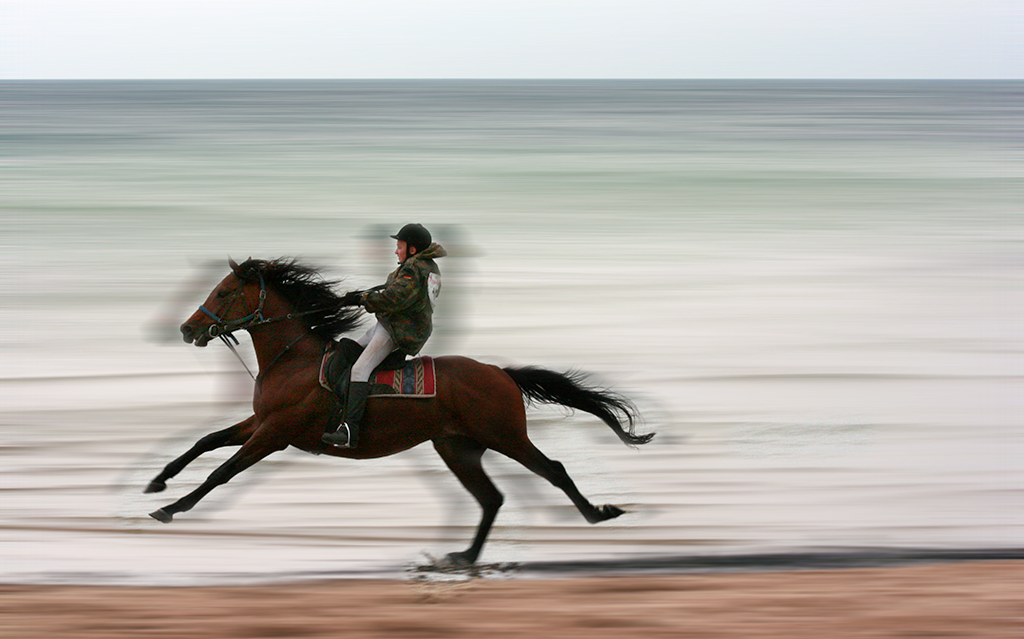
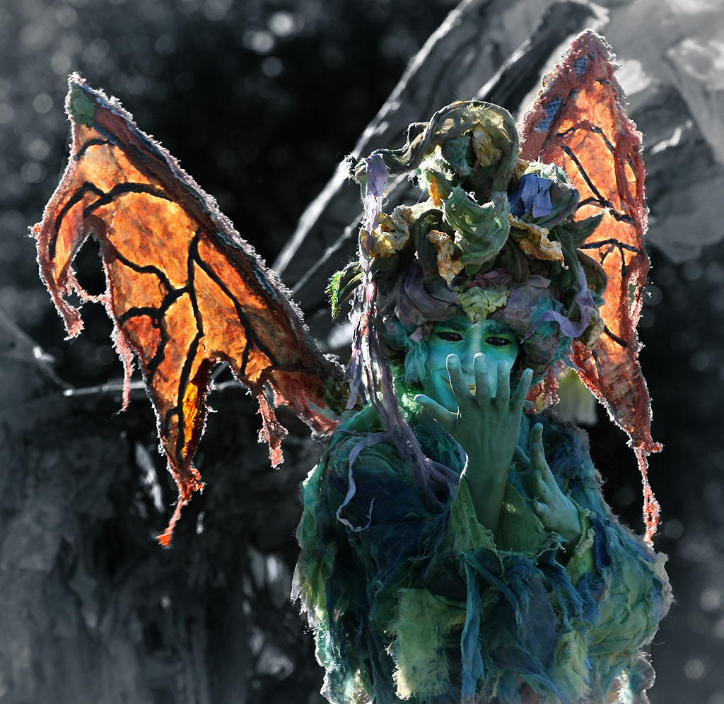
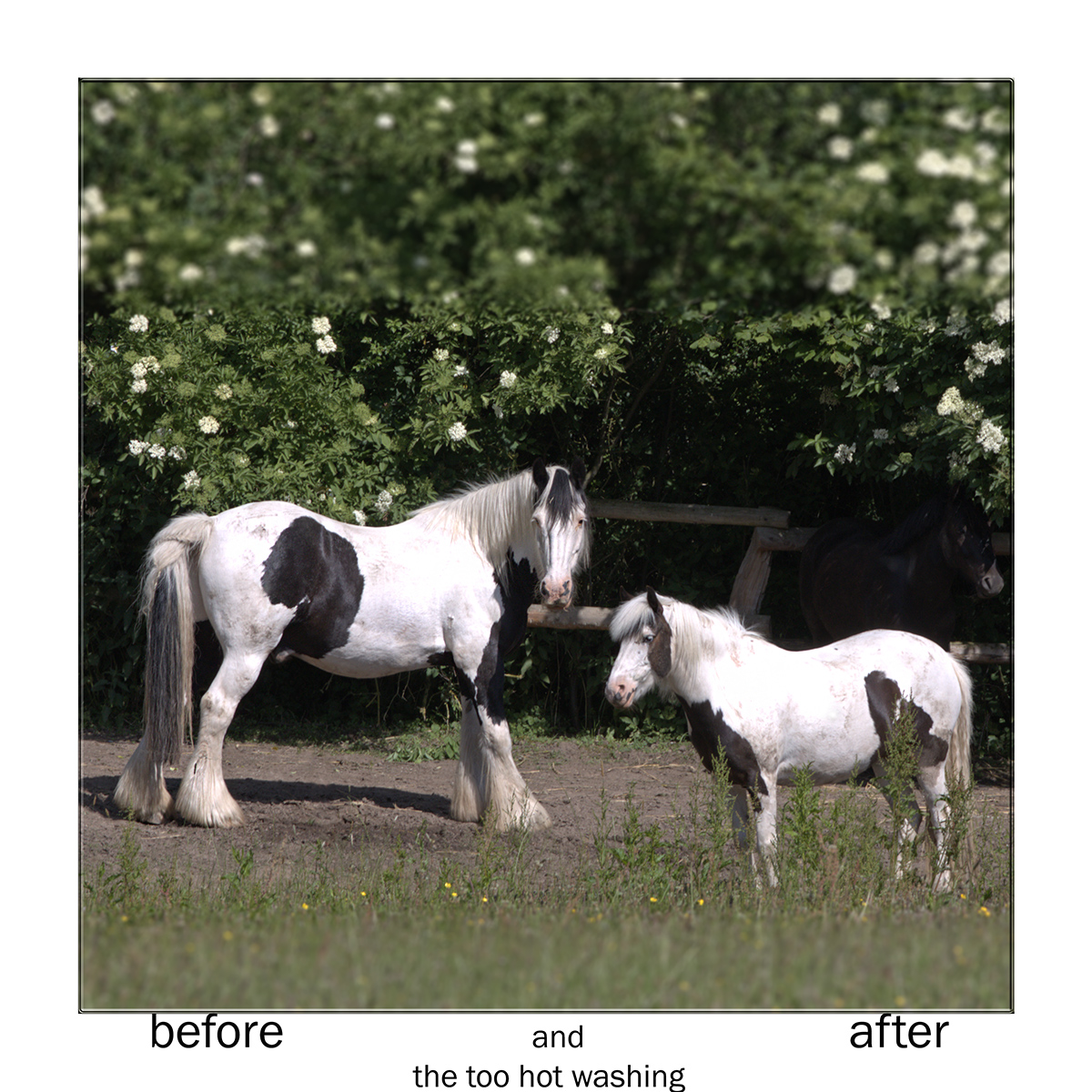
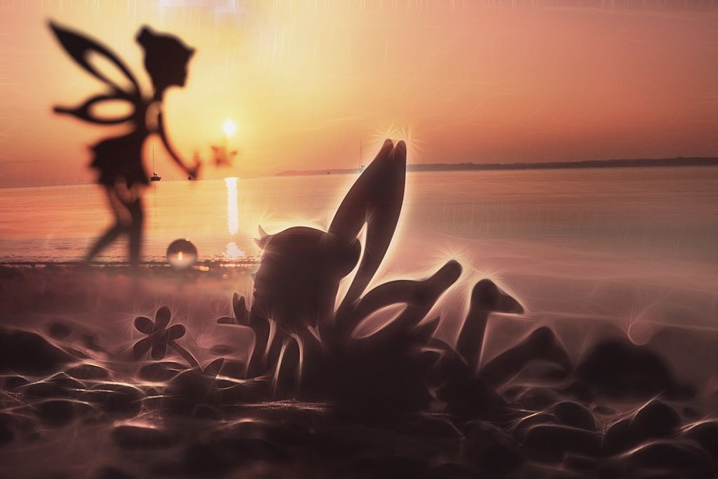
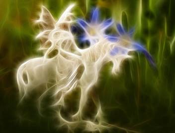
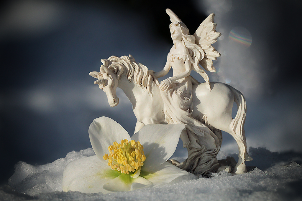
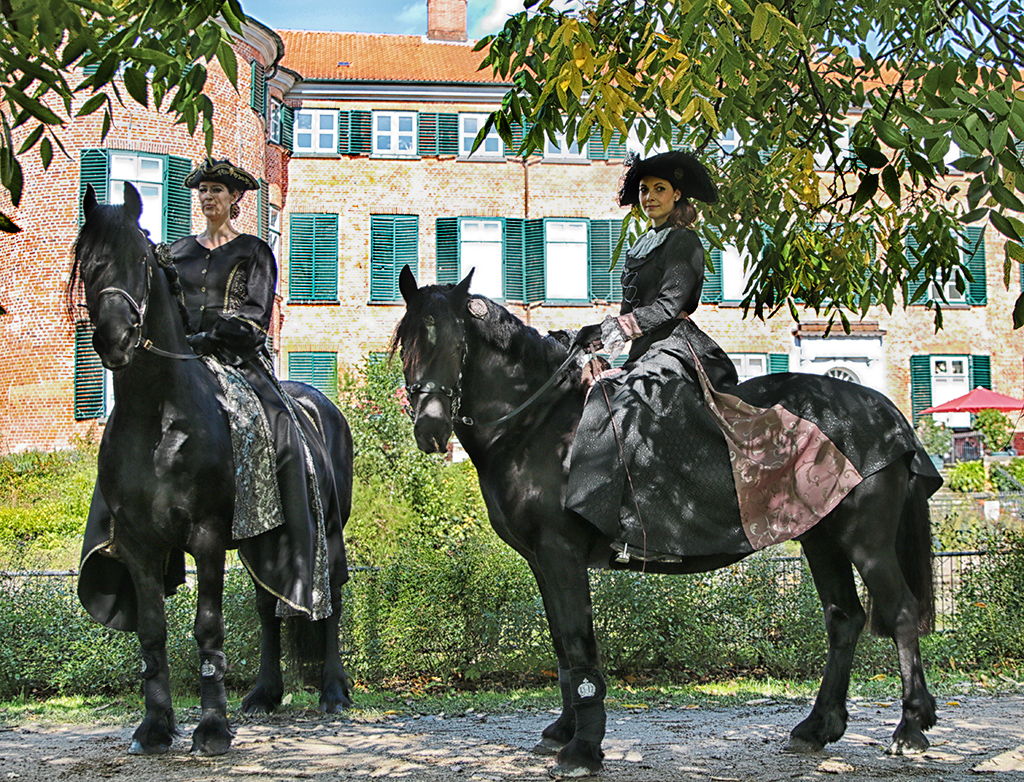
Great imagination here. Well done, how your are combining three pictures. Although I agree, that the horse on the second picture looks more confident (the white one a bit lost). Why did you choose a horse anyway? In my mind I am putting a fairy on the floating petal. |
Aug 26th |
6 comments - 0 replies for Group 18
|
| 38 |
Aug 18 |
Comment |
This picture works for me well - I like the texture and the background fits. Especially the soft toning works for me, so I don't agree this time with Art to give the picture more pop. See, tastes are different ;-). |
Aug 26th |
| 38 |
Aug 18 |
Comment |
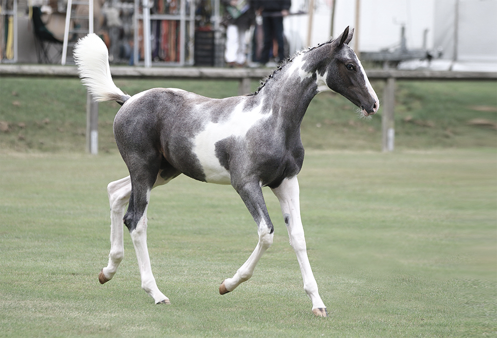
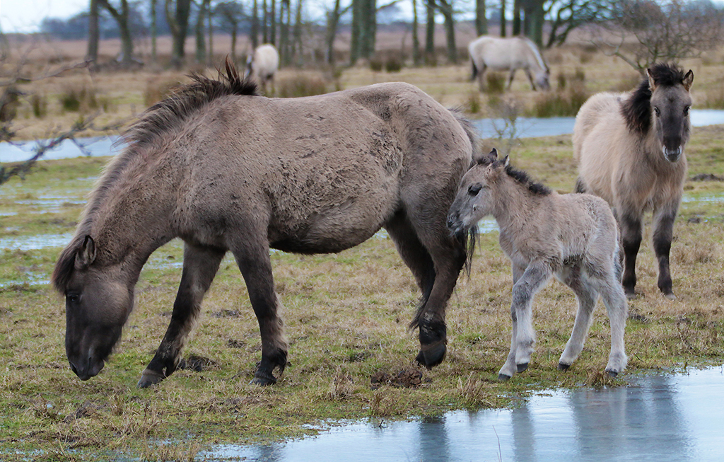
Oh Marge, since I looked at your picture I can't stop thinking about a horse story book I once read as a teenager. It was about a wild living dapple gray horse with a white head like yours on the photo. Your picture would fit perfectly the cover. Great this water action and the sharpness. I love it :-).
|
Aug 26th |
| 38 |
Aug 18 |
Comment |
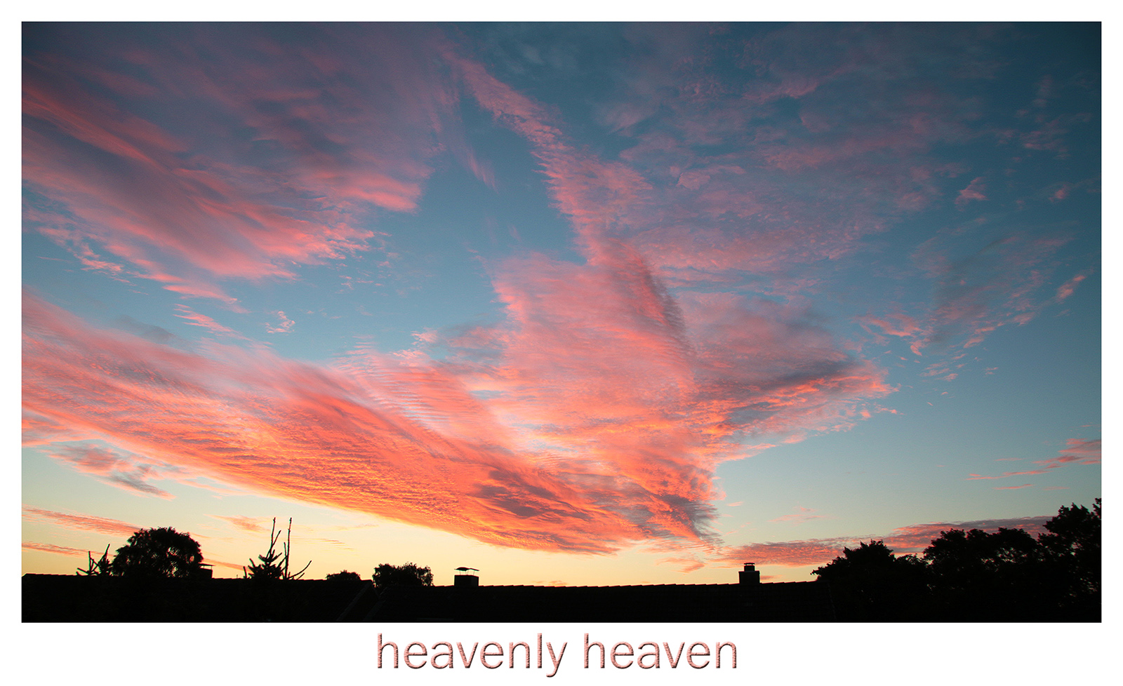
I like the great vibrant coloring of this picture + the drama clouds as a contrast. On the other hand Gabrieles version is well done too, but as your said in a more somber mood. It depends what you want to express here. |
Aug 26th |
| 38 |
Aug 18 |
Comment |
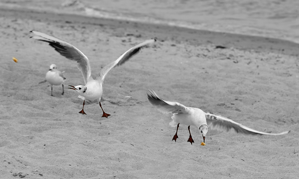
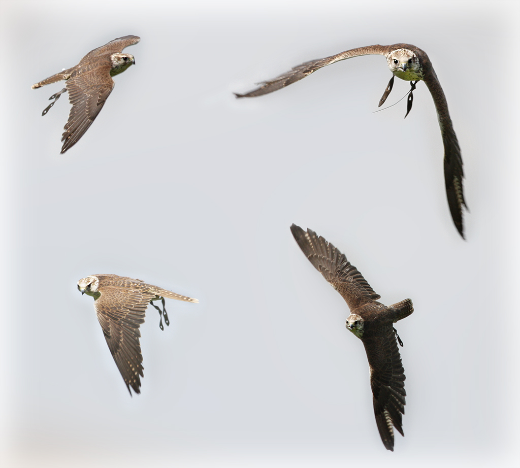
She sharpness of your pictures always are astonishing me! I just like to see this little catch in the birds beak - great.
And if you ever organize some bird shootings in North-Germany, let me know!! ;-)
|
Aug 26th |
| 38 |
Aug 18 |
Comment |
Good shot - getting the bird in this action pose.
Gabriele I agree with you about not cropping the picture, but it definitely needs to get the lights a bit toned down. At my first glimpse at the original picture I totally searched for the head of the bird. The second version works well! |
Aug 26th |
5 comments - 0 replies for Group 38
|
17 comments - 0 replies Total
|