|
| Group |
Round |
C/R |
Comment |
Date |
Image |
| 12 |
Apr 18 |
Comment |
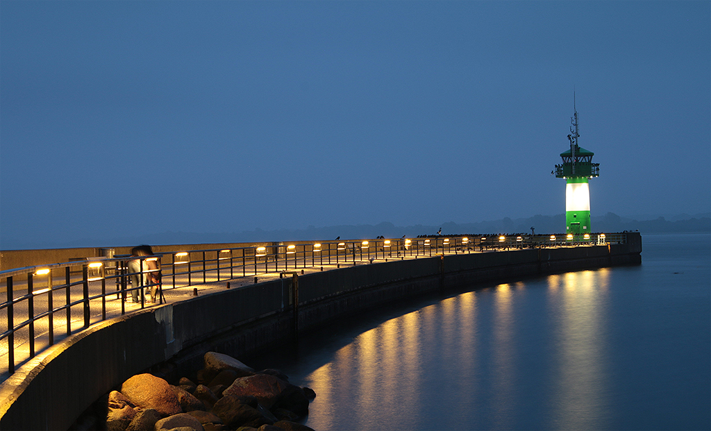
Like Ally I like the sculture contrast in front of the building. And all the lights around are more than enough light giving - even when they are a bit shaky, like Connie said. |
Apr 26th |
| 12 |
Apr 18 |
Comment |
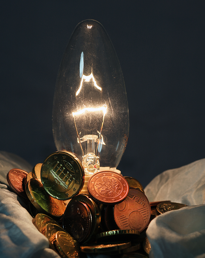
@Connie: No, I did not used a reflector here.
@Walter: The silver colored coins I keep staying in my money bag ;-)
@Carole: Although we have now the EURO quite a time, the coins are looking exotic to me too. Sometimes I am missing our nice old German "Mark". |
Apr 26th |
| 12 |
Apr 18 |
Comment |
Wow, that's quite a light giving lamp. I am following here Barbara's and Gavin's suggestion about the cropping. |
Apr 26th |
| 12 |
Apr 18 |
Comment |
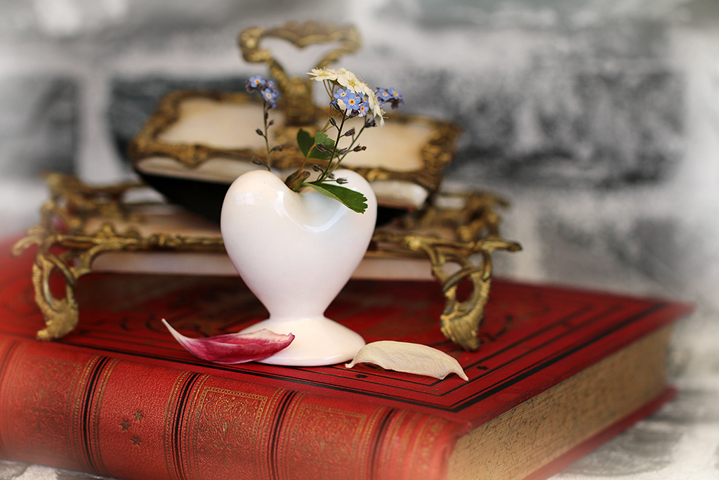
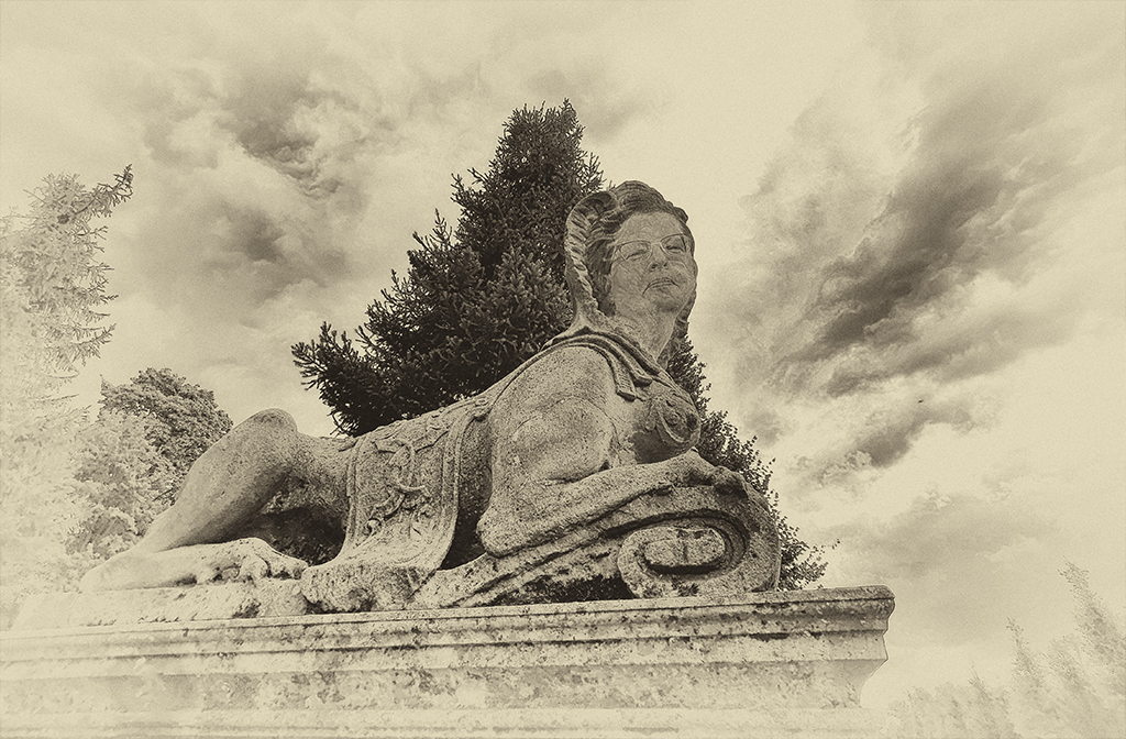
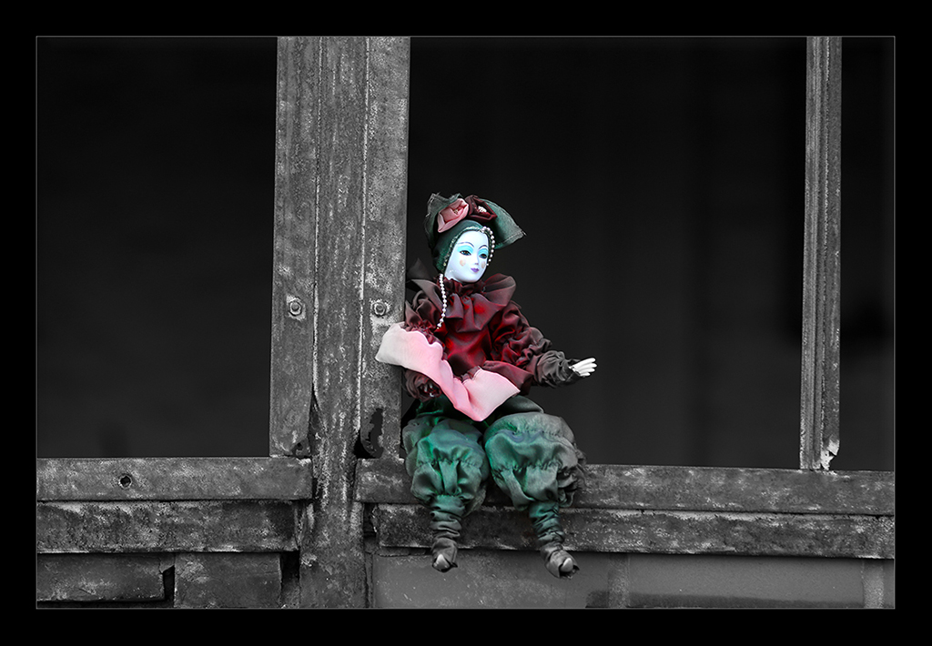
I like the hint of vintage look you added and how you pried out the architectural details. |
Apr 26th |
| 12 |
Apr 18 |
Comment |
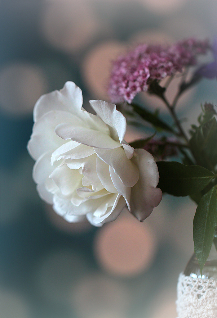
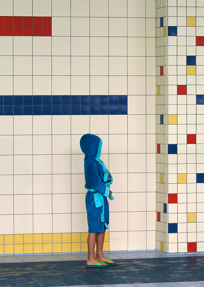
Well chosen object for our monthly theme and I like the shallow depth of field like Connie here. Maybe you could the picture brighten up a little bit? |
Apr 26th |
| 12 |
Apr 18 |
Comment |
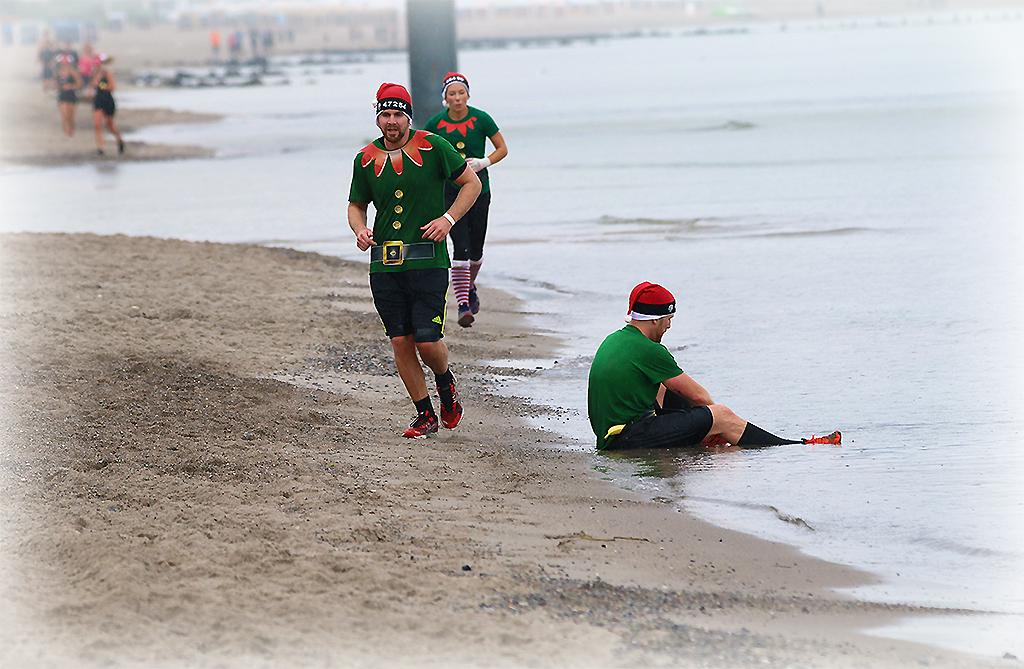
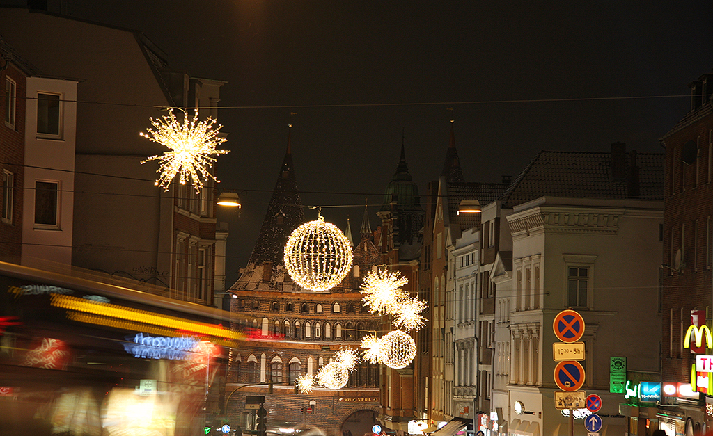
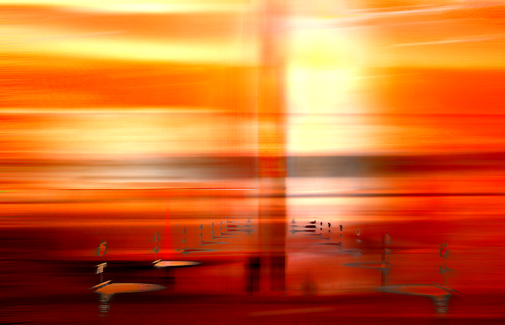
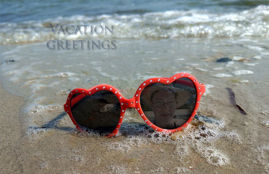
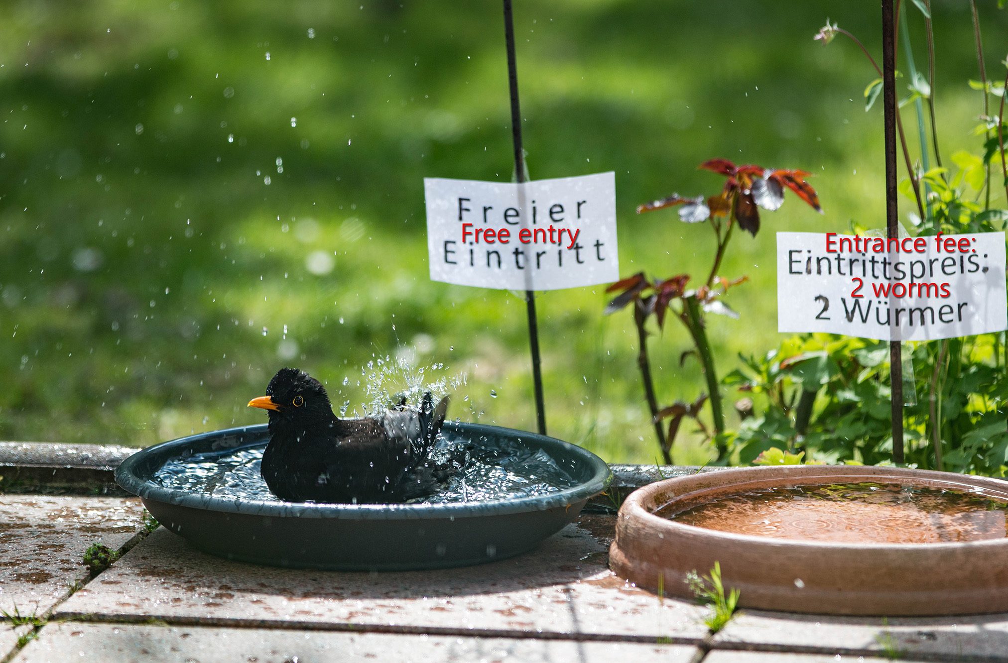
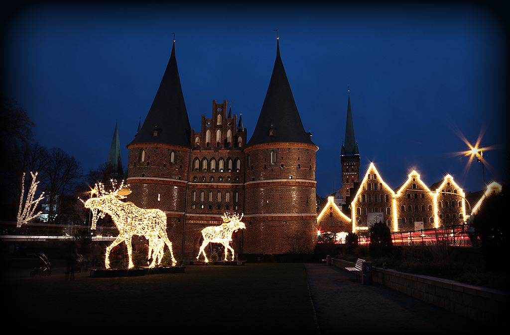
That looks great - it looks like the ships they are decorating every Christmas in our harbor. Wounderful colors.
|
Apr 26th |
6 comments - 0 replies for Group 12
|
| 18 |
Apr 18 |
Comment |
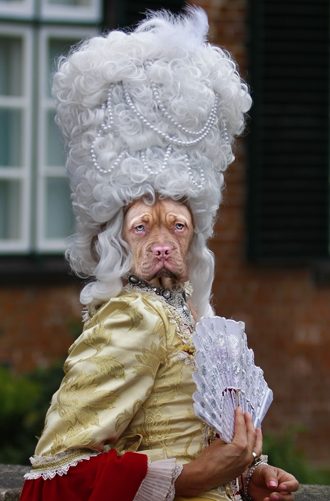
@Peter: Yes, Gratisprobe would be a nice title ;-).
@Mark: You are right with your cropping suggestion.
Thanks for your comments, I like to make people laugh about my pictures. |
Apr 26th |
| 18 |
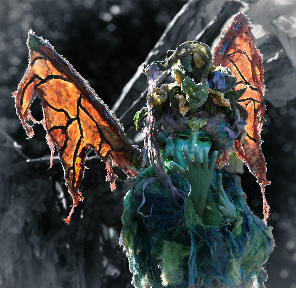
Apr 18 |
Comment |
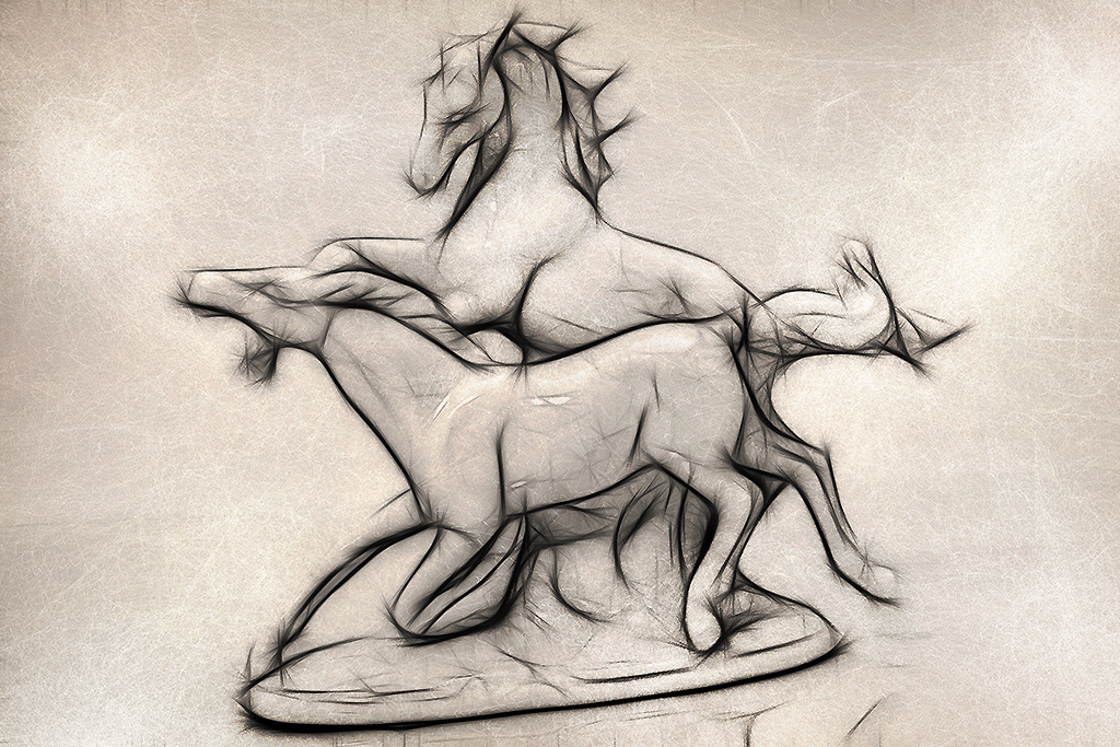
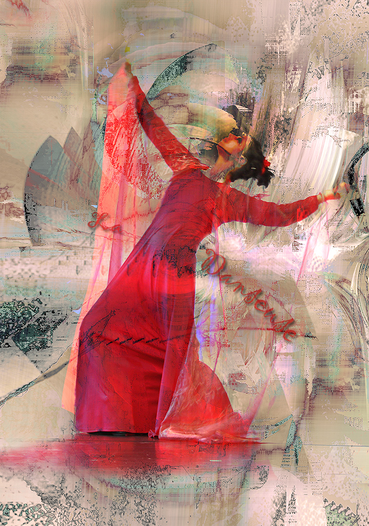
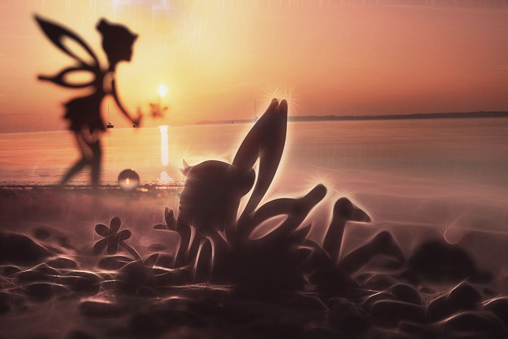
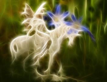
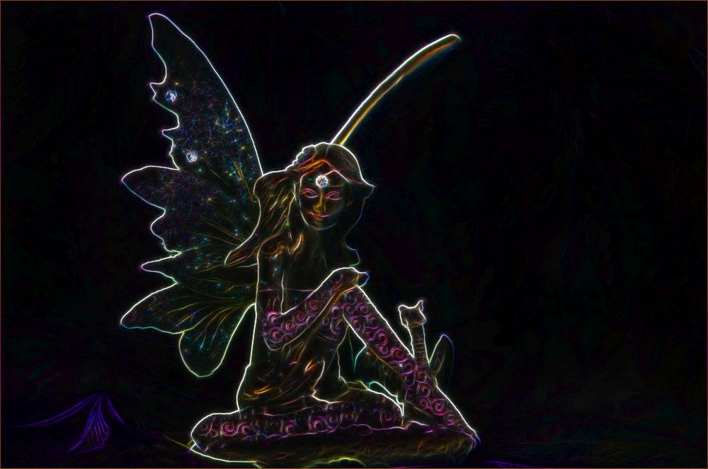
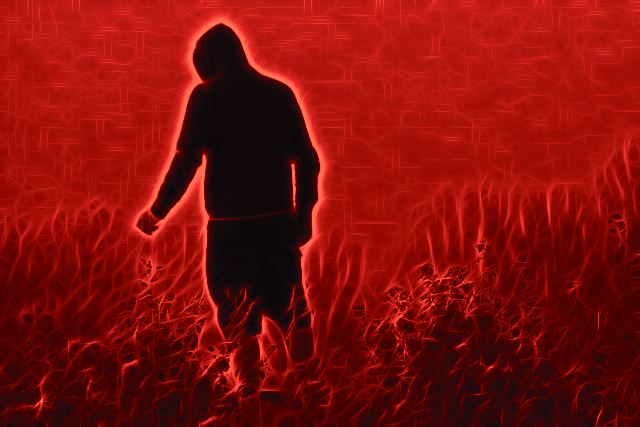
A fine fiery coloring - but I would like the figure more solid centered. I played around with your photo with the Fractalius filter and the color lookup from PS, if you don't mind... |
Apr 26th |
 |
| 18 |
Apr 18 |
Comment |
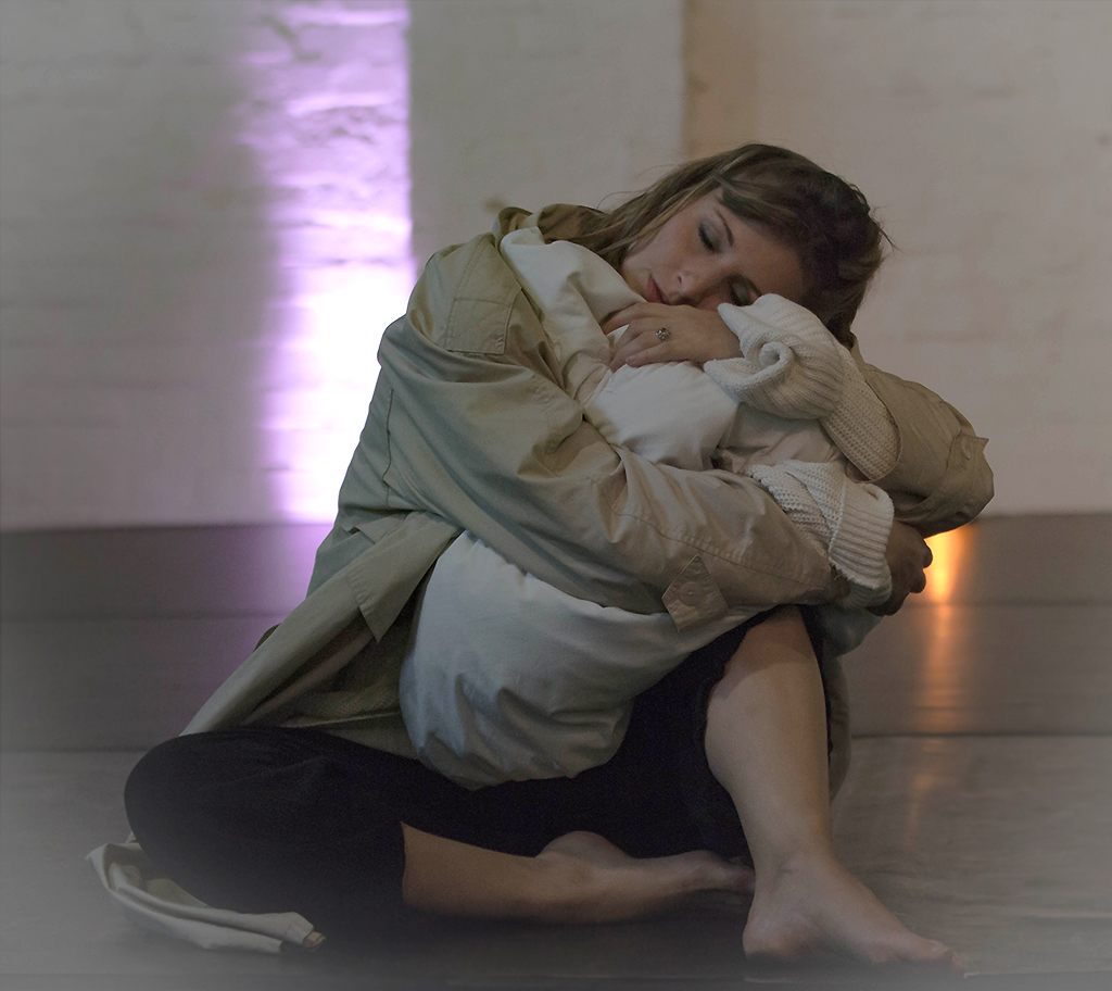
The toning works great and the second picture looks best for me with its thigher crop, although I didn't mind the text. |
Apr 26th |
| 18 |
Apr 18 |
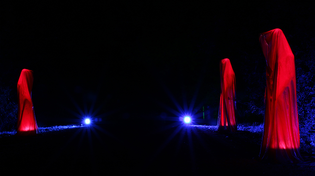
Comment |
Very scary - b/w was a good choice for it. About the crosses I am with the others - I even would eliminate the frame. It is too straight. |
Apr 26th |
| 18 |
Apr 18 |
Comment |
Congratulations Ian for your won Salon. You earned it with this picture. I have to look out for this PanosFX as well ;-). |
Apr 26th |
| 18 |
Apr 18 |
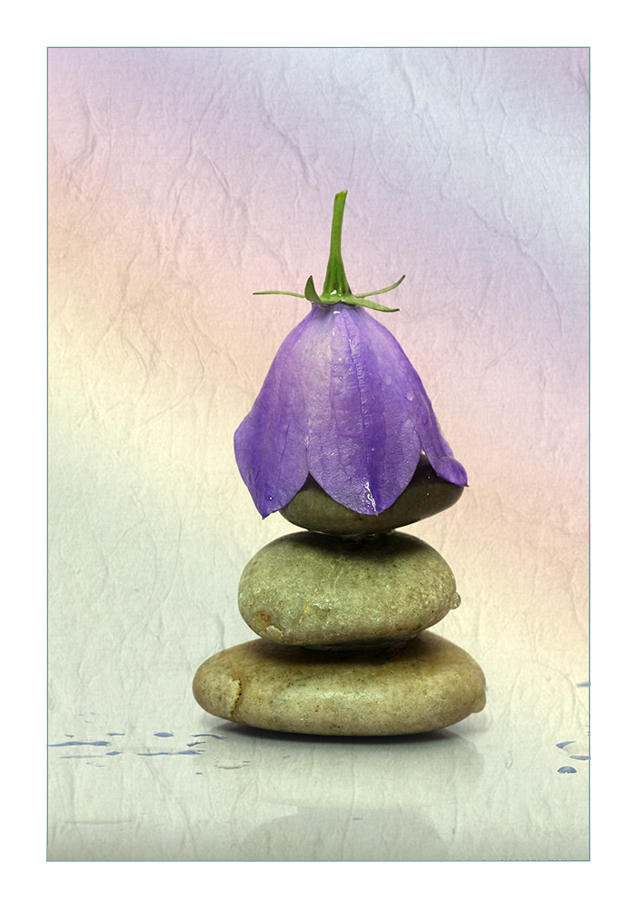
Comment |
No more improvements needed - you just made that picture vivid. I like it very much. |
Apr 26th |
6 comments - 0 replies for Group 18
|
| 38 |
Apr 18 |
Reply |
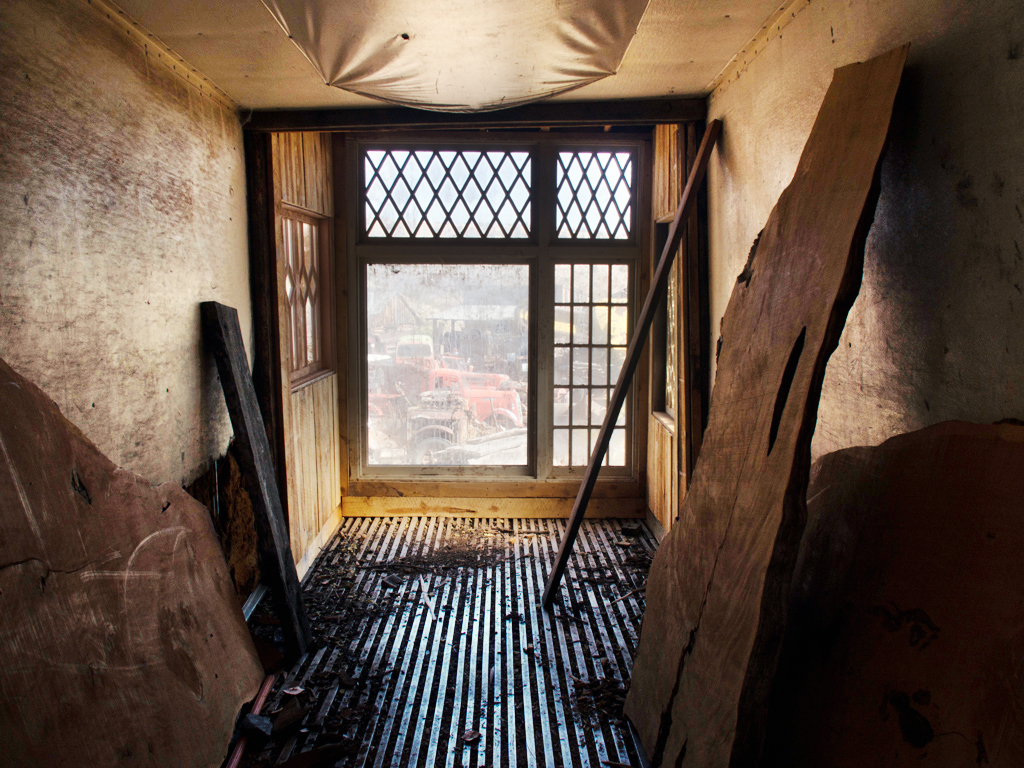
No, the ceiling does not bother me at all because the eye walkes straight through to the window. |
Apr 26th |
| 38 |
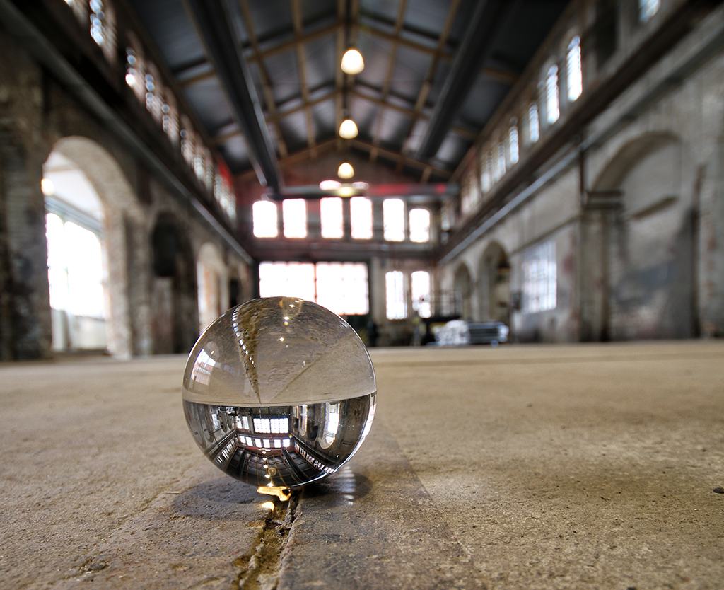
Apr 18 |
Comment |
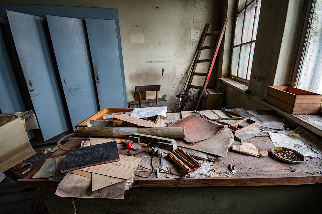
All in all I prefer the original picture - it has some more depth in it and has a nice lost place look. I tried to play with the gradient curve and with the color lookup from PS. |
Apr 25th |
 |
| 38 |
Apr 18 |
Comment |
Thanks for your nice comments - you make me blush ;-).
And Art is right here to darken the background! |
Apr 25th |
| 38 |
Apr 18 |
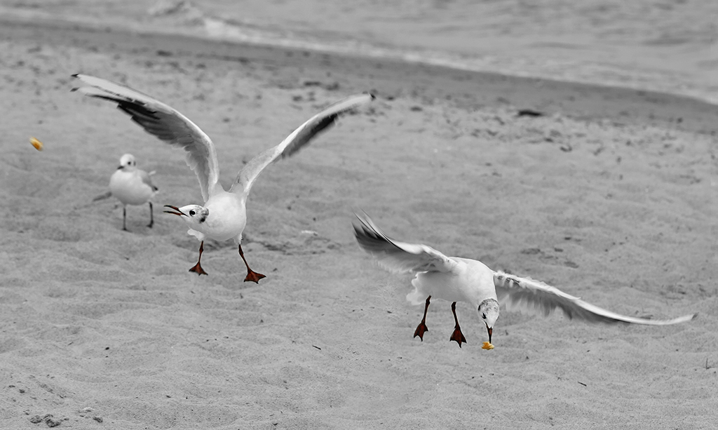
Comment |
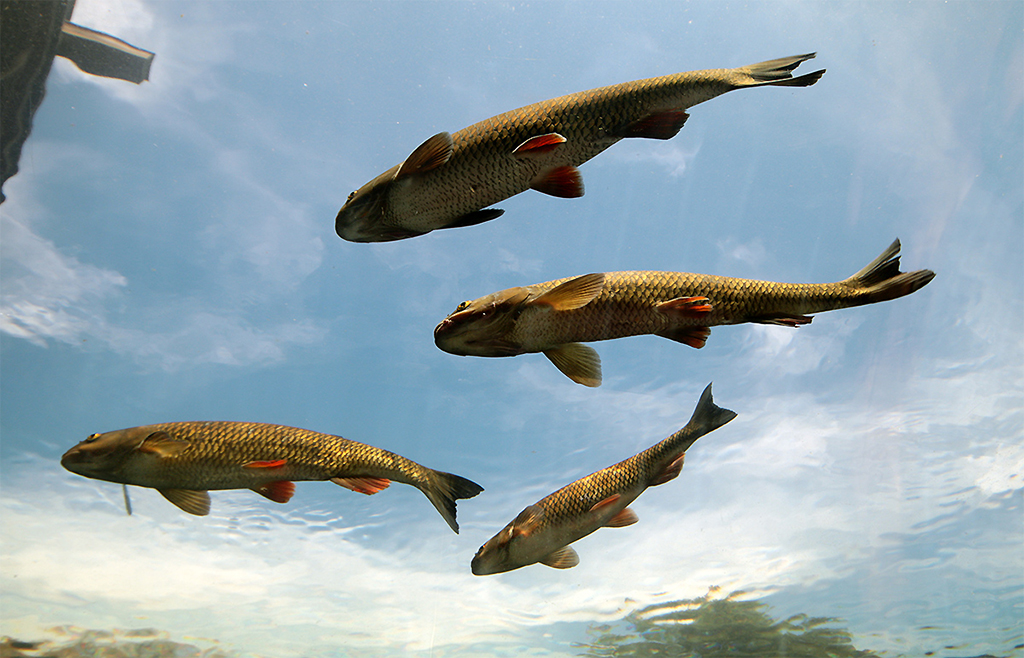
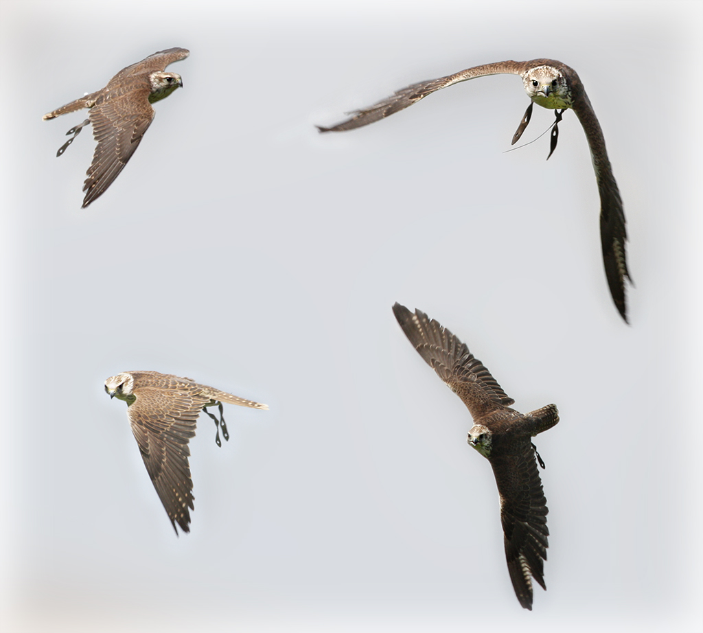
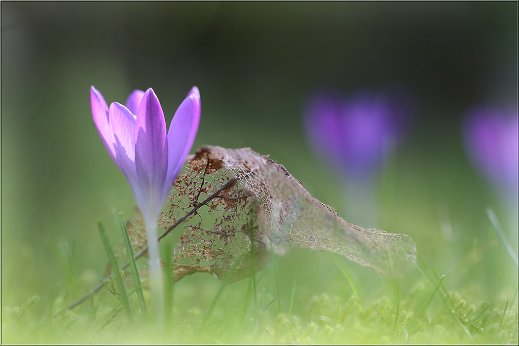
Very good shot and capturing three birds in action - I wouldn't change a thing. |
Apr 25th |
| 38 |
Apr 18 |
Comment |
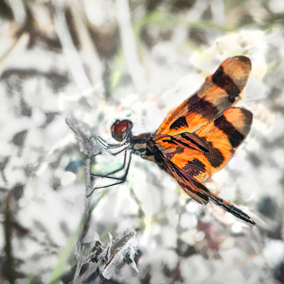
Hi Art, I agree that the background is a bit confusing. But I like your way of a nearly color-key picture here. Also I like Phyllis colored picture. For me it would be allright, just to crop your picture a bit. |
Apr 25th |
 |
| 38 |
Apr 18 |
Comment |
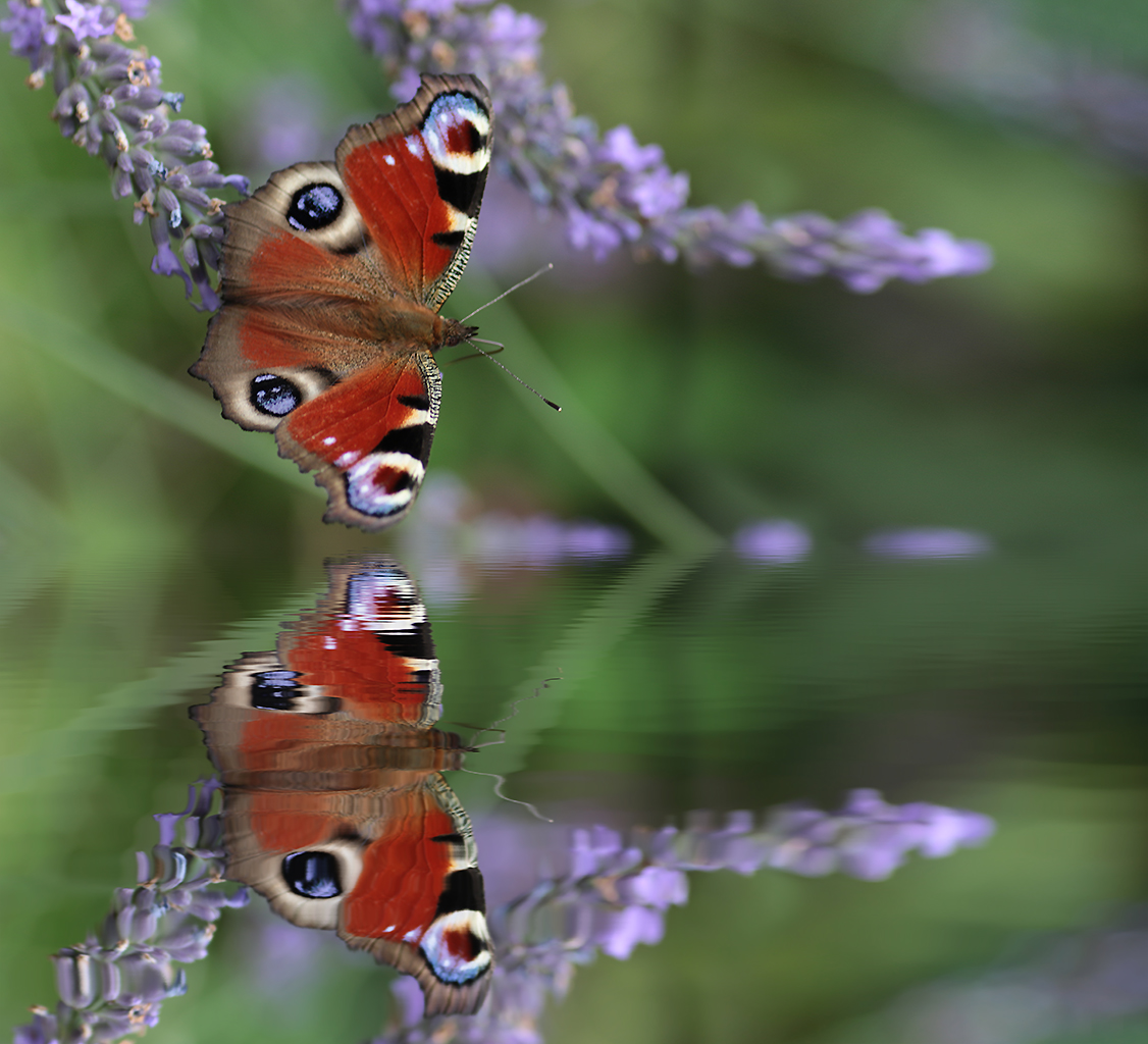
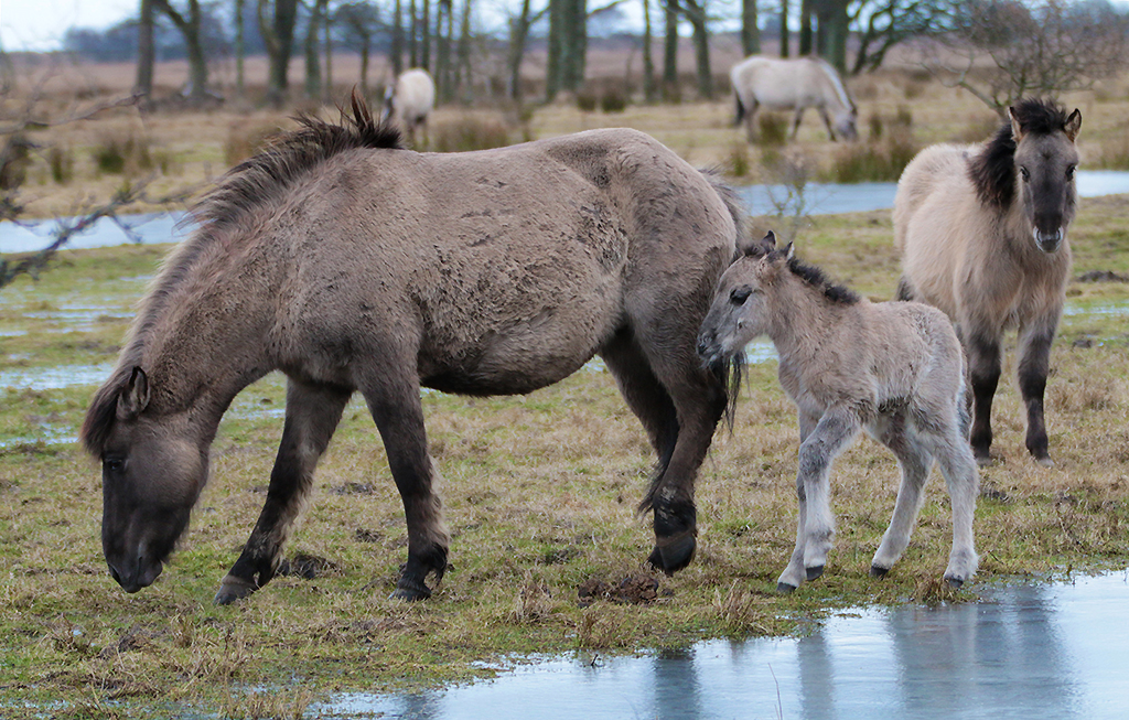
A nearly perfect wildlife shot - maybe I would enlighten the picture a tad bit and I would cut the bottom like Marge suggested. |
Apr 25th |
| 38 |
Apr 18 |
Comment |
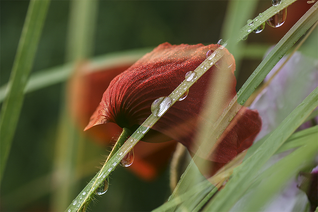
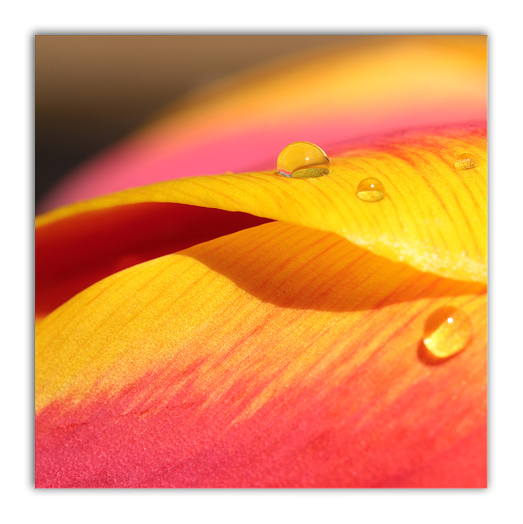
I like the yellow-red contrast very much - wonderful colorful. And I agree to Art's suggestion about the cropping from both sides. |
Apr 25th |
6 comments - 1 reply for Group 38
|
18 comments - 1 reply Total
|