|
| Group |
Round |
C/R |
Comment |
Date |
Image |
| 12 |
Mar 18 |
Comment |
A real cool picture of gemoetric architecture + the walking coupe it is perfect. I wouldn't change here anything. |
Mar 23rd |
| 12 |
Mar 18 |
Comment |
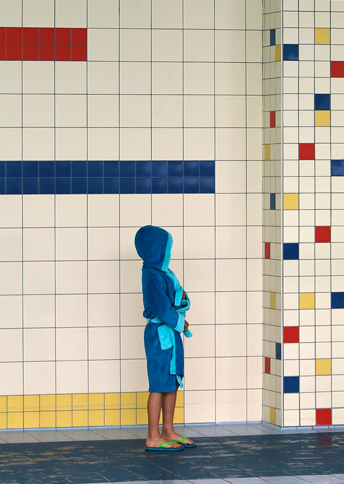
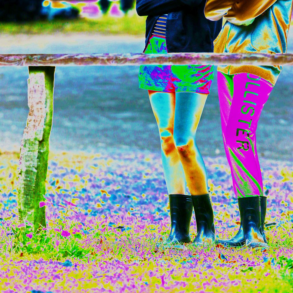
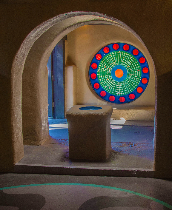
Hi Gavin - would this be a theme about people or street photography, you crop would be the winner.
But for the geometric shapes I chose all the colored tiles on purpose to show. |
Mar 23rd |
| 12 |
Mar 18 |
Comment |
A clever idea is this way to show diverse geometric shapes. As Barbara says, the red bush is a nice eye catcher. Therefor I would cut the bottom of the picture a bit to center it a bit more. |
Mar 23rd |
| 12 |
Mar 18 |
Comment |
This is a fine piece of art for my eyes! I love the first picture with its nice colors. And I enjoy to look at all the details too. |
Mar 23rd |
| 12 |
Mar 18 |
Comment |
Good eye, Gavin - there are really enough geometric shapes. Together with Carole's 2nd crop it is a very well done picture.
|
Mar 23rd |
| 12 |
Mar 18 |
Comment |
Good light, nice fitting frame and a good reflection. Well done Carole. I like your chosen Geometric Shapes. |
Mar 23rd |
6 comments - 0 replies for Group 12
|
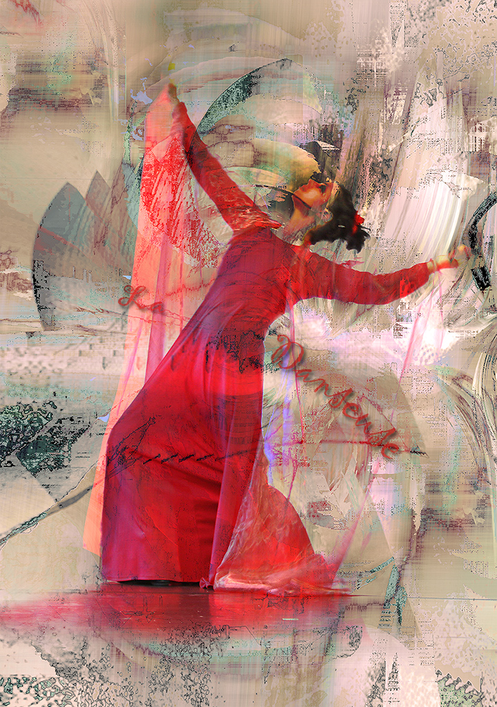
| 18 |
Mar 18 |
Comment |
;-) Peter, if I would change the background into a hairdresser salon, I would have to change the slogan like:
"We are making wonderous things for your hair... your faces are your own concern" ;-)
Thanks for all your comments :-). |
Mar 27th |
| 18 |
Mar 18 |
Comment |
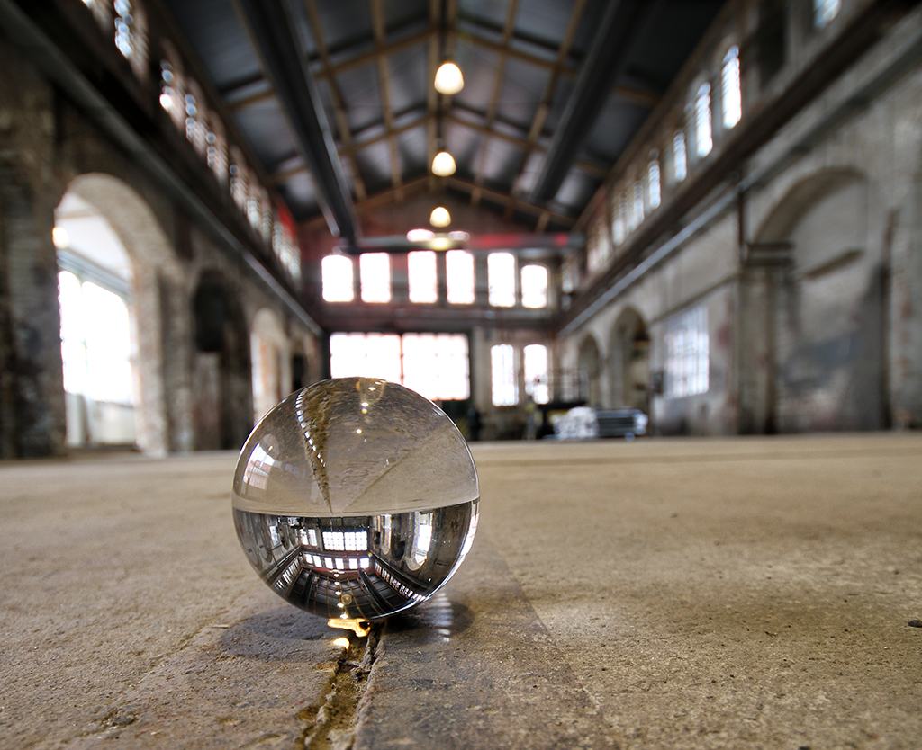
Great work - it looks very spherical. You definitely gave it a sci-fi look in a very dreamy way. And I like the first version better - all these colors just need "space"! |
Mar 27th |
| 18 |
Mar 18 |
Comment |
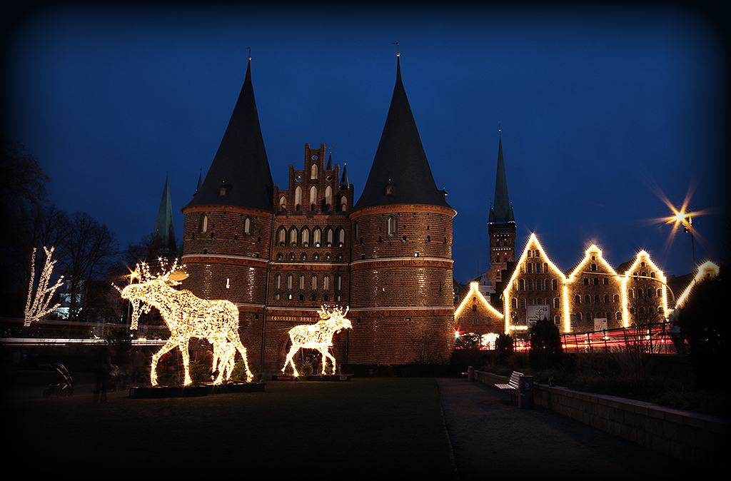
Very hard contrasts - but it works with this scenery. The clouds are looking really heavy. Peter's example is giving a more golden touch and works well too. Like Tom, I would like to see the original photo. |
Mar 26th |
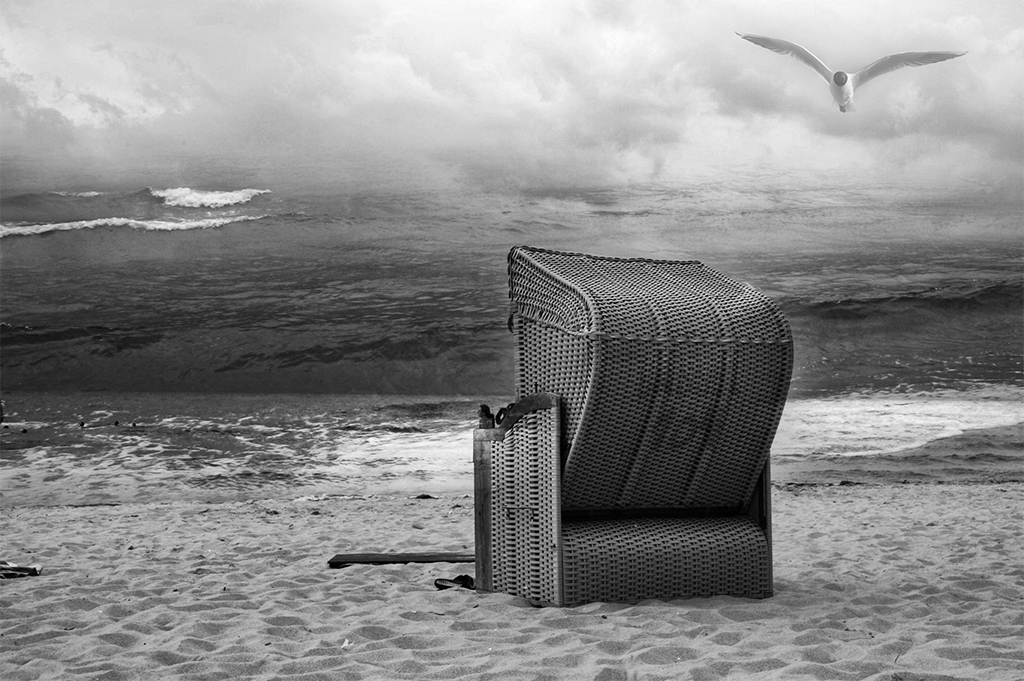
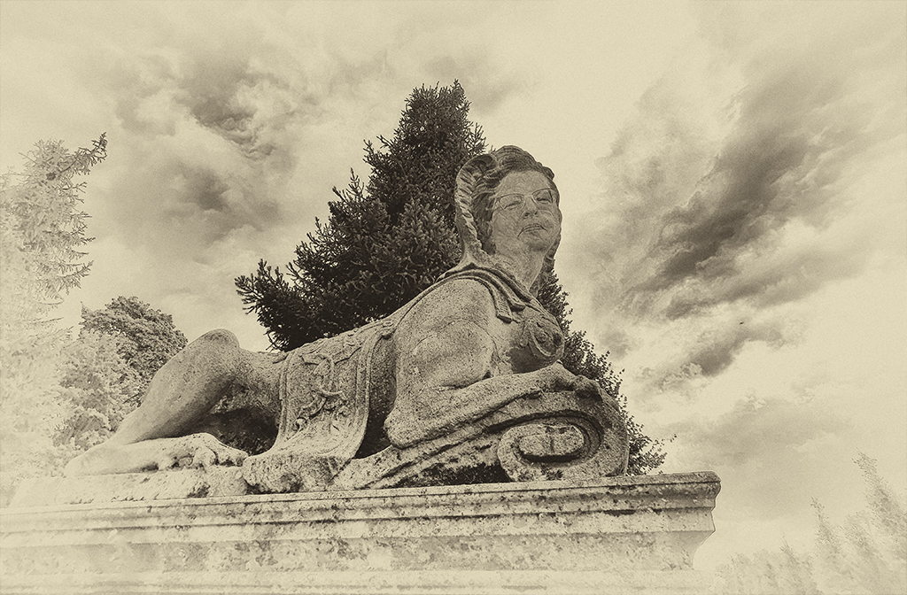
| 18 |
Mar 18 |
Comment |
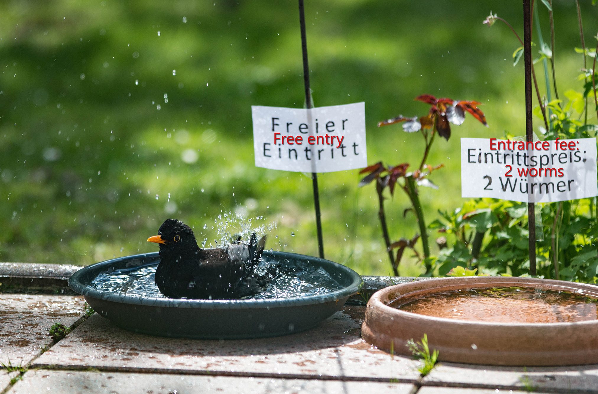
Great idea - the only thing I would change is a bit more sharpness for the lion. |
Mar 26th |
| 18 |
Mar 18 |
Comment |
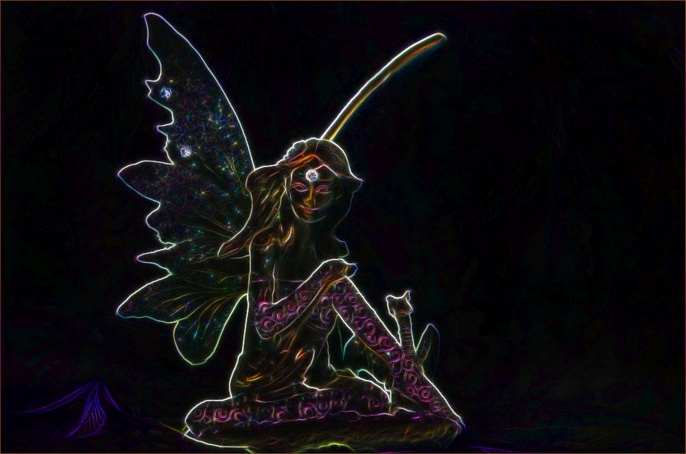
Wow - you gave the original a complete different look. You changed it from a lightful mediterranean look into something darker and with sparkling color lines. For me it looks now more dark and colorful - more asian. I like it.
When I am playing with such glowing lines I am using the plug-in "Fractalius" from Redfield. |
Mar 26th |
| 18 |
Mar 18 |
Comment |
For me your first pictures works better. As I already said, the shadows and colors are making it interesting for the viewers eye. |
Mar 26th |
6 comments - 0 replies for Group 18
|
| 38 |
Mar 18 |
Comment |
I like it, how the colorful background is luring the eye into the depth of the picture. Therefor I would enhance the color dynamic a bit more - but I would choose a crop between Gabriele and Art. The floor pattern is just too nice to be cropped out - but I would like the green line coming out of the right lower corner. Just see my added example.
|
Mar 23rd |
 |
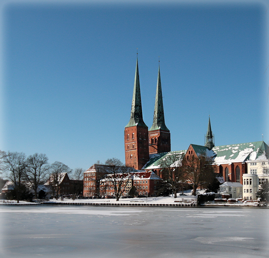
| 38 |
Mar 18 |
Comment |
Thank you for you comments :-).
My reason for bringing in the branches: It just gives a nice mood with the shadows on th ice. And there isn't too much plain sky.
I am adding a more plain picture just from the building - for me it doesn't work as well like the the first.
|
Mar 23rd |
 |
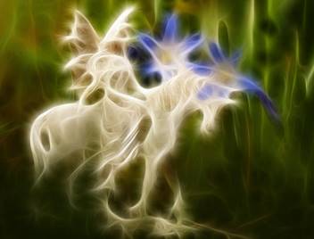
| 38 |
Mar 18 |
Comment |
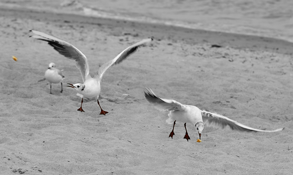
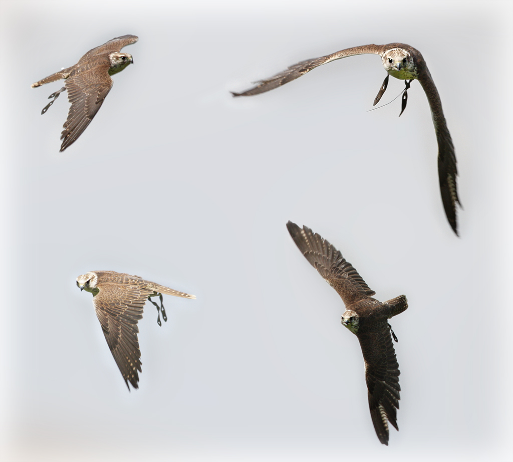
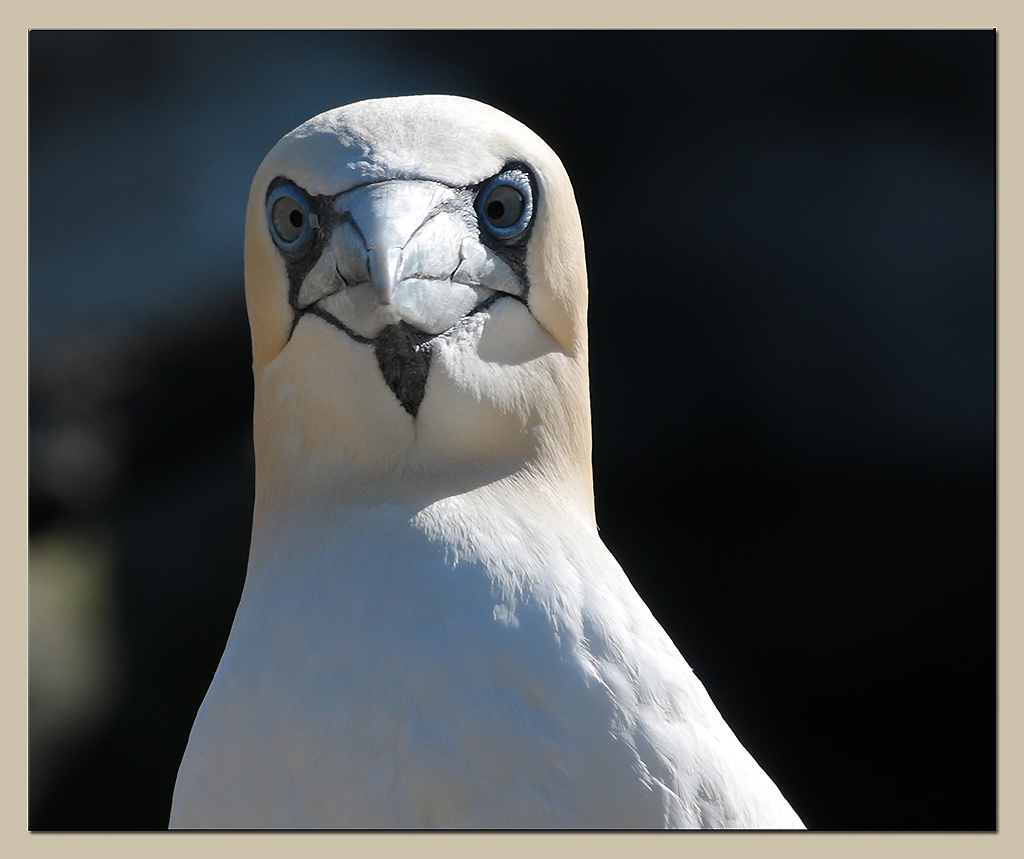
I just love it, how the feathers are fluorescing. Wonderful sharp picture, Marge. |
Mar 23rd |
| 38 |
Mar 18 |
Comment |
A great photo, Art, with it's dynamic and light. I only wish for a bit more space to the right side, because the dynamism is leaning in this direction. |
Mar 23rd |
| 38 |
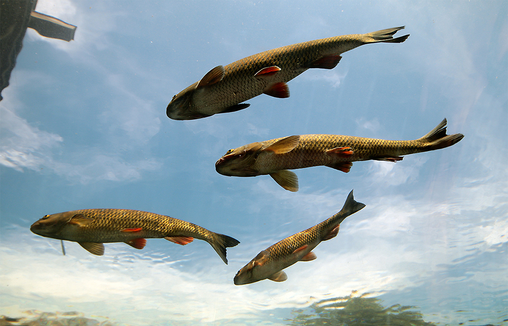
Mar 18 |
Comment |
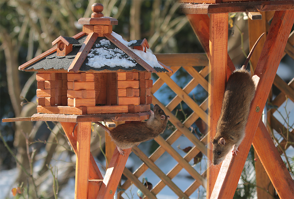
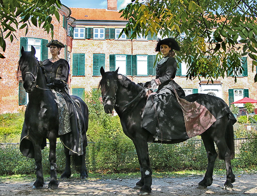
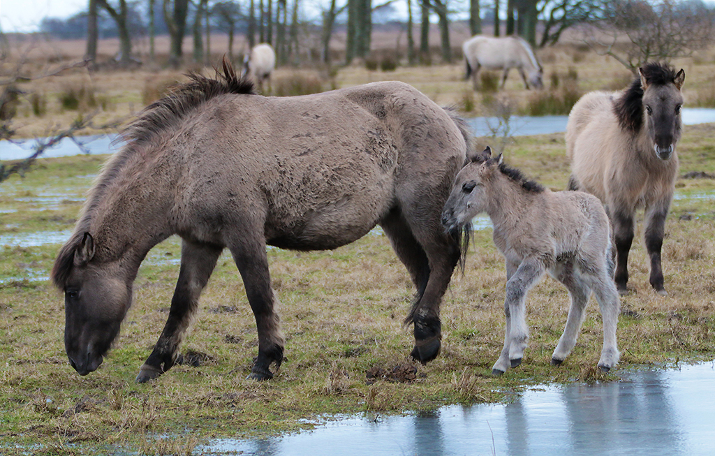
Wonderful picture, Gerhard. The models are lining up perfectly ;-) - the light is beautiful. Art's input fits well, because the animals would be more in the center of the picture. |
Mar 23rd |
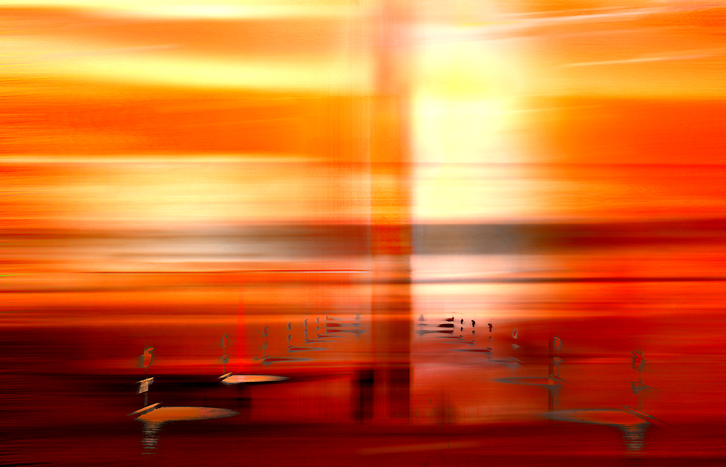
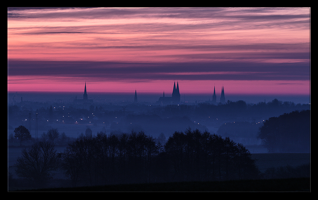
| 38 |
Mar 18 |
Comment |
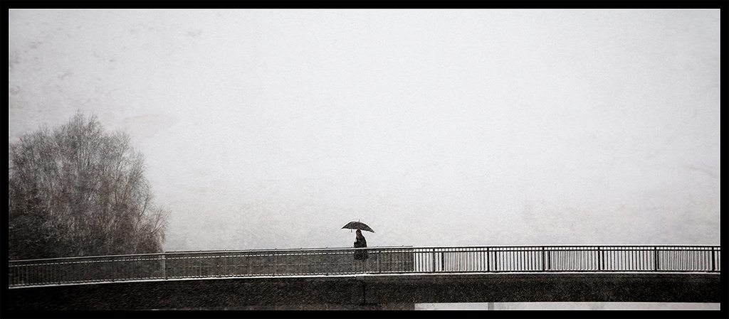
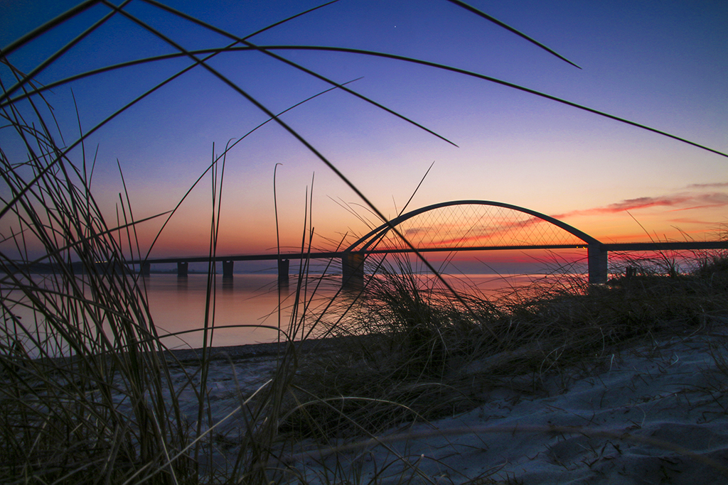
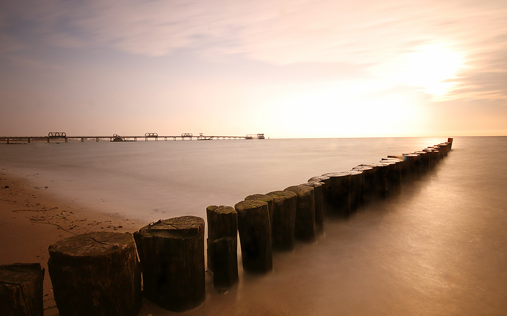
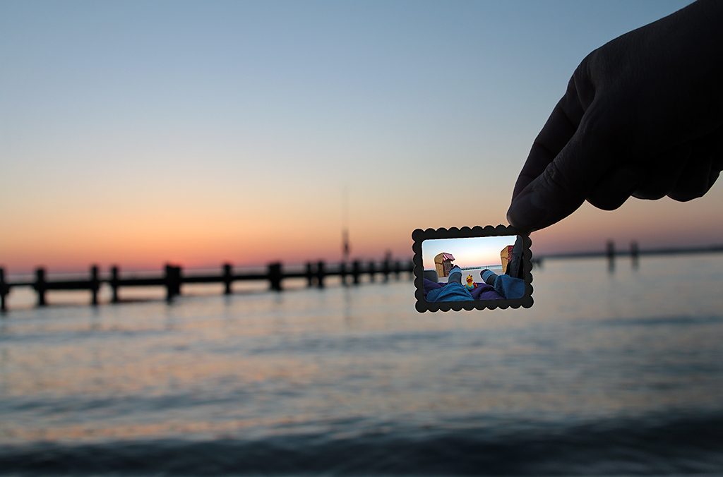
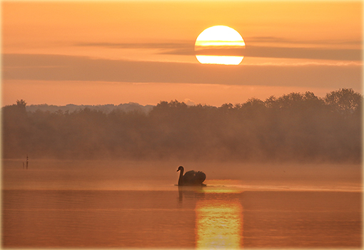
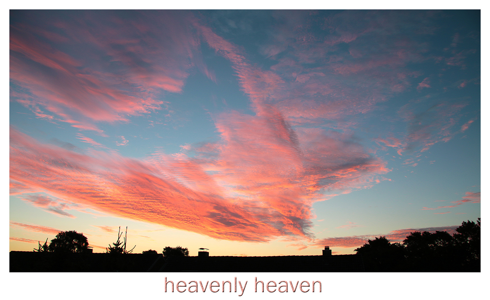
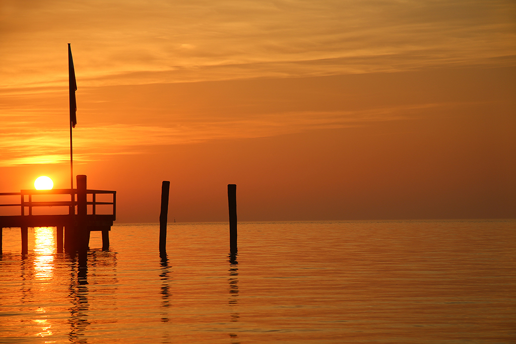
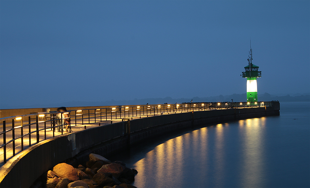
A fine sunrise/sunset picture. For me there is no crop needed on the left site because of the nice deep leading line of clouds above the bridge. |
Mar 23rd |
6 comments - 0 replies for Group 38
|
18 comments - 0 replies Total
|