|
| Group |
Round |
C/R |
Comment |
Date |
Image |
| 12 |
Nov 17 |
Comment |
Thank you for your comments!
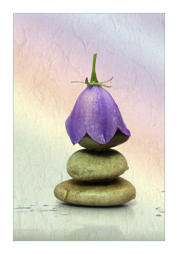
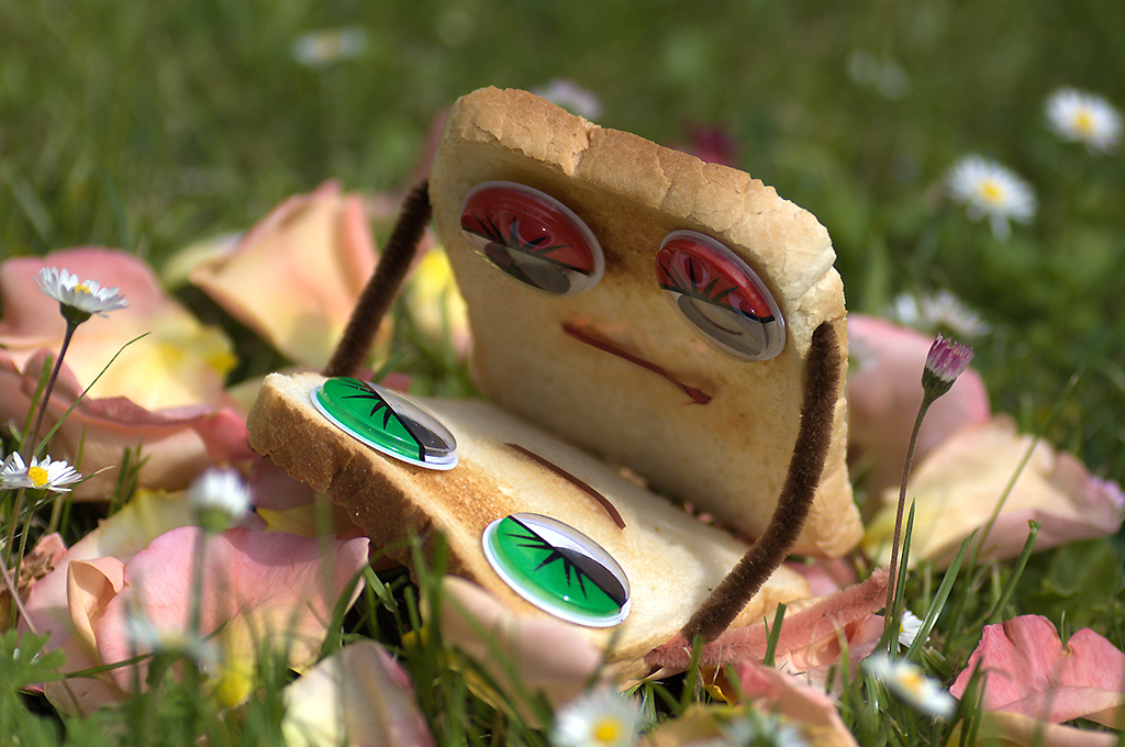
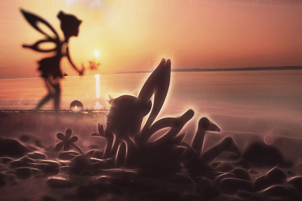
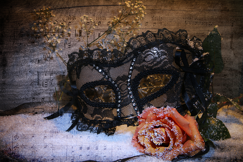
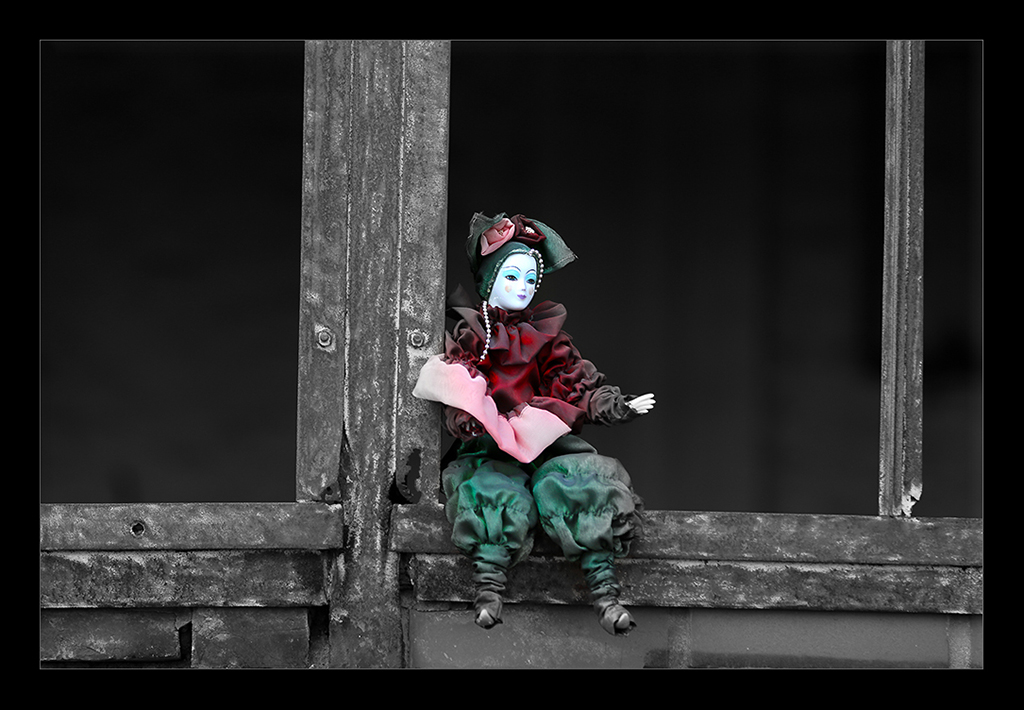
@Barbara: I guess, you choose the perfect titel for it, thank you! :-)
@Connie: Your hausband maybe is right. That's the reason, I always have some toys with my ;-). |
Nov 24th |
 |
| 12 |
Nov 17 |
Comment |
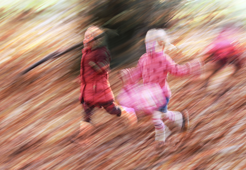
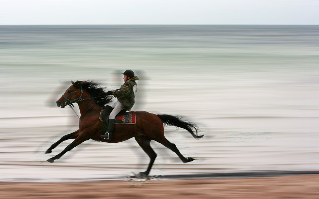
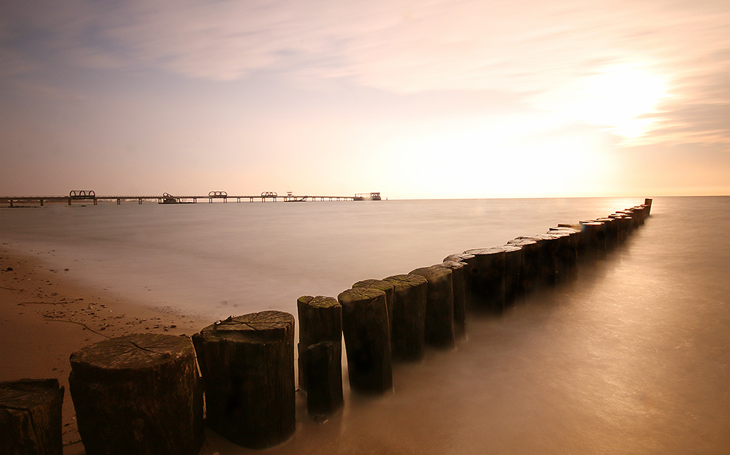
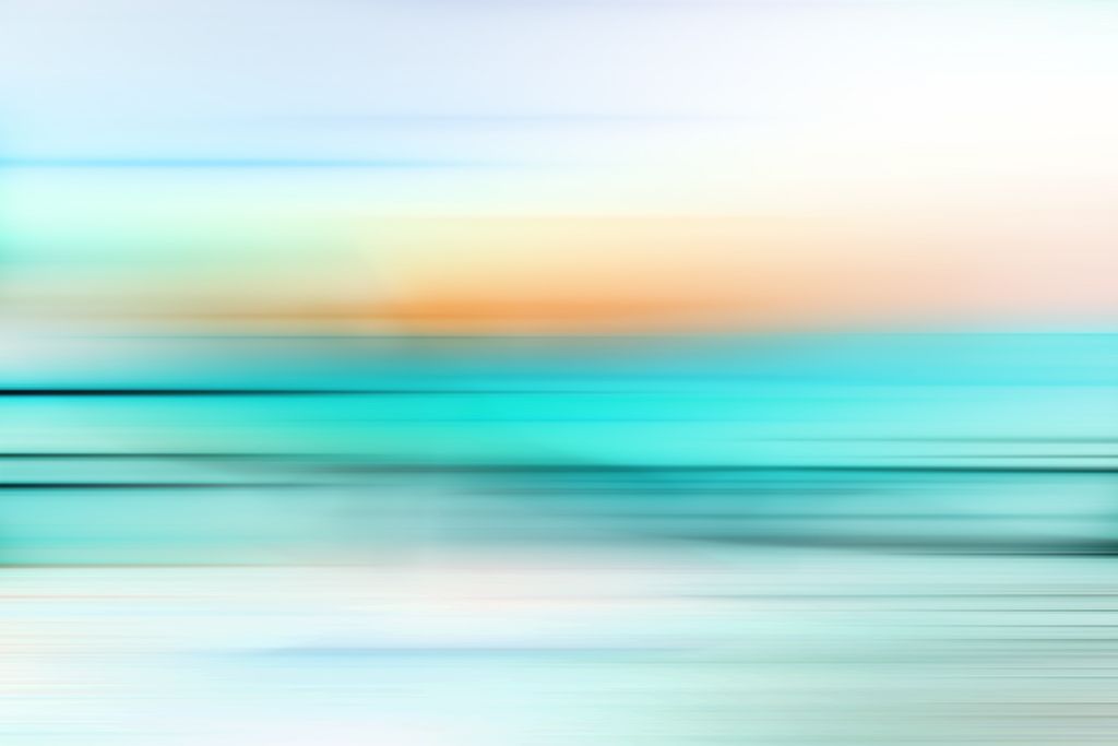
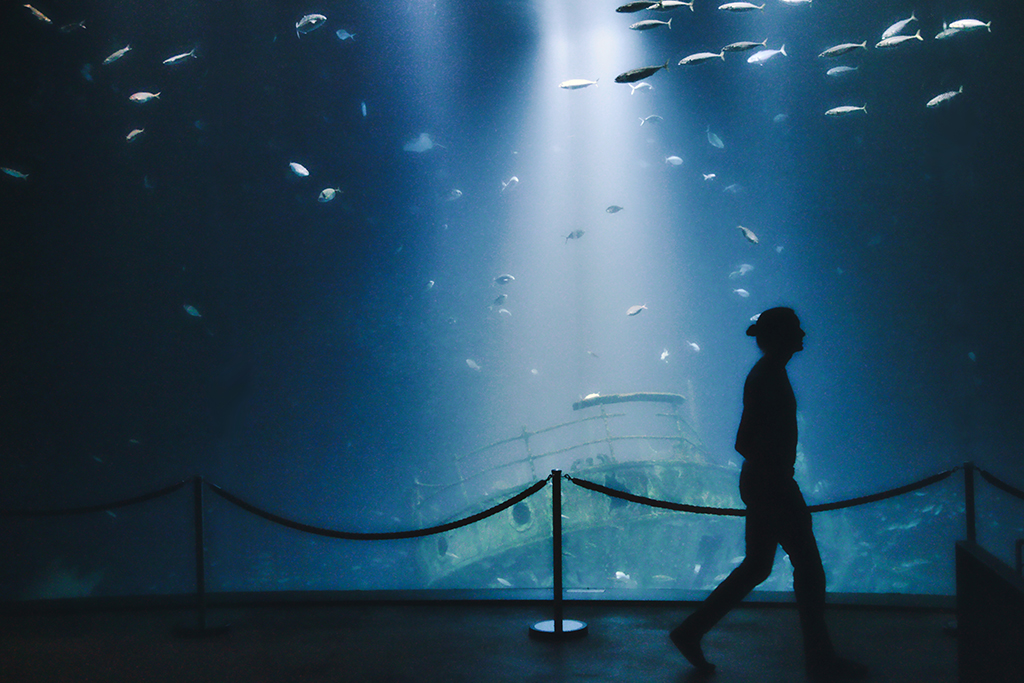
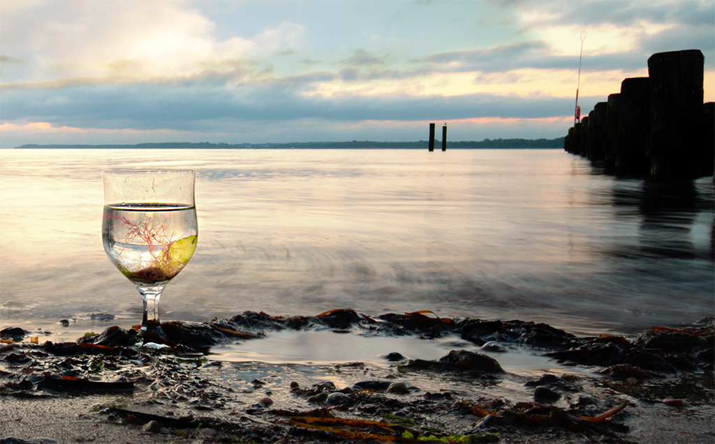
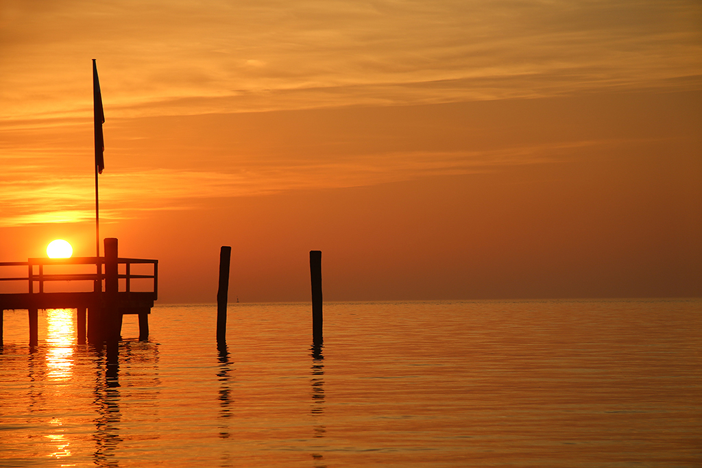
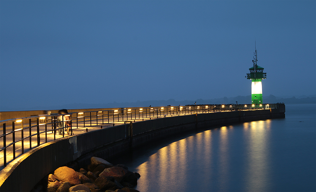
I like the dynamic of these lines - they are nearly "sucking" the eye into the ocean. I would led the black rock stay. |
Nov 24th |
| 12 |
Nov 17 |
Comment |
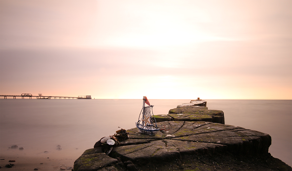
You are showing a strong leading line here. Well done. Like Carole suggested, I would darken the Highlights too. And I would cut some of the upper picture part to get the focus all the more one the line - like the added example. |
Nov 24th |
 |
| 12 |
Nov 17 |
Reply |
@ Connie: ;-) That's a nice way to call it in german. The correct spelling would be "schusselig". |
Nov 24th |
| 12 |
Nov 17 |
Comment |
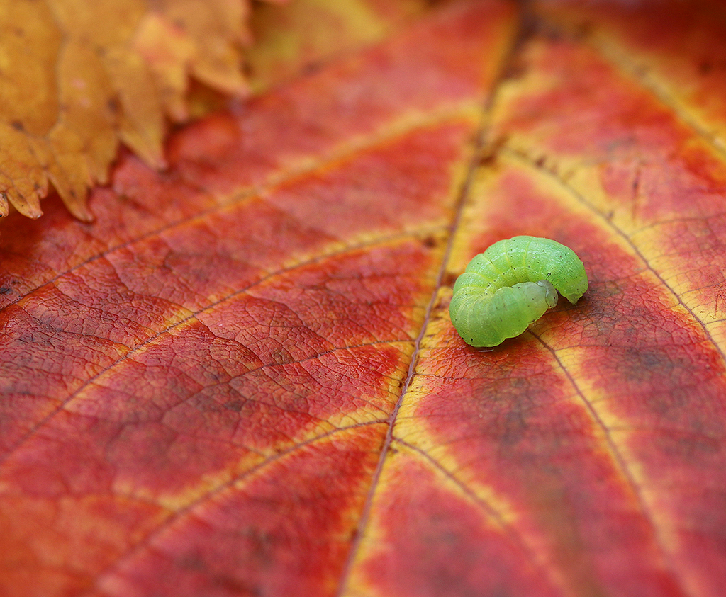
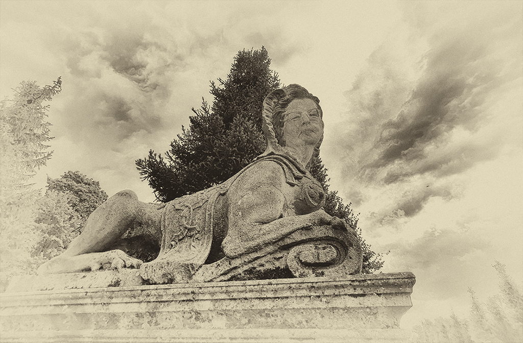
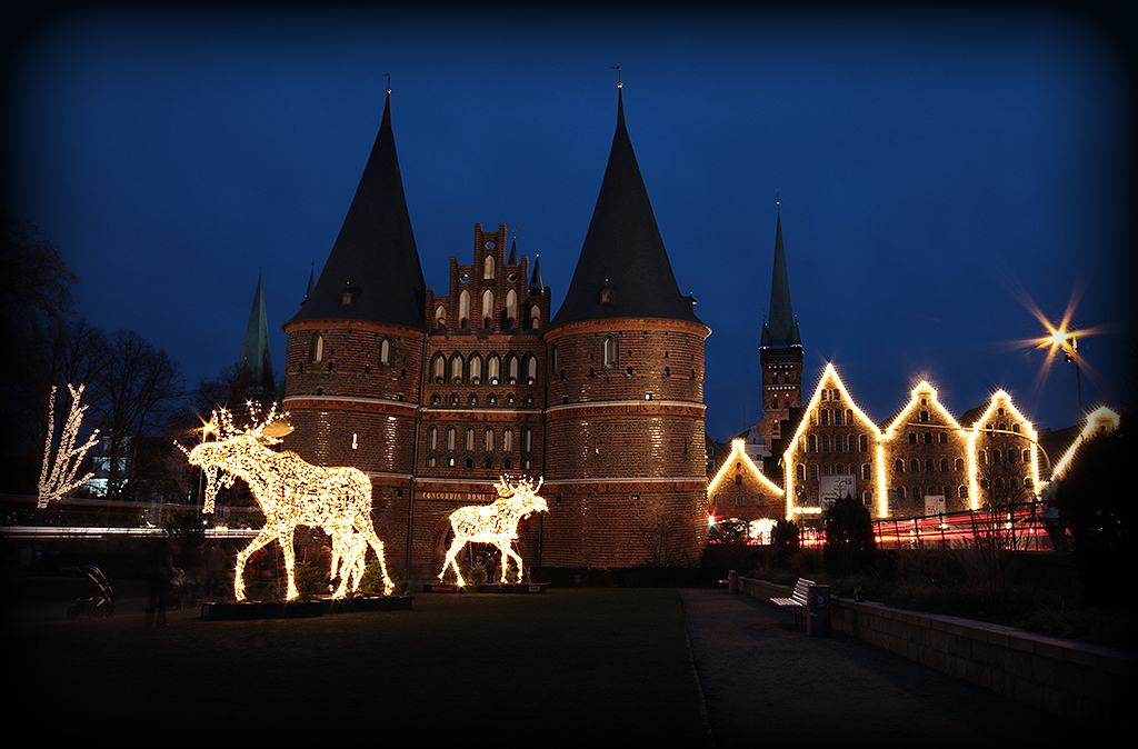
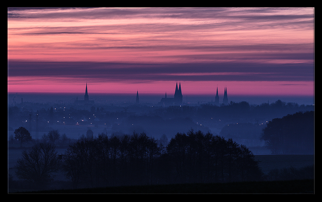
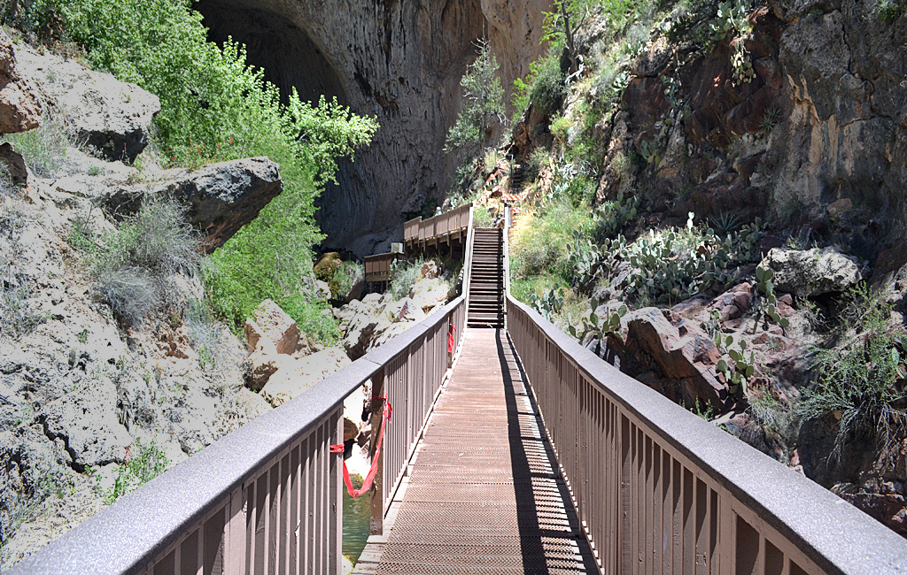
A wonderful church - there is so much to look at. And that is a bit eye distracting, even when the way is leading directly into the important center. I like all the warm colors.
@ Connie: ;-) That's a nice way to call it in german. The correct spelling would be "schusselig". |
Nov 24th |
| 12 |
Nov 17 |
Comment |
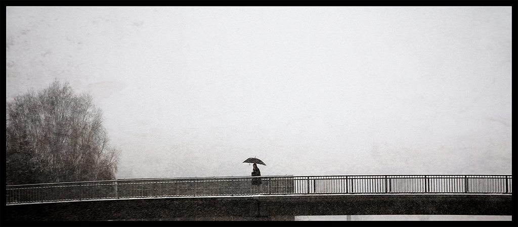
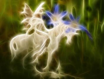
Simple and straight. And the b/w is the perfect choice here. Very well done! |
Nov 24th |
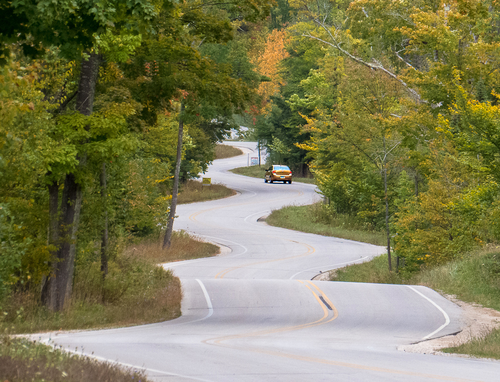
| 12 |
Nov 17 |
Comment |
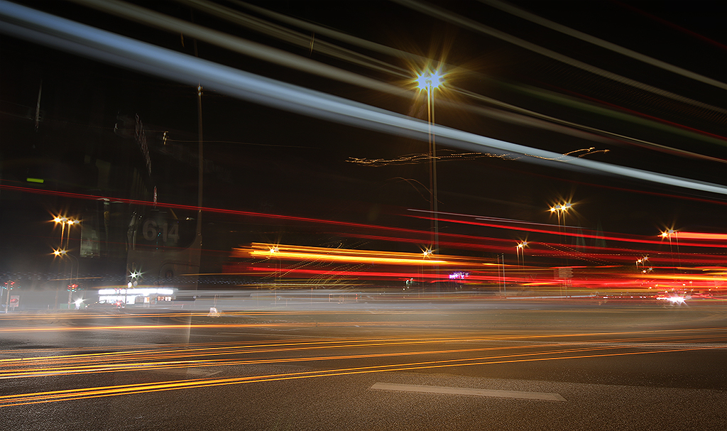
Great view of a road and the car is the leading point into the depth. But I would stamp out all the hanging cables (look at the added photo) + enhancing a bit the color dynamic. |
Nov 24th |
 |
6 comments - 1 reply for Group 12
|
| 38 |
Nov 17 |
Reply |
Well, Gabriele, as it is my commment referred to the first original picture.
And about the picture flipping: Art already gave the reason for this photo - it is the dog on the right side. It is like a focus point, when the eye is naturally looking from left to the right.
At least: All my comments are just my point of view (and sometimes I even can't give a reason, because it is just a feeling!!). Sorry, that I can't give you more. |
Nov 27th |
| 38 |
Nov 17 |
Comment |
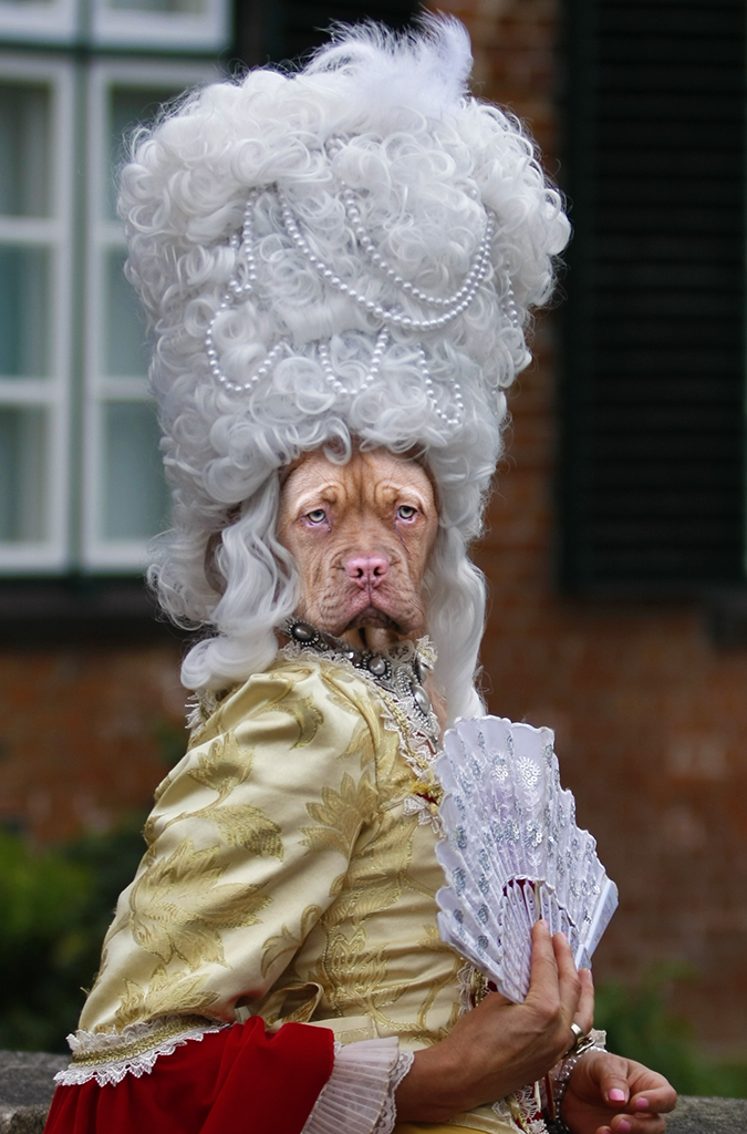
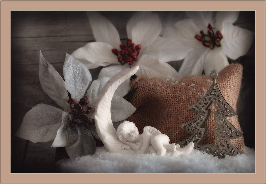
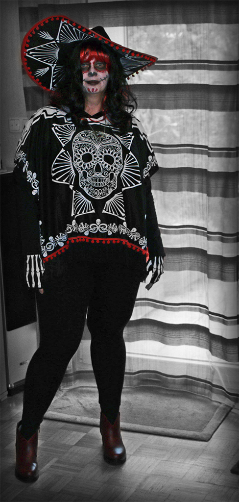
@Craig: There is indeed a picture called "Totentanz" in one of our city churches. It was made around 1463 by Bernd Notke under the impression of the black death. But my halloween disguise is an imitaion of the Mexican "Day of the Dead".
@Greg: Luckily it was very easy to remove the face paint. I was very reluctant to cover my face in white, but it didn't bother me at all later the whole night.
@Art: I like your way to increase the contrast too, like Peter and Marge are saying.
|
Nov 26th |
| 38 |
Nov 17 |
Comment |
Wonderful shot. Just great the sharpness on the feather's and eye. And the light looks perfect. |
Nov 26th |
| 38 |
Nov 17 |
Comment |
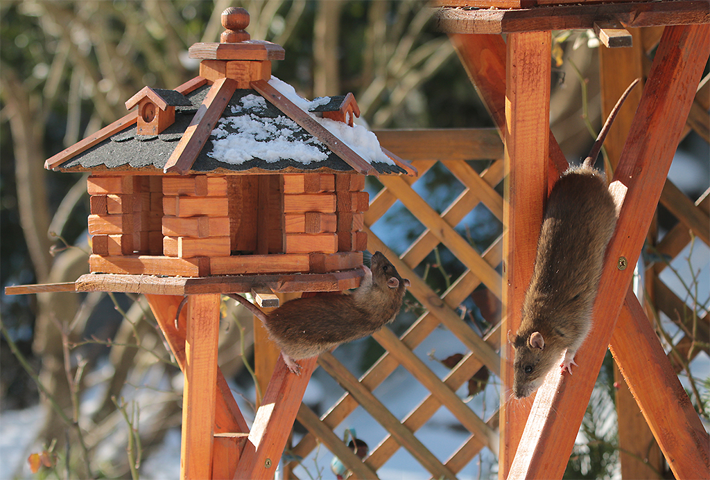
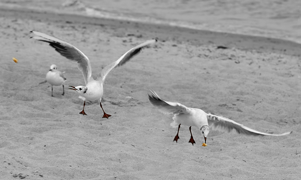
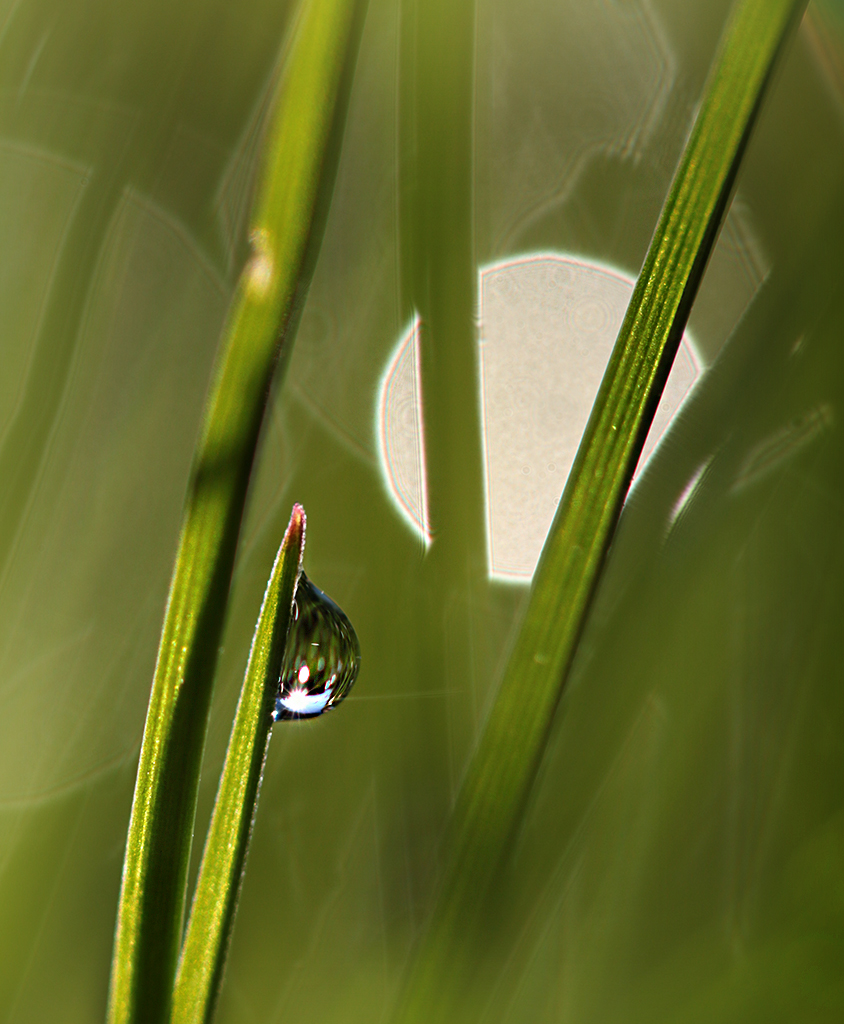
This is a great wildlife shot, Marge! It looks perfect in it's action and even a part of the spider web you got sharp. Well done for me. |
Nov 26th |
| 38 |
Nov 17 |
Comment |
Firework photos are always difficult to catch - I try every new year's eve ;-). So I do like the great colors here, Art. But all in all there is too much blurry in the picture and my eye can't focus easy. |
Nov 26th |
| 38 |
Nov 17 |
Comment |
Wow - that's not an easy process. And I guess for a first try it works really good. I like the colors and sharpness. Although Craig is right with his hints. |
Nov 26th |
| 38 |
Nov 17 |
Comment |
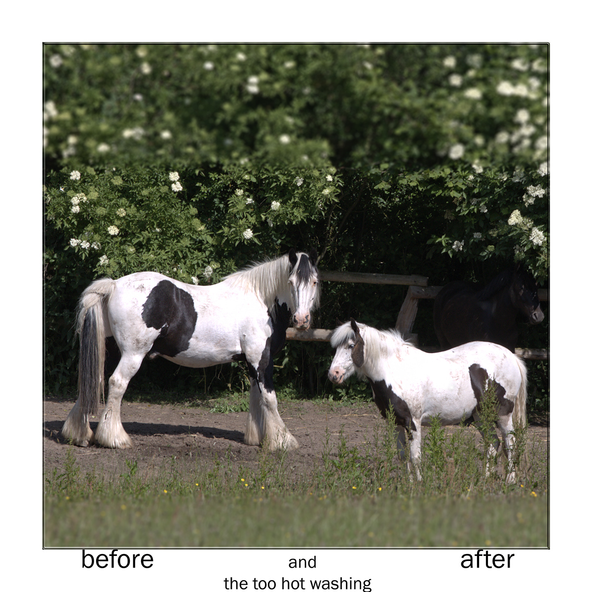
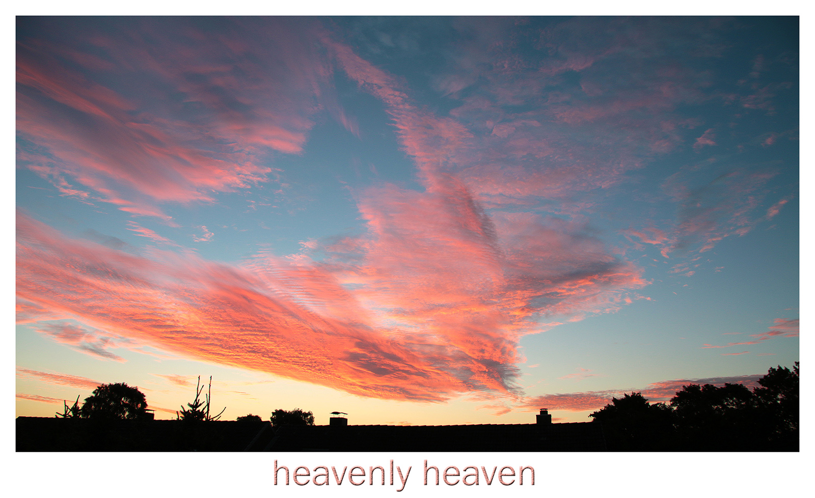
A fine vacation reminder, Marge. I would follow Arts suggestion of flipping the picture and the suggestion to enhance the cloud structures. And I personally would stamp out the background cranes. |
Nov 26th |
| 38 |
Nov 17 |
Comment |
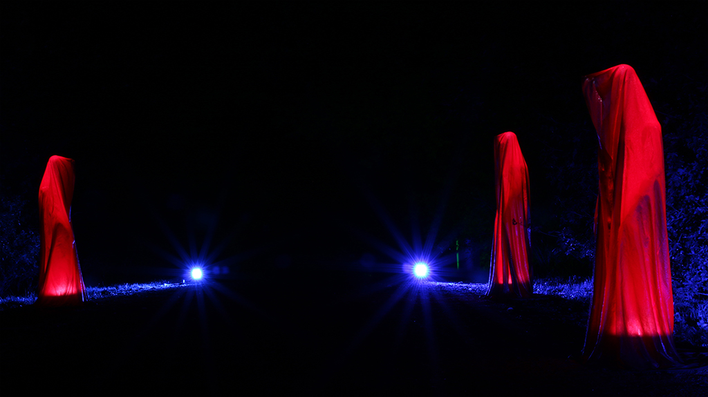
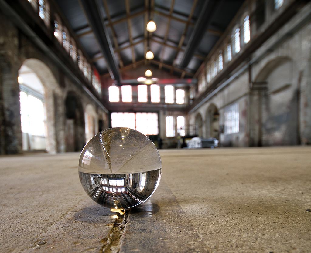
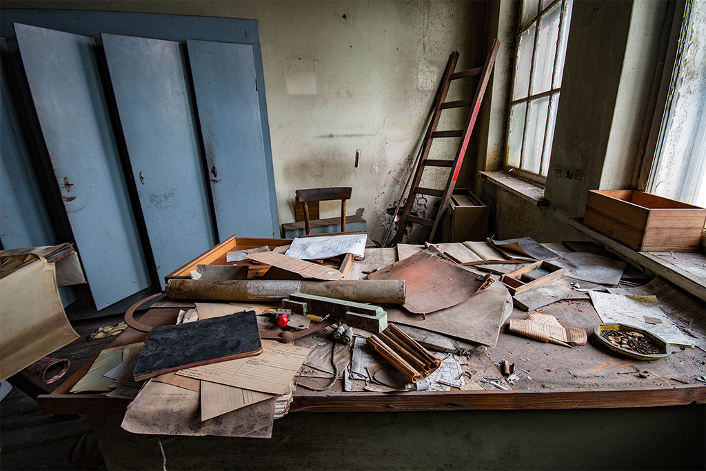
I like such "lost place" pictures. And you've done well with the enhancing of structures and contrasts. Espacially I like the blue light coming through the window. Therefor I won't flip the picture, like Art suggested, because the viewers eye is following the light from left to right easily and it has an incoming feeling. |
Nov 26th |
7 comments - 1 reply for Group 38
|
13 comments - 2 replies Total
|