|
| Group |
Round |
C/R |
Comment |
Date |
Image |
| 12 |
Feb 22 |
Comment |
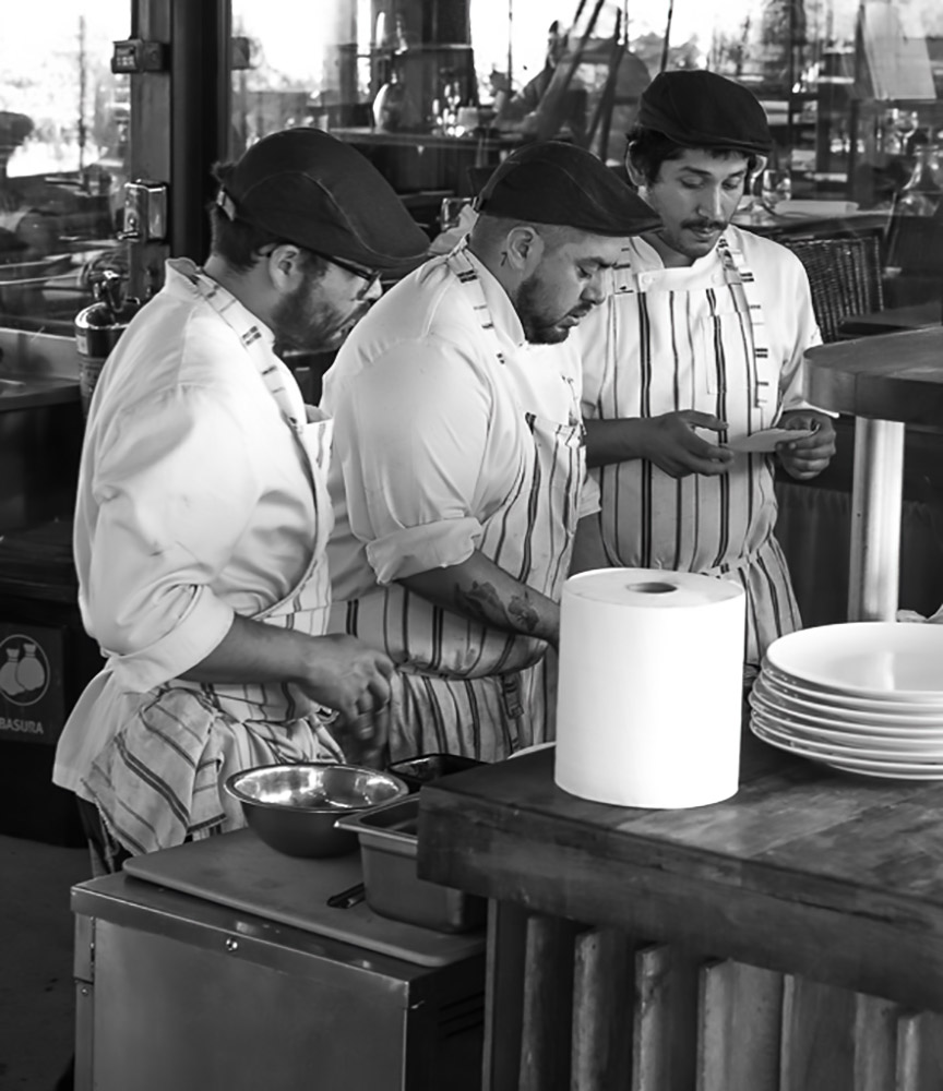
The black and white image is much stronger than the colored one. It eliminates many distractions. The men create a strong diagonal. I did a different crop than Carole's as I feel we need some of the surrounding elements to complete the story. This is a great PJ shot! |
Feb 12th |
 |
| 12 |
Feb 22 |
Comment |
Walter, your breakfast items are sharp and evenly lighted. Looking down gave us a different view The variety of colors compliment each other. I might have cropped off a small amount on the left side as it is empty space. I like that you included the "blended" items in the smoothie as well as each separate fruit. |
Feb 12th |
| 12 |
Feb 22 |
Comment |
You did a very good job creating the black background. When an image has lots of red and green it really pops! The placement of the 3 items is good and they are very sharp. Sometimes when I made a stroke I put it on its own layer and then slightly fade it a small percentage so it is not as bright as the main subject. Nicely done! |
Feb 12th |
| 12 |
Feb 22 |
Comment |
Gavin. I love this shot! Lots of repetitive patterns and lines and my eye goes straight into the "black hole". |
Feb 12th |
| 12 |
Feb 22 |
Comment |
The fork is sharp and in a good position in the frame. Did you try a shot with the blinds closed? That might reduce the horizontal lines created by the light coming in. I agree with Ally that a monochrome might be a good choice as that would eliminate the pastel colors. Good job. |
Feb 12th |
5 comments - 0 replies for Group 12
|
5 comments - 0 replies Total
|