|
| Group |
Round |
C/R |
Comment |
Date |
Image |
| 12 |
Nov 20 |
Reply |
Thanks, Marge. |
Nov 21st |
| 12 |
Nov 20 |
Comment |
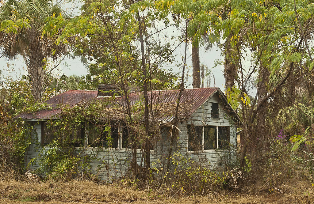
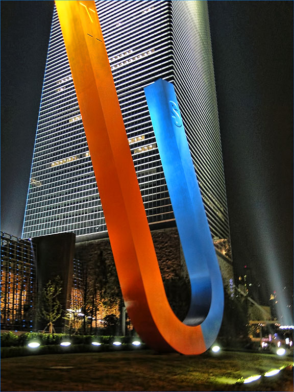
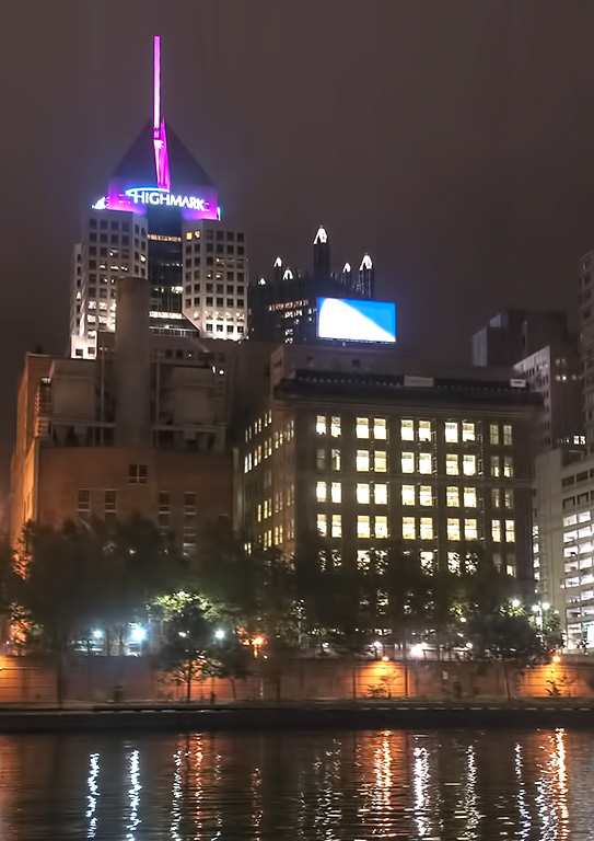
This is a very interesting building. The unusual angle adds interest to the image. Often I use Image>Adjustments>Shadows/ Highlights to tone down bright areas and open up dark areas. The void space helps balance the detailed large areas of brick. Good job. |
Nov 21st |
| 12 |
Nov 20 |
Comment |
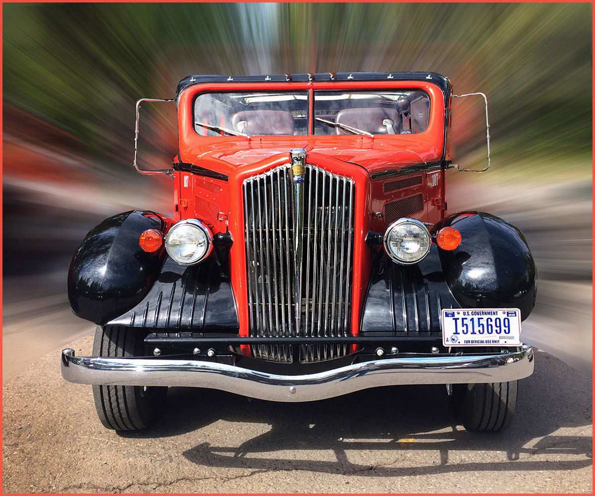
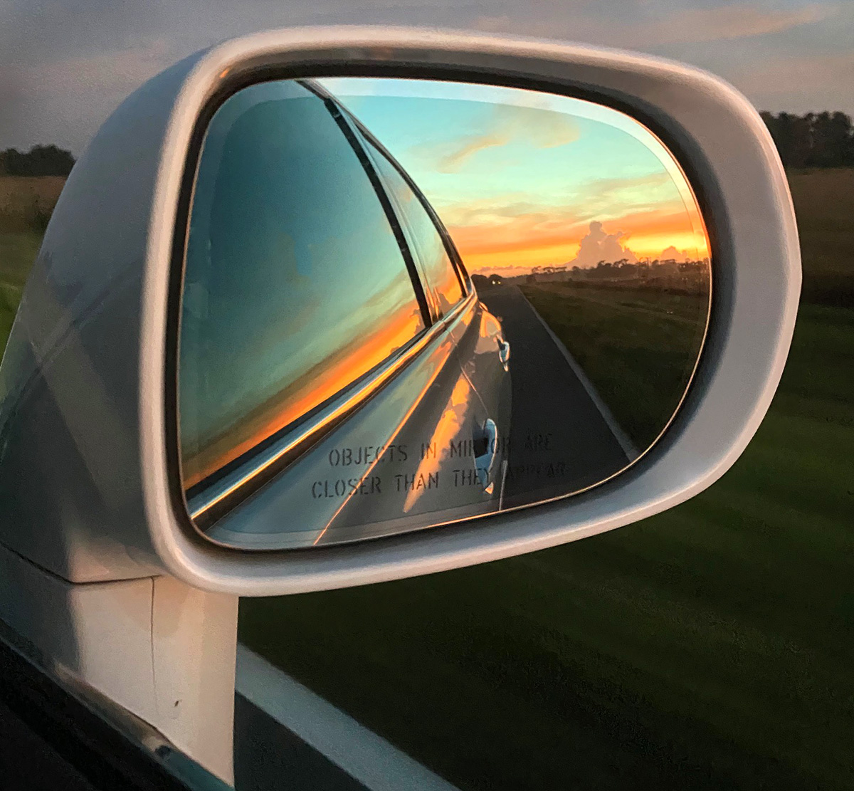
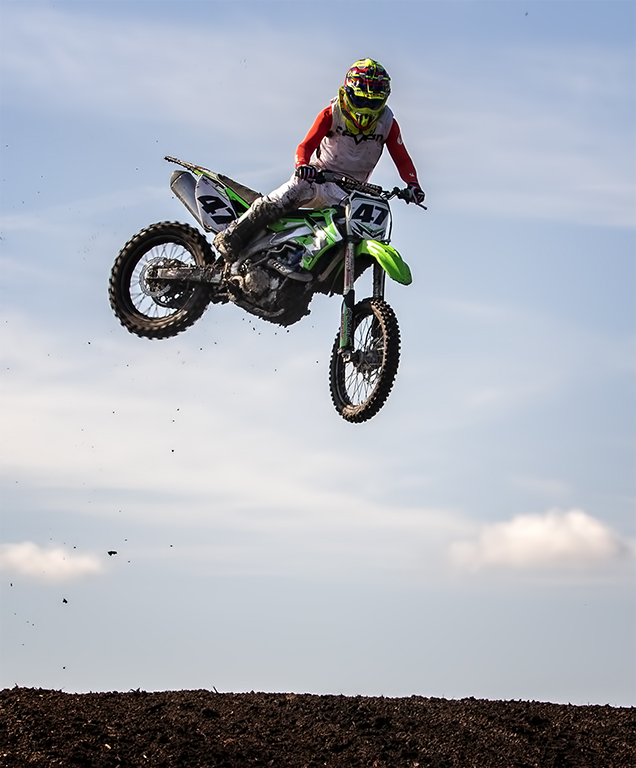
I love the way the front of the car goes to the image edges. It makes the car look even bigger and more impressive. Remember, our eye goes to the brightest part of the frame, which here is sky and grass. When I look at the image straight on my eye goes right out of the back window. Darken the sky and darken and/or saturate the hood(red part) Then lighten the center part of the umderside to bring in the detailed structure which is the most interesting part of the car. Great shot.
|
Nov 14th |
| 12 |
Nov 20 |
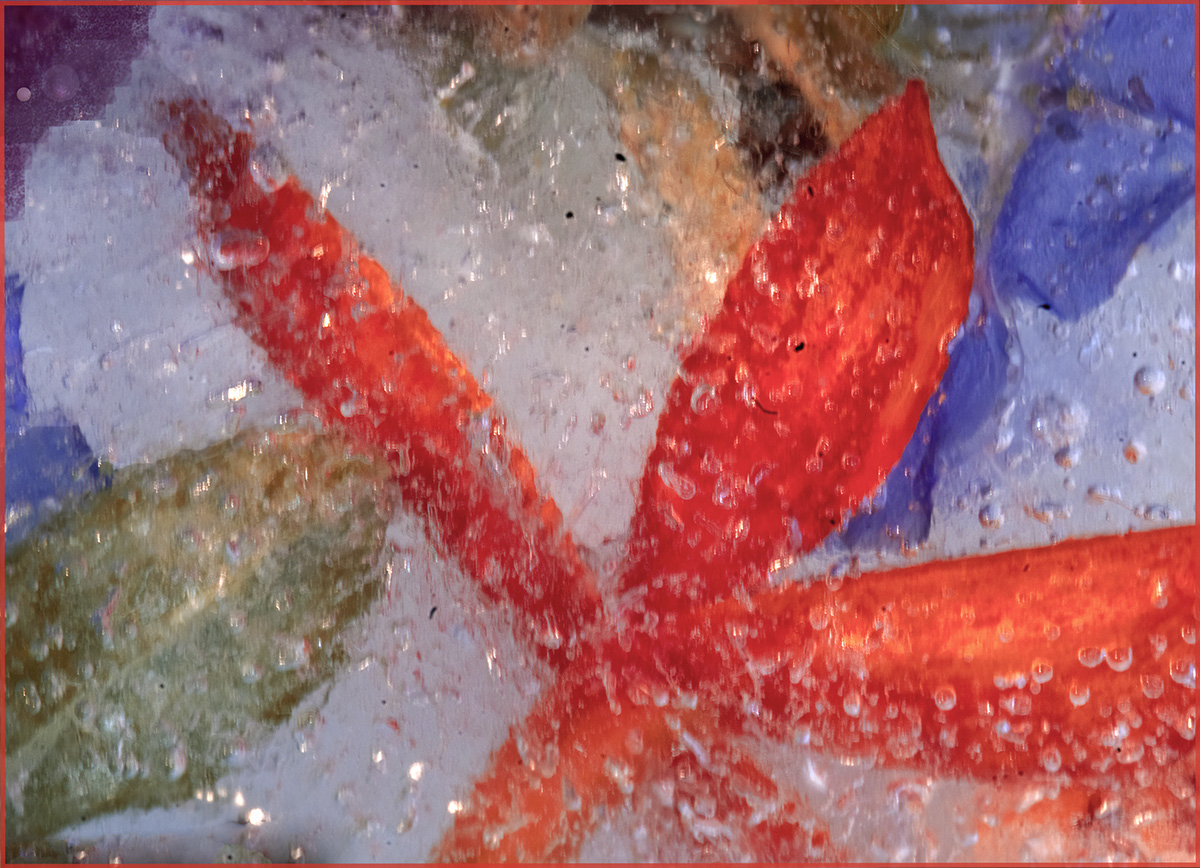
Comment |
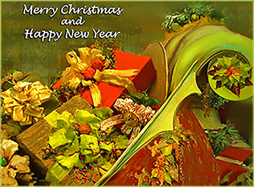
Very sweet and ultra creative. All elements fit here and the light beams bring the whole image together. The heart holds my eye and there is not fade off in the grasses. Good job. |
Nov 14th |
| 12 |
Nov 20 |
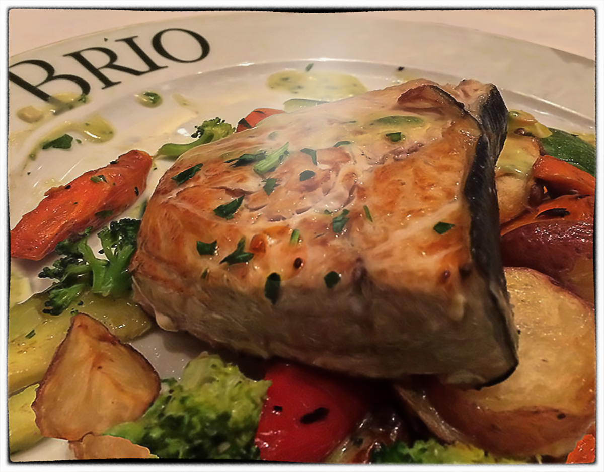
Comment |
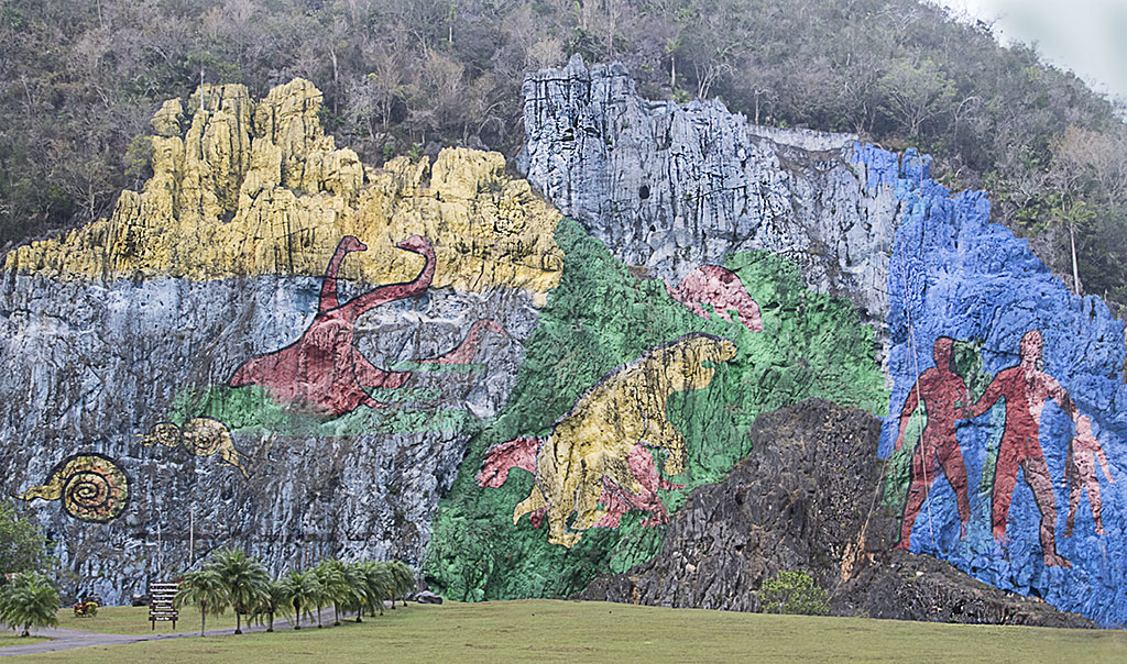
In any normal circumstance I would say no to a composition with competing background and foreground. But in this situation I find the result interesting and not competing. Maybe because the tonality and brightness on both parts of the image match. Cropping is good. I think you get an A+ for thinking "out of the box." |
Nov 14th |
| 12 |
Nov 20 |
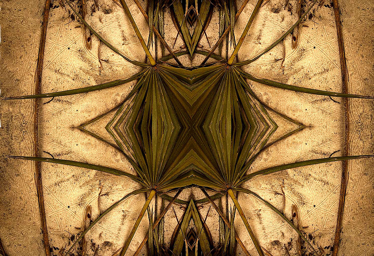
Comment |
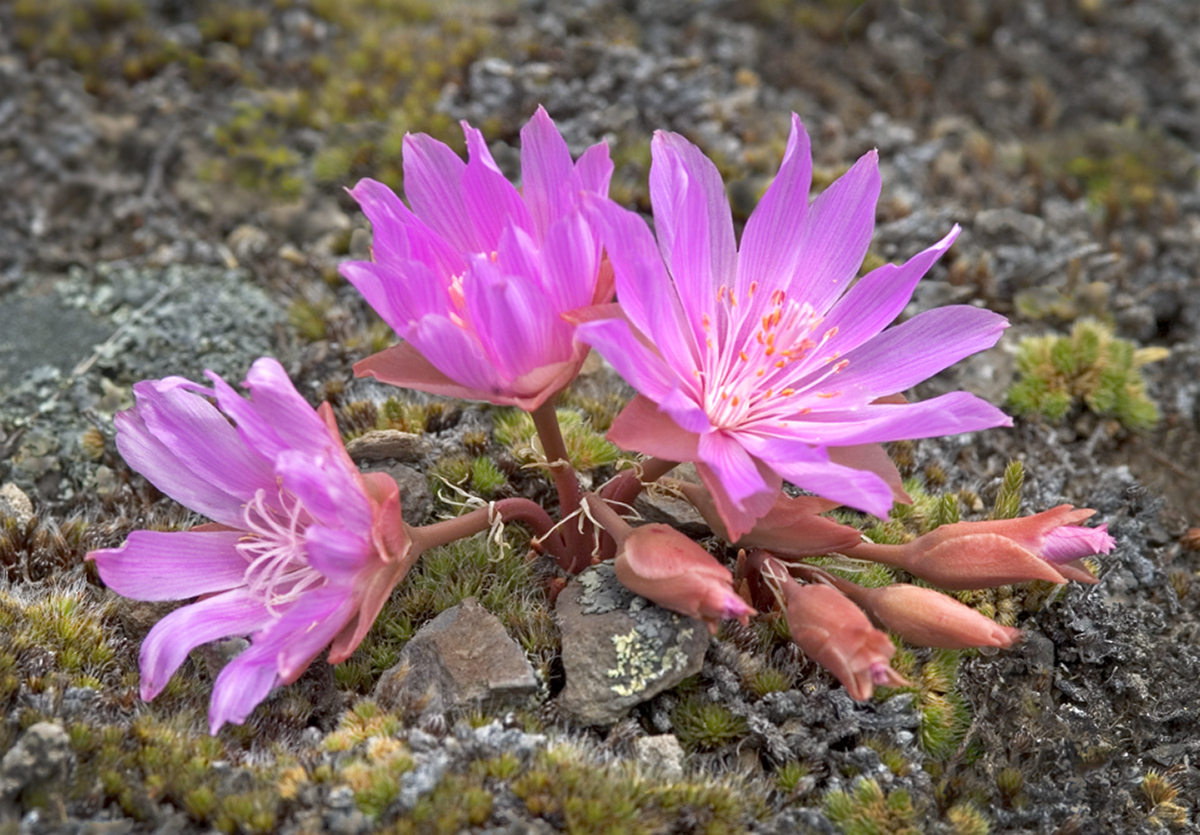
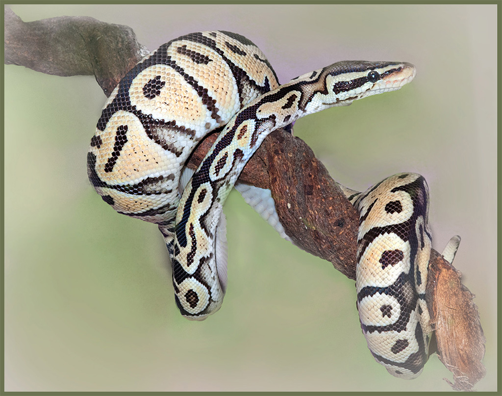
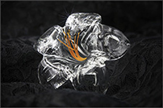
You did a great job with a "hard to photograph" image. Definitely shiny but well exposed and nicely presented. The orange stamens make the image pop and the starburst adds the finishing touch. I added a 4 pixel stroke - color taken from the image in order to make the image stand out on the black background. Recently saw a video suggesting using Camera Raw at end of processing to check for bright highlights. I did that and there were only a few too bright spots on the top flower. I lowered the highlight slider and fixed it. To see the effect of the stroke click on the object and view it on the black background. |
Nov 14th |
 |
| 12 |
Nov 20 |
Comment |
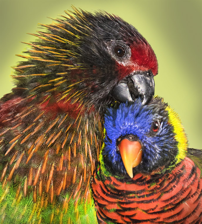
Carole, thank you SO MUCH for sharing your wonderful slideshow with us. Beautifully done! The beam stands out against the clear blue sky - great detail and texture and many tones of rusty color. The flag at half mast helps tell a story. This is a very strong image.
|
Nov 14th |
6 comments - 1 reply for Group 12
|
| 34 |
Nov 20 |
Comment |
Candy, this is a great graphic shot. I have a lens ball, too, but have yet to be that creative. |
Nov 15th |
1 comment - 0 replies for Group 34
|
| 69 |
Nov 20 |
Comment |
Great shot, Mervyn! Everything works here. This is a very strong image. |
Nov 15th |
1 comment - 0 replies for Group 69
|
8 comments - 1 reply Total
|