|
| Group |
Round |
C/R |
Comment |
Date |
Image |
| 12 |
Jul 20 |
Comment |
Kerstin, glad to have you back. I like the still life you created. Using the forget-me-knots as your "blue" was a great idea. The heart shaped vase is perfect for them and helps hold the eye in the center of the image where the flowers are. |
Jul 13th |
| 12 |
Jul 20 |
Comment |
Very nicely done. This is a perfect image for our July subject.
I would not change anything. You were lucky they had red towels. |
Jul 13th |
| 12 |
Jul 20 |
Reply |
To see the stroke please click on the image to enlarge it. |
Jul 13th |
| 12 |
Jul 20 |
Comment |
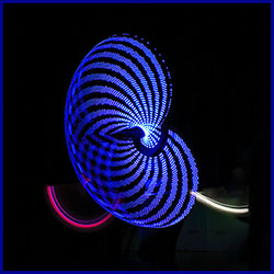
I love the design and colors. I am surprised it is so sharp. Since our images are on a black background I added a 12 pixel stroke in blue taken from the image. Stroke was faded to 80%. |
Jul 13th |
 |
| 12 |
Jul 20 |
Comment |
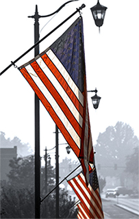
The foggy day and blank sky makes the flags stand out. By converting to mono there is nothing to compete with the "red, white and blue". Good choice. I flipped the image, cropped slightly on the left and rotated a small amount to make the pole straight. This brought out more detail in the stars. |
Jul 13th |
 |
| 12 |
Jul 20 |
Comment |
I like the graphic patterns created by your cropping of the flag. I think the black frame lines tie the colors together. There is good balance here - the blue starred horizontal is about the same size as the red section on the right and the 2 vertical panels (white on right & red brick on left are similar. If you had included more of the white section it would have overpowered the image. A slight black toned vignette might make the colors pop a bit more. |
Jul 13th |
5 comments - 1 reply for Group 12
|
5 comments - 1 reply Total
|