|
| Group |
Round |
C/R |
Comment |
Date |
Image |
| 12 |
Jun 17 |
Reply |
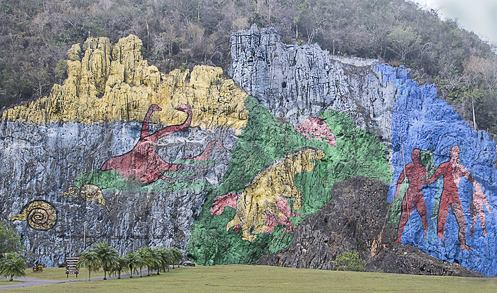
The Prehistoric Mural in Cuba's western province of Pinar del Rio has just celebrated its 50th birthday. Situated on a rock amidst the World Heritage Site of "The Viñales Valley" it was painted in 1959 as one of the largest 120m al fresco paintings.
Viñales is in the tobacco growing region of Cuba. You can get more info on Google. |
Jun 9th |
| 12 |
Jun 17 |
Comment |
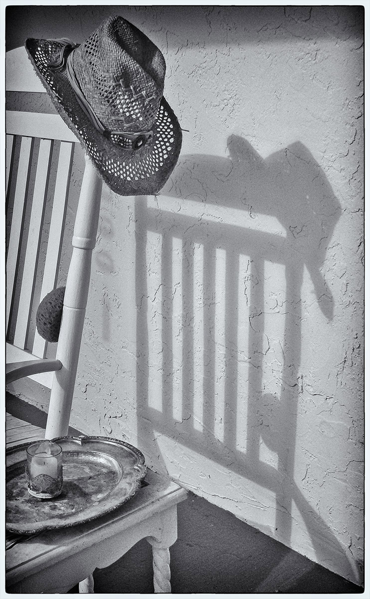
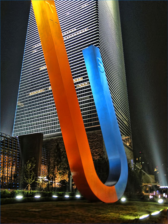
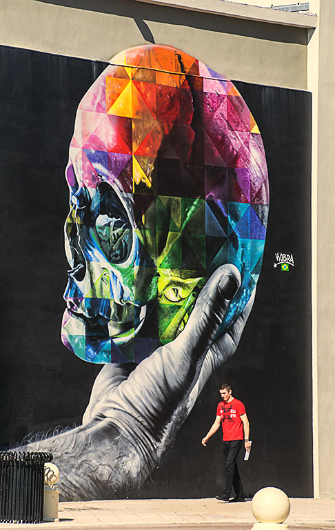
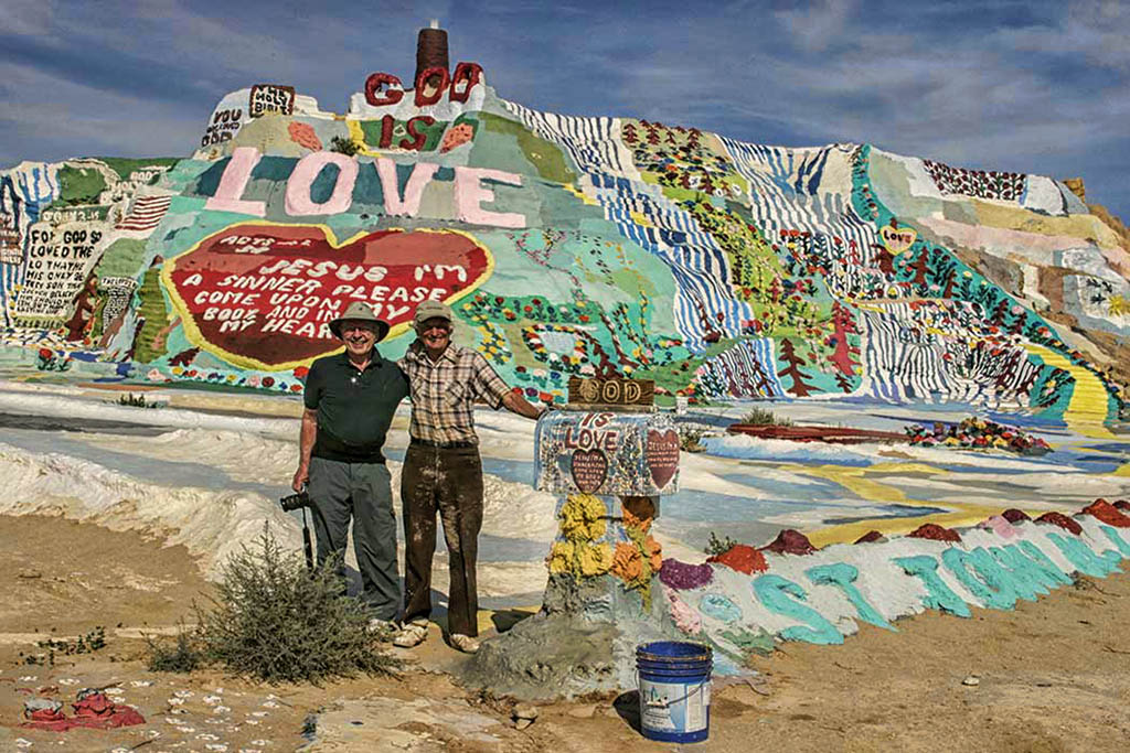
Colorful and well exposed. A very interesting image. Lots of shapes and colors but they do not compete with each other. The dark sky sets off the foreground. I agree with Carole about rotating the image so the black tower is vertical. I increased warmth with Topaz "Brilliant Warm" option and darkened the mail box to make it more prominent. Its fun seeing these unusual places we all would enjoy visiting. |
Jun 7th |
 |
| 12 |
Jun 17 |
Comment |
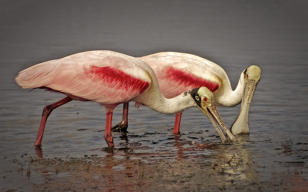
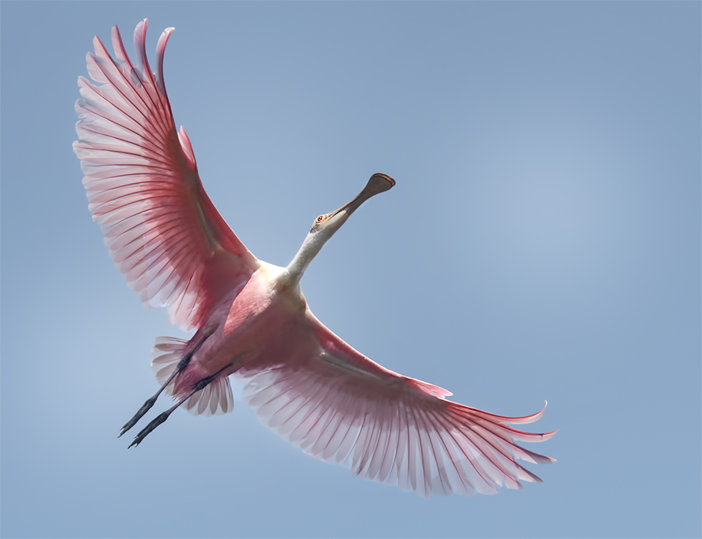
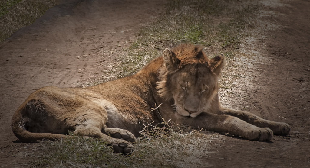
Absolutely adorable! The texture in the background does not bother me at all. The lighting is good and it is totally sharp which makes the texture stand out. Perfect exposure. Good job! |
Jun 7th |
| 12 |
Jun 17 |
Comment |
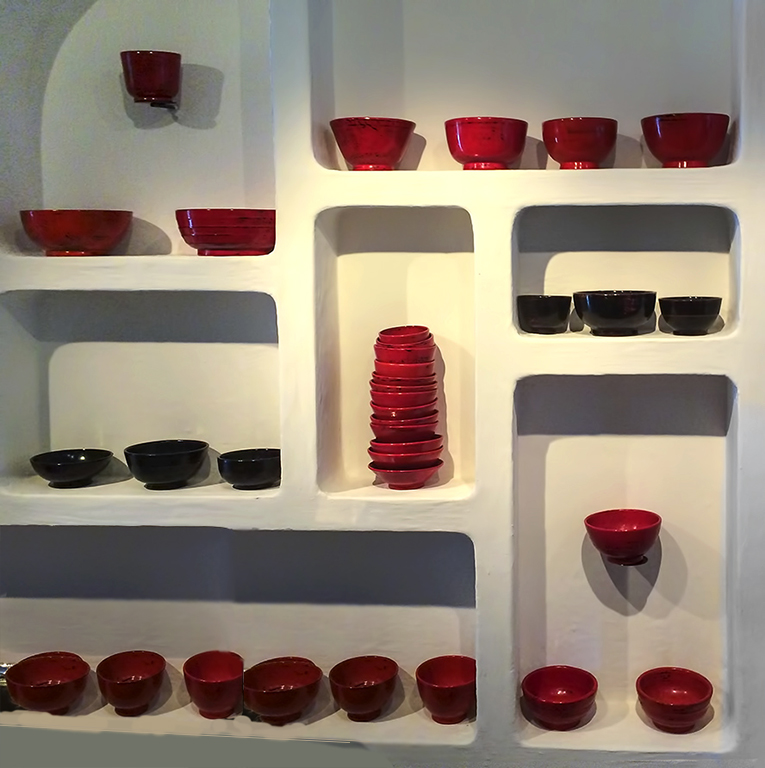
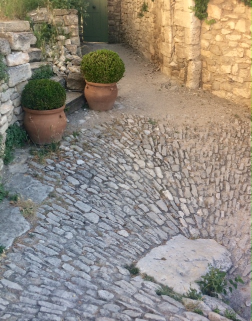
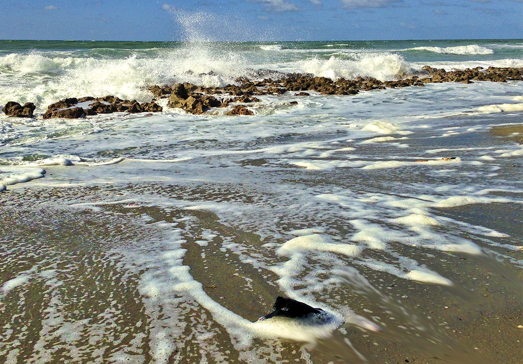
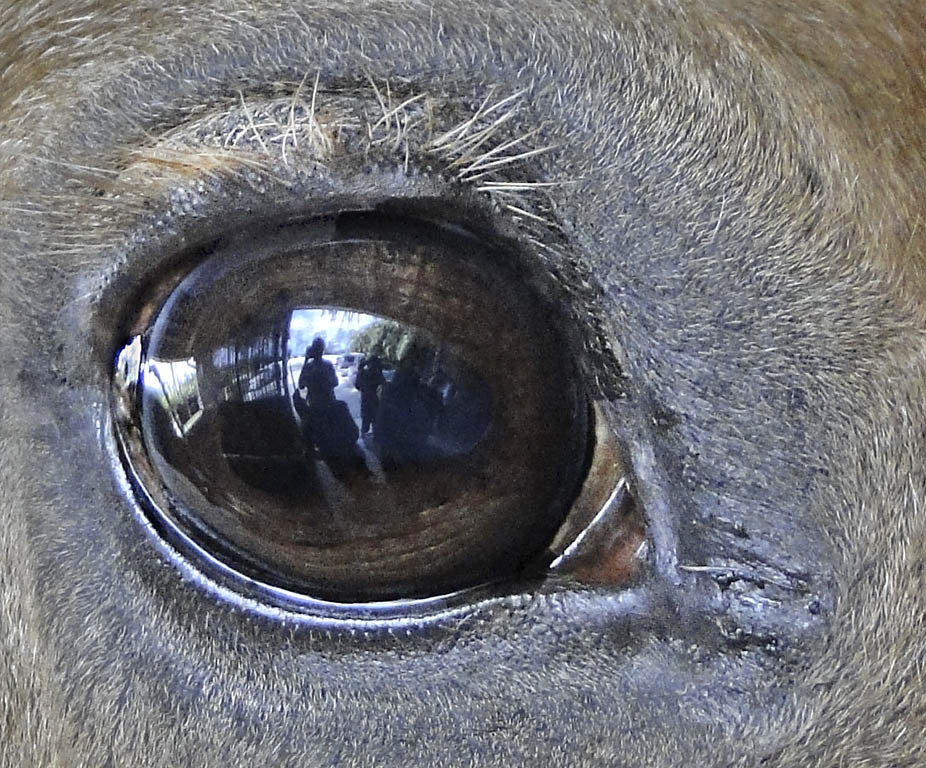
You have great texture and sharpness in the pebble areas. Good job! I would have expected a higher f stop to get that much sharpness. As to the halos maybe you sharpened too much or used too much contrast. I don't know of any way to get rid of them. |
Jun 6th |
| 12 |
Jun 17 |
Comment |
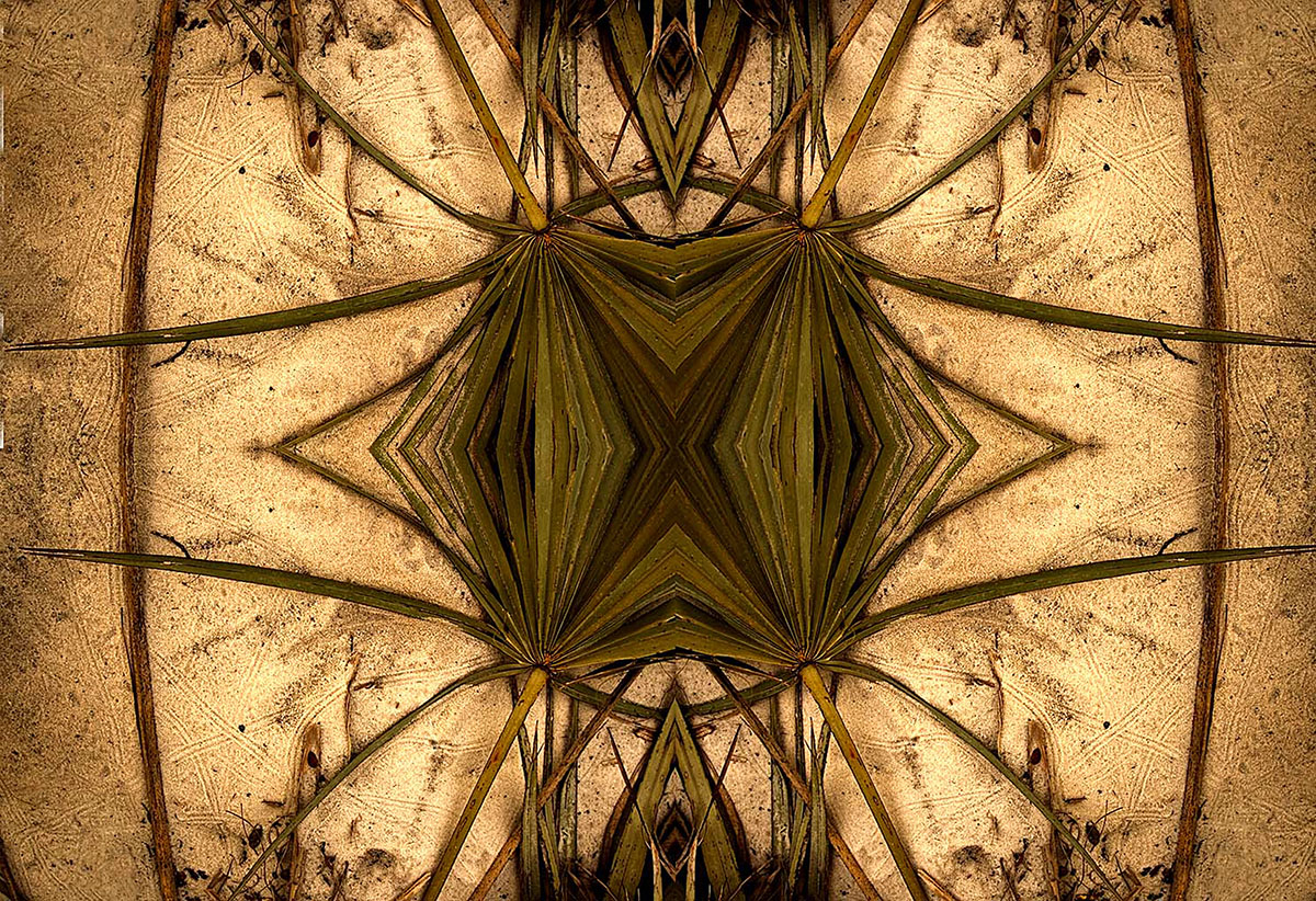
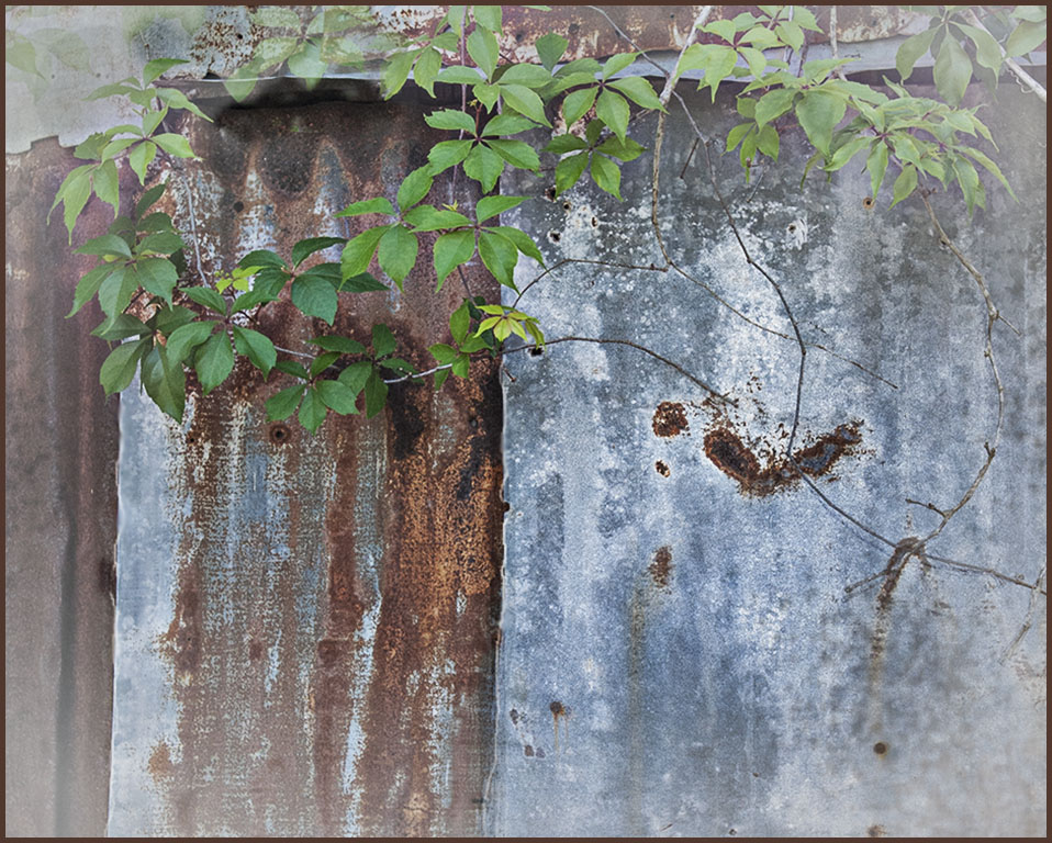
Your exposure is good. An image with primary colors always has impact. When you have a subject like a leaf which is not flat it is hard to make the entire image sharp. In macro your lens should be parallel to the main subject. With our cameras with so many pixels you can always raise your ISO to get more shutter speed or depth of field. |
Jun 4th |
| 12 |
Jun 17 |
Comment |
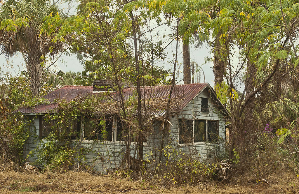
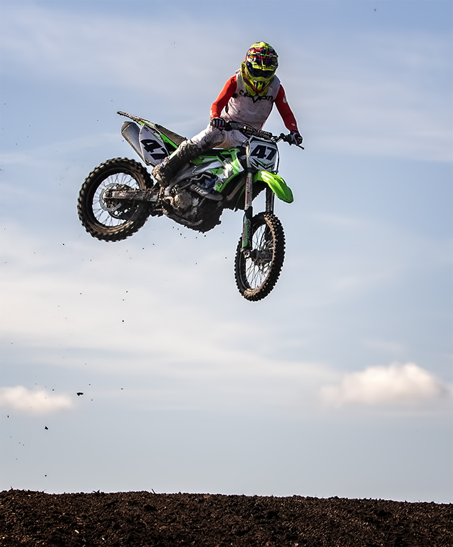
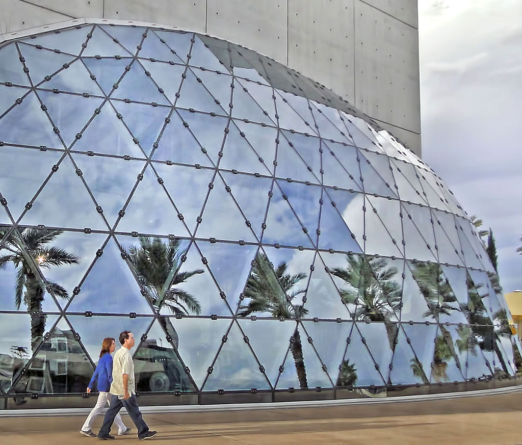
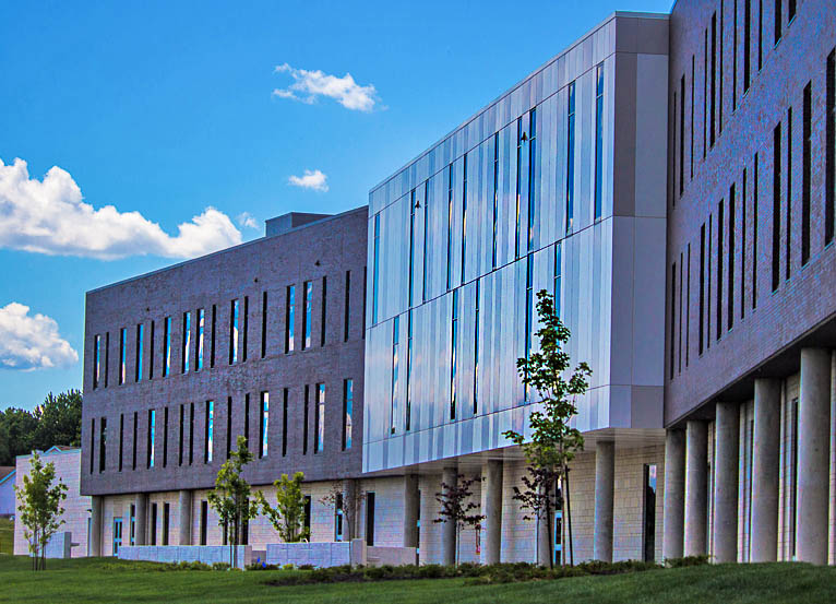
This is a very interesting building. Nice texture in the bricks and good sharpness. Sometimes "less is more". The sky is so colorful it pulls my eye away from the building. I cropped to make the building more prominent. Went to Image>Adjustments>Shadows & Highlights to get more contrast. Often I sharpen select areas only with the Sharpen tool which is in the box with the Smudge & Blur tools. That also adds some "punch" to the image.
|
Jun 4th |
 |
| 12 |
Jun 17 |
Comment |
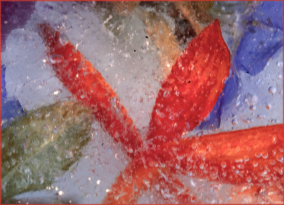
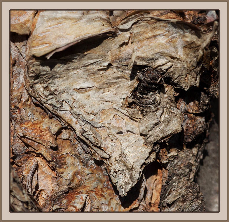
You see Texas. I see somewhat of a heart shape. The sharpness and color of the "object" (which creates the texture) is excellent. The only slight distractions I see are the small black dots in the soft gray area on the right lower corner. I cloned out them out and increased contract and brightness. |
Jun 4th |
 |
6 comments - 1 reply for Group 12
|
6 comments - 1 reply Total
|