|
| Group |
Round |
C/R |
Comment |
Date |
Image |
| 12 |
Feb 17 |
Comment |
Another great interpretation of "love". The only distracting thing to me is the color of the leaves above the monkeys. You could crop tighter on top and on the left side. There is good detail in the blacks and whites. Maybe just a little brightening of the face in front would add some contract. |
Feb 19th |
| 12 |
Feb 17 |
Comment |
Such a fun image. I would eliminate the 2 bright daisies on the left side and maybe light the top bread face a little bit. Or you could crop in tighter on the left side which would emphasize the faces. Great job. |
Feb 19th |
| 12 |
Feb 17 |
Comment |
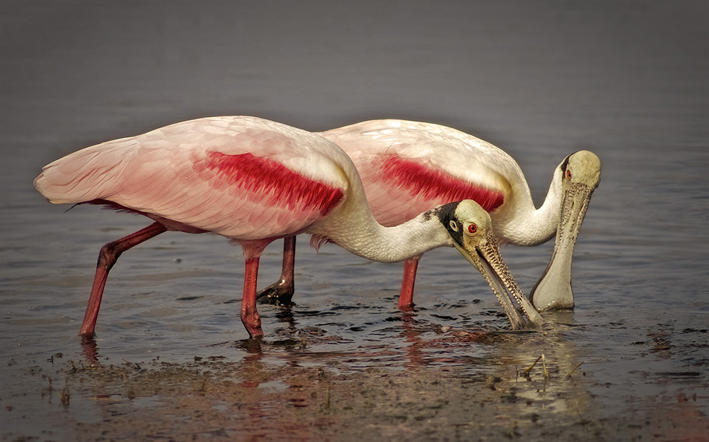
Thanks everyone. The background was painted and blurred. I use lots of different opacity settings when I paint. One tool that is not often used is the SMUDGE tool. What is does is pull color forward which helped keep the points on the feathers sharp. How hard you press and how far you pull determines where the paint goes. |
Feb 19th |
| 12 |
Feb 17 |
Comment |
A lovely interpretation of our subject. Well done. I like Carole's darkening of the background. I might have cropped some off the bottom. |
Feb 19th |
| 12 |
Feb 17 |
Comment |
Welcome to our group, Connie. Your image fits the theme and is well done. I like Carole's suggestion. Any time an image seems "flat" increasing the contrast helps brighten the image.
|
Feb 19th |
| 12 |
Feb 17 |
Comment |
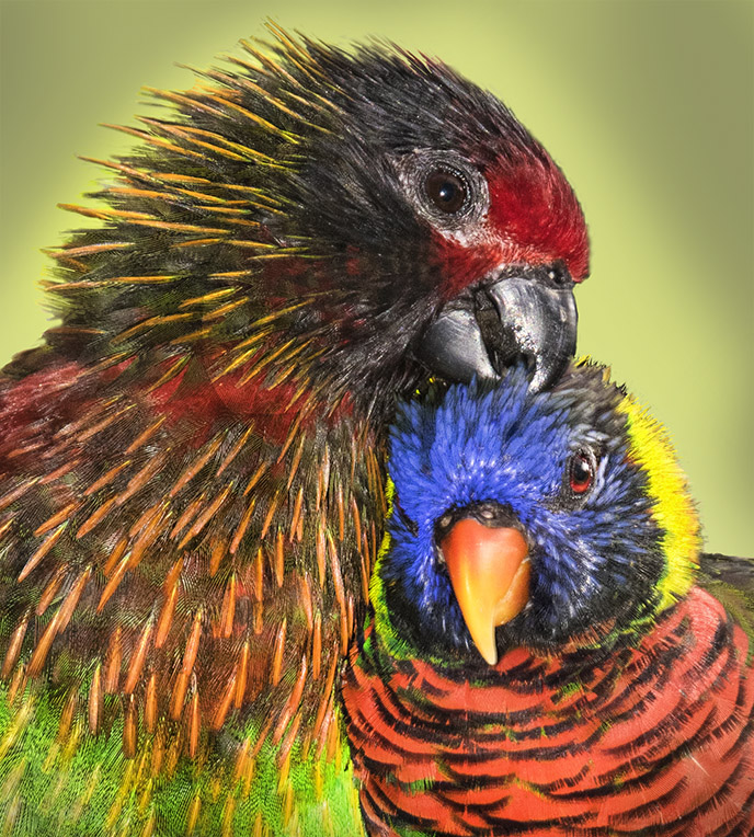
Perfect idea for the subject. I like the original better because it isolated the kiss even though the hot spots distract. A tighter crop would help. Maybe try just shooting one kiss with the banner attached & put it on a different background. |
Feb 19th |
| 12 |
Feb 17 |
Comment |
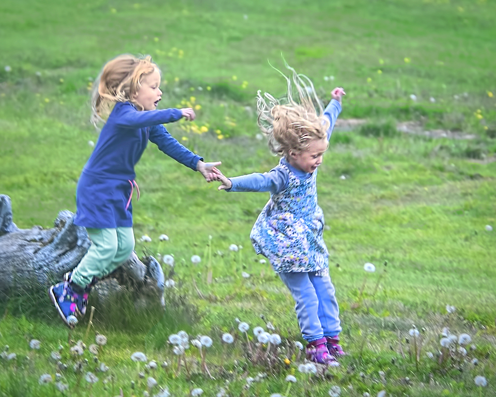
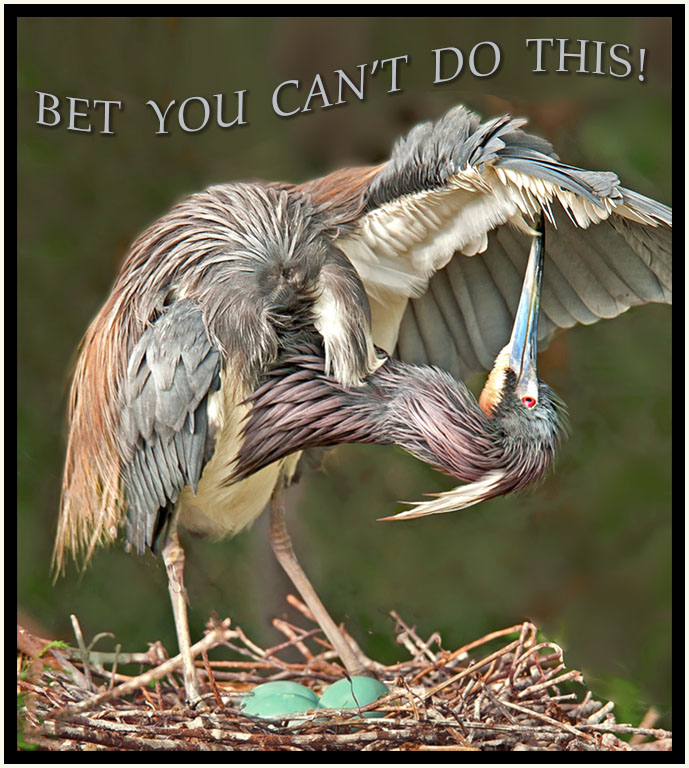
This is a fun shot. Full of joy and love and energy. Perfect composition would possibly lessen that feeling. Lighting and balance is good. Its a "keeper." |
Feb 19th |
| 12 |
Feb 17 |
Comment |
Here in original image |
Feb 4th |
 |
8 comments - 0 replies for Group 12
|
8 comments - 0 replies Total
|