|
| Group |
Round |
C/R |
Comment |
Date |
Image |
| 24 |
Jul 21 |
Reply |
Hi Steve,
I think there are leading lines. The composition is really an arrangement of four triangles: the reflection, the ridge, its reflection, the distant shore and Mt. Denali. The lines lead the eye back and fourth through the scene. The real question is, Does the composition work? You do raise a good question about the ridge. Perhaps the composition would be better, if I had not intensified the red foliage on the ridge? |
Jul 16th |
| 24 |
Jul 21 |
Reply |
Thanks everyone for your comments. I don't understand the comments that this is an old picture. Lumiere was a very fine film that produced good colors that were accurate , but nicely vibrant. How do I change the oldness, if doing so would improve the image?The colors have been edited in LR mostly by giving a tad more brightness to the reds on the foreground hill. I do agree that the scan needs some cleaning up |
Jul 16th |
| 24 |
Jul 21 |
Comment |
What a great job you did in stiching so seamlessly. I would experiment by increasing contrast and brightening the city, particularly on the right side. I can't quite figure out why the Duomo, having the same exposure as the brighter houses in the foreground doesn't have a more similar bright tone. I think that the photo needs a subject that is more difined --a center of interest, The Duomo is what I would select, by cropping at least to the tower (I forgot its name)on the left. The saturation seems good;could you boost vibrance? |
Jul 14th |
| 24 |
Jul 21 |
Comment |
This is technically exquisite, except that there are dew on only one flower. Everything is so sharp and well ordered, that the subject could have been completely artificial. |
Jul 14th |
| 24 |
Jul 21 |
Comment |
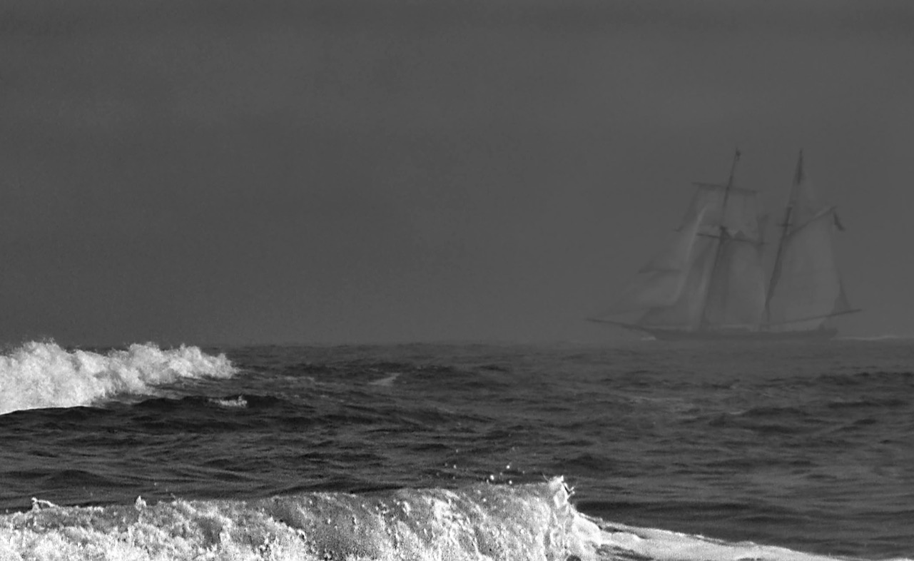
I agree with Sam's suggestion to crop out the group of birds on the right. The birds on the left were kind enough to you to arrange themselves in a rough triangle, which makes the photo a bit more dynamic. I don't mind the beak of the small tern blending in to the bird behind it, but if you could do some local adjustments you might get some separation. The light is flat. You might be able to achieve a little more definition by using a hi-pass layer, or increasing vibrance, or even trying a single image HDR. All that said, this is beautifully rendered image hat captures a sense of mist at sea side. |
Jul 14th |
| 24 |
Jul 21 |
Comment |
Welcome, Tam. You ad I are close in age. I live in New England--Massachusetts and Maine.
I think you have created a magical photograph. The contrast between the white of a very graceful woman against a sharply focused rough and solid tree and a distant impenetrable background works well to make this photograph interesting and beautiful The two orange flowers in the upper left add interest without distracting. The photograph is essentially monochromatic--Green. Why don't you experiment with a B&W conversion that would emphasize the forms, light and textures of the park and the woman's dress. |
Jul 14th |
| 24 |
Jul 21 |
Comment |
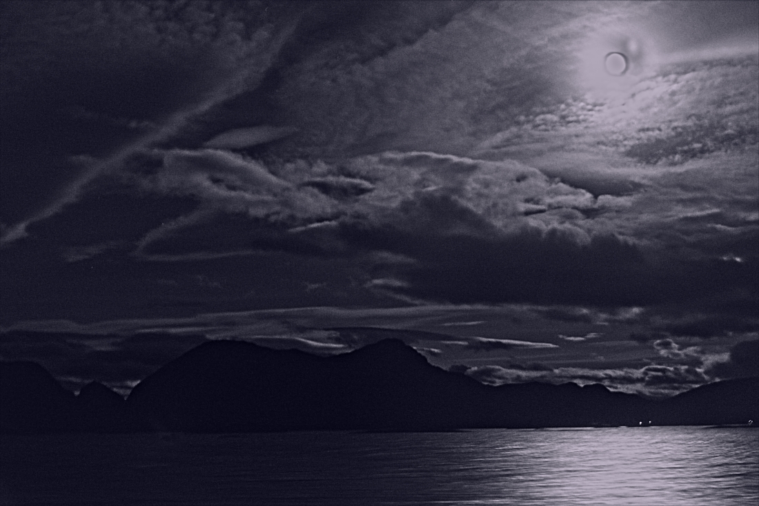
I have just started shooting stars and have produced nothing that I would ask someone to look at. The data given with the photo is very useful. I have been using very much the similar exposure, but I used 2000 for the ISO. The bon fire in my opinion spoils the picture. I am moved to a sense of awe much as Jim expressed, and the fire just screams. The post processing is stunning. I would try cloning out the fire and cropping on the right so the Milky Way becomes the dominant figure. Thanks for sharing your experiment with us. |
Jul 13th |
5 comments - 2 replies for Group 24
|
| 47 |
Jul 21 |
Comment |
I came back to your photo. It is interesting and a tension just as Kirsti felt. I think that the clouds do function as leading lines, but are somewhat weak. There is a dark line (apparently vegetation) If you darkened that a little you would have another leading line to reinforce the clouds, working with the woods in the background. Then the line of vegetaion in the front is an opposing ine which gives the picture tension. Play with it this photogdraph is very drich with possibilities. |
Jul 18th |
| 47 |
Jul 21 |
Comment |
This is really interesting andk well done. A bit more ontrast in the ground (by brightening whites a very little would be worth trying. Ik would alsop try cropping some of the black areas on the bottom. There is a picture within the picture with the three trees grouped together. Try some majopr cropping on each side in a square format |
Jul 12th |
| 47 |
Jul 21 |
Comment |
Beautifully made. I really like the pyramidal composition and the stuinning quality of the photograph==-sharpness and tonal balance, Unfortunately the wo man did not engage with you or with her husband |
Jul 12th |
| 47 |
Jul 21 |
Comment |
the major problem I have is that there is only a very weak point of interest--thetriangular space formed by the crossed weapons;the other problem is that some of the reenactors just are not in the spirit of the event. |
Jul 12th |
| 47 |
Jul 21 |
Comment |
This is really nicely done. I do like the sky. I think thje foreground is a bit dark and flacct. It needs to have the whites brightenm I think. Also the horizon is too centered for my taste. This needs a lttile nore work and will be a spectacular landscape |
Jul 12th |
| 47 |
Jul 21 |
Comment |
Beautifully done. The converging
lines and strong contrasts, with the strong bright areas on street make this a very arresting composition. The square small building in the right side background could be cloned out. It is a minor distraction
|
Jul 12th |
6 comments - 0 replies for Group 47
|
11 comments - 2 replies Total
|