|
| Group |
Round |
C/R |
Comment |
Date |
Image |
| 25 |
Apr 19 |
Reply |
I think this is my favorite! |
Apr 22nd |
| 25 |
Apr 19 |
Reply |
If you do another black and white version, I would love to see it. |
Apr 19th |
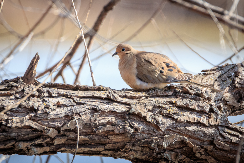
| 25 |
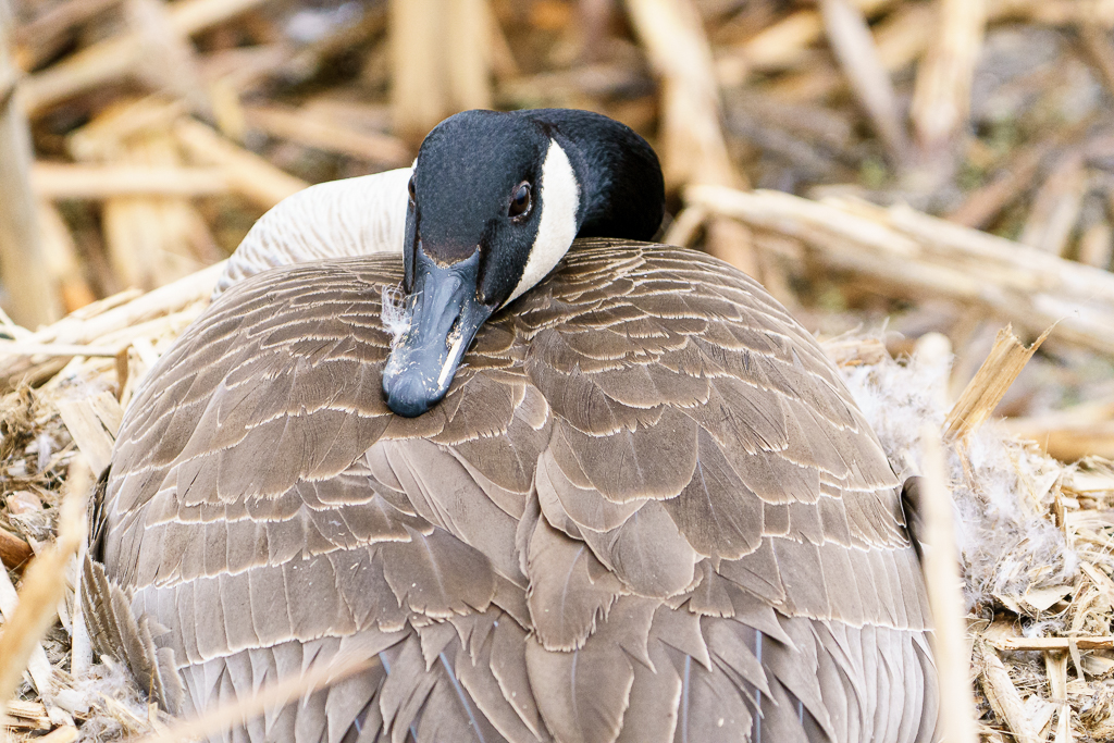
Apr 19 |
Reply |
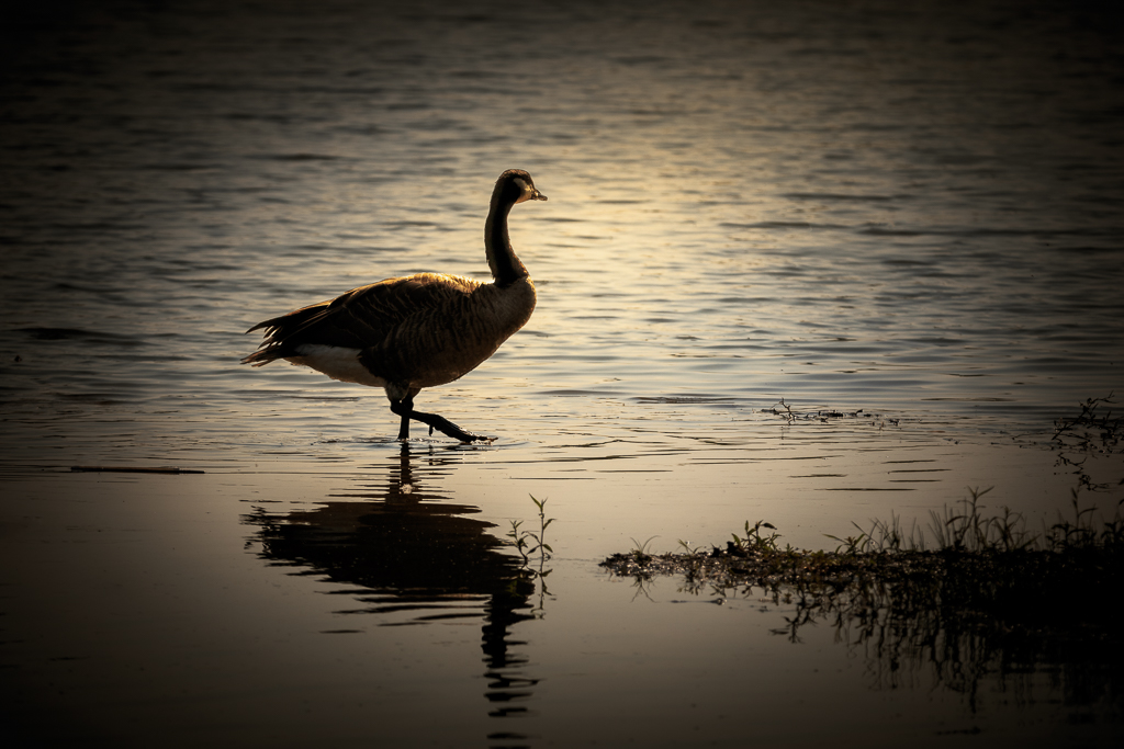
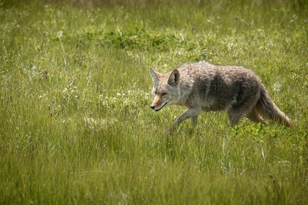
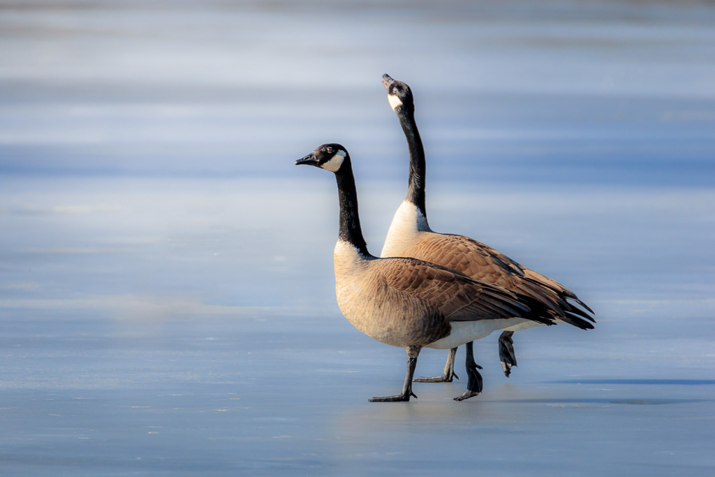
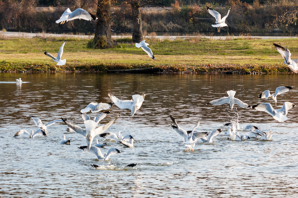
Interesting. In our area, we are over run will Canada geese. It's so bad that last year they killed the babies before they could hatch. |
Apr 19th |
| 25 |
Apr 19 |
Reply |
It's interesting that you know doves as a common subject. I have never seen a mourning dove before and had to research what he was after I got home from the shoot. I do like the black and white option too as I am seeing it in a different way. Thank you. |
Apr 19th |
| 25 |
Apr 19 |
Reply |
I'm glad you gave more background on this image. I decided it was definitely worth another look. I had originally taken your image into PS and messed around with it to see if something would spark for me. I had changed it to black and white and really liked it, but for some reason didn't stick with it. So, another trip back to PS. I think I like the black and white a lot better because the colors aren't competing with the shapes, but as you said, it's personal preference. |
Apr 19th |
 |
| 25 |
Apr 19 |
Comment |
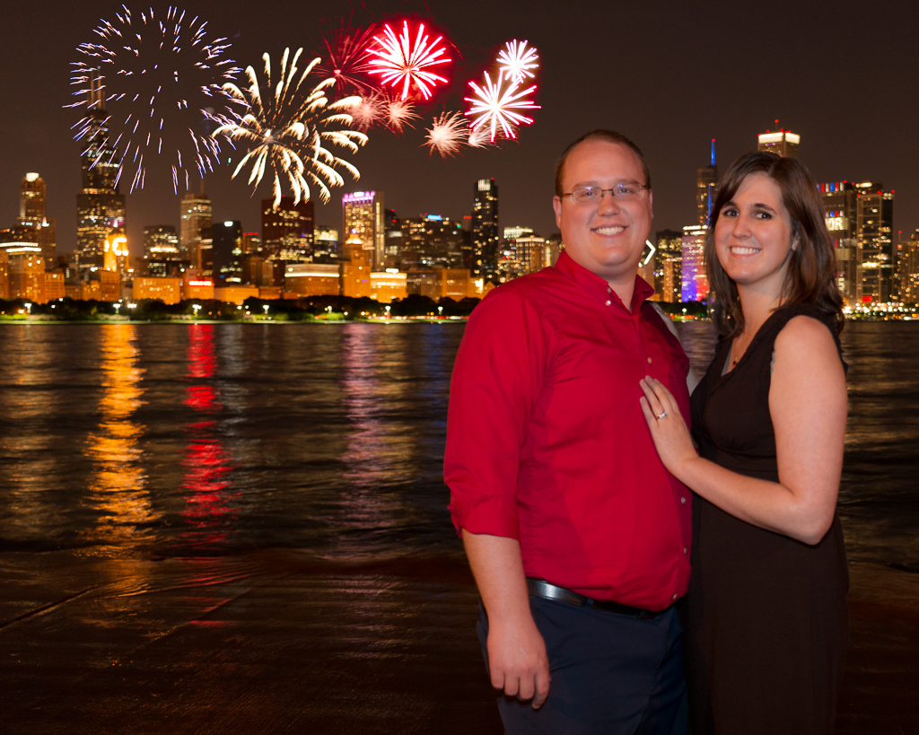
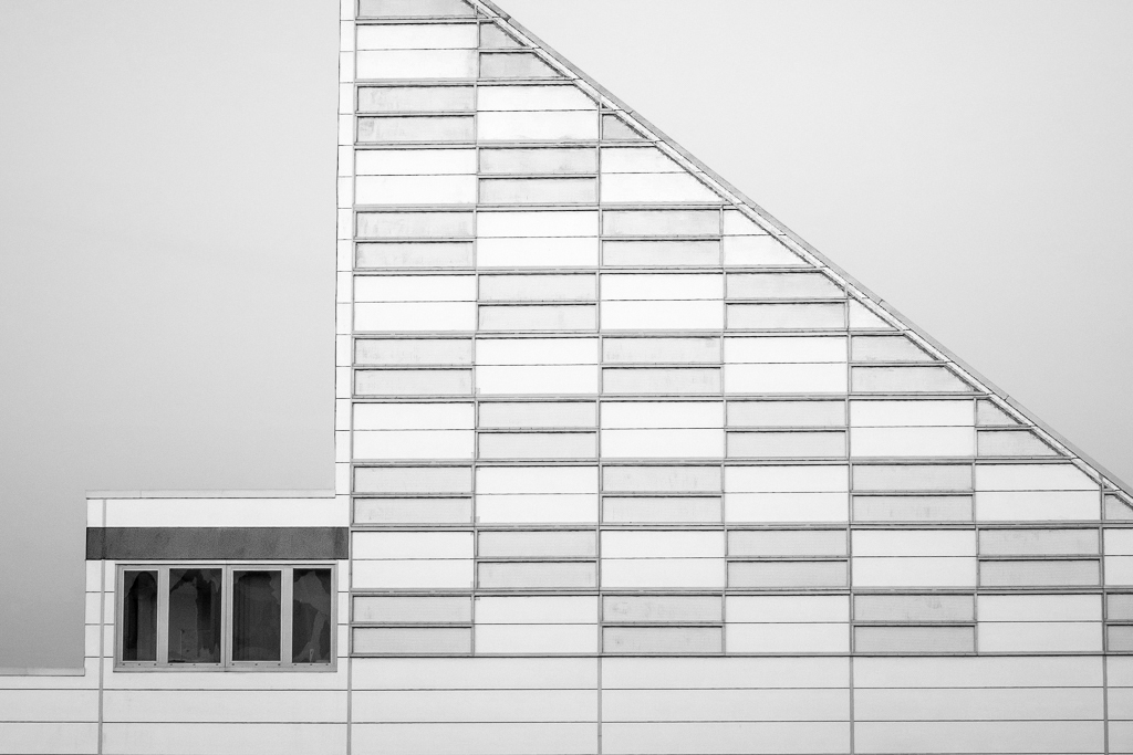
I'm going to have to see what others think on this one. Until I finally looked at your original, I did not realize the pink was sky. I thought I was looking at the side of a pink and tan building. It's exposed correctly, it's straight. I would say the best part of this photo is that it makes a great memory, which is not a bad thing. |
Apr 18th |
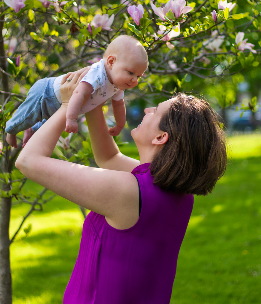
| 25 |
Apr 19 |
Comment |
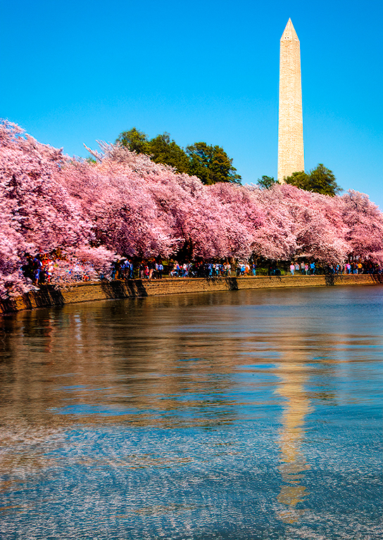
It's years like this that I miss living in the DC area. I saw on the news the blossoms were awesome this year. I liked your photo, but wished the blossoms were showing off their pink more. So I tried a new technique that I just learned on your photo. In PS, I created a pink layer. You use the HARD MIX blend mode (yes, it makes your photo look ridiculous). Then lower the FILL (not opacity) to about 10%. I then masked away the pink from the rest of the photo. I thought it came out pretty good. |
Apr 18th |
 |
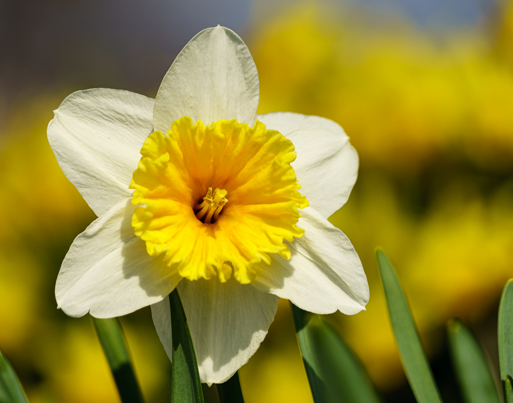
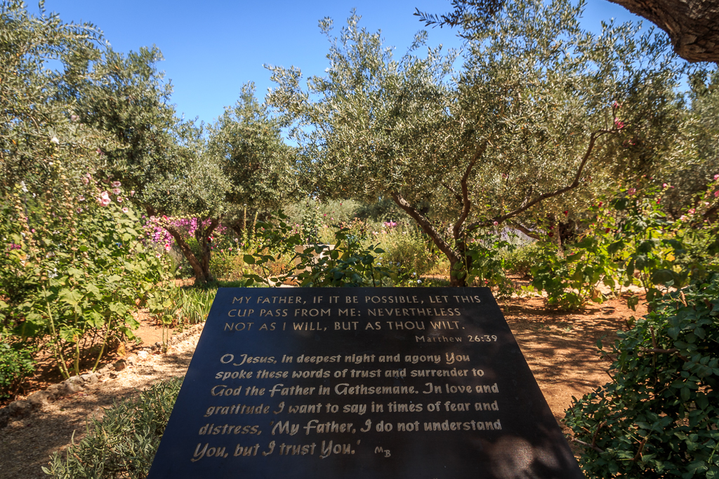
| 25 |
Apr 19 |
Comment |
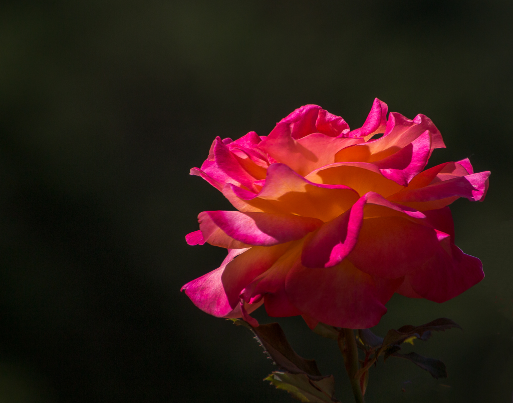
The original was a nice photo, but I have to say, I really like the edit you did to this photo. It seems to make the yellow pop. I wouldn't change anything. |
Apr 18th |
| 25 |
Apr 19 |
Comment |
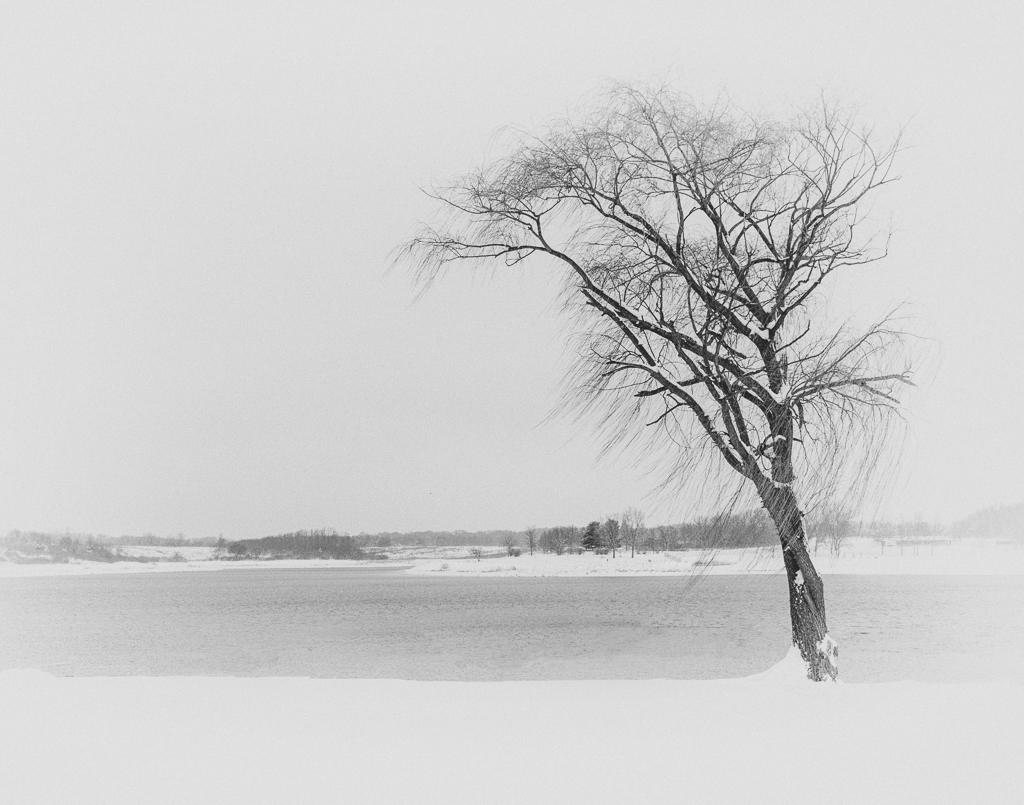
I really like the color of the light reflecting on all the branches. |
Apr 18th |
4 comments - 5 replies for Group 25
|
| 71 |
Apr 19 |
Reply |
I like it! Thanks. |
Apr 19th |
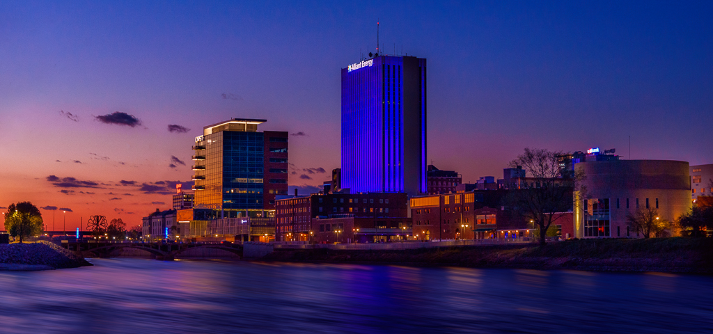
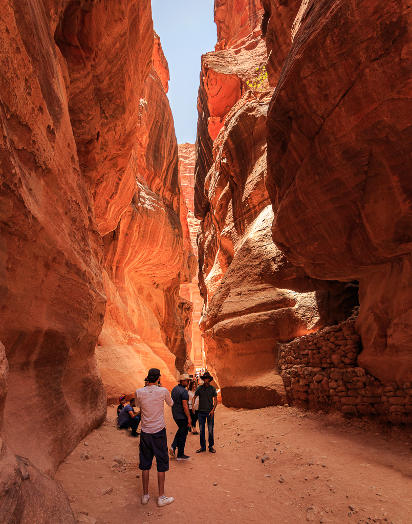
| 71 |
Apr 19 |
Comment |
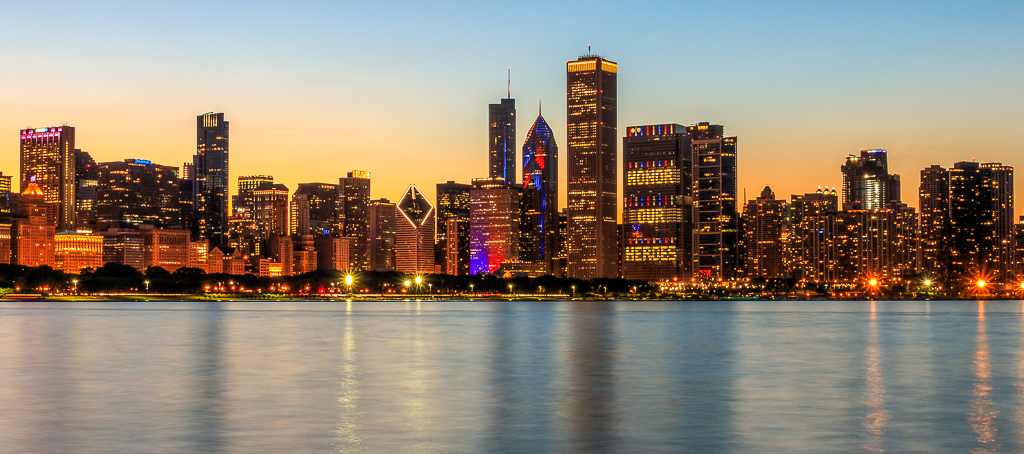
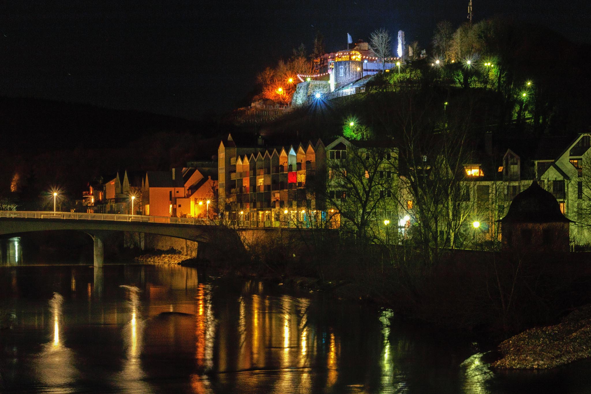
I love this photo. My only suggestion: remove the sign on the left side of the street. My eye keeps getting drawn to that neon green. |
Apr 18th |
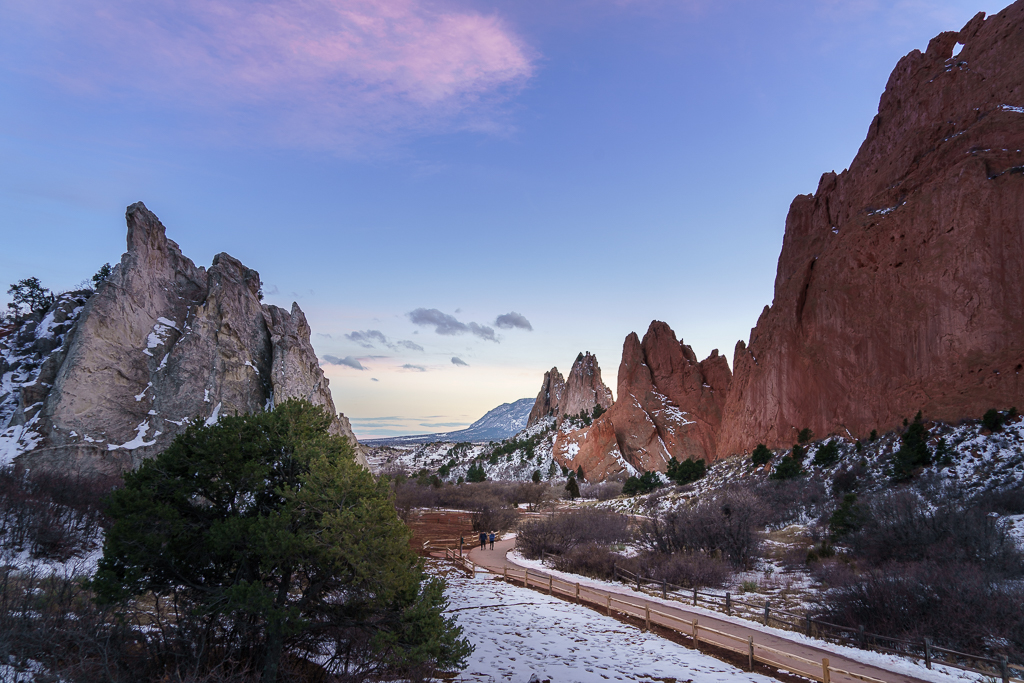
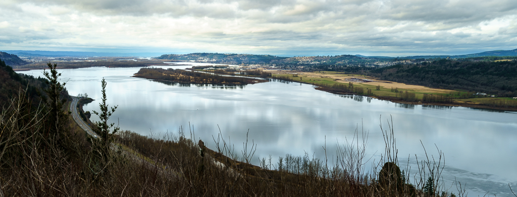
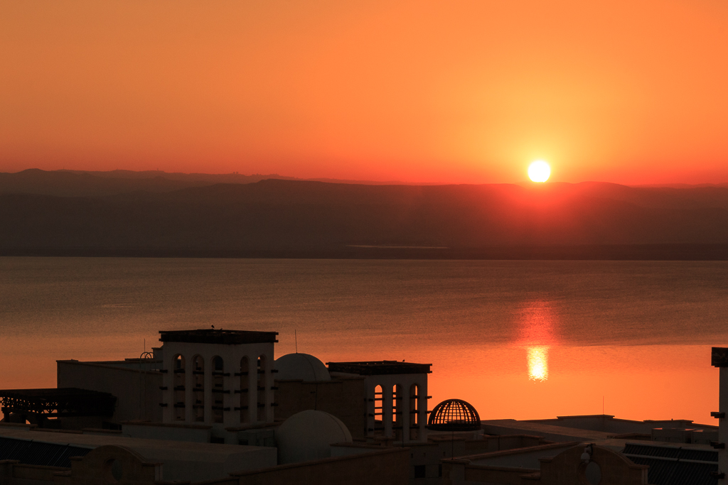
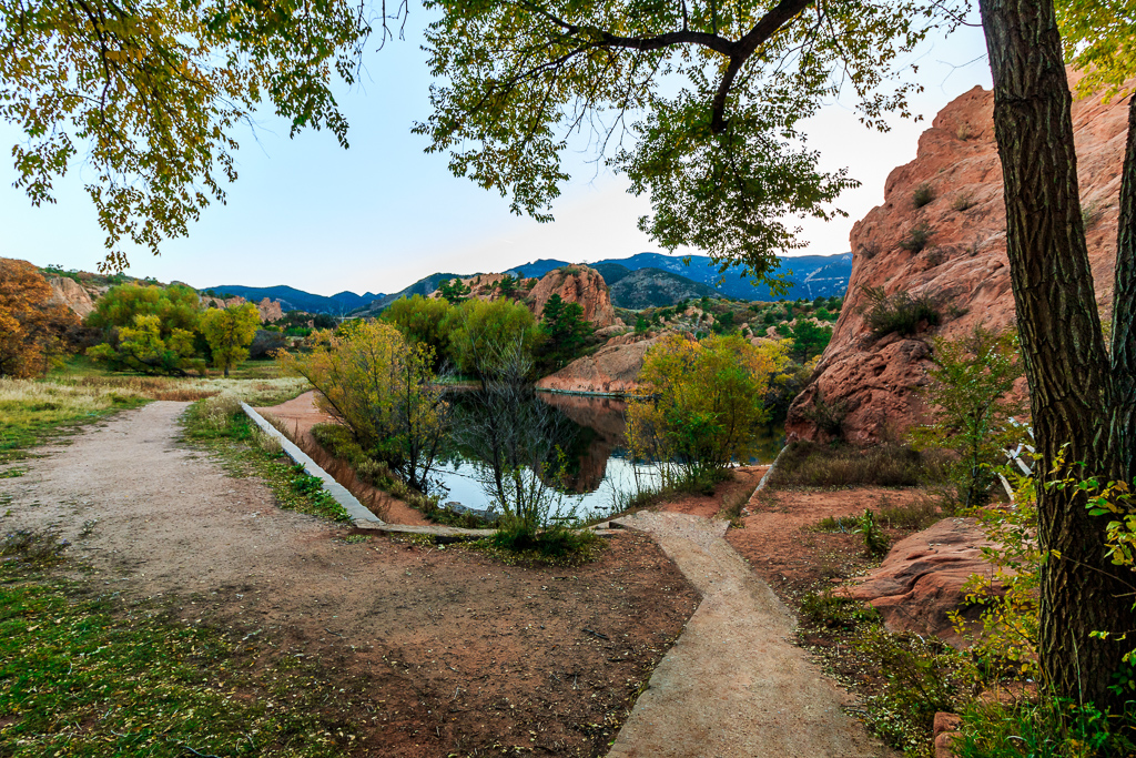
| 71 |
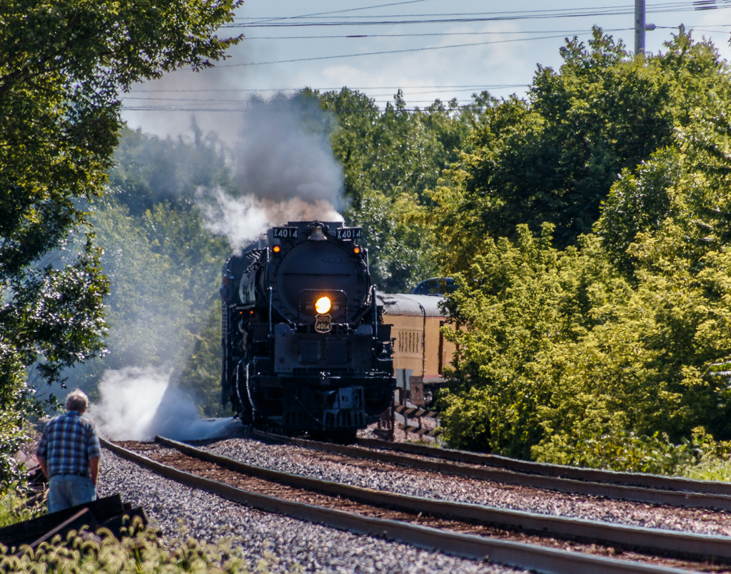
Apr 19 |
Comment |
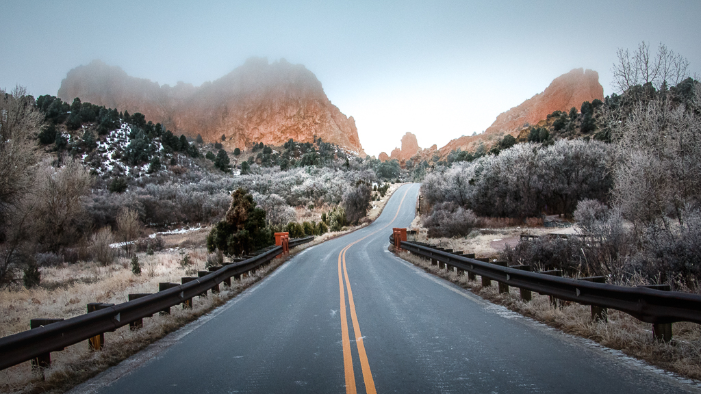
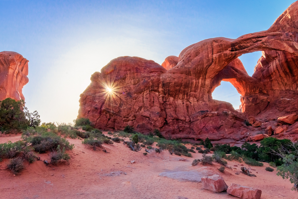
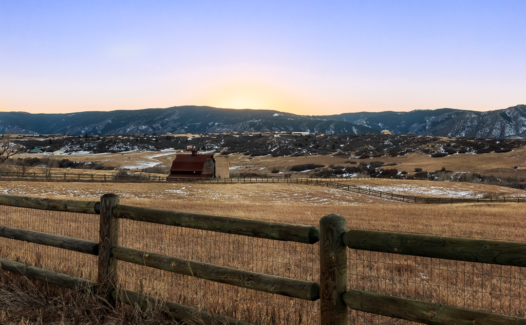
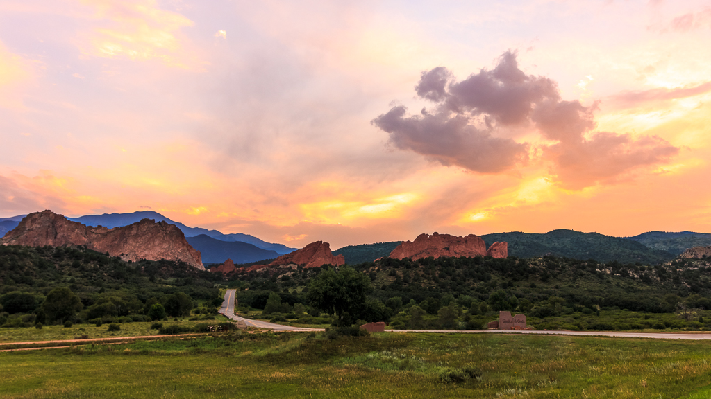
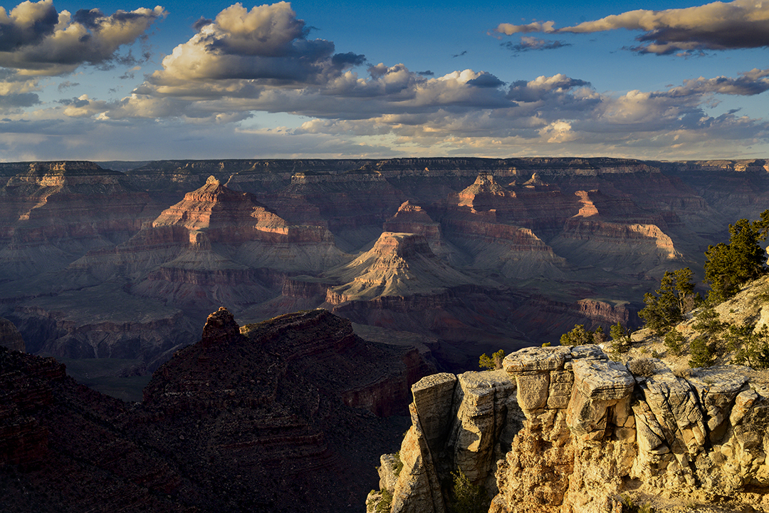
I thought the canyon looked a little blue for a sunset photo. I took it into PS Camera Raw and warmed up the canyon. I also toned down the cliff on the right. You can decide if you like it. |
Apr 18th |
 |
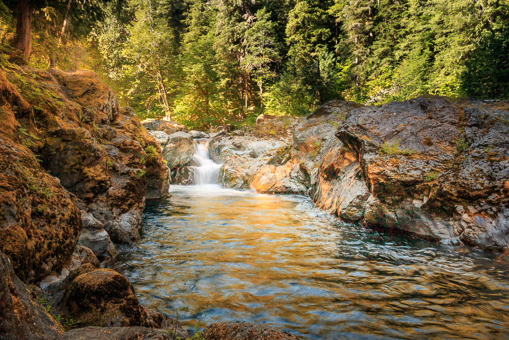
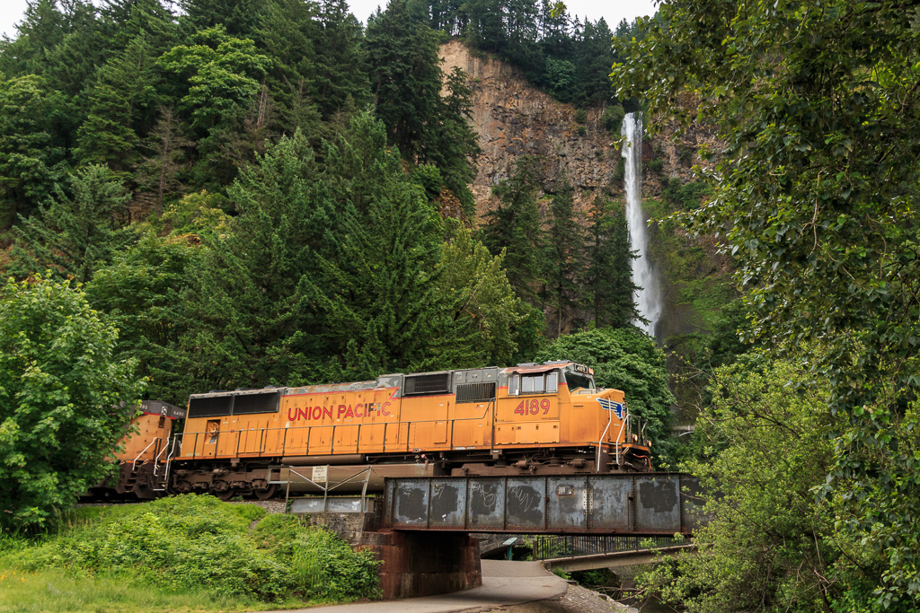
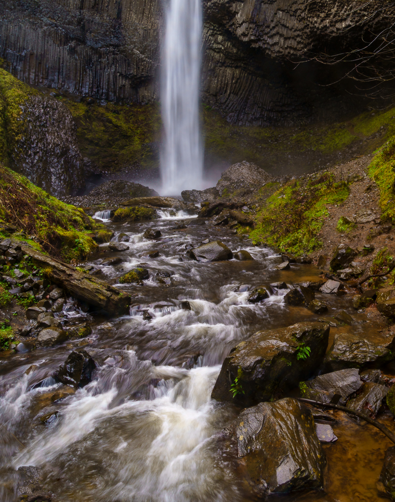
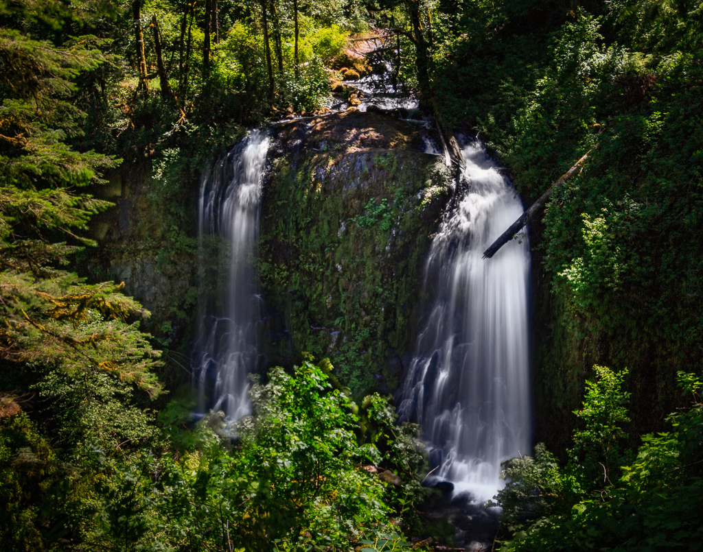
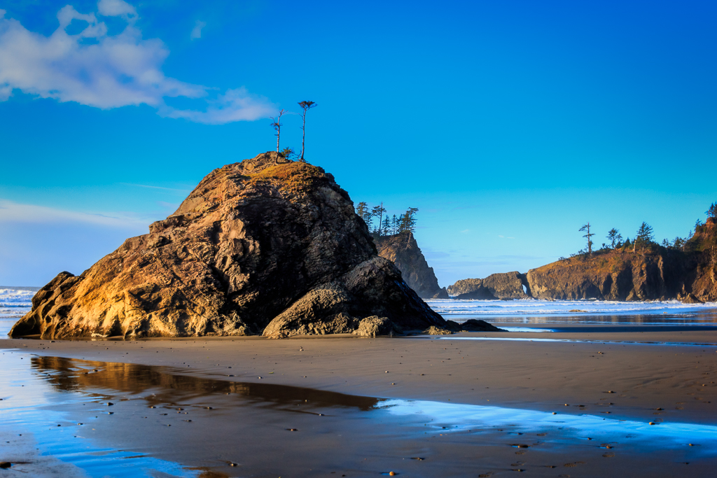
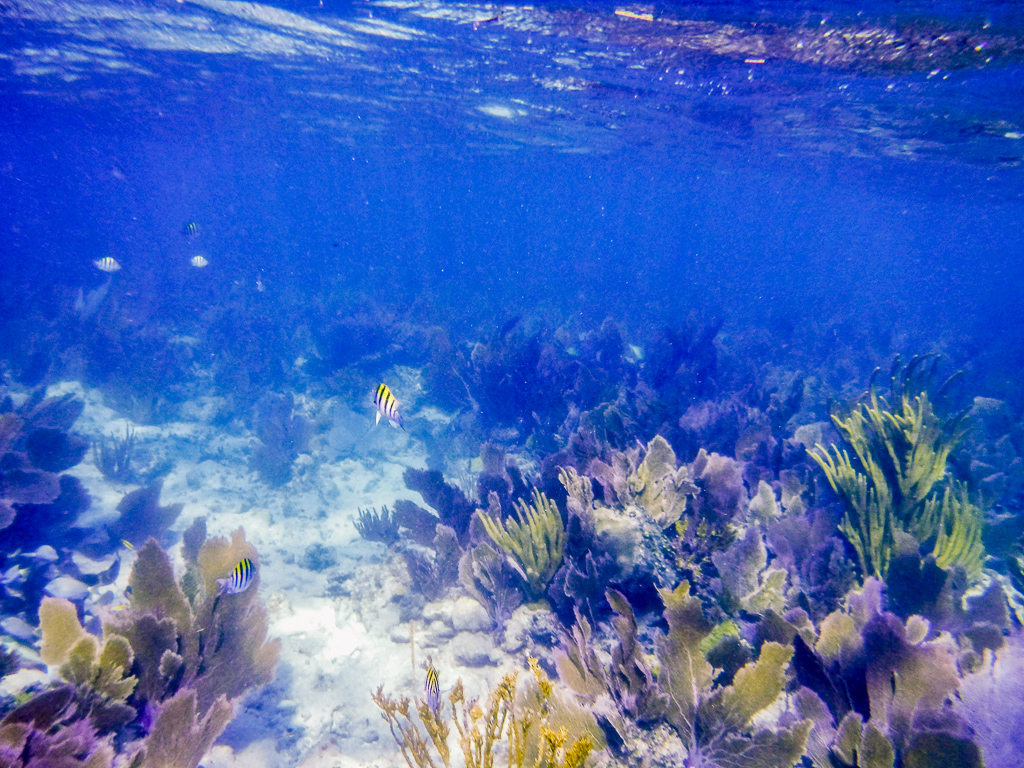
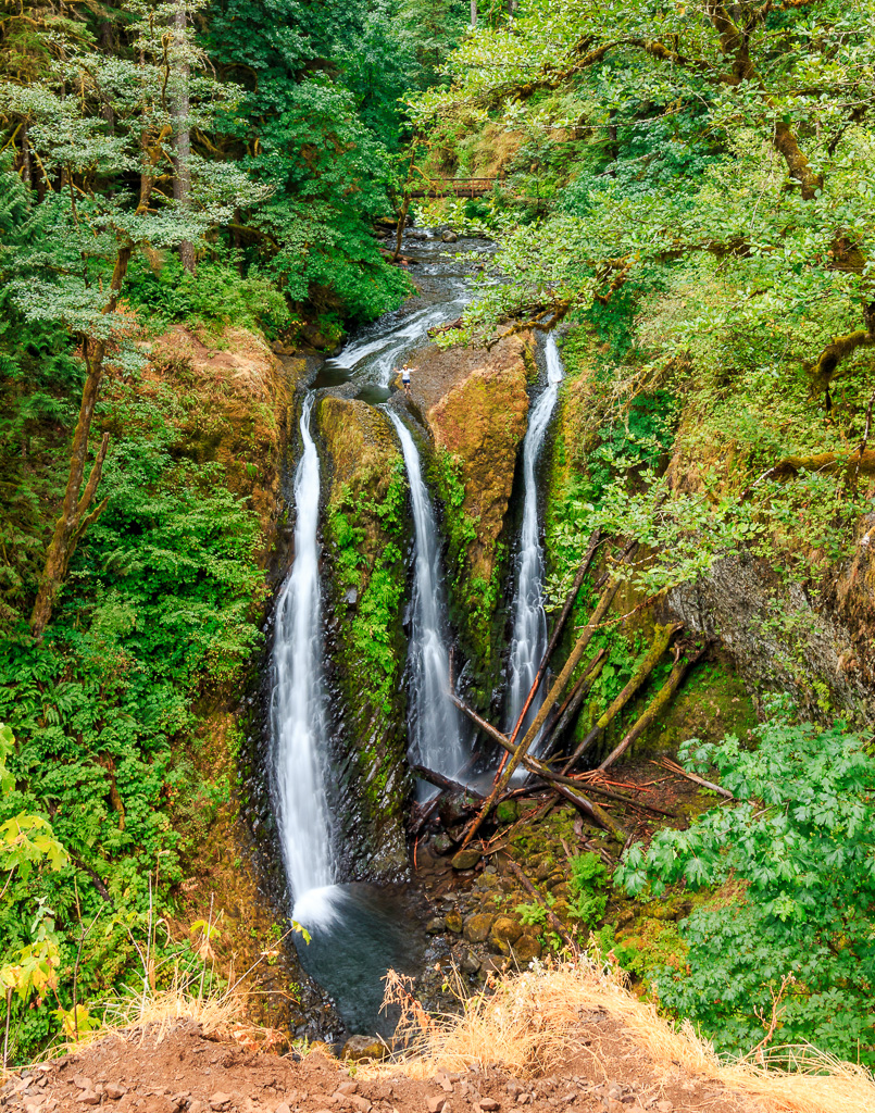
| 71 |
Apr 19 |
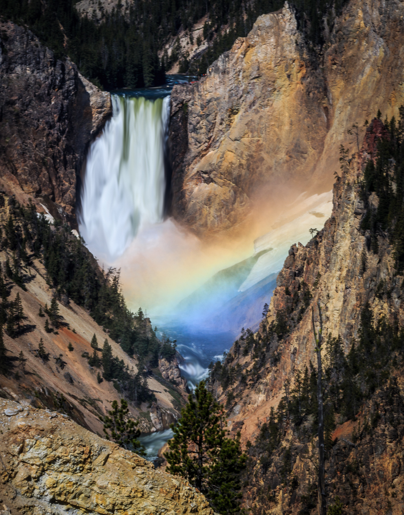
Comment |
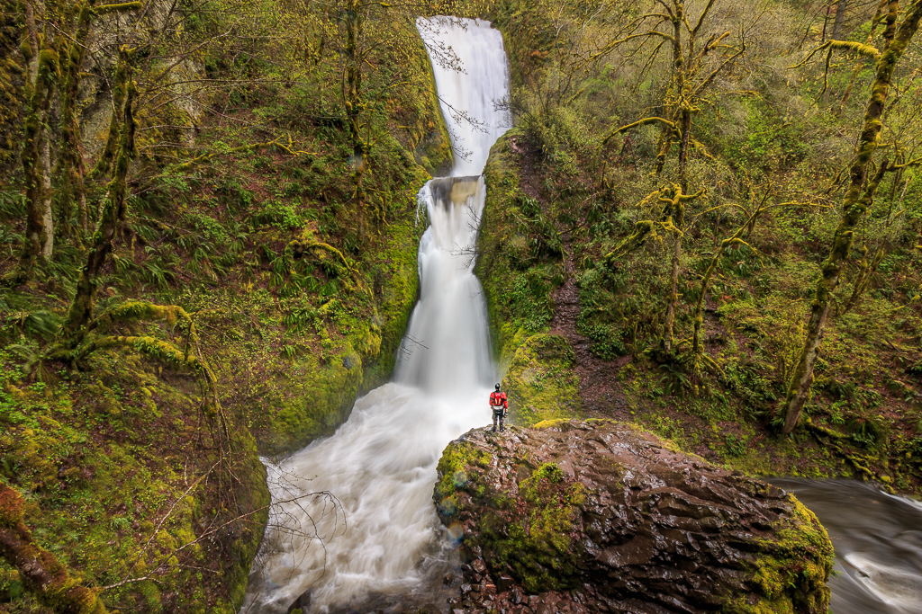
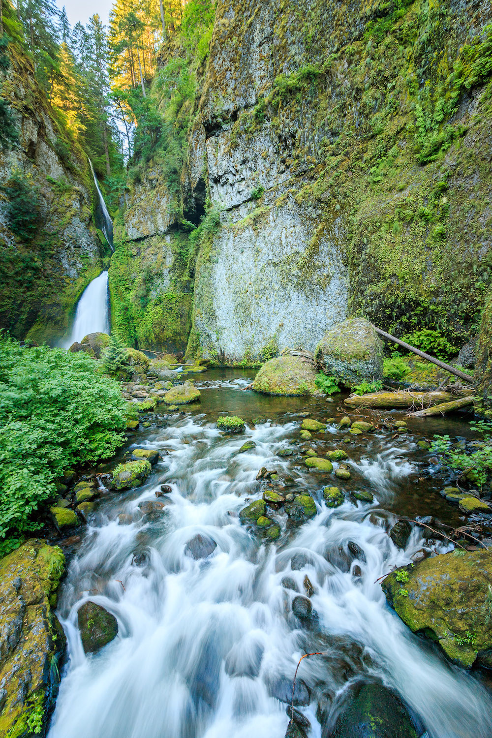
I loved the way you captured the water coming over the rock! Like Nancie, I am wondering if you cropped this. A bit wider view would have been nice. Next time I'm on the west coast, I want to try capturing something like this. I really like it. |
Apr 18th |
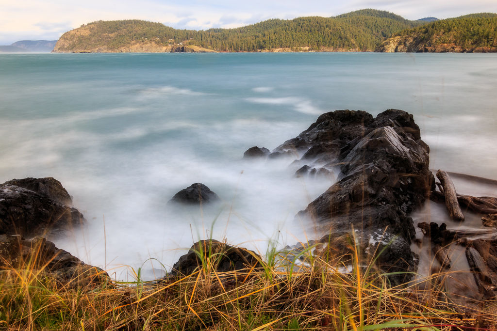
| 71 |
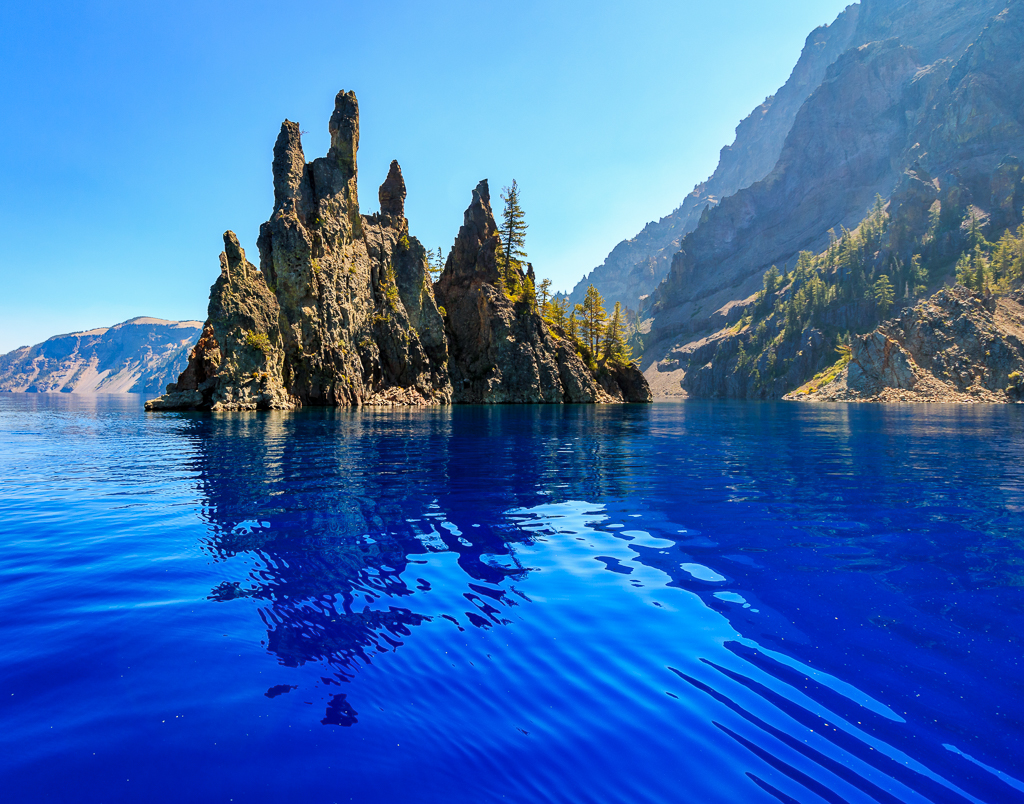
Apr 19 |
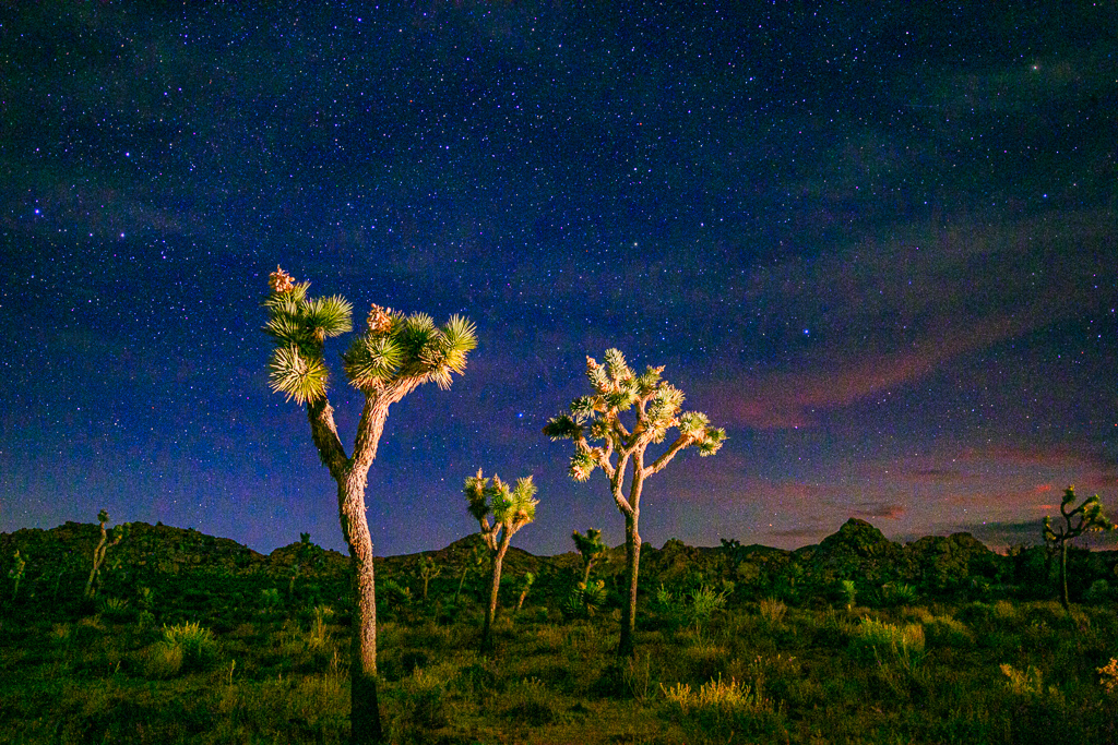
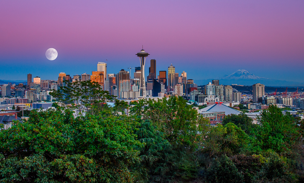
Comment |
I agree with everyone's comments: This is a great shot. I am wondering if that is the Milky Way showing on the right. If so, you may want to enhance it. I used to do that, but it's been too many years to remember how. I would have to watch some Youtube videos. It's something you could play with, but the photo is nice either way. |
Apr 18th |
| 71 |
Apr 19 |
Comment |
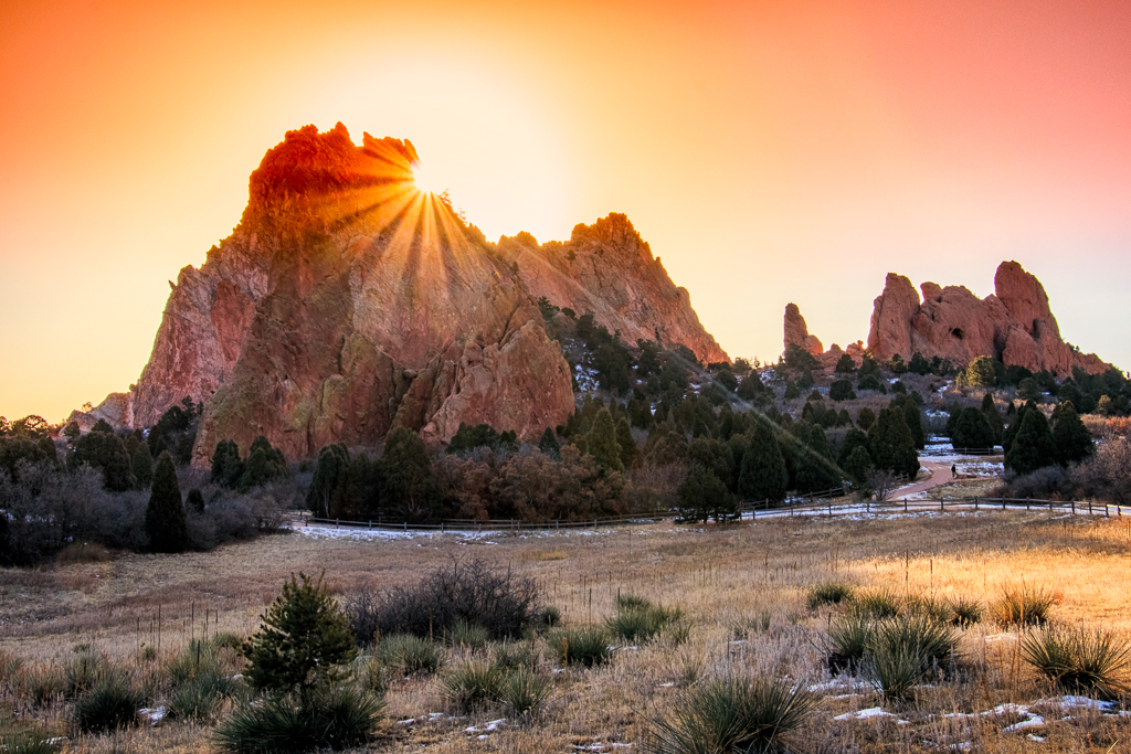
It's a gorgeous shot. I wouldn't change anything. |
Apr 18th |
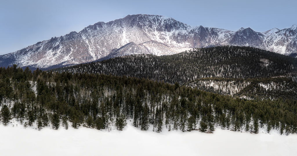
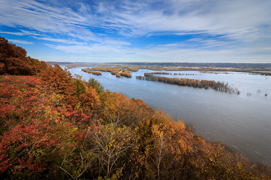
| 71 |
Apr 19 |
Comment |
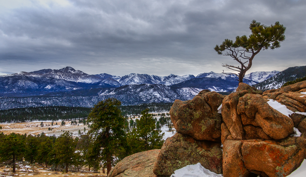
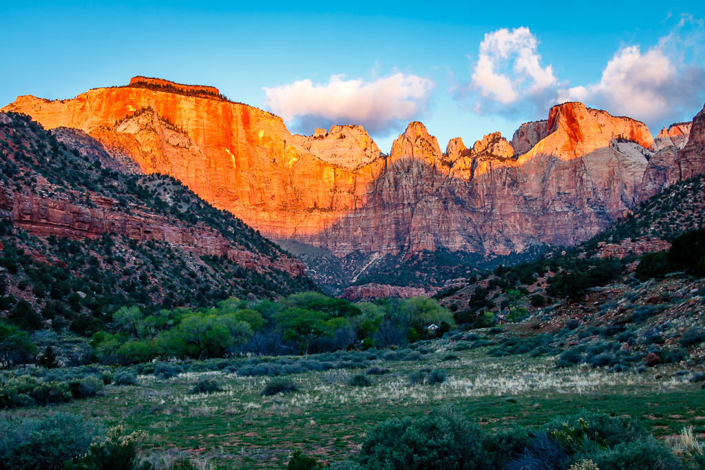
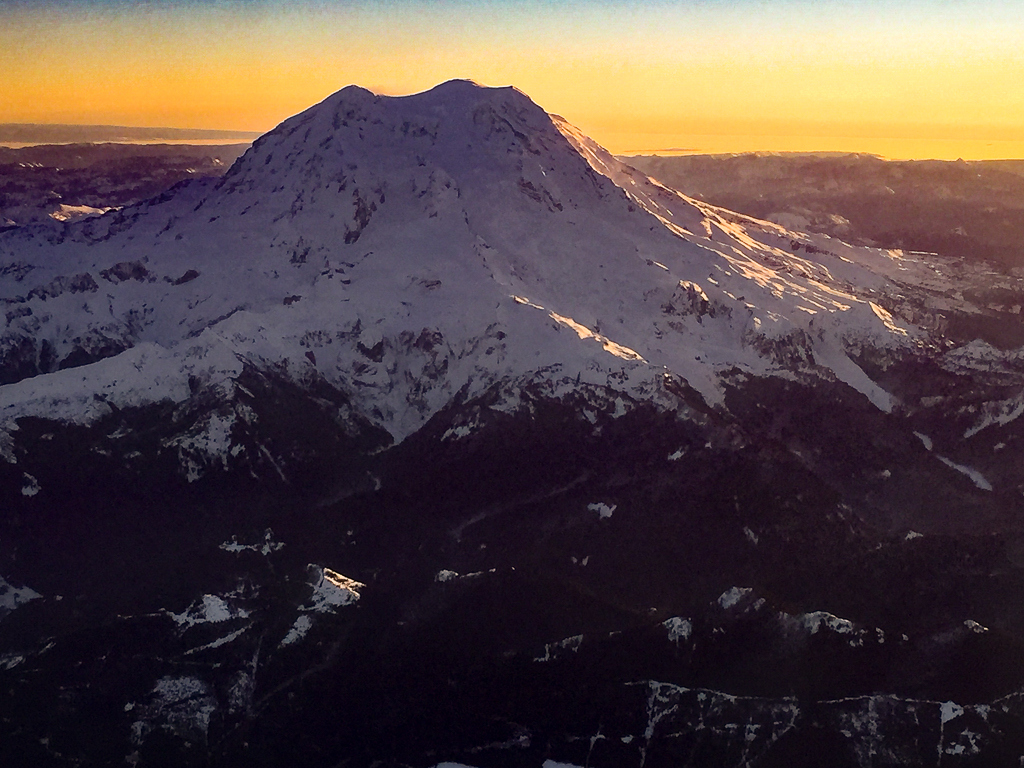
I had the same first thought as Mike, too much sky. I would crop the sky back to just above the tree on the left. I love the colors though. |
Apr 18th |
6 comments - 1 reply for Group 71
|
10 comments - 6 replies Total
|