|
| Group |
Round |
C/R |
Comment |
Date |
Image |
| 25 |
Sep 17 |
Comment |
Nice job! Love how this came out with HDR. Wouldn't change a thing. |
Sep 20th |
| 25 |
Sep 17 |
Reply |
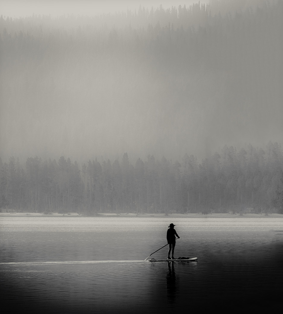
Nice! The other thing I like about this photo is that he is actually paddling, rather than dragging his paddle behind. Not sure if you like the light foggy feel of the first one better. If so, just try the adjustment brush with dehaze on the trees behind and add in haze. Either way is fine with me. |
Sep 7th |
| 25 |
Sep 17 |
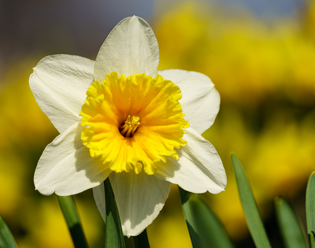
Comment |
Unfortunately, the image is really small. Given what I can see, it looks great. Nice job with the cloning. The green leaves make a nice background to the flower. |
Sep 5th |
| 25 |
Sep 17 |
Comment |
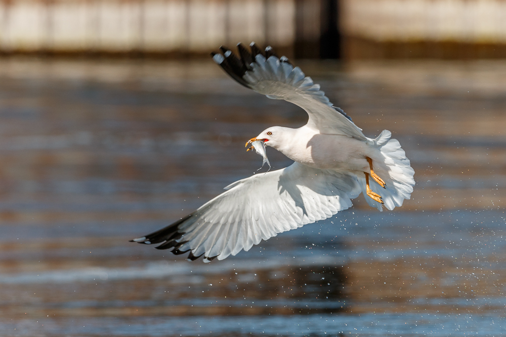
I also would have loved photographing these little guys. I definitely prefer the cropped version to make the frog not feel lost. He's nice and sharp. The only problem I see is that the petals are blown out and keep drawing my eye to them. Unfortunately, I noticed them first rather than the frog. I tried decreasing highlights on the petals, but there was no information to bring back. Even so, adding a vignette would help. |
Sep 5th |
| 25 |
Sep 17 |
Comment |
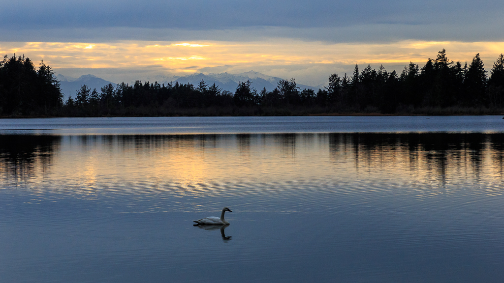
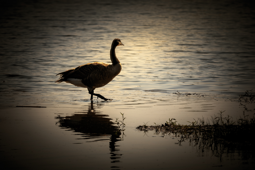
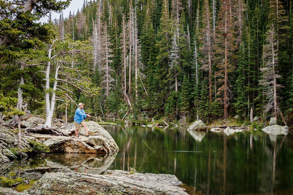
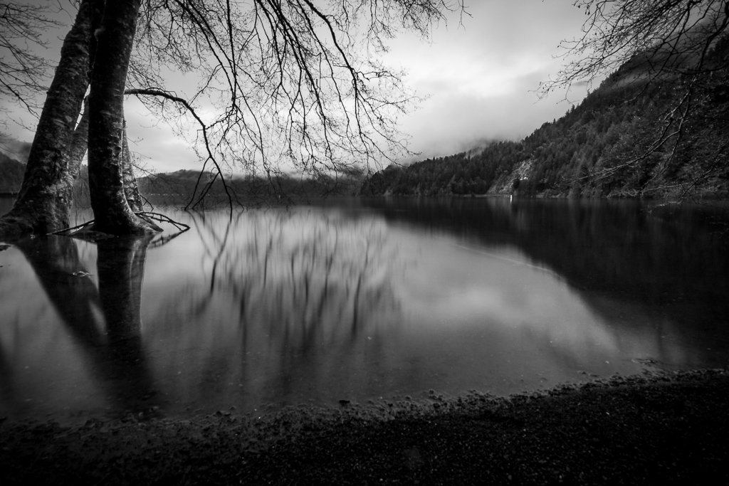
I love this photo as a black and white. The lone figure on the water in the early morning is a nice simple composure. The only draw back to me is that he is too far to the right. I would have preferred that he had a bit more room to paddle into. So, I took it into photoshop and used content aware fill to create the right side. To do this, I created a new layer that was slightly bigger than the photo and made it white. Placed the photo on the left side, selected the white area and selected content aware fill from the Fill option in the Edit menu. Just some minor blending with the spot healing brush and clone tool. |
Sep 5th |
 |
| 25 |
Sep 17 |
Comment |
I love this! I was there a four years ago so I recognized it right away. I think you did a great job with the post processing and I wouldn't change a thing. |
Sep 5th |
5 comments - 1 reply for Group 25
|
| 71 |
Sep 17 |
Reply |
Unfortunately, I can't repeat it either.
|
Sep 28th |
| 71 |
Sep 17 |
Comment |
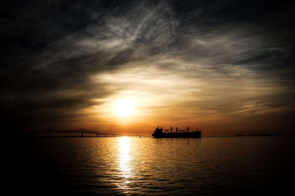
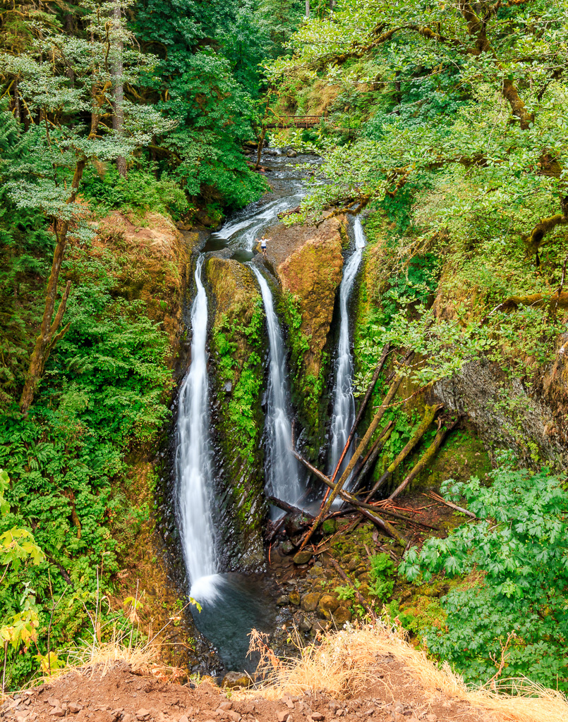
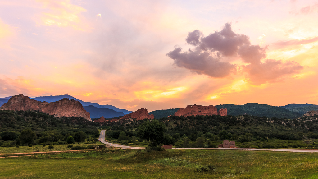
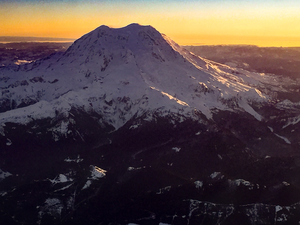
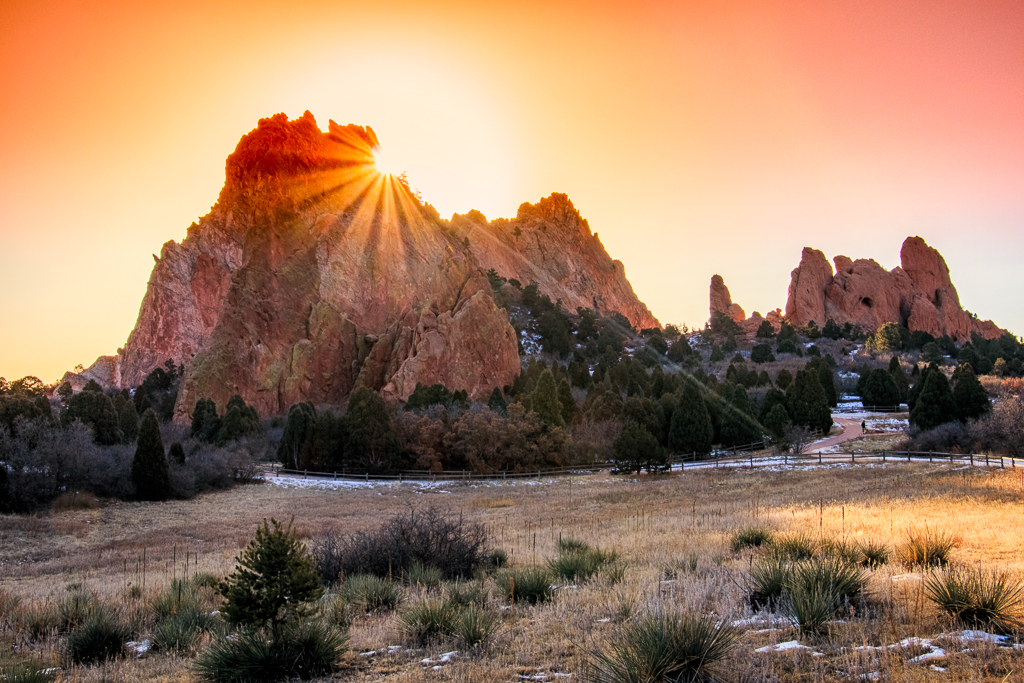
I totally understand why you wanted to get this shot. It's gorgeous. My suggestion would be to back off the clarity and contrast in the clouds and adjust the white balance. The black on the bottom of the clouds is usually an indication of over processing. |
Sep 24th |
| 71 |
Sep 17 |
Comment |
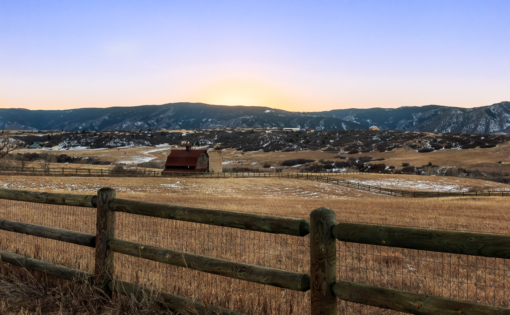
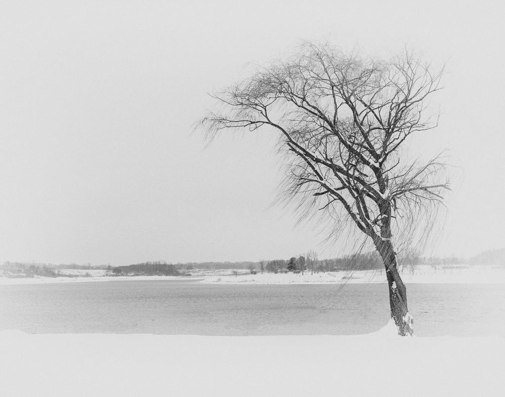
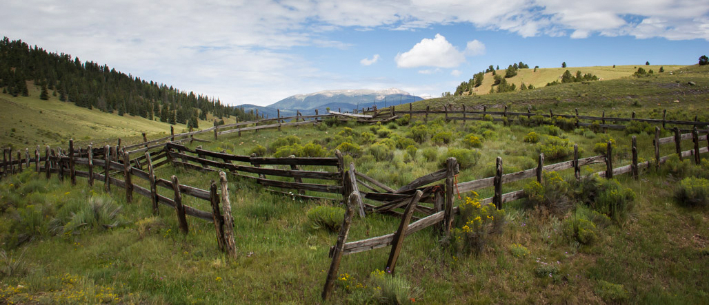
I love the photo of the fence, but without the description, I'm not sure if I would have caught what was important as there is so much sky. The lightest areas of the photo are the sky and the hills behind the fence. I recropped, added a vignette, and added a few highlights to the grassy area inside the fence to help draw the eye there. You can decide what you think. |
Sep 24th |
 |
| 71 |
Sep 17 |
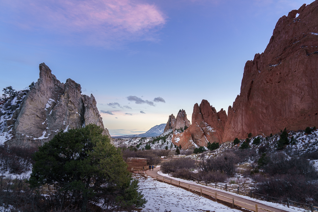
Comment |
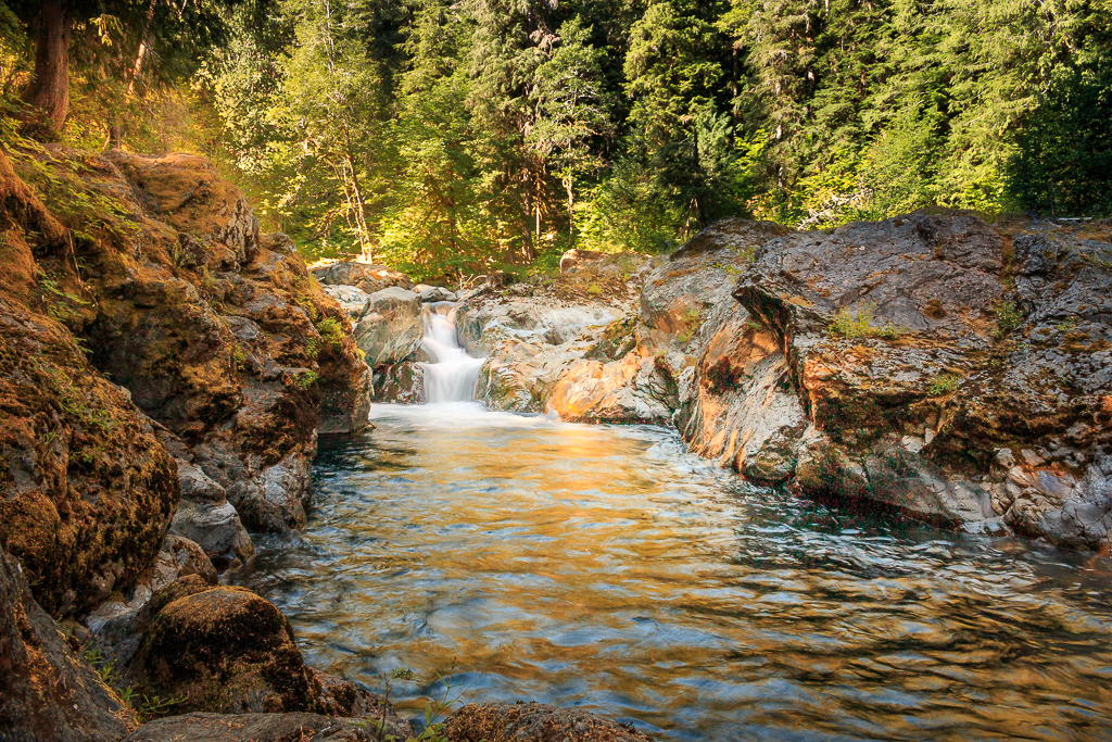
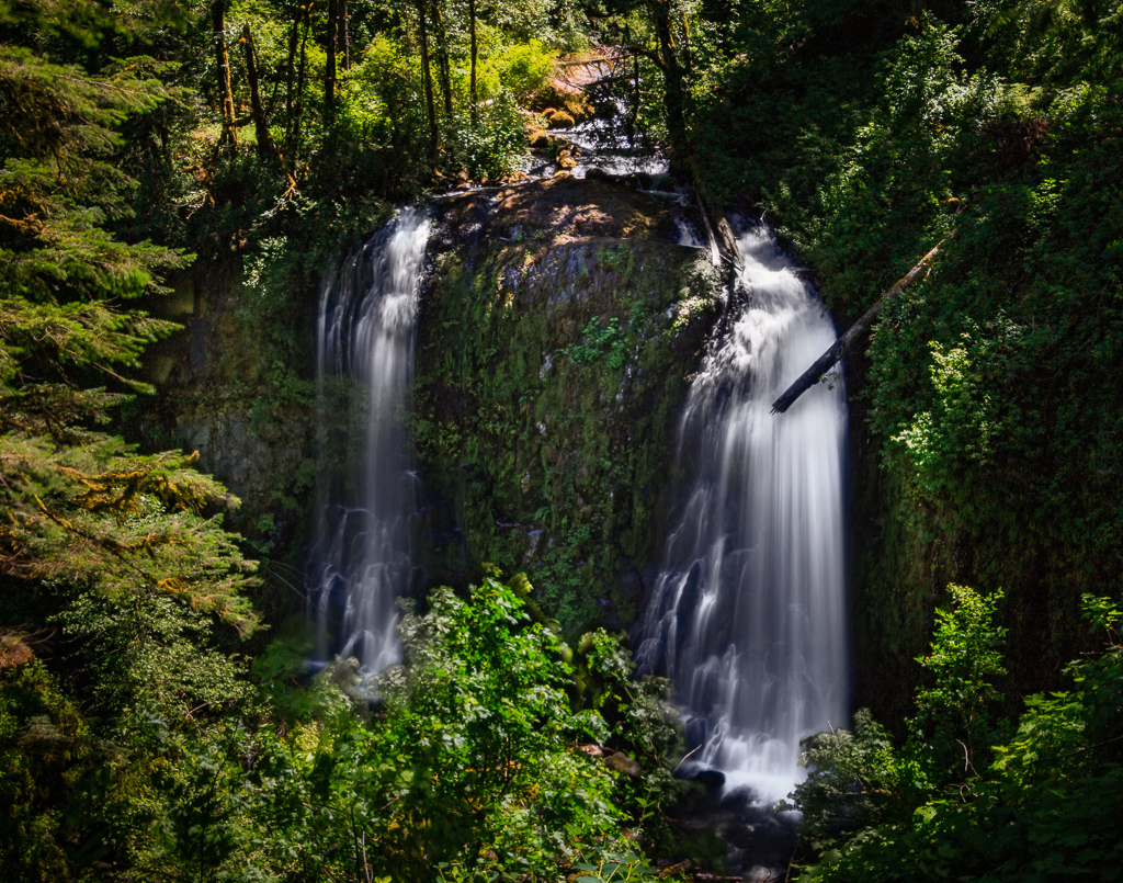
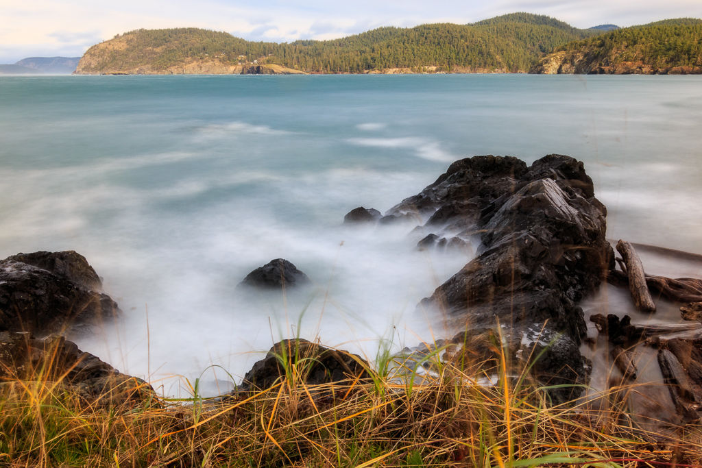
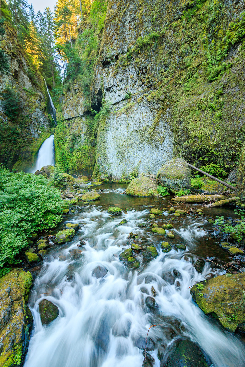
Nicely framed shot. I can't think of anything to add to the suggestions for this photo. This is definitely a photo to enjoy. If you would like something to try in the future, put on an ND filter and do a longer exposure to smooth out the water even more. It's something I do on occasion for fun. |
Sep 24th |
| 71 |
Sep 17 |
Comment |
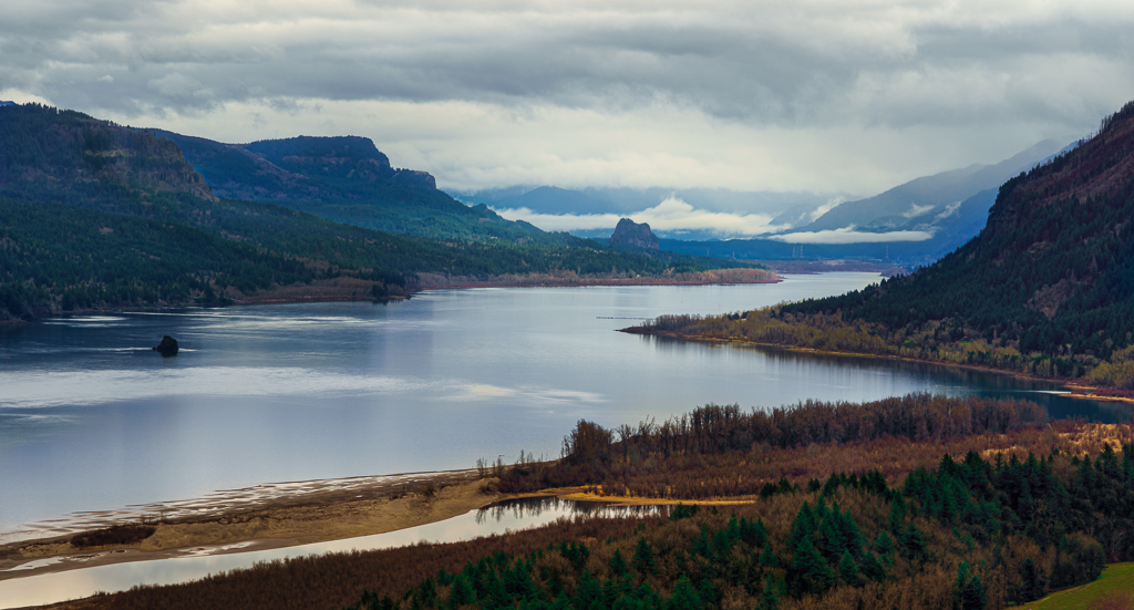
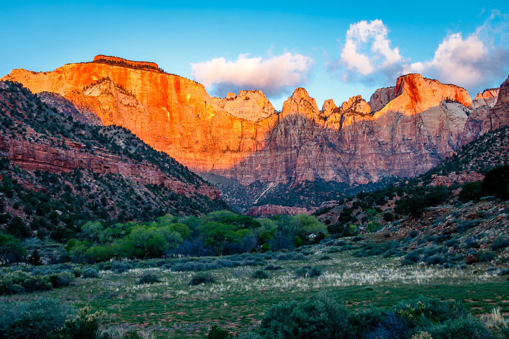
I always love your photos and this is no exception. It's beautiful. My only suggestion would be to crop out some of the sky as there is nothing of interest in it. |
Sep 24th |
| 71 |
Sep 17 |
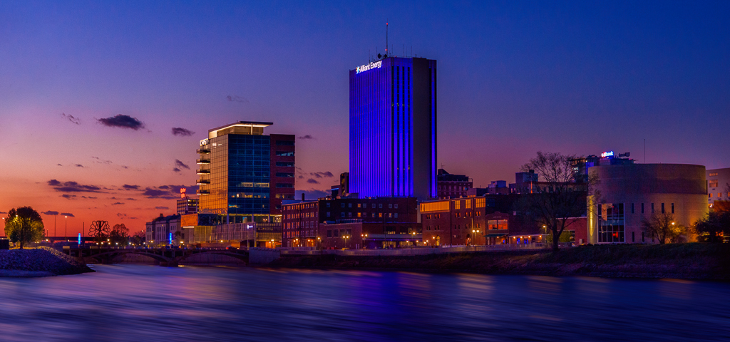
Comment |
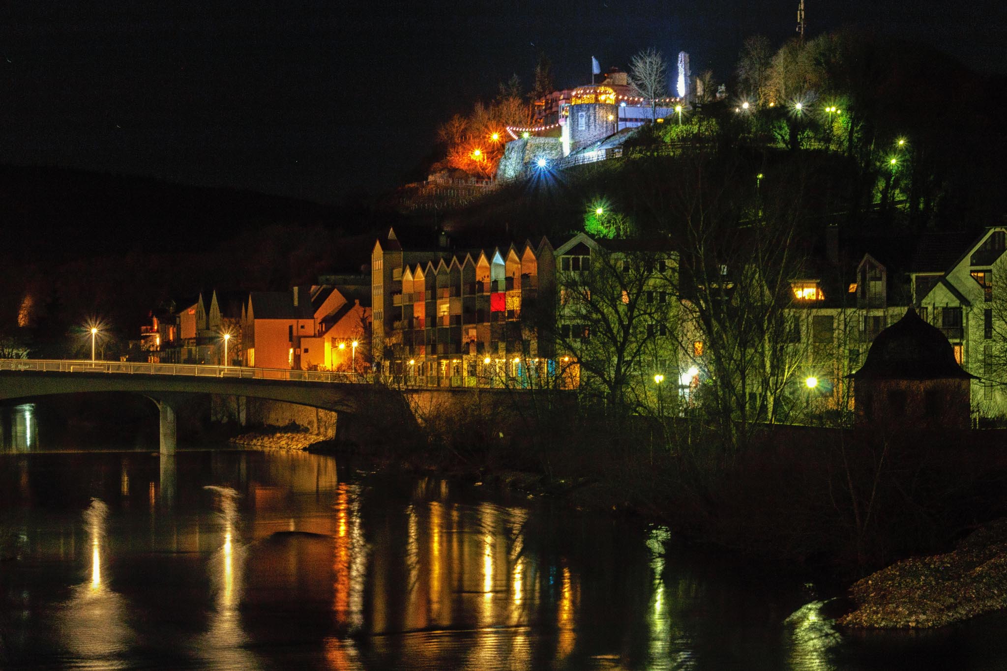
Very nice! I agree with Virginia, this needs to be framed. |
Sep 24th |
| 71 |
Sep 17 |
Reply |
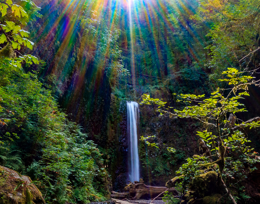
Hi Virginia. So I was curious what I did with the colors. I did use the dehaze slider on the whole picture. It did remove a bit of white haze from the sun, but otherwise the colors were pretty intense. |
Sep 19th |
5 comments - 2 replies for Group 71
|
10 comments - 3 replies Total
|