|
| Group |
Round |
C/R |
Comment |
Date |
Image |
| 11 |
Jul 24 |
Reply |
Thanks, Peter.
Here is the overview for my submission. I am awaiting notification whether it was accepted.
|
Jul 25th |
 |
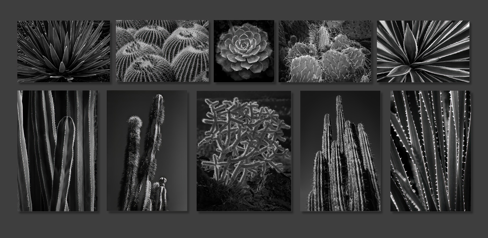
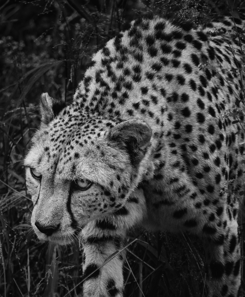
| 11 |
Jul 24 |
Reply |
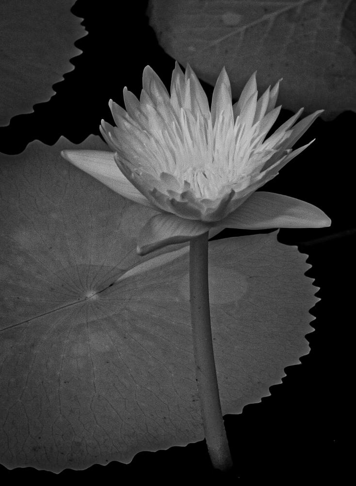
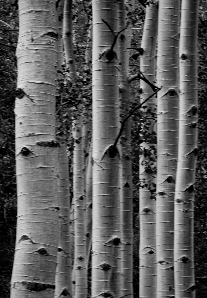
Thanks, Henry. I just did my 10 image Bronze portfolio with monochrome succulents. I had a hard time choosing the best 10 of over 200 images. I will post the final overview image when it is approved.
|
Jul 24th |
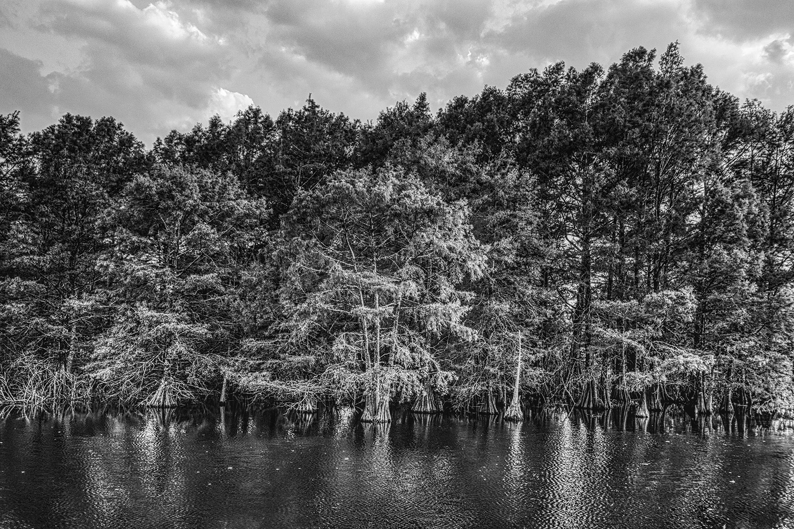
| 11 |
Jul 24 |
Reply |
Thanks, Jim. I used it in my recent Bronze Portfolio submission,
|
Jul 21st |
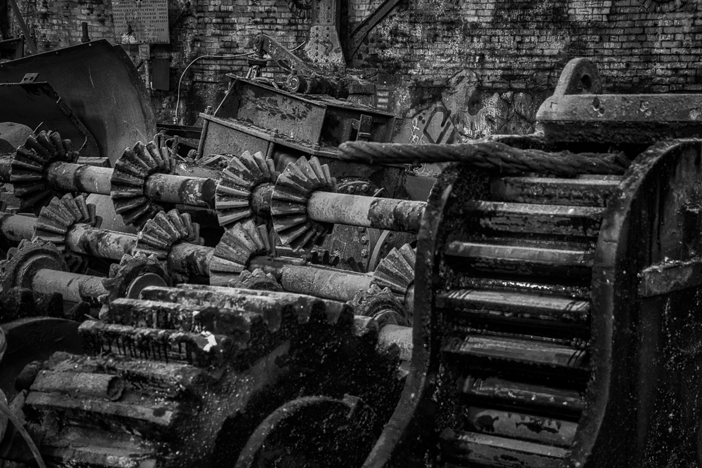
| 11 |
Jul 24 |
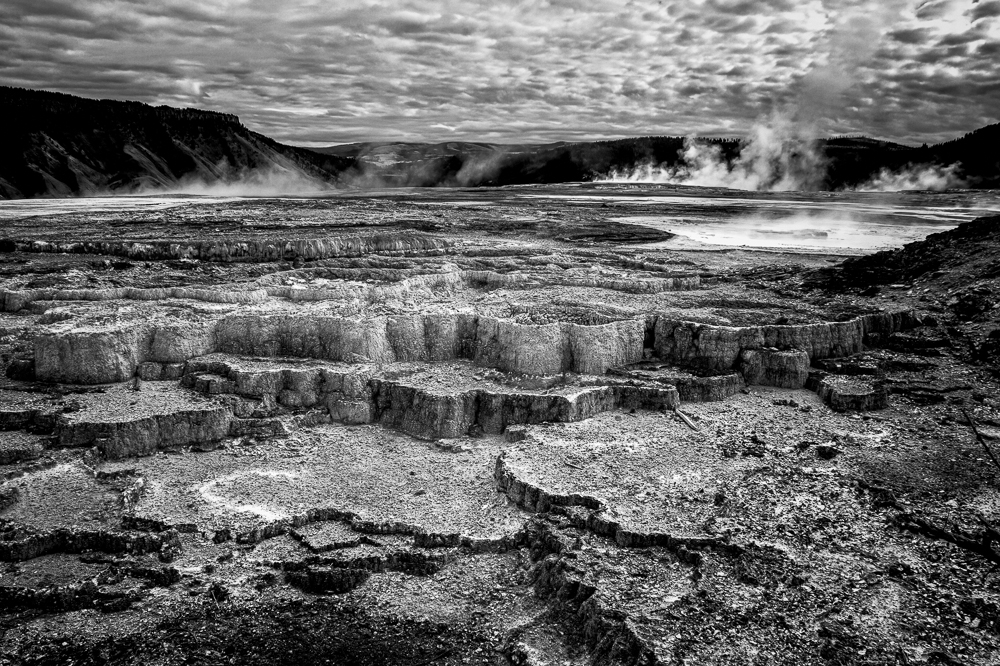
Comment |
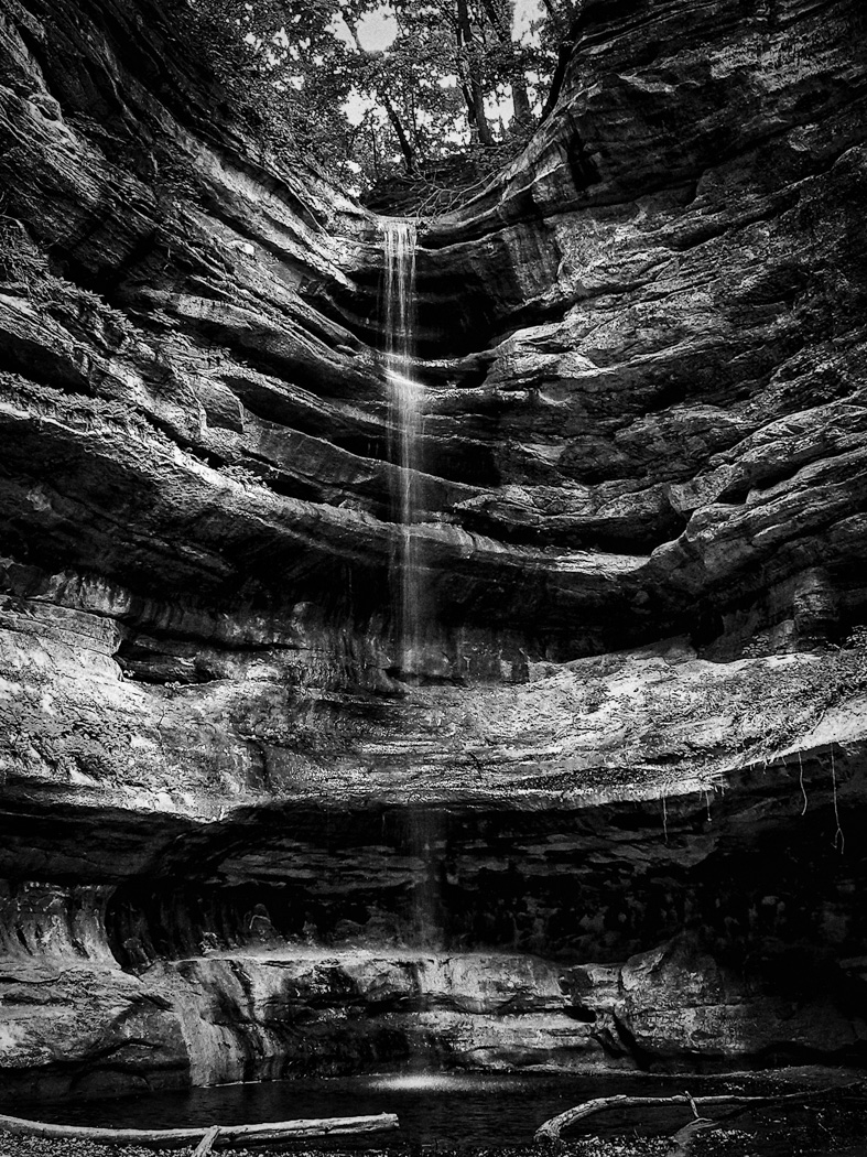
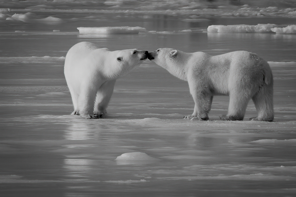
Again, removing the distraction of color simplifies the composition and the visual experience for the viewer. By opening up the shadows, the viewer's eye easily follows the 6 pipes as they ascend the body of the turbine and avoids the confusing color difference of the ceiling on the color version. A very homogeneous and balanced image, Henry. Well done.
|
Jul 7th |
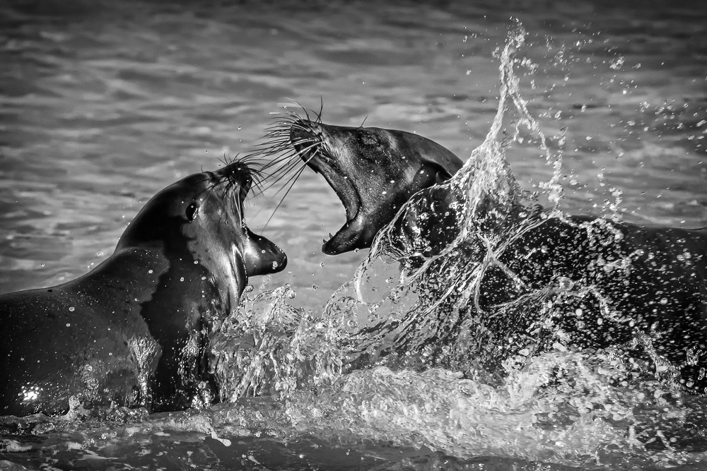
| 11 |
Jul 24 |
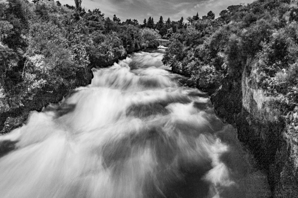
Comment |
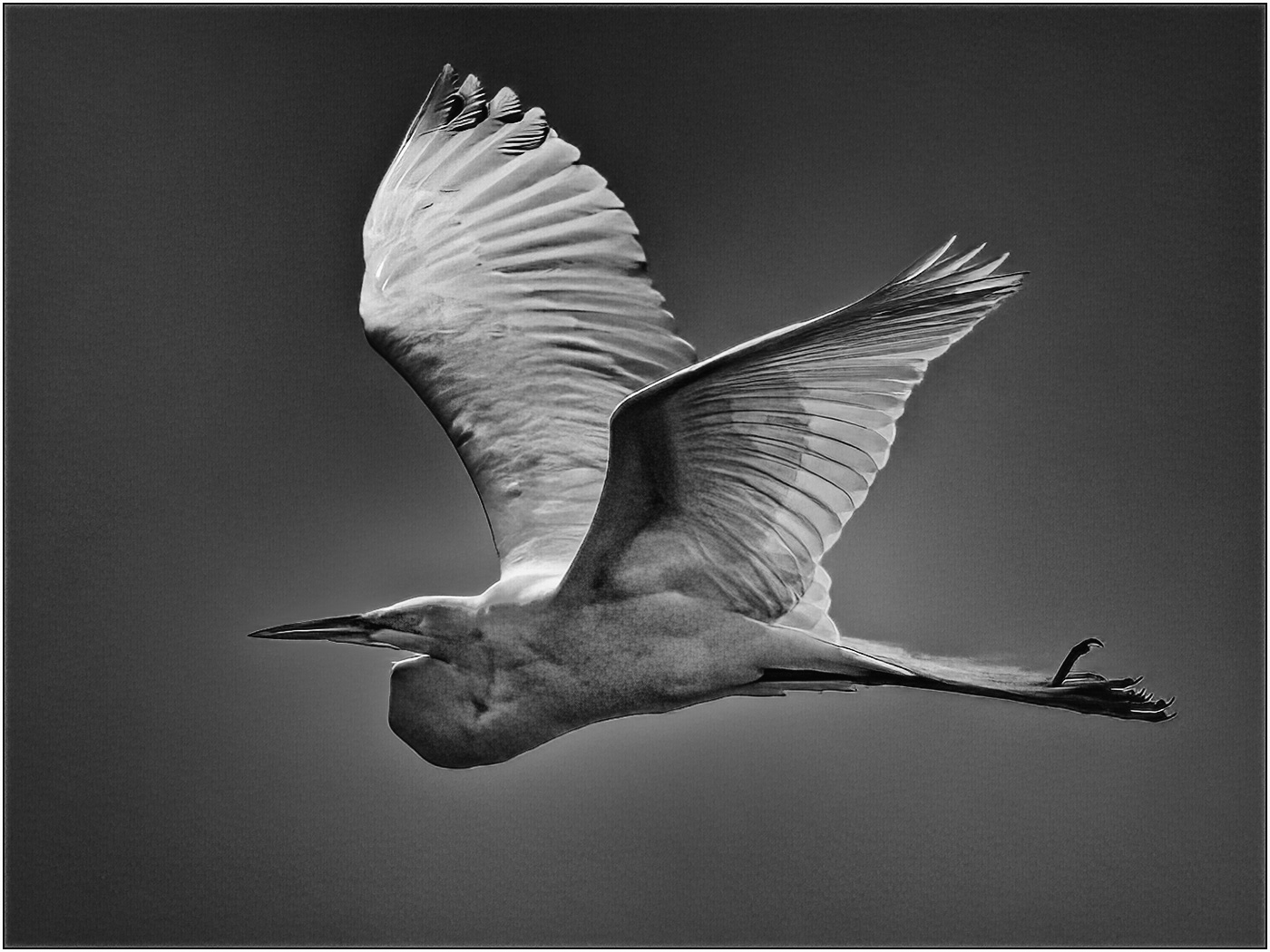
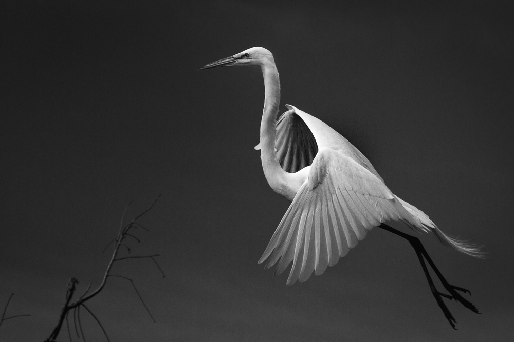
Excellent silhouette in B&W, Jim. Removing the distraction of color improved the simplicity of the image and provided an easier focus for the viewer. Well done!
|
Jul 7th |
| 11 |
Jul 24 |
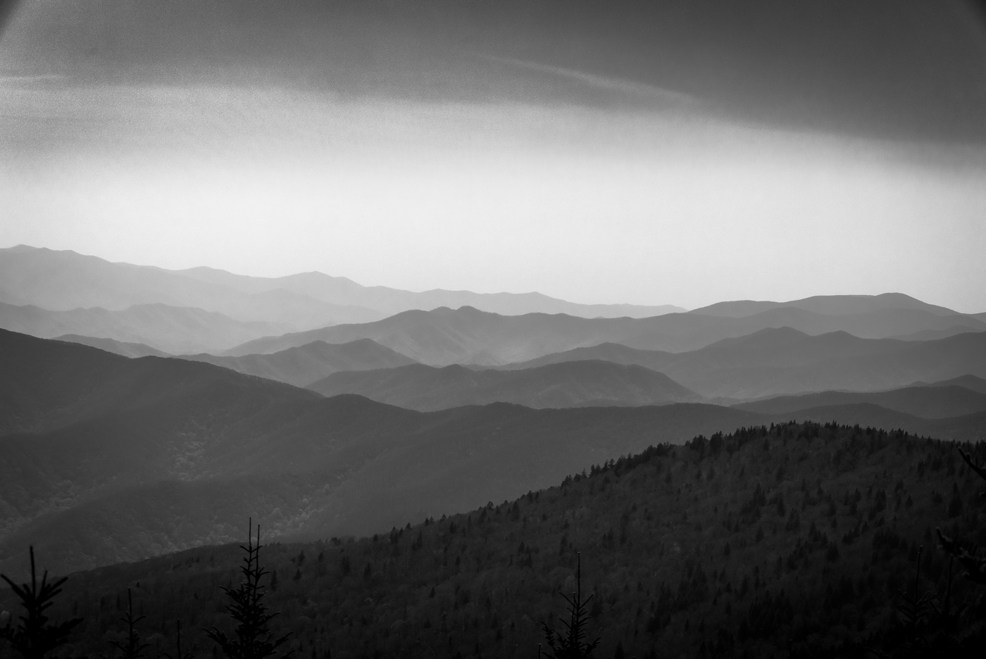
Comment |
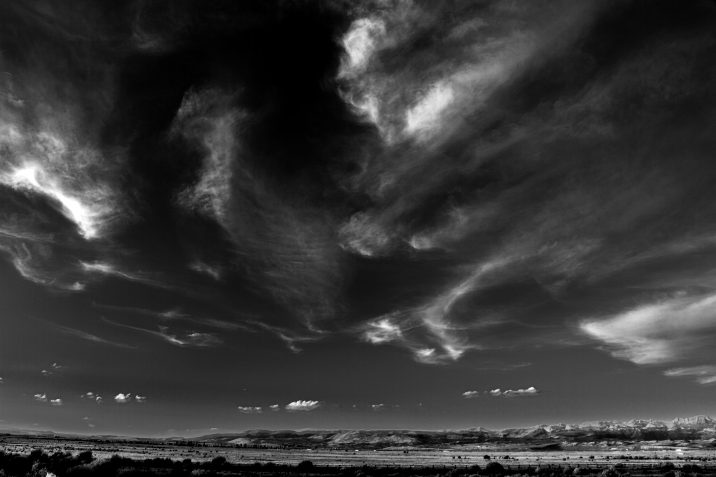
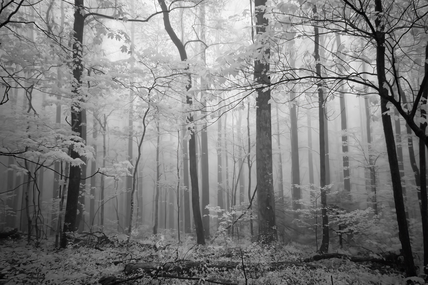
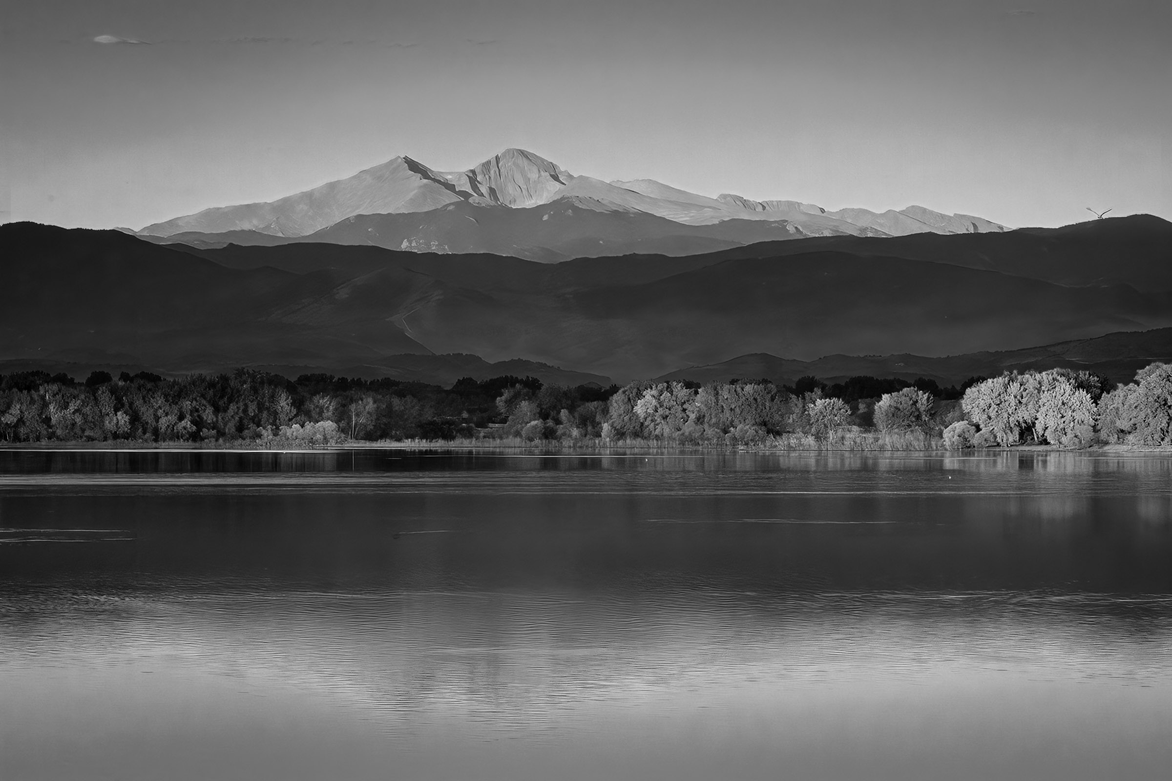
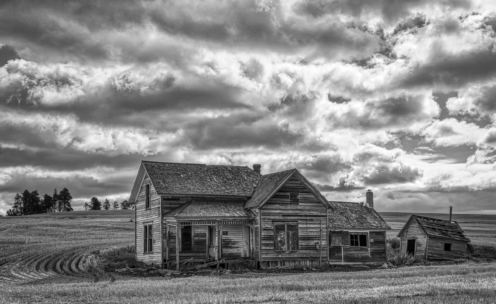
I really enjoyed your B&W version, Christian. I liked the moodiness that the clouds present of the darkened hills, and the in focus tree in the foreground for balance. The light beams create leading lines from the bright background to the darker, sharper foreground. Very nice!
|
Jul 7th |
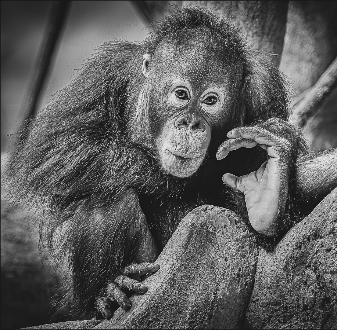
| 11 |
Jul 24 |
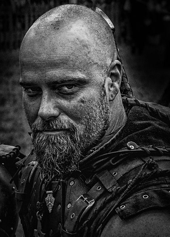
Comment |
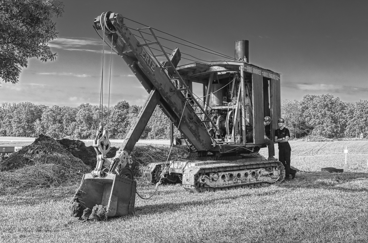
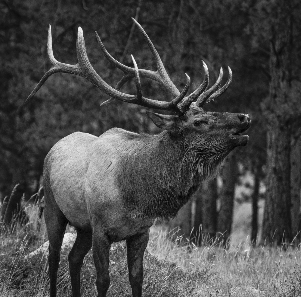
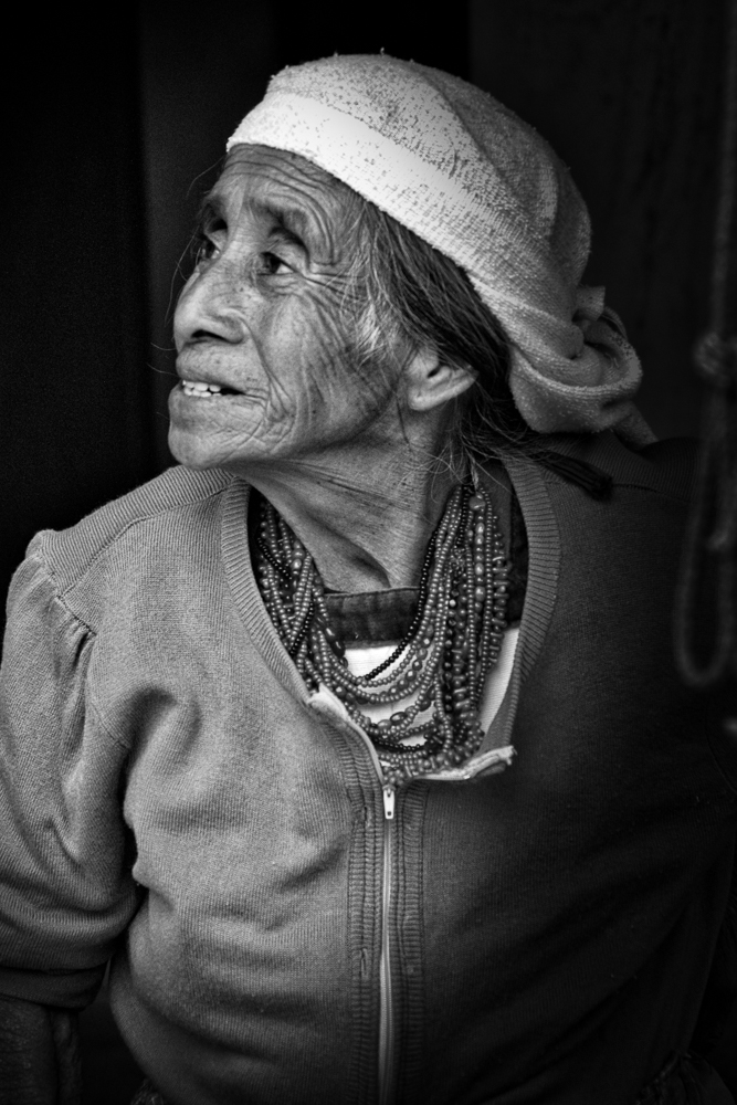
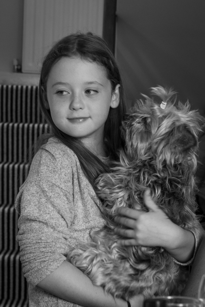
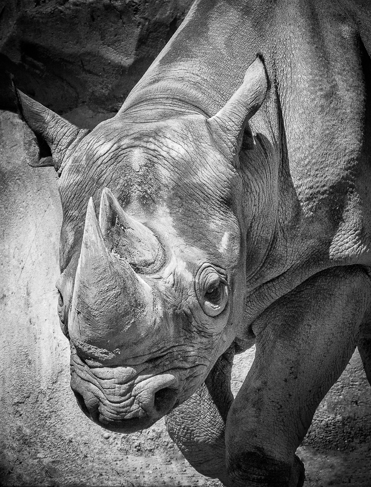
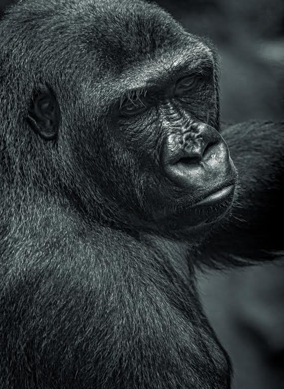
Thanks for joining us, Peter. You produced a very nice portrait with balanced exposure and no hot spots. I would have cropped a little tighter, removing excess door and ceiling, with the downside of forcing the subject more to the center. It would truly be a balancing act.
Overall, a good image. I look forward to seeing more of your work in coming months.
|
Jul 7th |
| 11 |
Jul 24 |
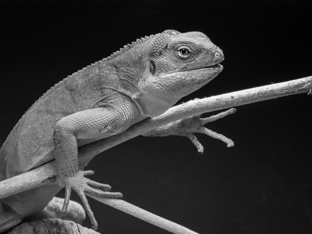
Comment |
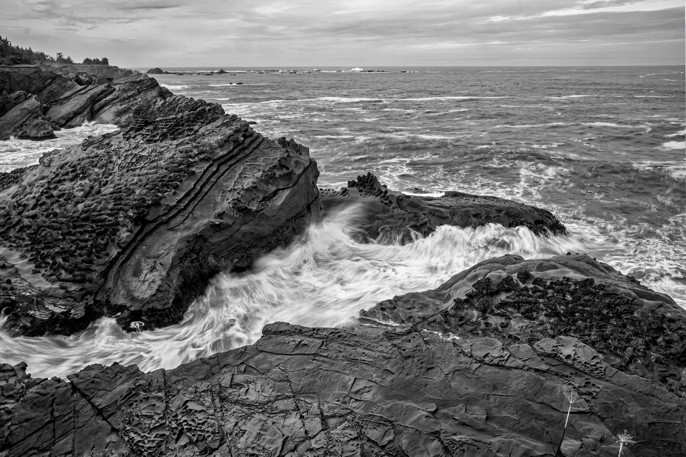
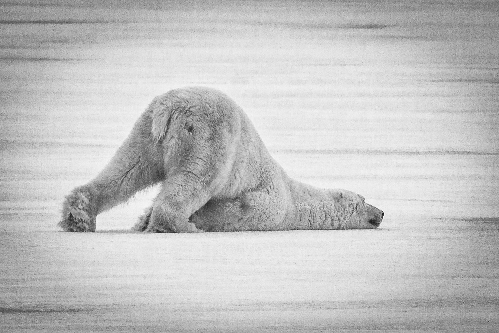
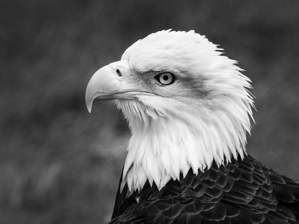
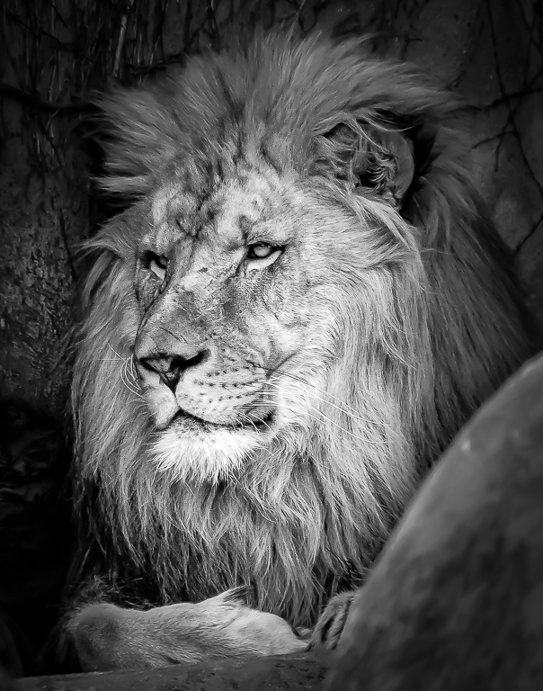
That is a tricky exposure in bright sun, Peter. You captured the detail, but the eyes need help. My suggestion would be the object selection on LR/PS for detail masking and then increase the exposure of the dark area. A quick (imperfect) 3 minute edit is attached to indicate possibilities. You could perfect it to your own tastes.
|
Jul 7th |
 |
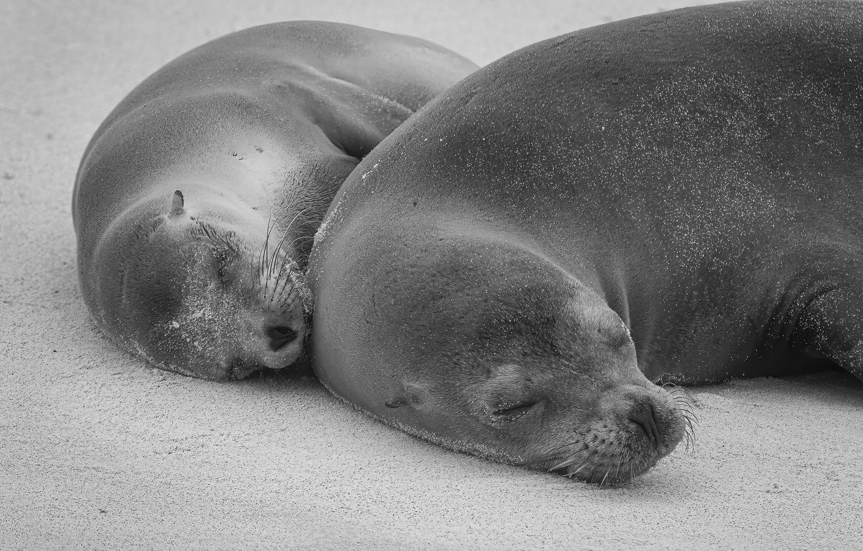
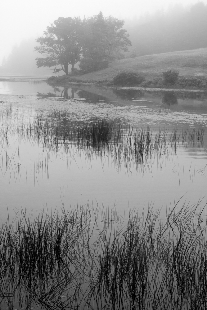
| 11 |
Jul 24 |
Comment |
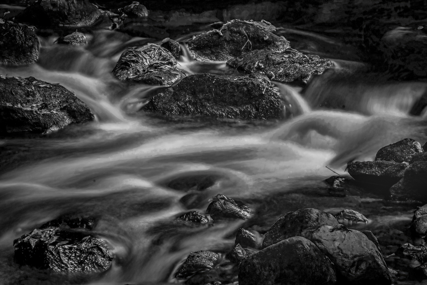
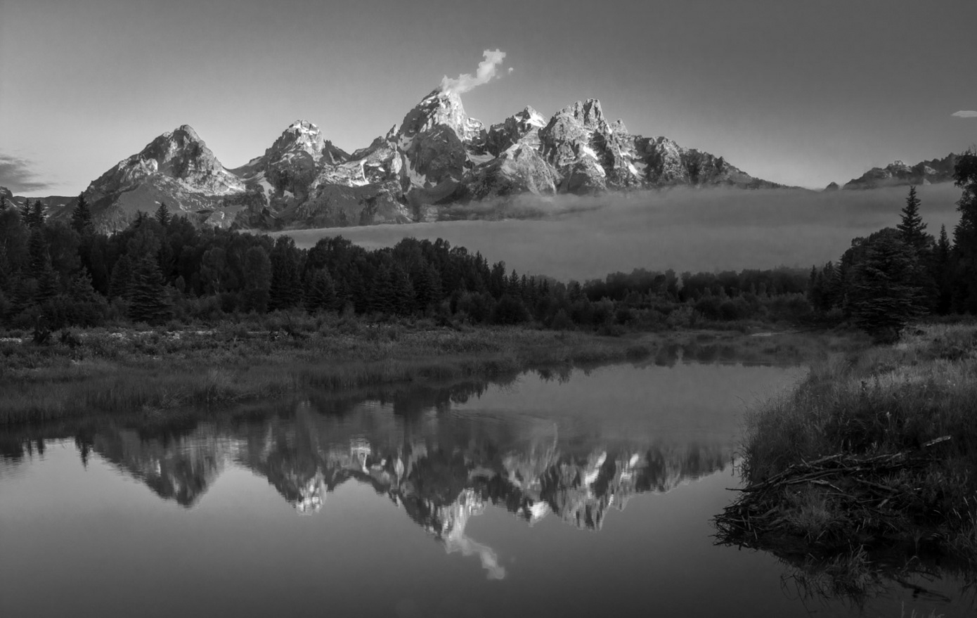
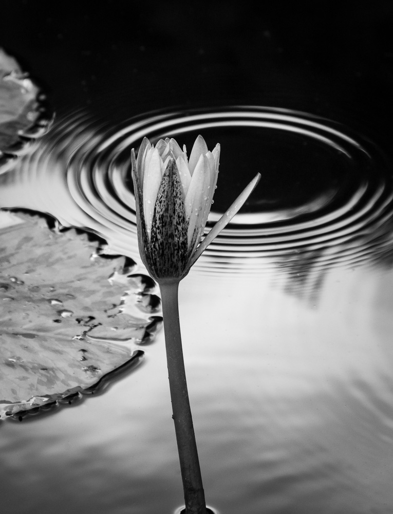
A very peaceful image, Darlene. I think both the color and B&W versions work well, so it is hard to make a choice.
Thanks for you details on your editing process. I have both TK9 and Lumenzia by Greg Benz, which I find easier to use. I should use both of them more, but get caught-up just finishing the edit, rather than seeking perfection.
Great image!
|
Jul 7th |
| 11 |
Jul 24 |
Reply |
You are right, Christian, since this is a PID site. I am basically a nature photographer, where such modifications are not allowed, so I forget. Also, by not doing it, I keep my entire catalog intact for nature, so I don't accidentally send in a PID corrected image to a Nature competition.
You are correct, that would improve the image. Thanks for your insight.
|
Jul 7th |
6 comments - 4 replies for Group 11
|
6 comments - 4 replies Total
|