|
| Group |
Round |
C/R |
Comment |
Date |
Image |
| 11 |
Feb 22 |
Comment |
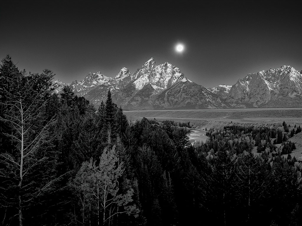
A great image, Henry. I like that you captured the full tonal range and balanced the exposure. The textures are well done and not too crispy. I think your crop is spot-on, avoiding all of the distractions.
I have used Lumenzia before, but wouldn't have thought of it for this image - - you presented a good learning experience.
|
Feb 28th |
| 11 |
Feb 22 |
Comment |
I believe that you succeeded, Jim. The lighting on the 3 children balances well with the lighting on the stone and you achieved great sharpness on both. The cropping of the scene is perfect as it eliminates the distractions of the original. The blurring of the remaining background emphasizes the main subject. You also achieved full tonal range. Great image, Jim.
|
Feb 28th |
| 11 |
Feb 22 |
Comment |
I like your image, Henry, but I would darken the sky if you are going for the full Ansel Adams look. I don't usually modify a member's image, but wanted to see what it would look like.
I opened a copy in PS and selected the sky and made a mask for a curves layer that I darkened the mid tones. I duplicated the layer and mask and inverted the mask so that it selected all in the image except the sky and lightened the dark areas of the image which brought out some depth and detail of the foreground. I like the final product, but it may be different than how you visualized the scene.
Your thoughts?
|
Feb 28th |
 |
| 11 |
Feb 22 |
Comment |
I like your B&W interpretation of the image, Peter. As always the absence of color accentuates the texture and shapes which is the foundation of your image. I also like the new crop as it brings the viewer into the image better. Good job.
|
Feb 27th |
| 11 |
Feb 22 |
Comment |
The B&W conversion was excellent as you took efforts too minimize difficulties, but to me the star of the show was the lighting.
With the proper lighting, you were able to emphasize the shapes, surfaces and grain which really makes the image superior.
Good job, Allen!!
|
Feb 2nd |
6 comments - 0 replies for Group 11
|
6 comments - 0 replies Total
|